Culver's brand guidelines
The Culver's brand style guide offers an introduction to consistent storytelling with a left-hand navigation structure and real-world restaurant photography.
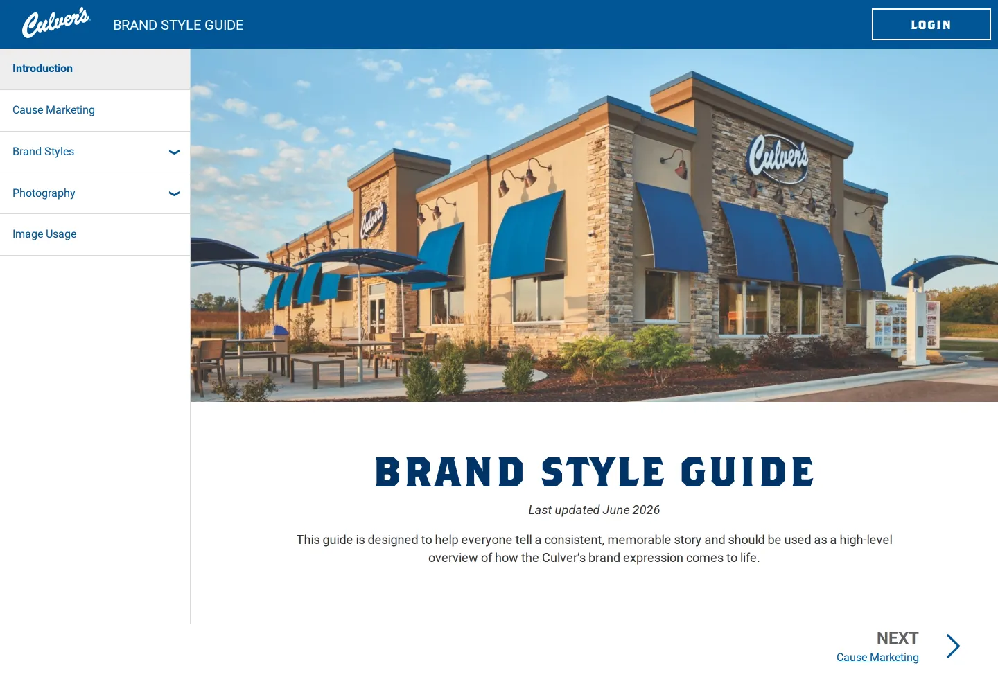
Culver's Brand Style Guide introduction screen displaying restaurant exterior photography, brand storytelling introduction, and sidebar navigation.
Want a brand center like Culver's’?
Create your brand center with Freedam ↗Freedam's take
I like how Culver's grounds their brand portal right away with real-world architecture. The introduction page features a large exterior shot of a restaurant complete with blue awnings and outdoor seating, giving an immediate sense of physical space. Navigation stays accessible through a persistent left sidebar covering topics like Cause Marketing, Photography, and Image Usage, while a top bar provides quick login access. The blue slab serif typography matches the chain's familiar look. It feels like a straightforward, practical hub built to keep their team focused on clear and consistent storytelling across everyday touchpoints.
At a glance
- Sections
- Introduction · Cause Marketing · Brand Styles · Photography · Image Usage
- Tone
- Warm, practical, and focused on clear storytelling.
What I noticed
- The introduction page features a large banner photograph of a Culver's restaurant exterior with blue awnings, outdoor seating, and a drive-thru lane.1
- A left sidebar lists navigation links including Introduction, Cause Marketing, Brand Styles, Photography, and Image Usage.2
- The top bar includes the Culver's logo, the title BRAND STYLE GUIDE, and a LOGIN button.3
- The page displays a last updated note reading June 2026.4
Numbers refer to the screenshots above.
What I could not see
- Could not view content behind the login button or interior sections such as Cause Marketing, Brand Styles, and Photography beyond the navigation links.
Ideas to borrow
Reviewed on 25 September 2026. Request a correction · I built this