City of Reykjavík brand guidelines
City of Reykjavík’s Hanna design system documentation details digital standards, practices, and UI modules built on zeroheight.
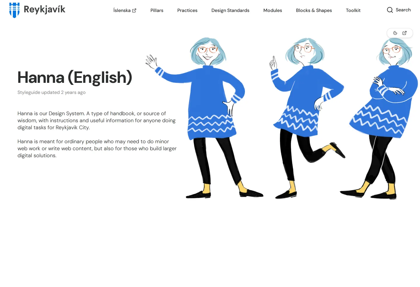
Introductory page for City of Reykjavík's Hanna design system featuring top navigation and character illustrations.
Want a brand center like City of Reykjavík’s?
Create your brand center with Freedam ↗Freedam's take
I like encountering civic design documentation that brings a sense of personality to municipal tools. For the City of Reykjavík, their system Hanna serves as a design handbook for digital projects. The landing view introduces the system alongside illustrated poses of a blue-haired character on the right, which gives a friendly, approachable touch to an otherwise structured guide. Across the top, clear navigation lays out sections like Pillars, Practices, Design Standards, and Modules, complemented by an active search tool and a language link back to Icelandic.
At a glance
- Sections
- Íslenska · Pillars · Practices · Design Standards · Modules · Blocks & Shapes · Toolkit
- Tone
- A welcoming, structured design system handbook tailored for municipal digital tasks.
What I noticed
- The Reykjavík logo is placed in the top left navigation bar.1
- Top navigation links to Íslenska, Pillars, Practices, Design Standards, Modules, Blocks & Shapes, Toolkit, and a search tool.2345678910
- The hero area features three illustrated poses of a character with short blue hair and glasses in a blue dress.11
- The documentation platform is built with zeroheight.1213
Numbers refer to the screenshots above.
What I could not see
- Only a single introductory page in English was captured, leaving the contents of Modules, Toolkit, and Design Standards unviewed.
- No downloadable assets or file packages were observed on the introductory screen.
Ideas to borrow
- Pairing a friendly mascot or illustrated character with digital design system documentation can make municipal standards feel approachable.11
Reviewed on 25 September 2026. Request a correction · I built this
Similar brand centers
All brand guidelines →