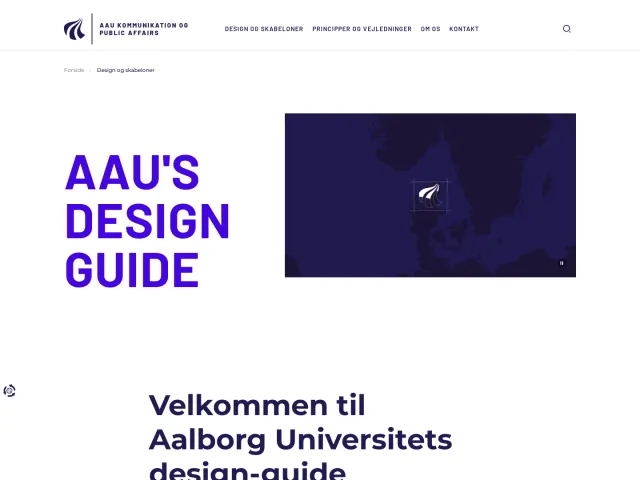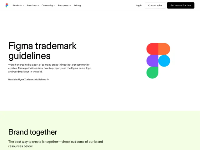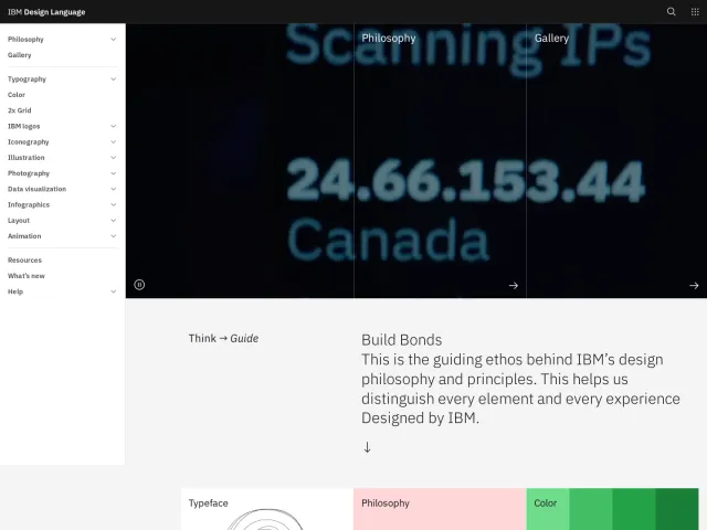
Capital University brand guidelines
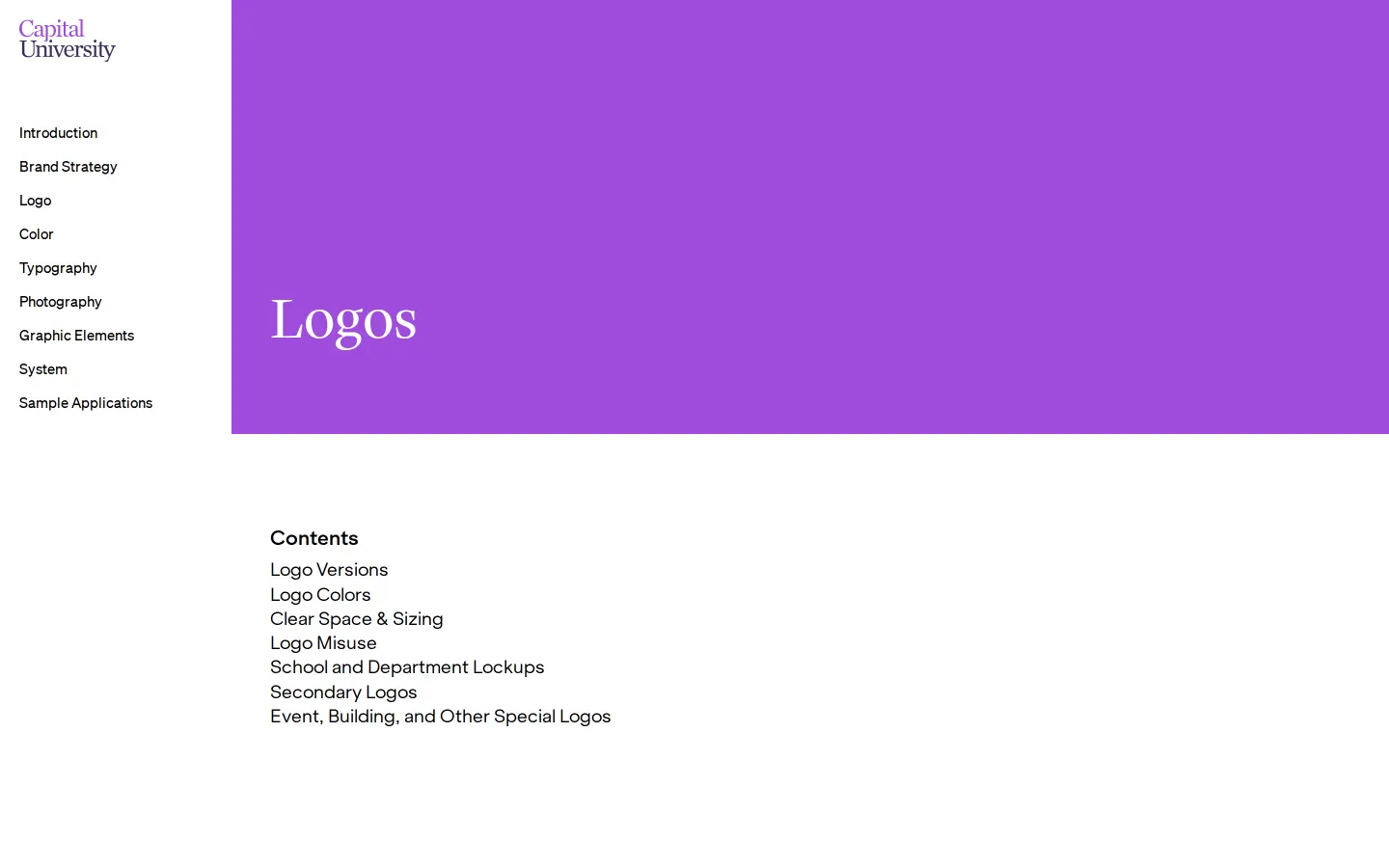
Capital University provides a clean online brand portal featuring core visual guidelines, direct asset archives, and strategy documents.
Freedam's take — I like how clear and focused Capital University kept their online identity hub. Everything is neatly divided into essential chapters covering logo, color, typography, strategy, and photography. Instead of hiding key files behind forms or complex portals, the team provides direct asset downloads right alongside the rules, including specific packages for sub-brands like the seminary and art gallery. The inclusion of audience messaging strategy downloads directly within the brand strategy section is a thoughtful touch for campus communicators who need both verbal and visual direction close at hand.
Details
- Type
- Guidelines
- Access
- Public
- Source
- live.standards.site
- Industry
- Education
- Capabilities
- Downloads
- Tags
- brand architecture, brand story, color system, typography, photography, asset downloads, pdf downloads
- Added
- Last checked

What I noticed
- The portal organizes documentation across dedicated pages for logo, color, typography, brand strategy, and photography.123456
- Direct download packages are provided for primary logos, Comets athletics logos, and individual unit marks like Trinity Seminary and Schumacher Gallery.78910
- The brand strategy section provides downloadable PDF guides for audience messaging strategies and messaging maps.1112
Numbers refer to the screenshots above.
What I could not see
- Could not view full page content or specific color palettes beyond the titles and download files.
- Could not verify if search or interactive asset browsing features exist behind authentication.
Ideas to borrow
- Pair messaging frameworks and audience strategy documents directly alongside visual identity rules so teams have unified communication guidance.
Reviewed on 18 September 2026. Request a correction · I built this