Canton of Zurich brand guidelines
The Canton of Zurich corporate design page details its three-part logo system, diagonal flag motif, and signage rules while offering the full manual on request.
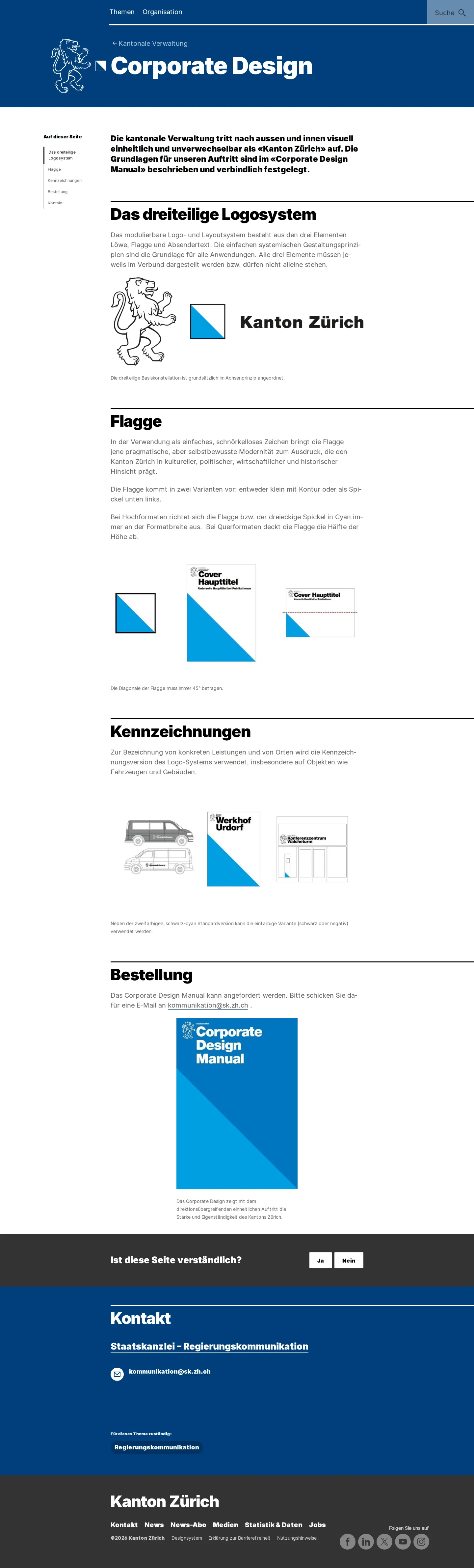
The Canton of Zurich corporate design page detailing the three-part logo system, flag graphics, and manual ordering details.
Want a brand center like Canton of Zurich’s?
Create your brand center with Freedam ↗Freedam's take
I spent time reviewing the Canton of Zurich brand page, and I appreciate its disciplined public-sector approach. It covers the core three-part logo system, pairing the regional lion mark, diagonal flag graphic, and department sender text. Rather than overwhelming visitors with downloads, it explains how the 45-degree diagonal flag element carries across both portrait and landscape collateral, as well as municipal vehicle markings and building signage. If you need the complete identity specifications, you have to contact the state chancellery directly, keeping the public summary focused and very clear.
At a glance
- Sections
- Das dreiteilige Logosystem · Flagge · Kennzeichnungen · Bestellung · Kontakt
- Tone
- Formal, disciplined, and informative public administration design standard.
What I noticed
- The identity system breaks the logo into three components: a lion, a flag graphic, and sender text.1
- The documentation details how the flag graphic's 45-degree diagonal rule applies across portrait and landscape formats.2
- Signage and vehicle branding examples include building entrances and municipal vans.3
- Direct downloads are omitted in favor of ordering the complete Corporate Design Manual via email.45
Numbers refer to the screenshots above.
What I could not see
- The full Corporate Design Manual was not directly viewable without requesting it via email.
Ideas to borrow
- Demonstrating how a single geometric rule, like a 45-degree diagonal graphic element, adapts consistently across portrait and landscape layouts.2
Quick answers
Reviewed on 25 September 2026. Request a correction · I built this
Similar brand centers
All brand guidelines →