Cambridge University Press & Assessment brand guidelines
Online brand guidelines for Cambridge University Press & Assessment detailing their One Cambridge identity, typography, colour, and logo usage.
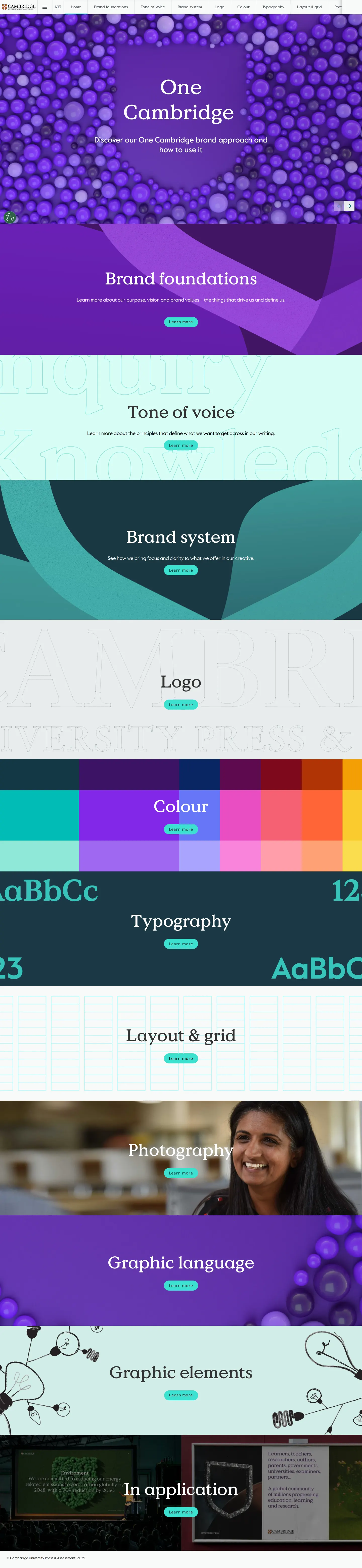
Freedam's take — I love seeing how an established academic institution translates a unified identity across so many contexts. Cambridge University Press & Assessment frames this work under a One Cambridge approach, organizing everything from high-level brand behaviors down to minute design execution. The typography guidance is especially thorough, distinguishing between Value Serif, Value Sans, and Open Sans while clearly addressing substitute fonts and licensing. I also appreciate the practical coverage of niche touchpoints like book spine logos and video sting treatments, showing a clear awareness of their real-world publishing and digital outputs.
Details
- Type
- Guidelines
- Access
- Public
- Source
- brand.cambridge.org
- Industry
- Education
- Capabilities
- Guidelines, Asset browsing, Search, Partner resources
- Tags
- typography, logo usage, tone of voice, motion design, search
- Added
- Last checked





What I noticed
- The guide introduces a unified brand approach titled 'One Cambridge'.12
- The typography section outlines specific typefaces including Value Serif, Value Sans, and Open Sans, along with substitute fonts and licensing.34567
- Logo specifications cover specialized placements such as the Cambridge spine logo, boilerplate text, and video logo stings.8910
- Brand behaviors are broken down into personas like 'Empathetic expert', detailing how the brand looks, speaks, and acts.11121314
- A site search mechanism is available across guideline pages.1516171819
Numbers refer to the screenshots above.
What I could not see
- Direct asset download links or file download managers could not be verified from the visible headings and navigation.
- Guidelines for layout & grid, photography, and graphic elements could not be fully inspected beyond page titles and navigation labels.
Ideas to borrow
Reviewed on 18 September 2026. Request a correction · I built this