Bitpanda brand guidelines
Bitpanda's brand guidelines outline core design elements, brand portfolio structures, typography, and color rules across structured sections.
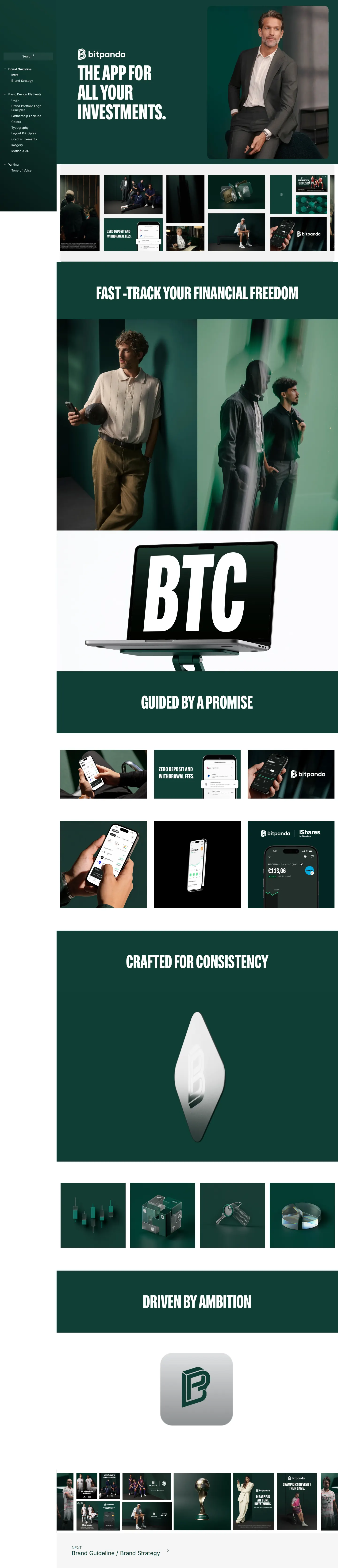
Bitpanda brand guideline home screen showing the dark green hero banner, brand headline, and navigation menu.

Logo guidelines page featuring section index links, combination rules, and modular wordmark variations.
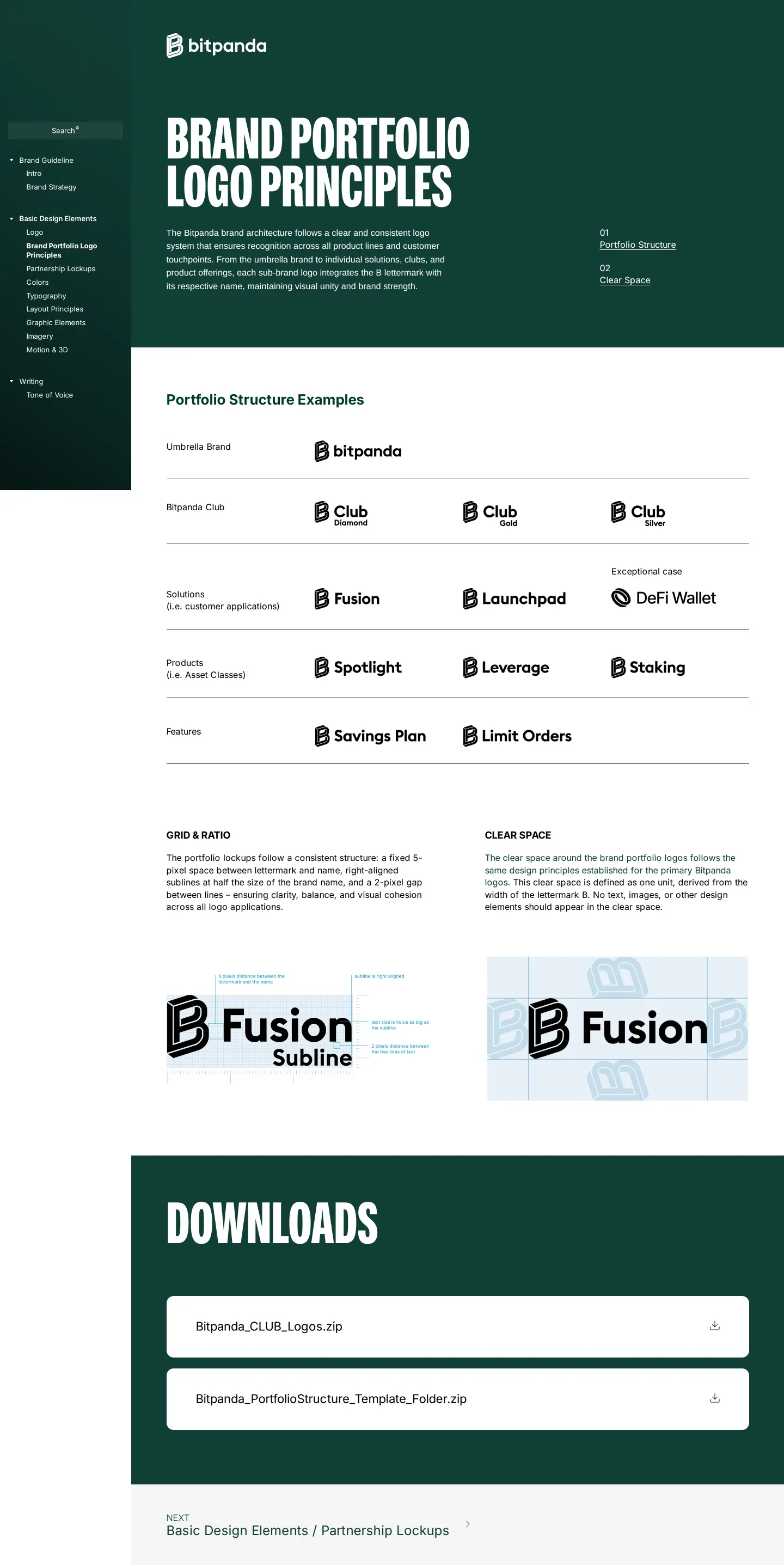
Brand Portfolio Logo Principles page explaining portfolio architecture and the umbrella brand structure.
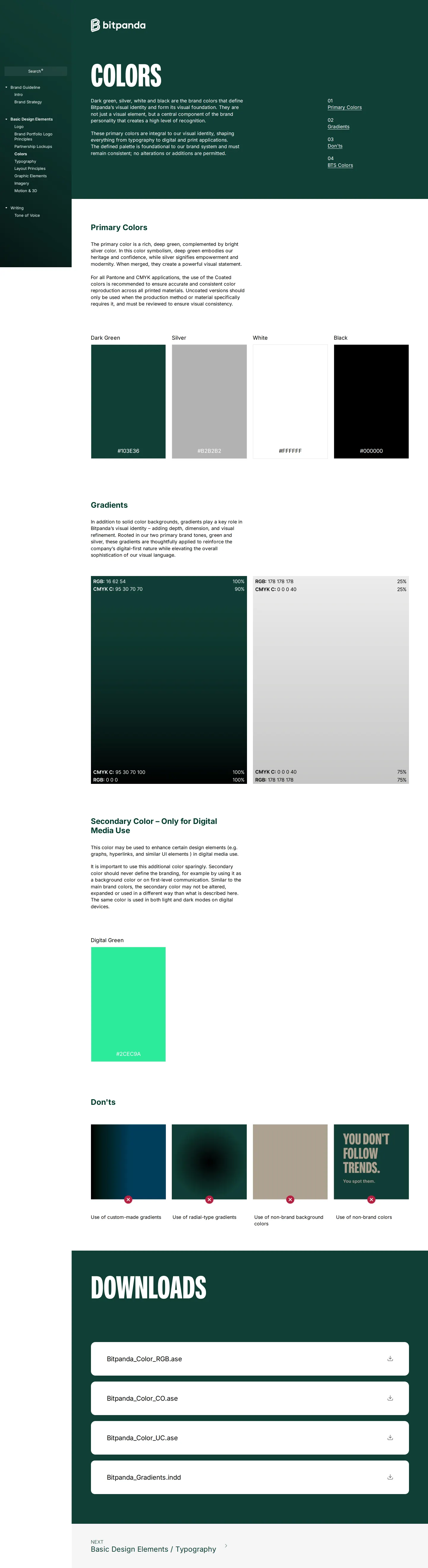
Colors overview page displaying primary color definitions, gradients, and secondary digital media usage.
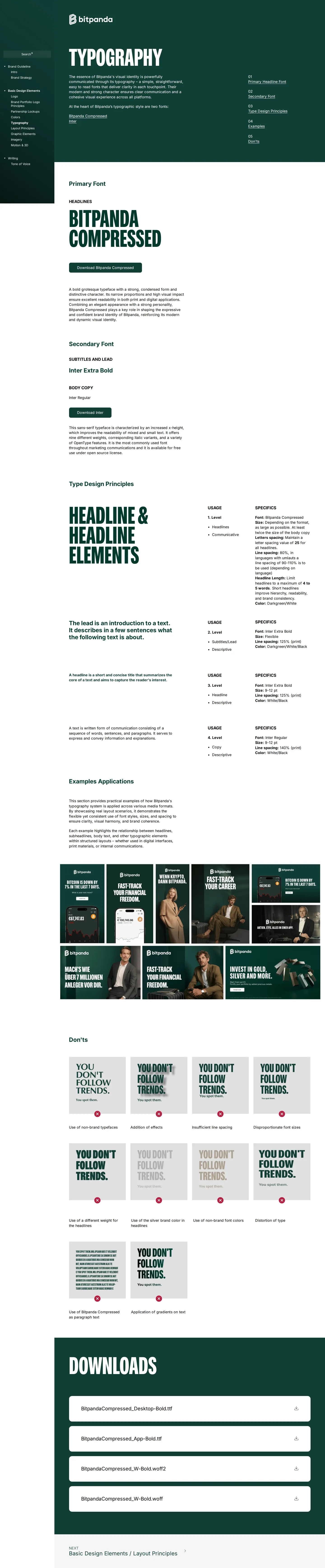
Typography rules introducing Bitpanda Compressed and Inter fonts with headline hierarchies.
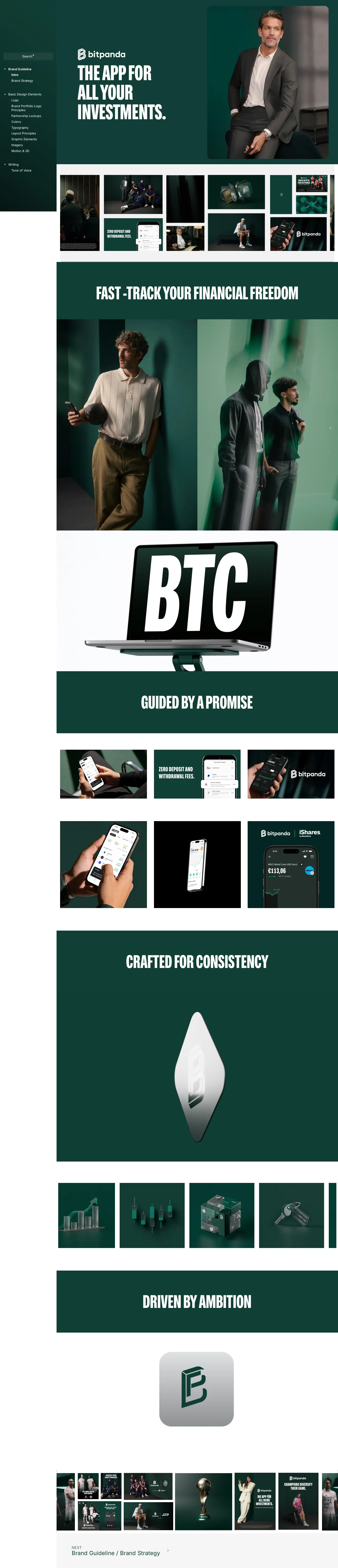
Introduction page showcasing campaign imagery and core brand messaging against a dark green layout.
Want a brand center like Bitpanda’s?
Create your brand center with Freedam ↗Freedam's take
I like how deliberate Bitpanda is with their presentation. Built on Corebook, the portal leans heavily into deep green headers, bold condensed typography, and clear numbered indices at the top of every section. The type system caught my eye right away, pairing their custom Bitpanda Compressed headline face with Inter for body copy, while linking out straight to Google Fonts. Every element feels measured, from the modular wordmark rules to how their lettermark anchors sub-brands across the portfolio architecture.
At a glance
- Sections
- Brand Guideline · Basic Design Elements · Writing
- Tone
- Structured and polished documentation focusing on clean hierarchy and systematic brand architecture.
What I noticed
- The portal organizes its guidelines into three primary sidebar categories: Brand Guideline, Basic Design Elements, and Writing.123
- The typography documentation specifies two core typefaces: Bitpanda Compressed for primary headlines and Inter for secondary text.456
- The color foundation identifies dark green, silver, white, and black as primary brand colors, alongside a secondary color restricted to digital media.78
- Brand portfolio guidelines detail umbrella branding structure and integrate the B lettermark across sub-brands.910
Numbers refer to the screenshots above.
What I could not see
- The search interface functionality could not be tested directly from the captured screens.
- Specific downloadable file packages and formats under the downloads headings are not visible on the captured viewports, aside from an external Google Fonts link.
Ideas to borrow
Quick answers
What primary fonts does Bitpanda use?
Bitpanda specifies Bitpanda Compressed as its primary headline typeface and Inter as its secondary font.456
Where can the secondary font Inter be downloaded?
The guideline provides an outbound download link directly to Inter on Google Fonts.13
Reviewed on 25 September 2026. Request a correction · I built this