Academy of Motion Picture Arts and Sciences brand guidelines
The AMPAS brand guide welcomes visitors with an immersive full-bleed photograph, a minimal sidebar menu, and navigation for its major brand pillars.
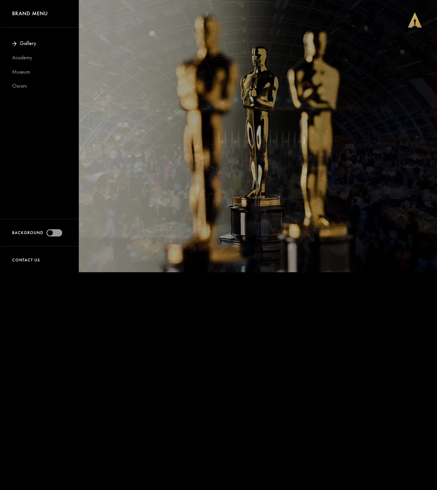
Landing gallery page featuring a full-bleed evening banquet photograph, top-right statuette logo, and a left navigation sidebar.
Want a brand center like Academy of Motion Picture Arts and Sciences’?
Create your brand center with Freedam ↗Freedam's take
I like how cinematic this landing screen feels right away. The Academy uses an atmospheric full-bleed photograph of an evening banquet beneath a domed glass ceiling, immediately establishing the prestige of the institution. A minimal left sidebar contains a brand menu routing visitors to sections for the Gallery, Academy, Museum, and Oscars, while an iconic golden statuette logo sits cleanly in the upper right. There is also a small background toggle switch at the bottom of the navigation bar, keeping the layout focused entirely on visual presence before diving into detailed identity rules.
At a glance
- Sections
- Gallery · Academy · Museum · Oscars · CONTACT US
- Tone
- Atmospheric, cinematic, and understated, leading with immersive photography rather than dense initial copy.
What I noticed
- The home viewport displays an overhead photograph of a crowded banquet event beneath a domed glass ceiling at night.12
- A left sidebar features a Brand Menu linking to Gallery, Academy, Museum, and Oscars.34
- A golden triangle-shaped Oscars statuette logo sits in the top right corner of the screen.5
- A background toggle switch labeled BACKGROUND is placed near the bottom of the sidebar.6
Numbers refer to the screenshots above.
What I could not see
- Only the top-level gallery landing page was captured, leaving the Academy, Museum, and Oscars sub-pages unseen.
Ideas to borrow
- Using a dedicated background toggle control allows visitors to adjust or swap the visual backdrop while browsing.6
Reviewed on 25 September 2026. Request a correction · I built this
Similar brand centers
All brand guidelines →