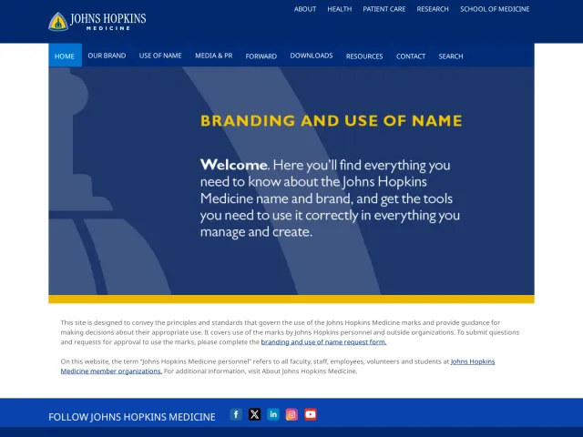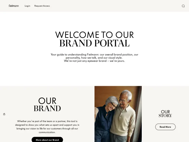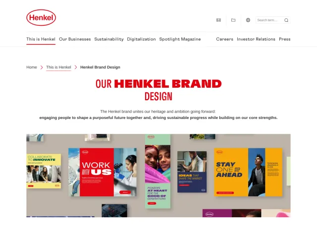
ZEISS brand guidelines
The ZEISS Brand Portal offers design guidance spanning brand identity, iconography structures, color palettes, and partnership rules alongside login gates for full resources.
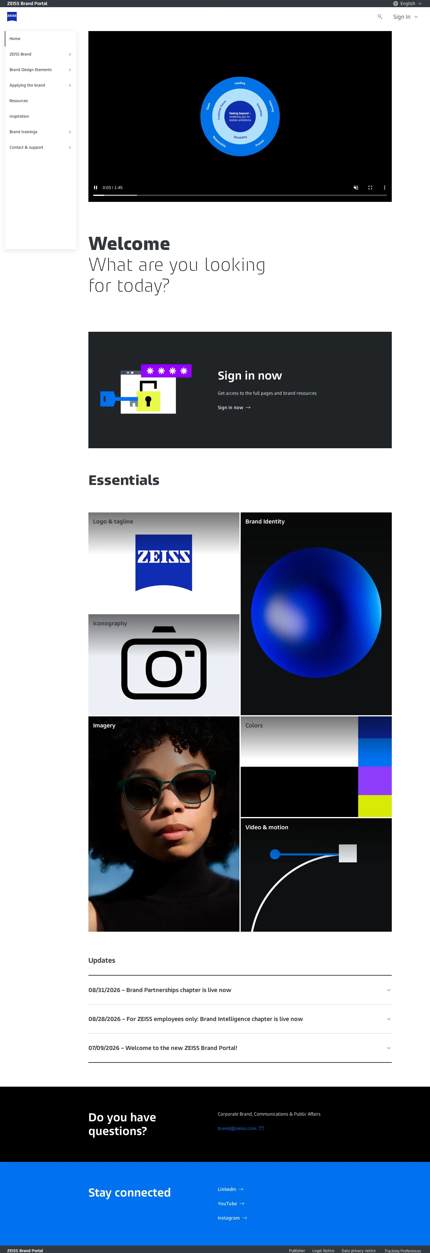
Home page of the ZEISS Brand Portal with key essentials, updates, and navigation sidebar.

Brand colors overview presenting primary black and white blocks alongside accent color strips.
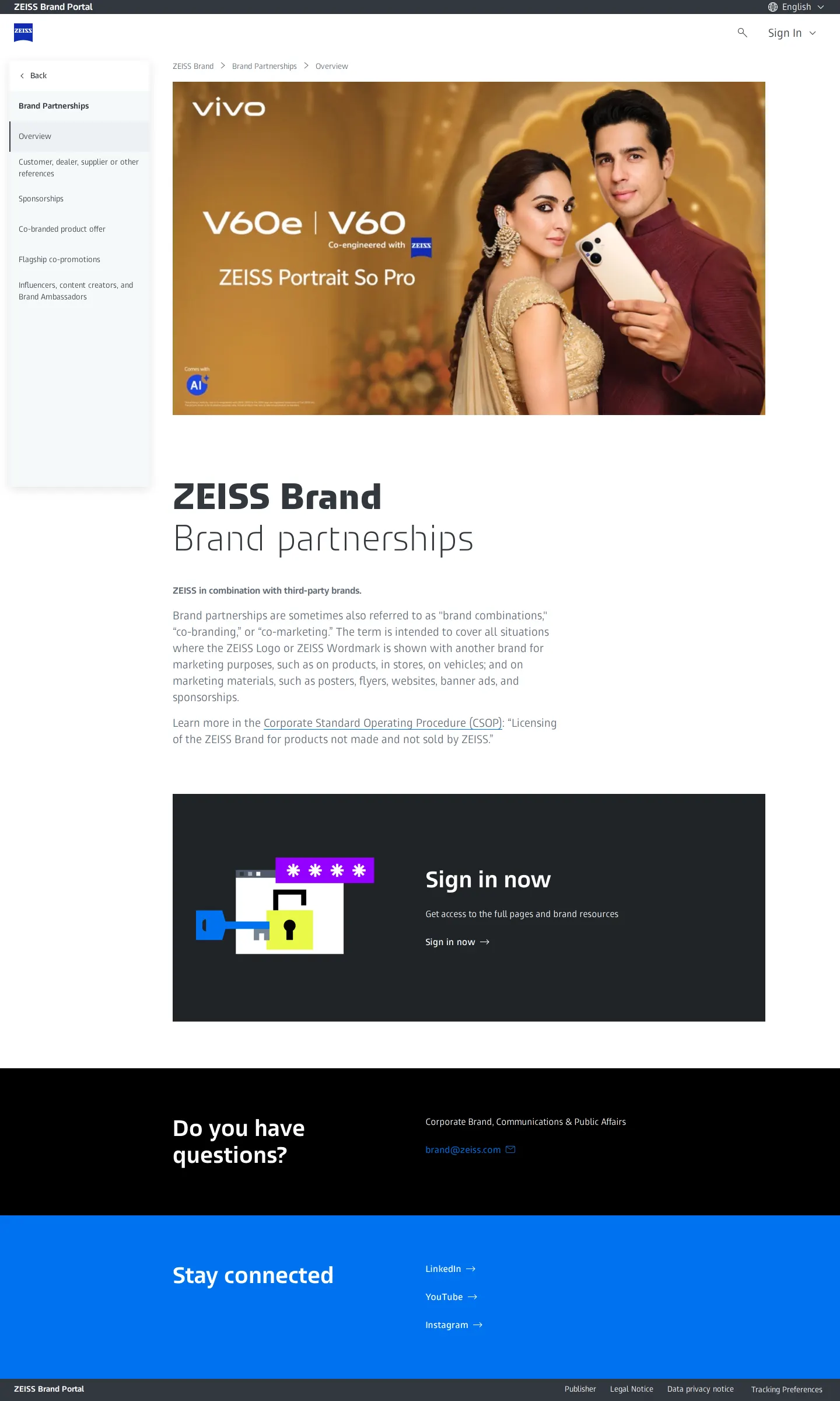
Brand partnerships page detailing co-branding contexts and featuring a sign-in callout.
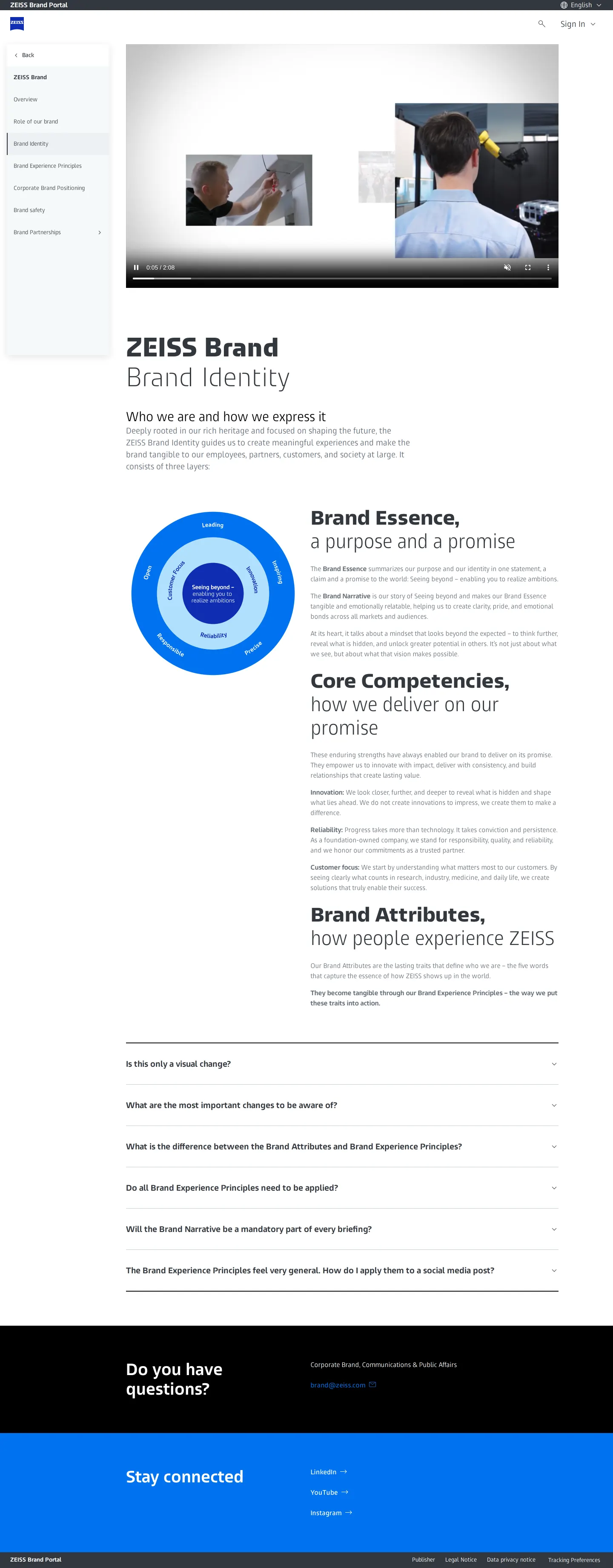
Brand identity guide showing the concentric circular model for essence, competencies, and attributes.
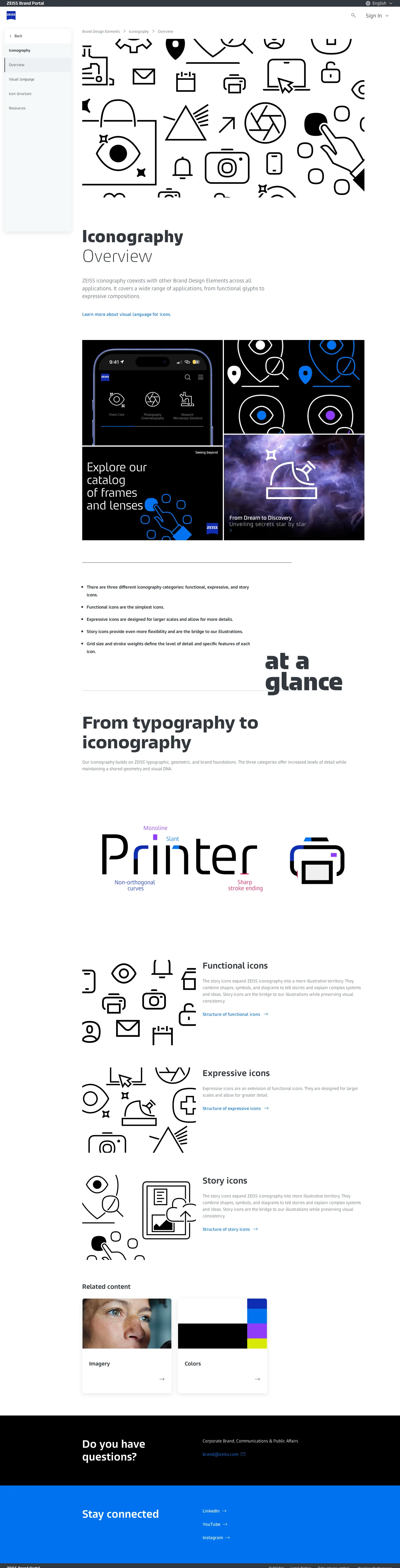
Iconography overview categorizing functional, expressive, and story icons alongside type-matching traits.
Want a brand center like ZEISS’s?
Create your brand center with Freedam ↗Freedam's take
I like how ZEISS explains the mechanical details of its visual system. On the iconography page, they show a diagram comparing the word Printer to a printer icon, pointing out shared attributes like monoline weight, slant, non-orthogonal curves, and sharp stroke endings. They also group their iconography into functional, expressive, and story tiers. While full pages and brand resources require a sign-in, the open pages still give clear definitions for partnerships, identity layers, and core colors like black and white paired with accents like ZEISS Azure, Violet, and Lime.
At a glance
- Sections
- ZEISS Brand · Brand Design Elements · Applying the brand · Resources · Inspiration · Brand trainings · Contact & support
- Downloads
- Tone
- Technical, systematic, and focused on optical precision and clear brand governance.
What I noticed
- The iconography page categorizes icons into functional, expressive, and story icons, and shows shared design attributes with typography such as monoline, slant, non-orthogonal curves, and sharp stroke endings.123
- Callout boxes on the homepage and partnerships page prompt visitors with 'Sign in now' to access full pages and brand resources.45
- The brand identity section diagrams three concentric circles representing brand essence, core competencies, and brand attributes.67
- The color system sets black and white as primary colors, paired with accent tones such as ZEISS Azure, ZEISS Violet, and ZEISS Lime.8910
Numbers refer to the screenshots above.
What I could not see
- Full asset downloads, complete resource libraries, and gated portal pages could not be viewed without signing in.
Ideas to borrow
- Illustrate how icons inherit specific visual traits from typography, such as slant and stroke termination, to unify interface graphics.2
Quick answers
Reviewed on 26 September 2026. Request a correction · I built this