brandcenter.gallery
Generate yours with Freedam

Vy brand guidelines

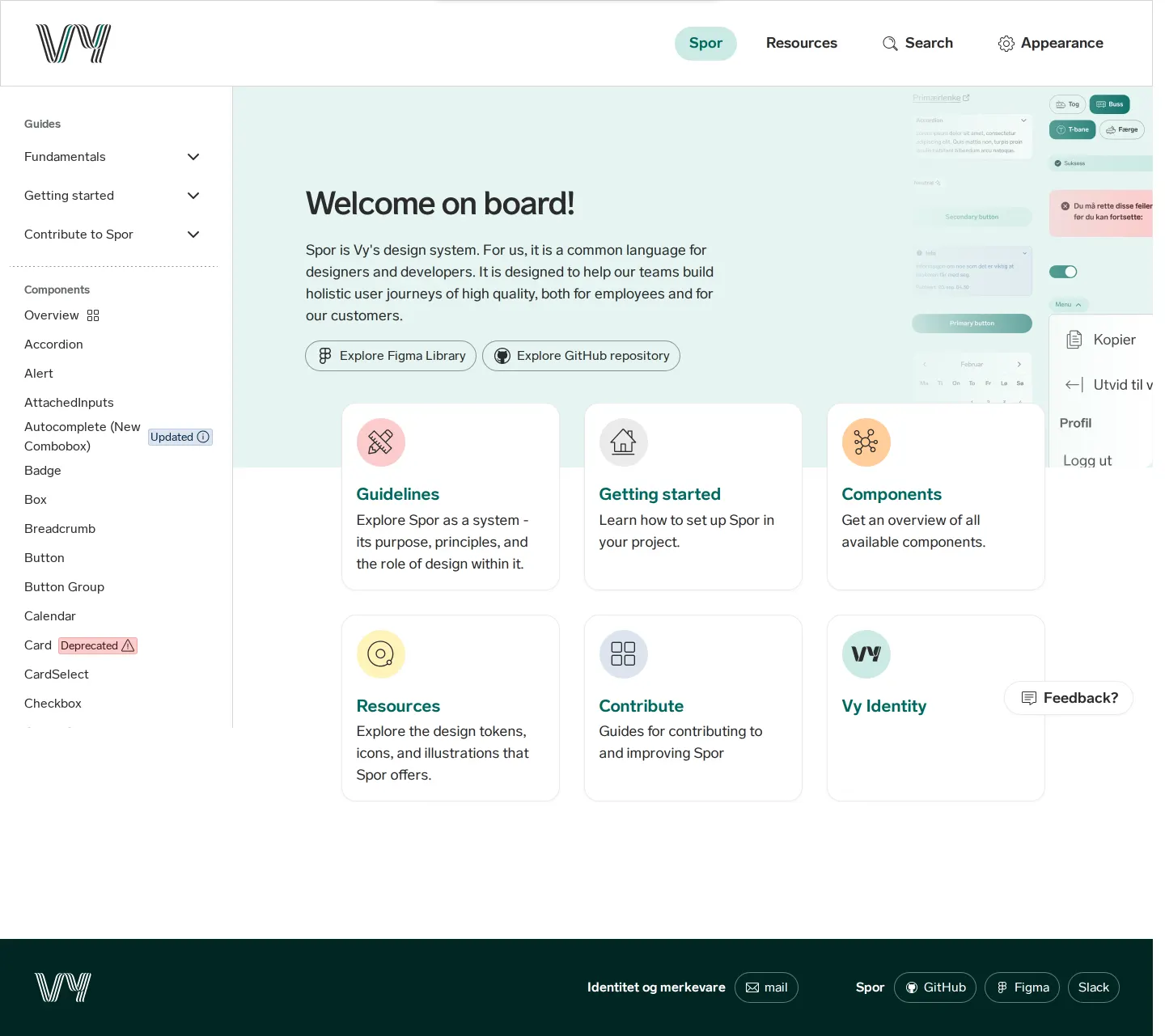
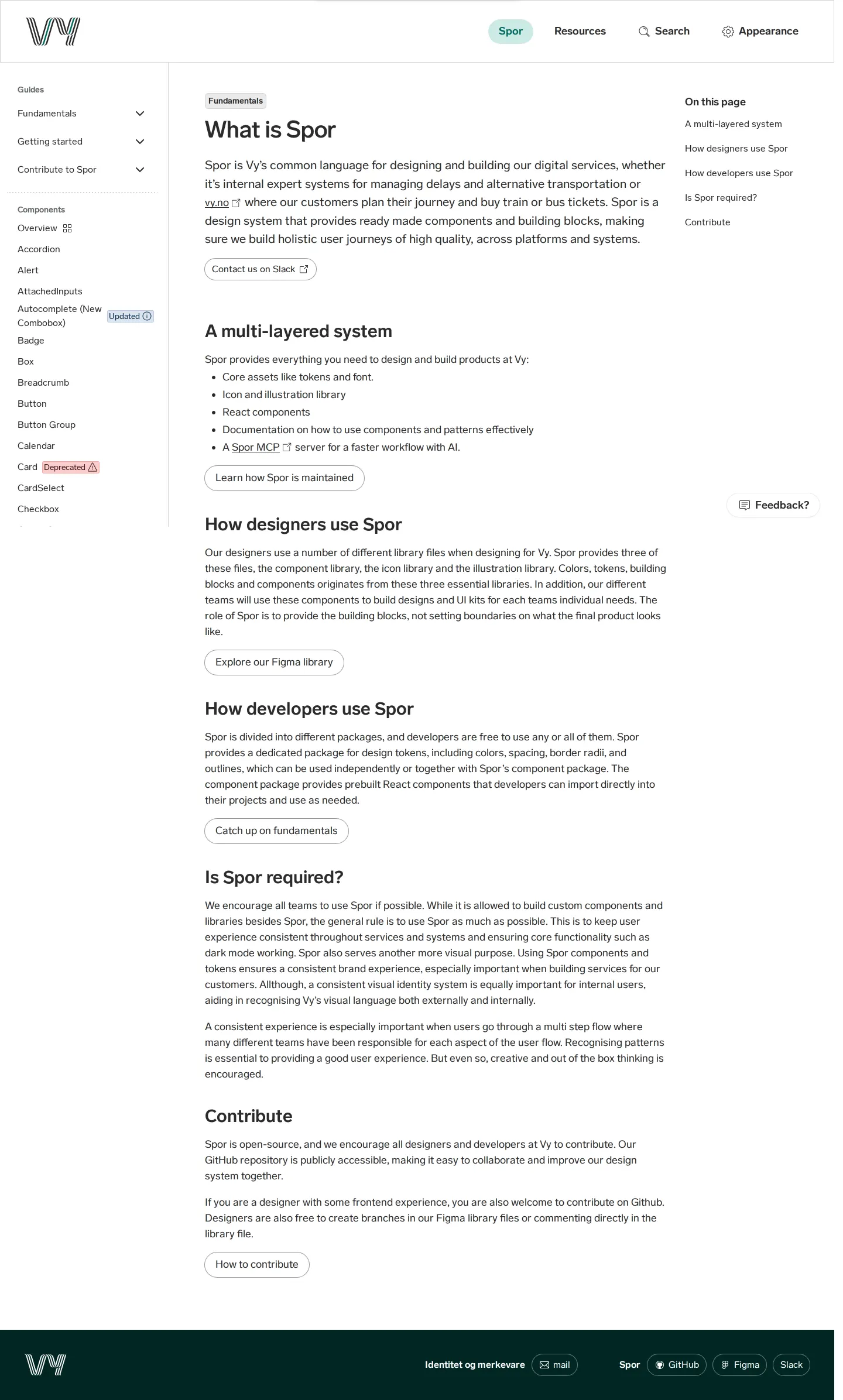
Spor is Vy's design system documentation site, providing component guidelines, React code examples, design tokens, and shared brand resources.

Freedam's take — I really enjoy exploring Spor, Vy's design system documentation. The structure feels immediately practical, balancing high-level design principles with deep technical implementation details for everyday interfaces. Each component page cleanly breaks down into dedicated sections for guidelines and direct code examples. I appreciate how the navigation keeps everything transparent by highlighting the lifecycle status of parts, like marking items as updated or deprecated right in the sidebar. The resources area neatly gathers core assets, from design tokens to icon libraries and an interactive playground, making it an approachable reference for anyone building Vy products.
Visit Vy's brand center ↗
Type
Guidelines
Access
Public
Industry
Transport & logistics
Capabilities
Guidelines, Asset browsing
Tags
ui components, design tokens, iconography, illustration, media library, interactive
Added
Last checked
Vy Designmanual Captured 16 Sep 2026
What is Spor Captured 16 Sep 2026
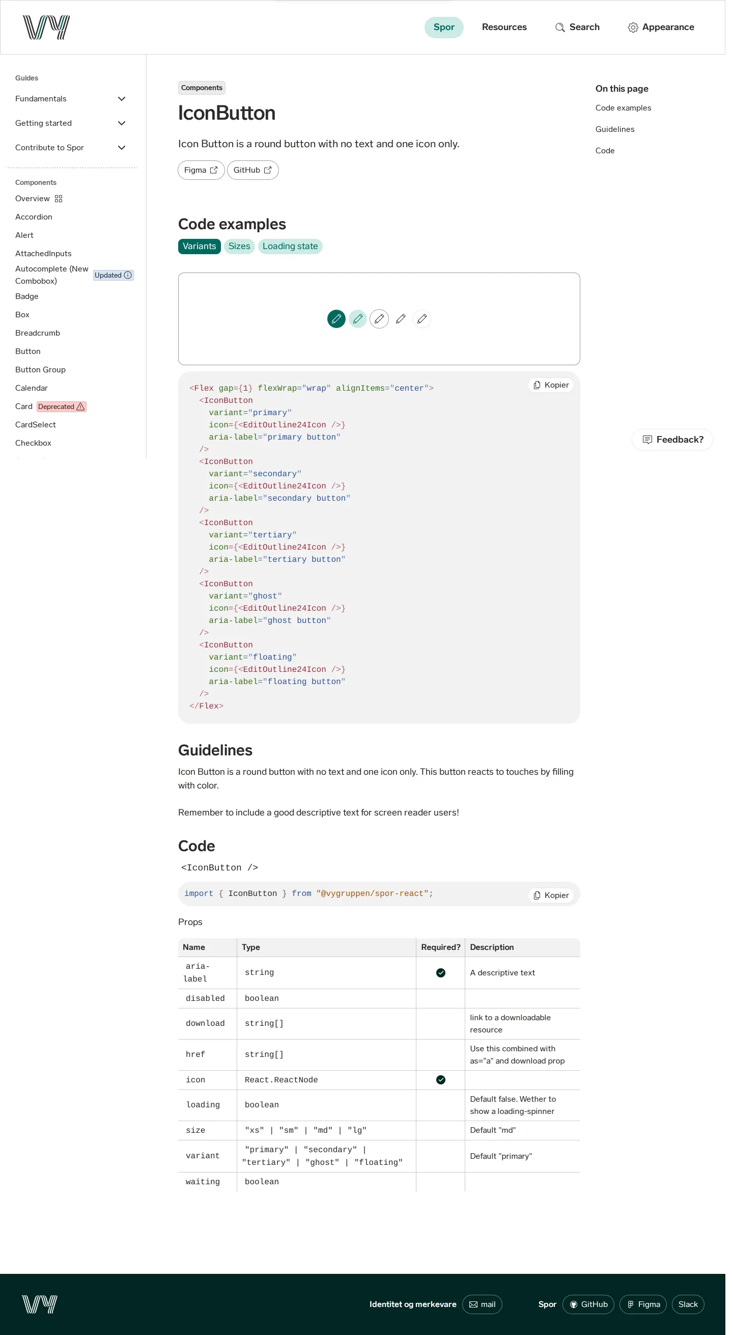
IconButton Captured 16 Sep 2026
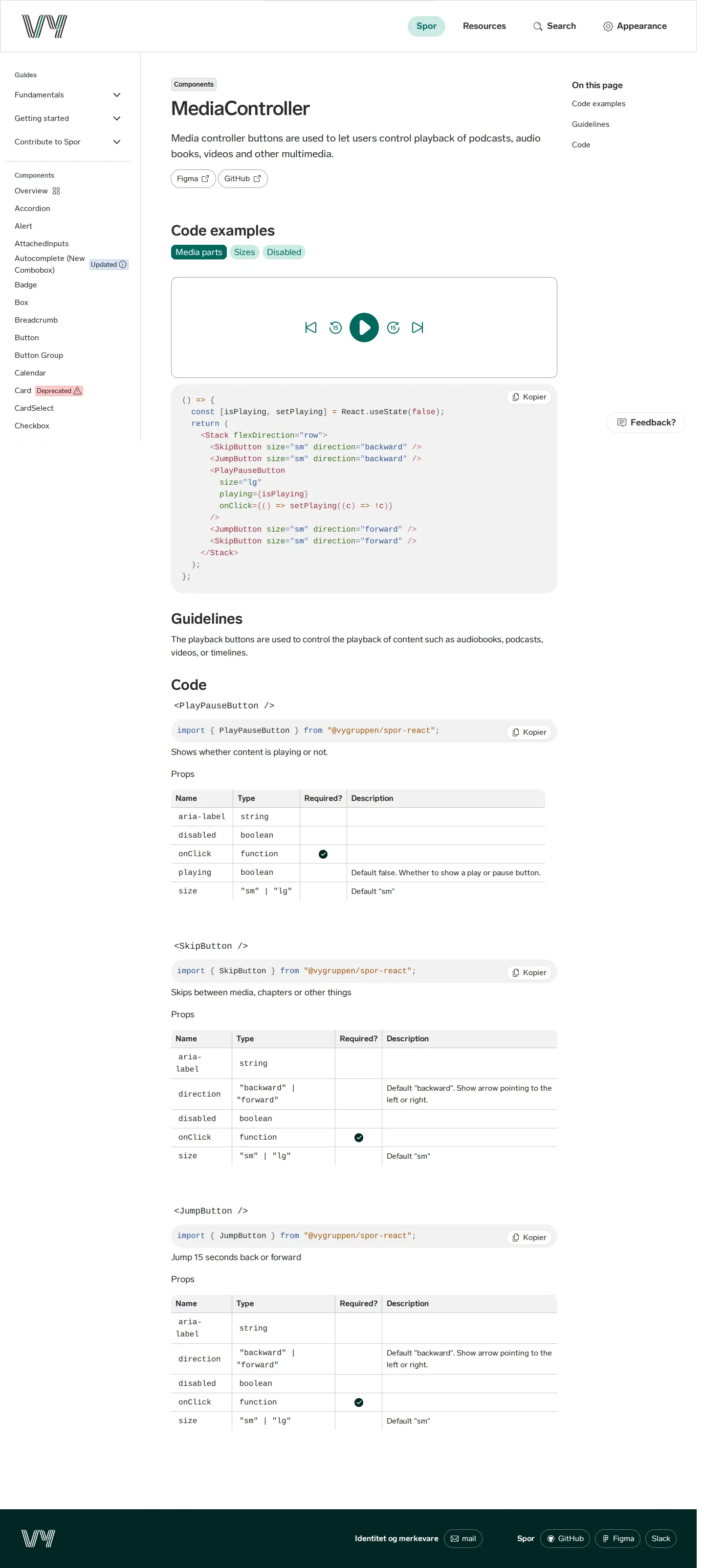
MediaController Captured 16 Sep 2026
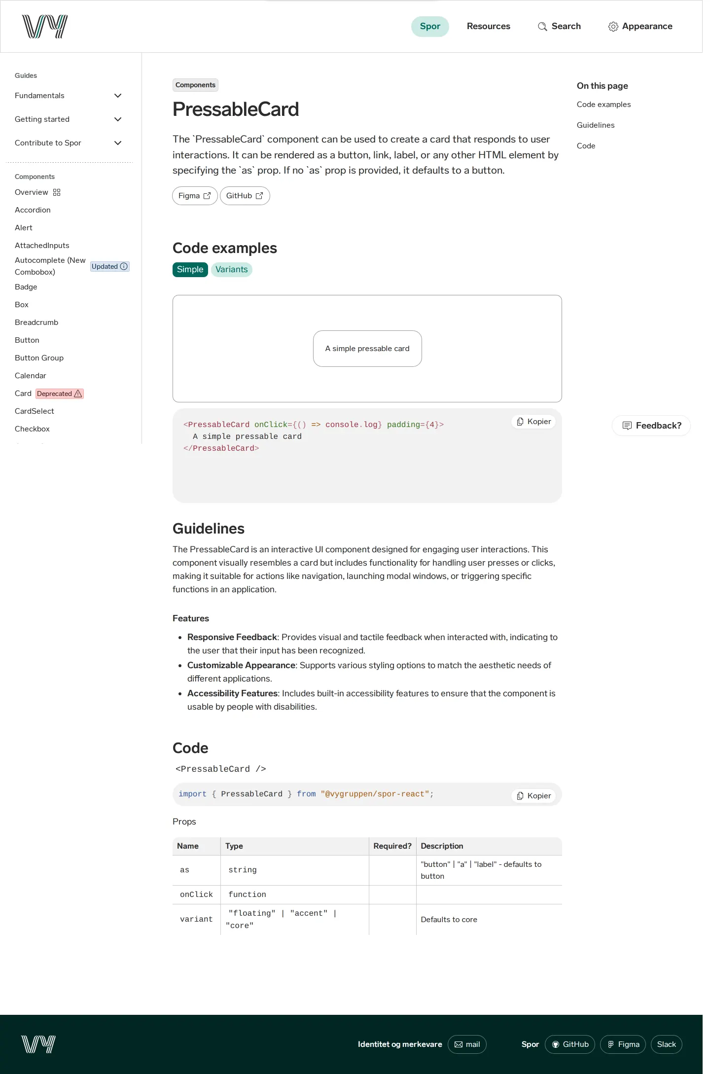
PressableCard Captured 16 Sep 2026
Vy Designmanual Captured 16 Sep 2026

What I noticed

  1. Spor documents Vy's design system with code examples, guidelines, and getting started materials across platforms.12
  2. The sidebar navigation explicitly flags component lifecycle statuses, including updated, new, and deprecated states.345
  3. Component pages are divided into distinct sections for guidelines, code examples, and code implementation details.67891011121314
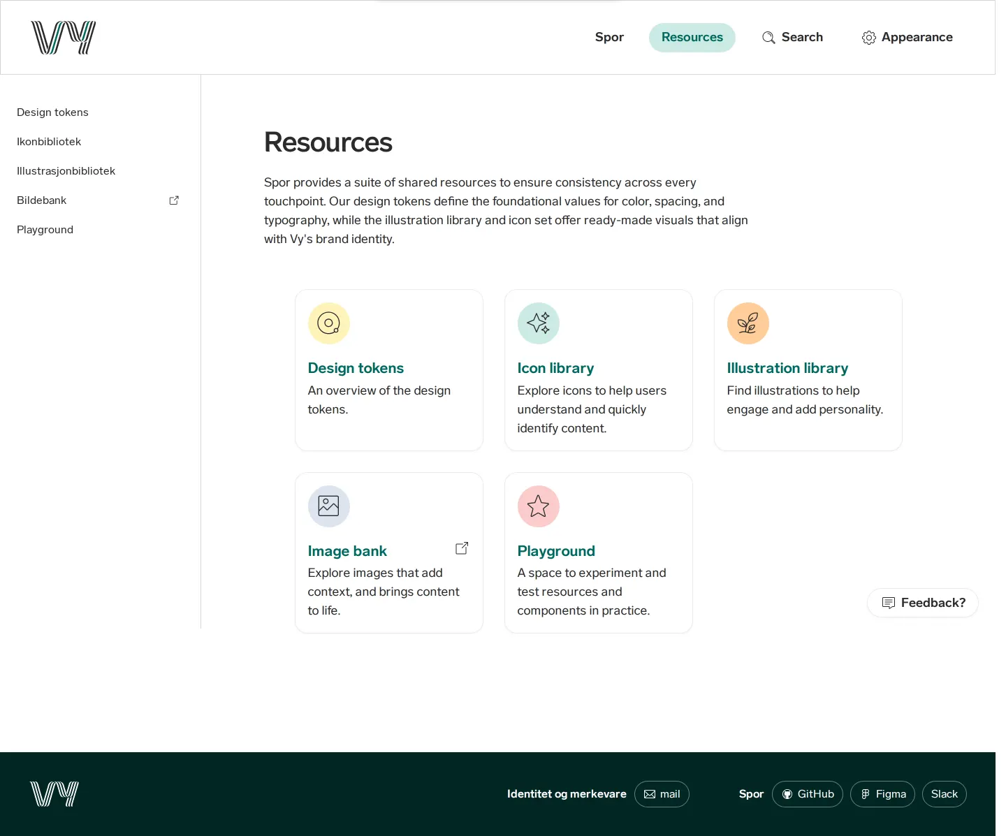
  4. The resources section provides access to design tokens, an icon library, an illustration library, an image bank, and a playground.1516171819

Numbers refer to the screenshots above.

What I could not see

  • Could not view full contents of the icon and illustration libraries or the image bank due to lack of captured page detail.
  • Could not observe direct file download options or search functionality.

Ideas to borrow

  1. Labeling component health directly in the primary navigation helps teams quickly spot breaking changes, replacements, or updates.345

Reviewed on 17 September 2026. Request a correction · I built this
Similar brand centers

All brand guidelines →