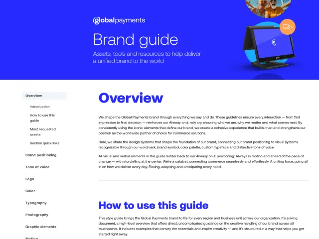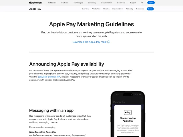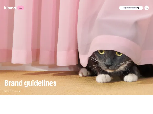
Venmo brand guidelines
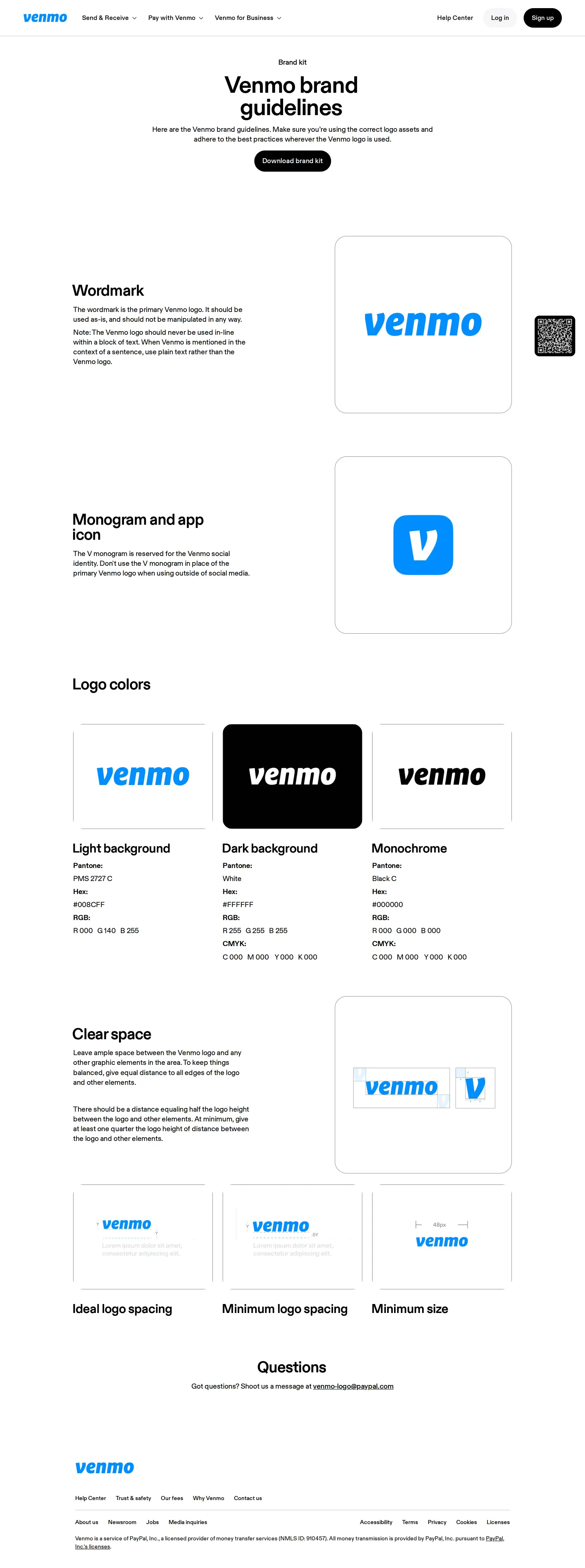
Venmo provides a single-page brand guide detailing basic logo rules, clear space, colors, and an asset download archive.
Want a brand center like Venmo’s?
Create your brand center with Freedam ↗Freedam's take
I added Venmo to the gallery because their brand page offers a straightforward snapshot of their visual identity essentials. The layout focuses primarily on the core marks, covering their wordmark, monogram, and app icon alongside logo colors and clear space requirements. Everything is packaged very simply on a single page, complete with a direct link to download the complete assets archive. I appreciate how quickly external partners or press can grasp the basic rules without digging through multi-page manuals, providing just enough guidance to keep representations consistent.
What I noticed
- The page includes dedicated sections for the wordmark, monogram, app icon, logo colors, and clear space.12345
- A downloadable zip file containing logos and guidelines is offered via a direct link.6
- The brand kit is designed to quickly serve press and external partners seeking core assets.
Numbers refer to the screenshots above.
What I could not see
- Could not view interactive asset browsing, search capabilities, templates, or expanded typography specifications.
Ideas to borrow
- Pair basic visual rules directly with an immediate asset download link to minimize friction for partners.
Reviewed on 10 November 2026. Request a correction · I built this