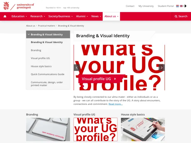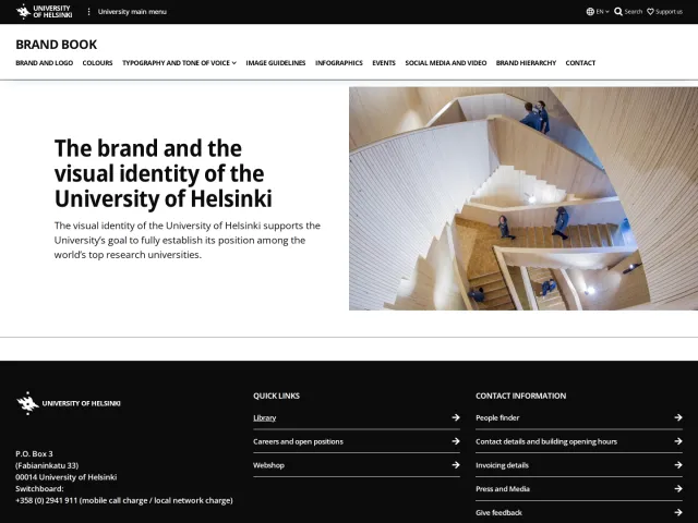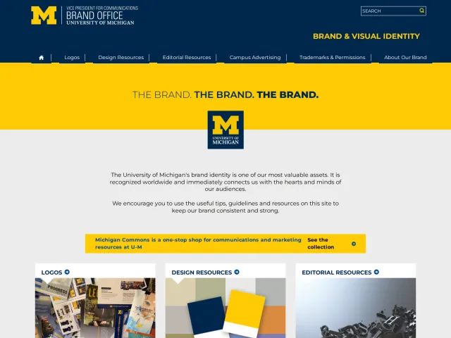
University of North Carolina at Chapel Hill brand guidelines
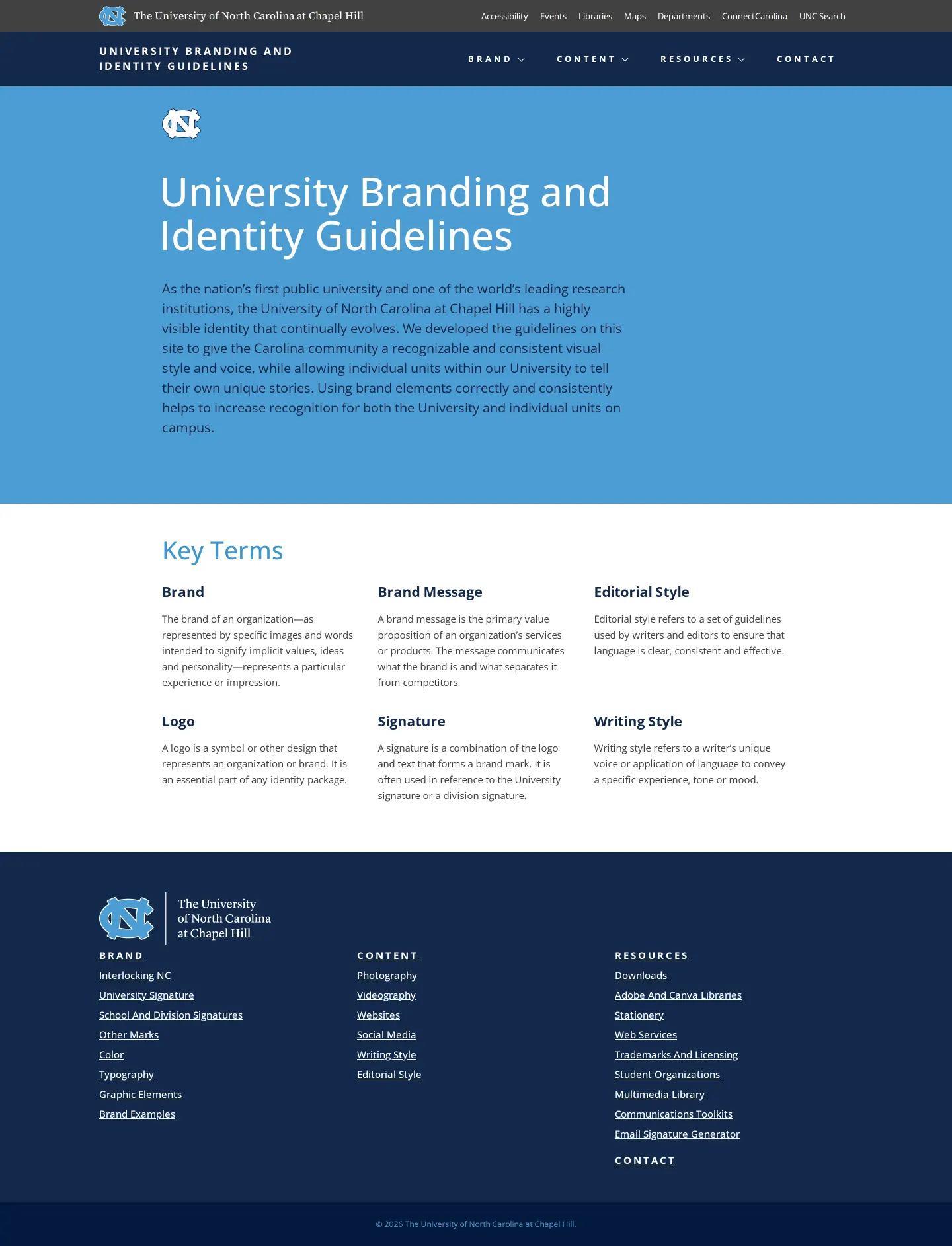
University of North Carolina at Chapel Hill presents structured identity guidelines covering university signatures, color palettes, typography, and resources.
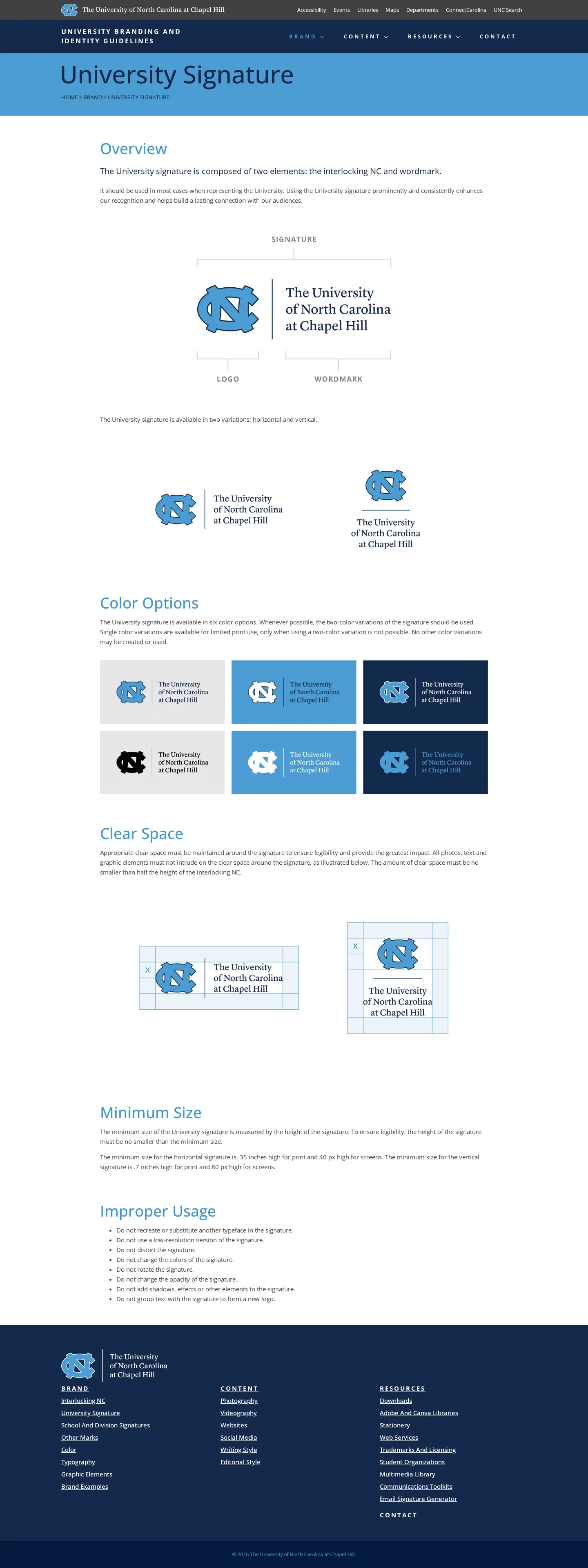
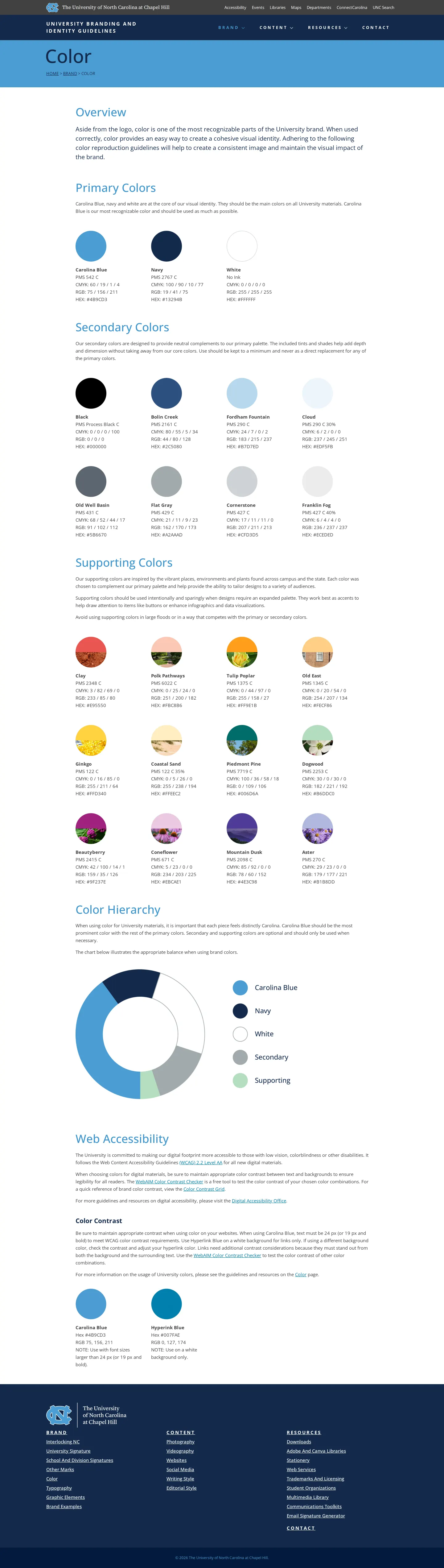
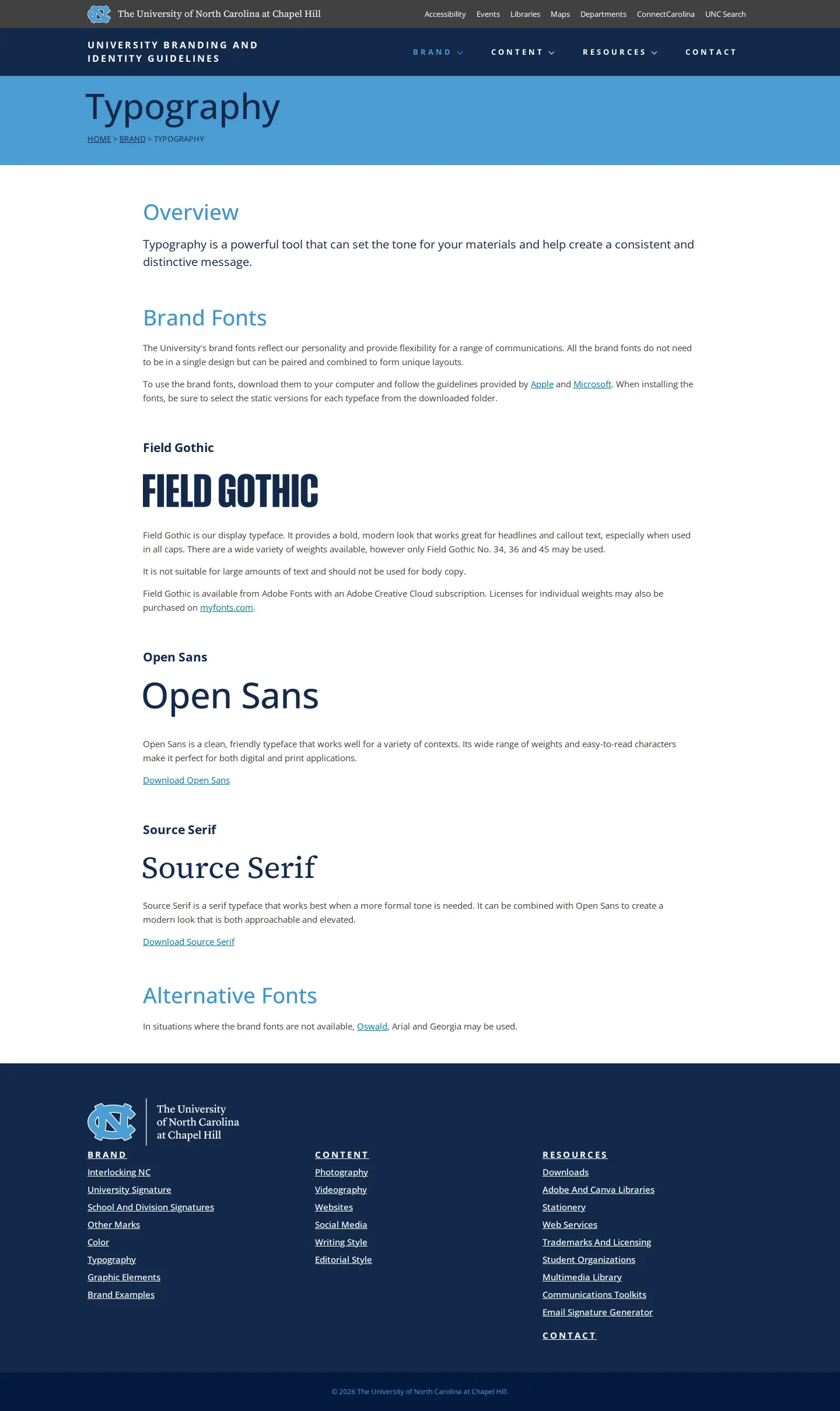
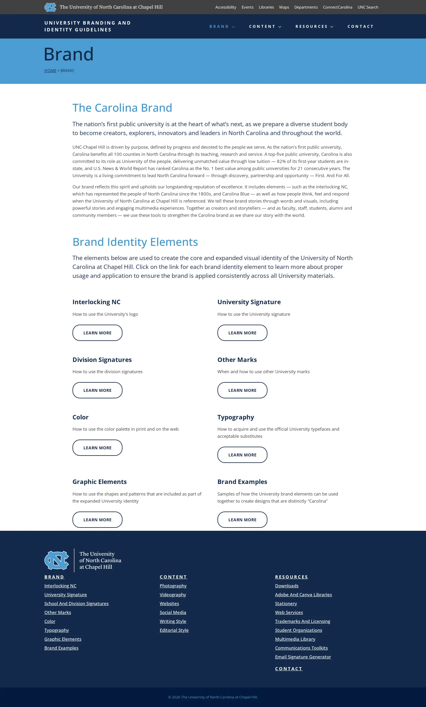
Freedam's take — I like how cleanly the University of North Carolina at Chapel Hill presents its identity foundations. The navigation keeps things simple by grouping essentials under Brand, Content, and Resources. Walking through the pages, you get clear parameters for their core marks, complete with clear space rules and examples of improper usage. Their color section covers practical hierarchy alongside web accessibility and contrast, which is always reassuring to see. For typography, they detail primary choices like Field Gothic and Open Sans, providing direct links out to accessible web font specimens for immediate use.
Details
- Type
- Guidelines
- Access
- Public
- Source
- identity.unc.edu
- Industry
- Education
- Capabilities
- Guidelines, Downloads
- Tags
- logo usage, do's and don'ts, color system, accessibility, typography, font downloads
- Added
- Last checked
What I noticed
- The site provides dedicated guidance on the University Signature, including color options, clear space, minimum size, and improper usage rules.12345
- The color guidelines address primary, secondary, and supporting colors along with web accessibility and color contrast.678910
- The typography documentation lists Field Gothic, Open Sans, and Source Serif, offering direct download links to Google Fonts for Open Sans and Source Serif 4.111213141516
Numbers refer to the screenshots above.
What I could not see
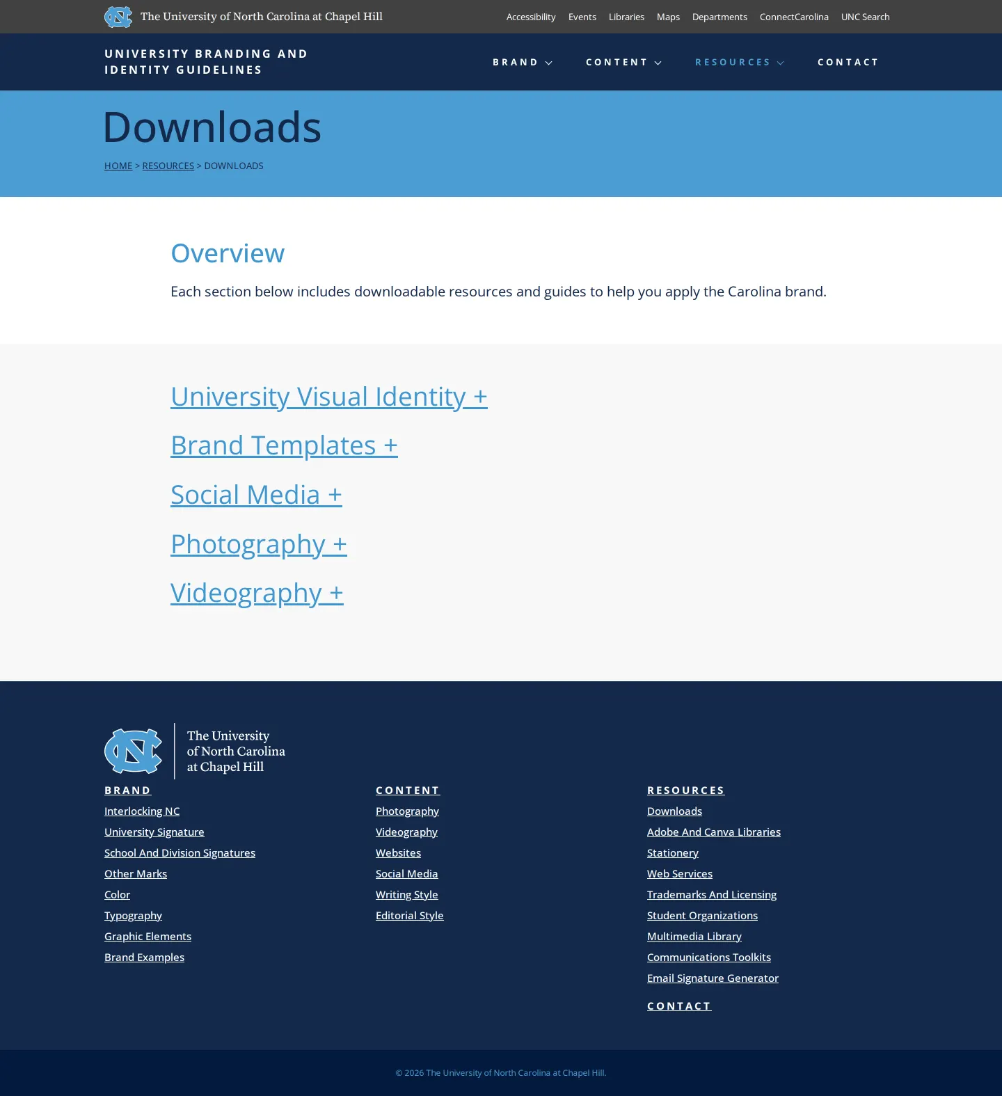
- Content inside the Downloads hub could not be inspected beyond its top-level heading.
- Internal search functionality and asset filtering tools were not observed.
Ideas to borrow
- Incorporate accessibility and color contrast rules directly within the primary color system documentation rather than keeping them isolated in technical specifications.
Reviewed on 17 September 2026. Request a correction · I built this
Similar brand centers
All brand guidelines →