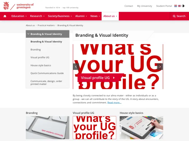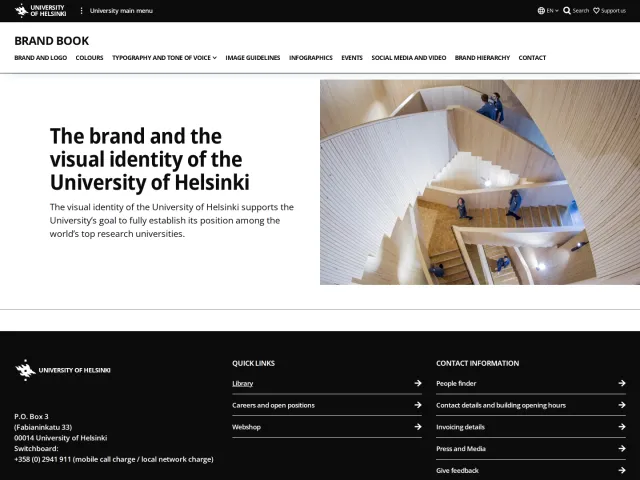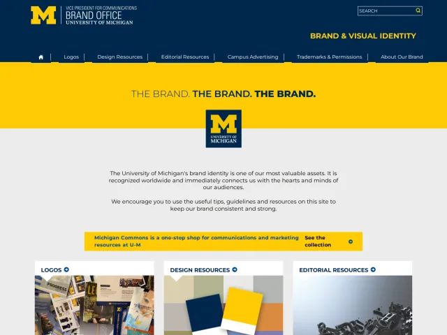
University of Minnesota brand guidelines
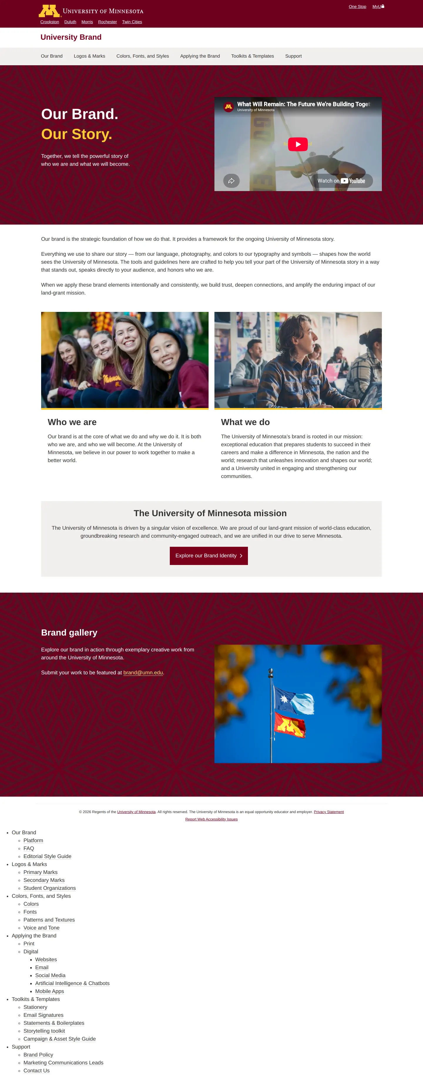
The University of Minnesota brand site offers institutional guidelines covering brand narrative, digital touchpoints, AI chatbots, and a structured color palette.
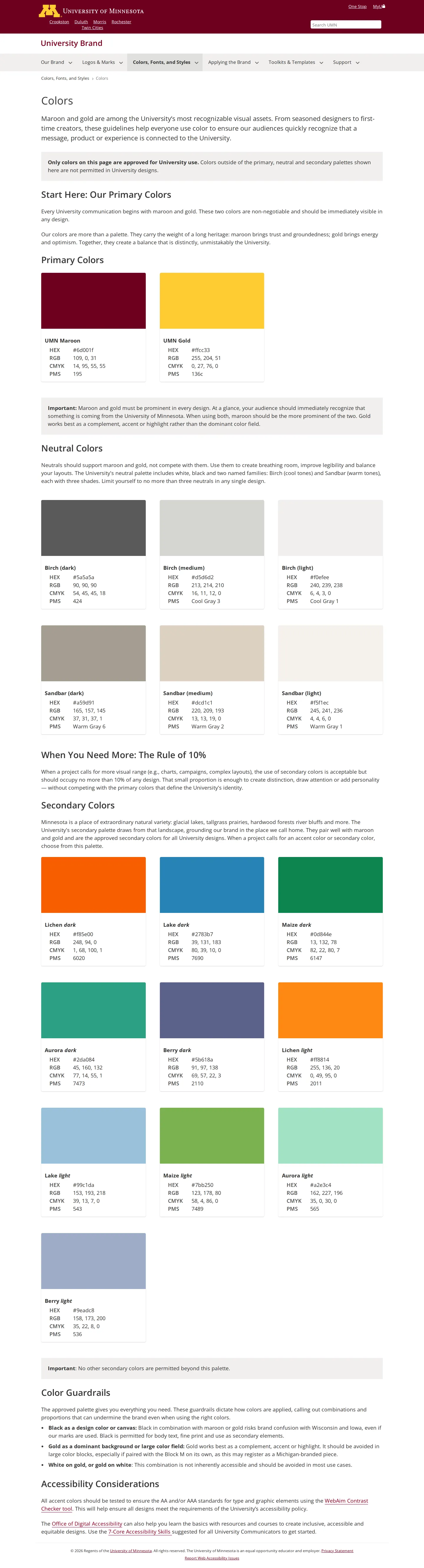
Freedam's take — I really appreciate how thorough the University of Minnesota brand portal is across its campus network. Looking through the structure, the navigation immediately maps out practical channels from email signatures to mobile apps, and even emerging areas like artificial intelligence and chatbots. On the colors page, I noticed they structure their palette carefully, setting up primary tones like UMN Maroon and UMN Gold alongside neutrals and secondary shades governed by a specific Rule of 10% guideline. It feels like a grounded, working system designed for a sprawling institution.
Details
- Type
- Guidelines
- Access
- Public
- Source
- brand.umn.edu
- Industry
- Education
- Capabilities
- Guidelines, Asset browsing, Search, Campaigns
- Tags
- color system, brand architecture
- Added
- Last checked
What I noticed
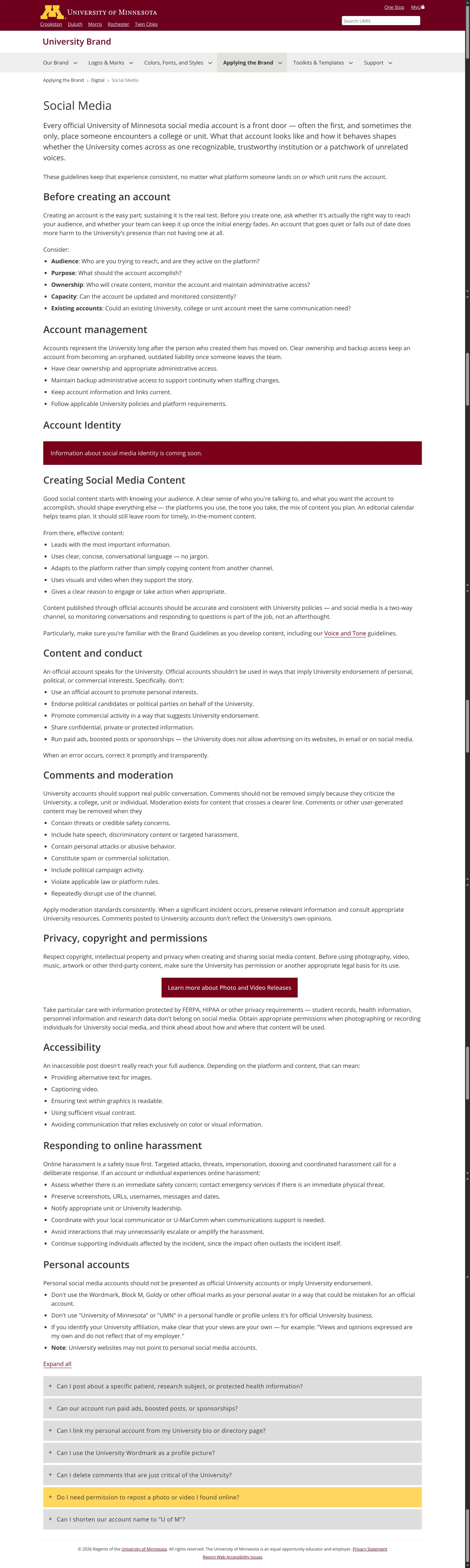
- The site navigation covers emerging touchpoints including Artificial Intelligence & Chatbots alongside traditional print and digital media.123
- The color system defines primary colors UMN Maroon and UMN Gold, accompanied by neutrals and a secondary palette guided by The Rule of 10%.45678
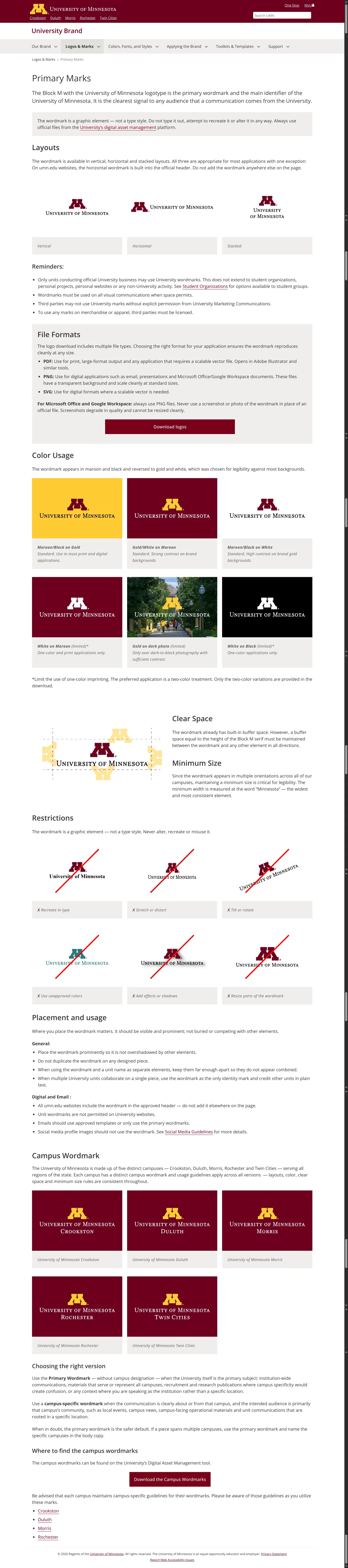
- The brand portal links out to multiple individual campus entities across the University system, including Crookston, Duluth, Morris, Rochester, and Twin Cities.910111213
Numbers refer to the screenshots above.
What I could not see
- Asset download files or gated asset portals could not be directly verified from the provided pages.
- Guidelines under the Artificial Intelligence & Chatbots section were not fully captured in the evidence.
Ideas to borrow
Reviewed on 17 September 2026. Request a correction · I built this
Similar brand centers
All brand guidelines →