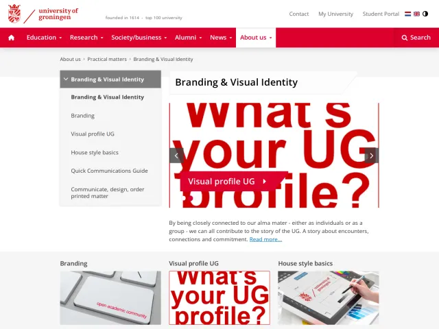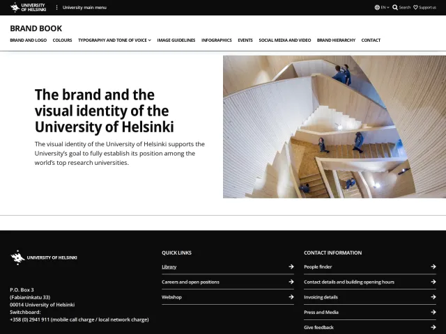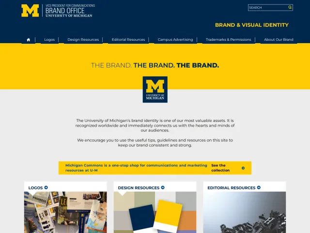
University of Kansas brand guidelines
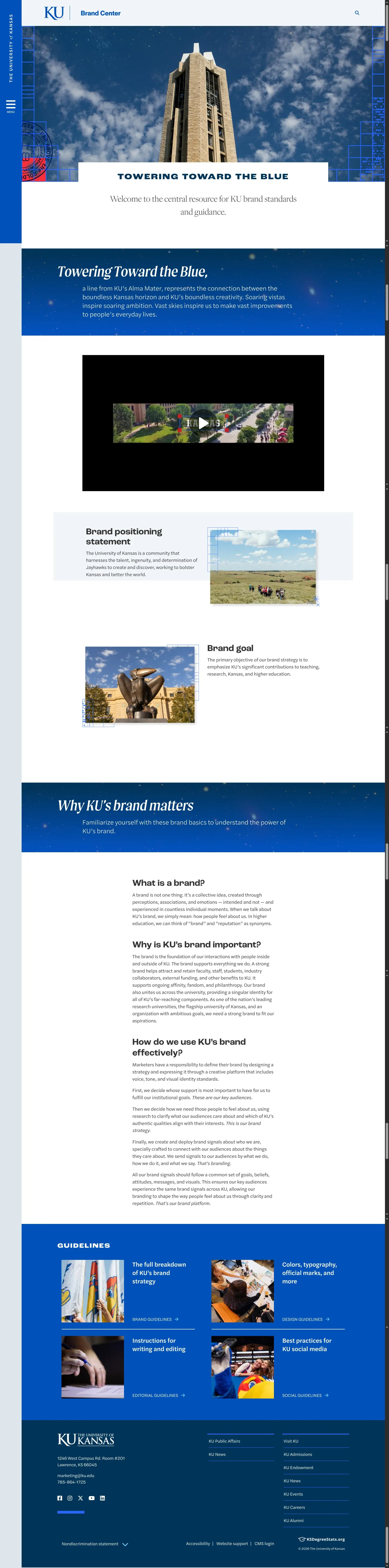
The University of Kansas Brand Center provides comprehensive brand guidelines, editorial standards, design elements, downloads, and stationery ordering resources.
Freedam's take — I like how the University of Kansas Brand Center frames its entire narrative around Towering Toward the Blue. The writing guide stands out immediately by breaking down voice versus tone alongside concrete lists of words to embrace and avoid. On the visual side, they detail specific building blocks like visible grids, stars, crimson squares with radial fades, and even sunflowers. Pair that with operational tools for trademark licensing and stationery orders, and you get a comprehensive brand home that clearly guides campus partners and external designers alike.
Details
- Type
- Guidelines
- Access
- Public
- Source
- brand.ku.edu
- Industry
- Education
- Capabilities
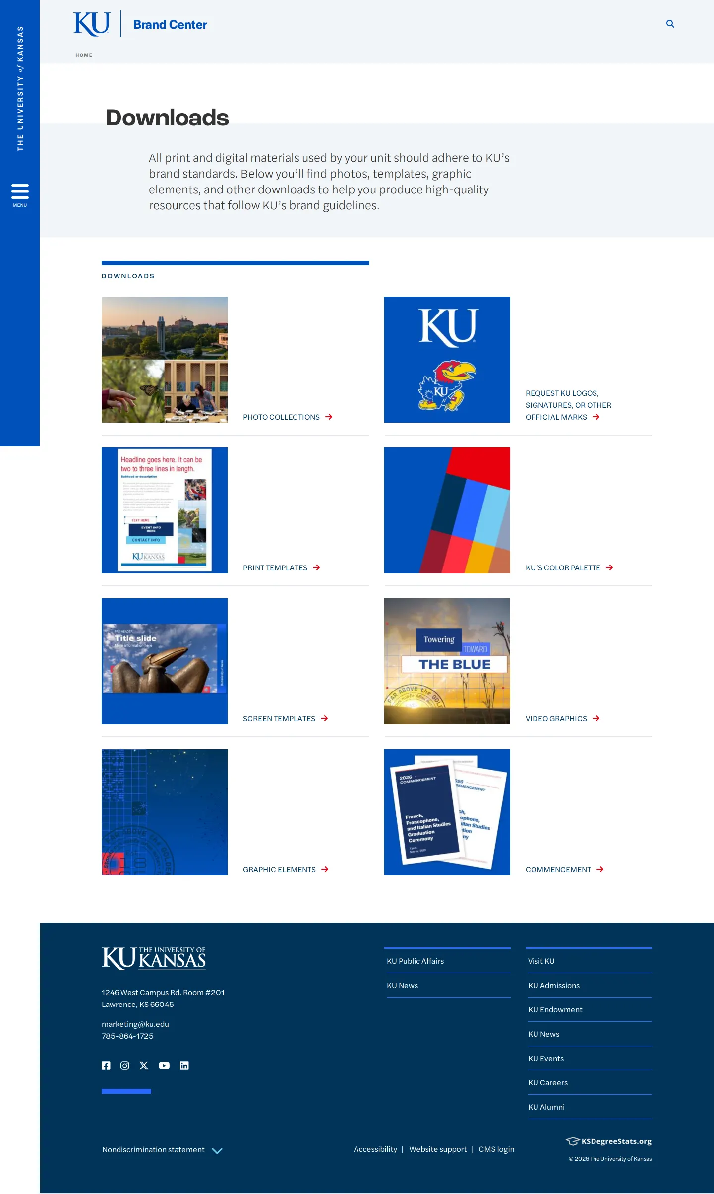
- Guidelines, Asset browsing, Search, Downloads
- Tags
- editorial guidelines, tone of voice, print & stationery, legal & trademark, comprehensive
- Added
- Last checked

What I noticed
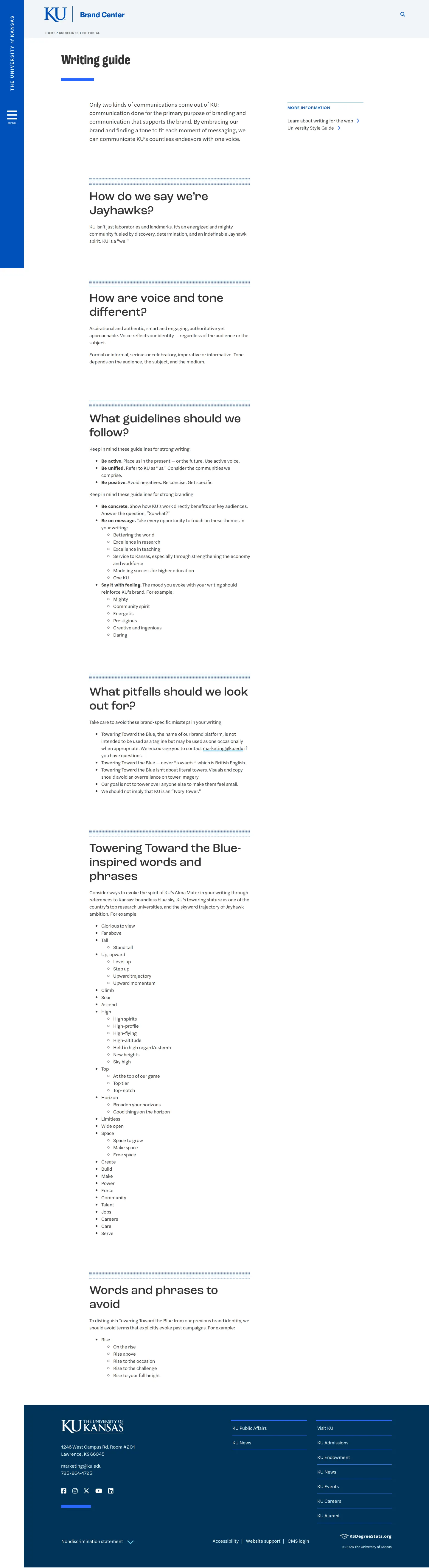
- The brand center includes an editorial writing guide featuring specific words to embrace and phrases to avoid.12
- Visual guidelines outline specific brand graphic components such as visible grids, spark stars, holding boxes, and sunflowers.3456
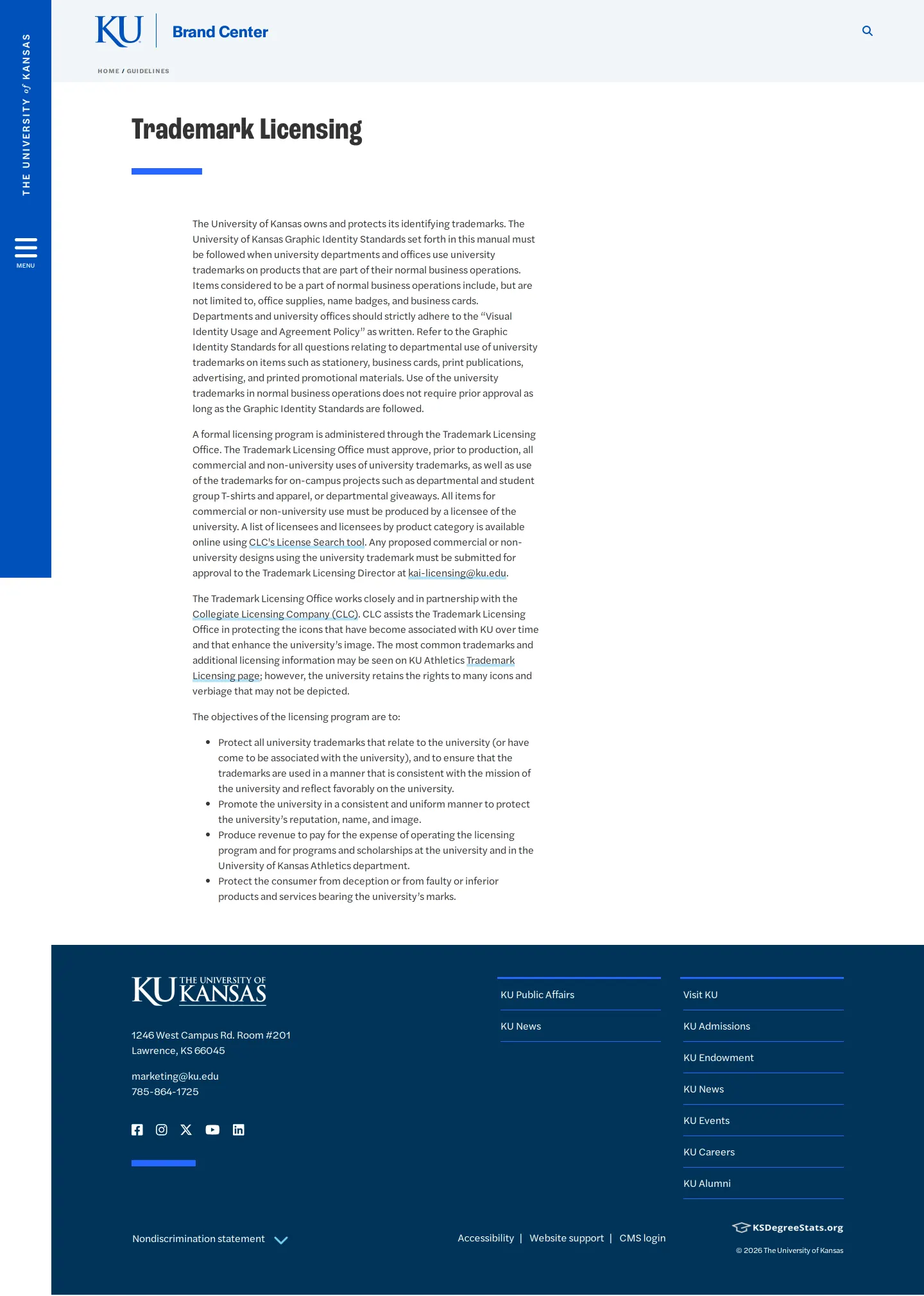
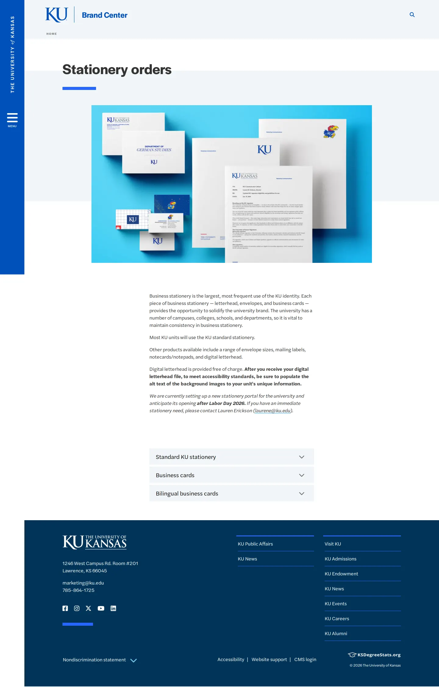
- The site provides workflows for university stationery ordering and trademark licensing.789
Numbers refer to the screenshots above.
What I could not see
- Could not view the full contents of internal asset downloads or restricted CMS documentation.
Ideas to borrow
- Supplying an explicit list of brand-inspired phrases alongside terms to avoid gives writers immediate clarity without ambiguity.
Reviewed on 17 September 2026. Request a correction · I built this
Similar brand centers
All brand guidelines →