University of California brand guidelines
The University of California brand guidelines site presents the institution's strategic foundation through core themes of purpose, positioning, and attributes.
Freedam's take — I spent some time looking through the University of California brand guidelines site, and I appreciate how they frame their core narrative. The home page introduces the theme Boldly Californian right away, establishing a confident tone for the public university system. Moving into the about section, the pages focus squarely on purpose, positioning, and attributes rather than rushing straight into visual assets. It reminds me how valuable it is to anchor a complex institution in shared intent first, giving people clear conceptual footing before asking them to apply design rules across different campuses and departments.
Details
- Type
- Guidelines
- Access
- Public
- Industry
- Education
- Capabilities
- Asset browsing
- Tags
- brand story, minimal, editorial
- Added
- Last checked


What I noticed
- The main landing page features the heading Boldly Californian.1
- The purpose page includes subheadings such as Not just a university and The brand is made visible through every word, image and gesture.23
- Navigation options within the about section include Purpose, Position, and Attributes.456
Numbers refer to the screenshots above.
What I could not see
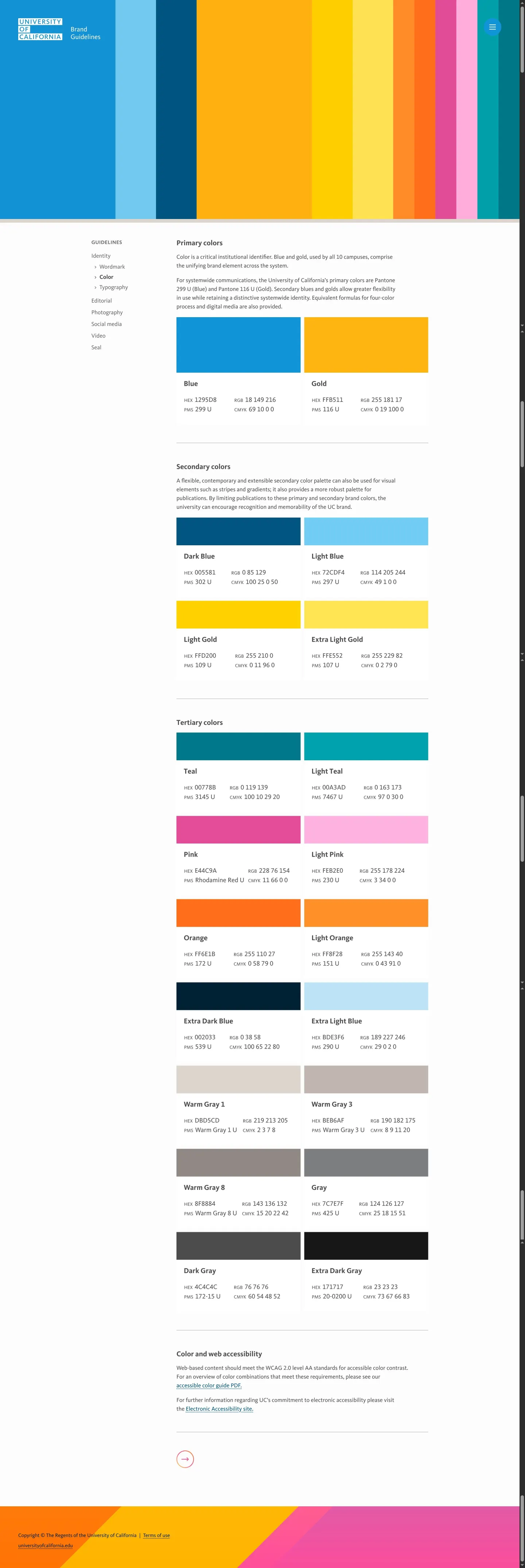
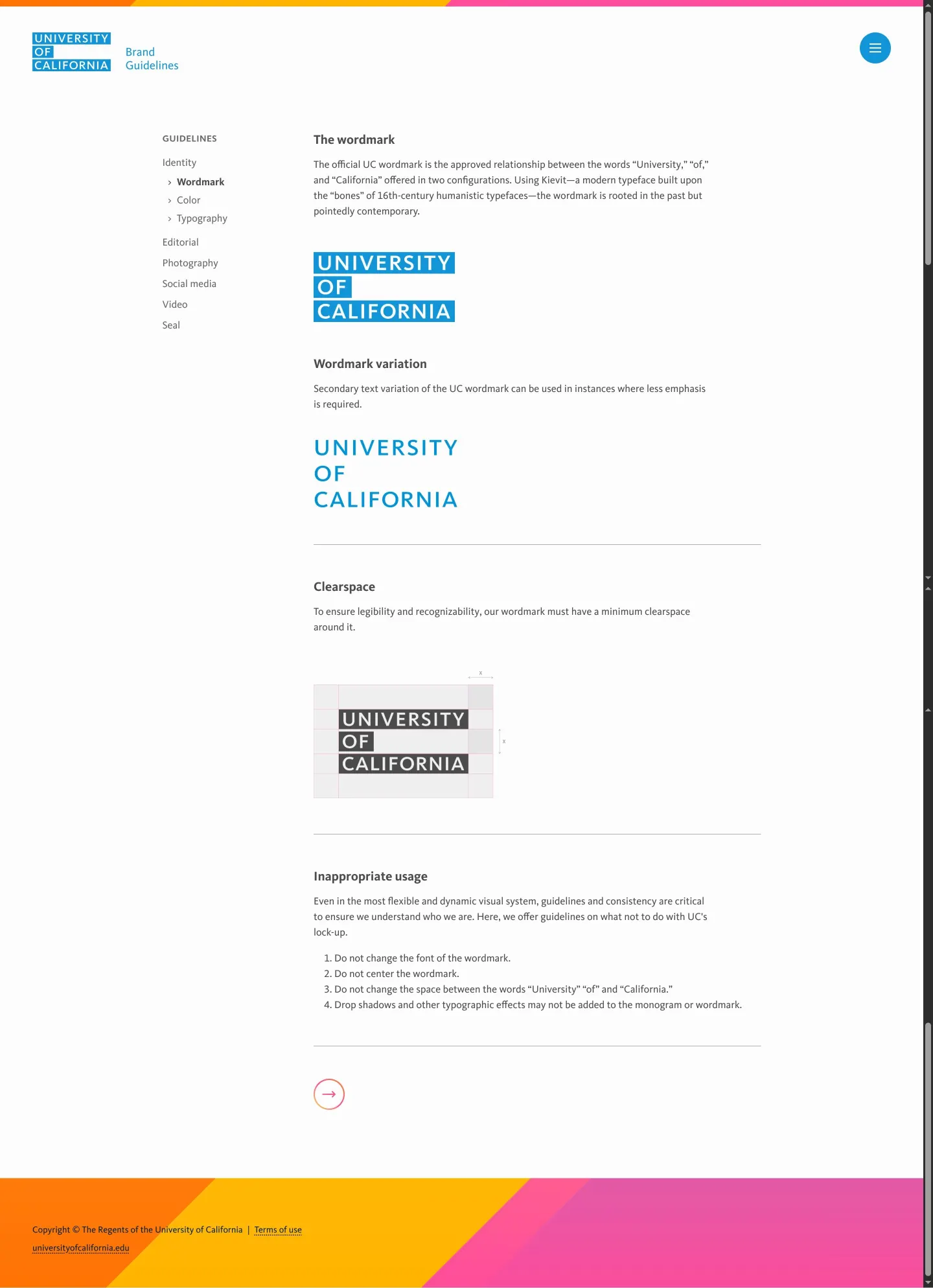
- Could not view visual identity specifications such as logo files, color palettes, or typography rules.
- Could not confirm search functionality, downloadable assets, or template availability from the captured pages.
Ideas to borrow
- Structuring the initial sections of a brand manual around strategic principles like purpose and attributes helps establish intent before introducing visual guidelines.
Reviewed on 18 September 2026. Request a correction · I built this