tonies brand guidelines
The tonies brand and digital style guide outlines brand positioning, accessibility, motion guidelines, and visual assets built on Frontify.
Freedam's take — I spent some time looking through the tonies brand and digital style guide on Frontify. The navigation is divided into brand narrative, core guidelines, and a dedicated UI kit. I appreciate seeing accessibility given top billing right inside the brand style guide section, alongside standard visual fundamentals like typography, color, and logo rules. They also dedicate space to animation styles, from doodle motion to 2D character movements, which fits their physical audio product ecosystem nicely. It feels like a practical tool made to help creators keep the playful Tonie world consistent across platforms.
Details
- Type
- Guidelines
- Access
- Public
- Source
- tonies.frontify.com
- Industry
- Media & entertainment, Consumer goods
- Capabilities
- Guidelines, Asset browsing
- Tags
- accessibility, motion design, ui components, typography, color system, logo usage, playful, frontify
- Added
- Last checked
What I noticed
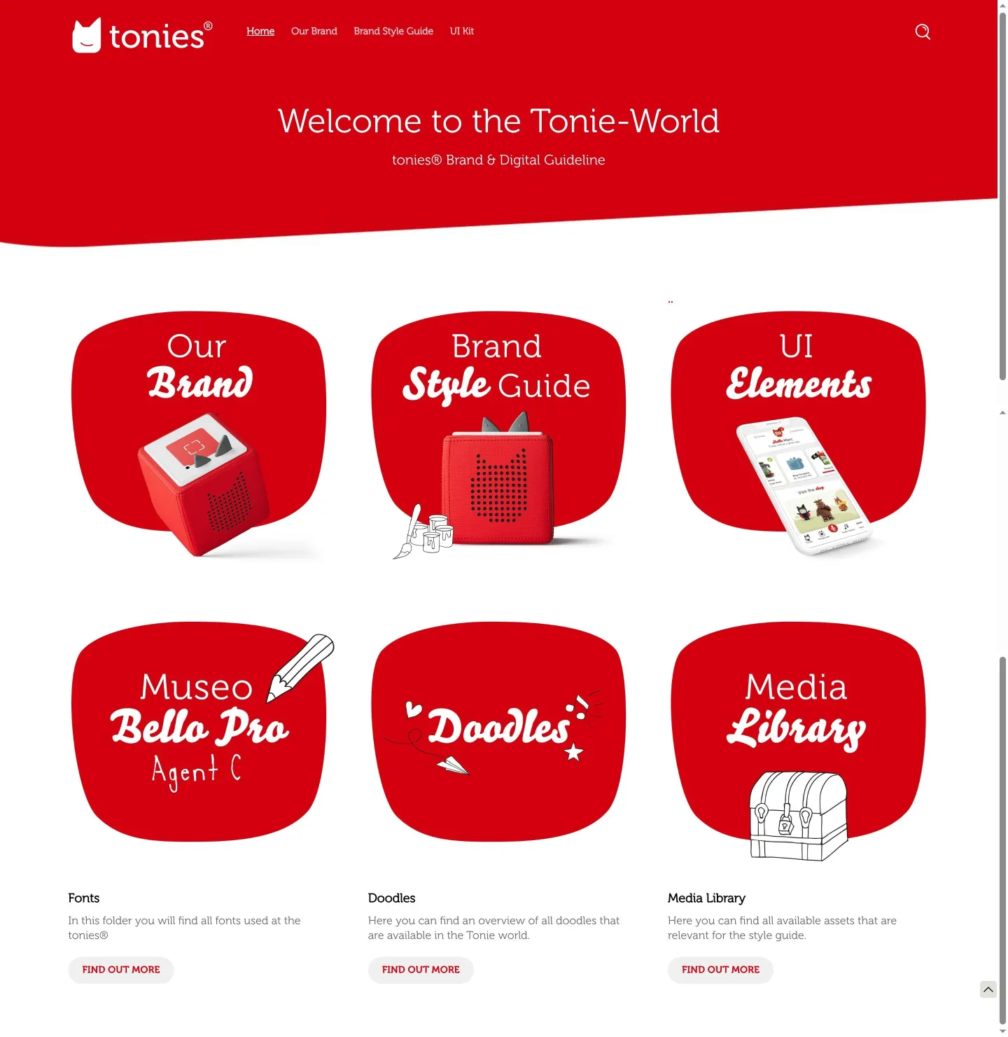
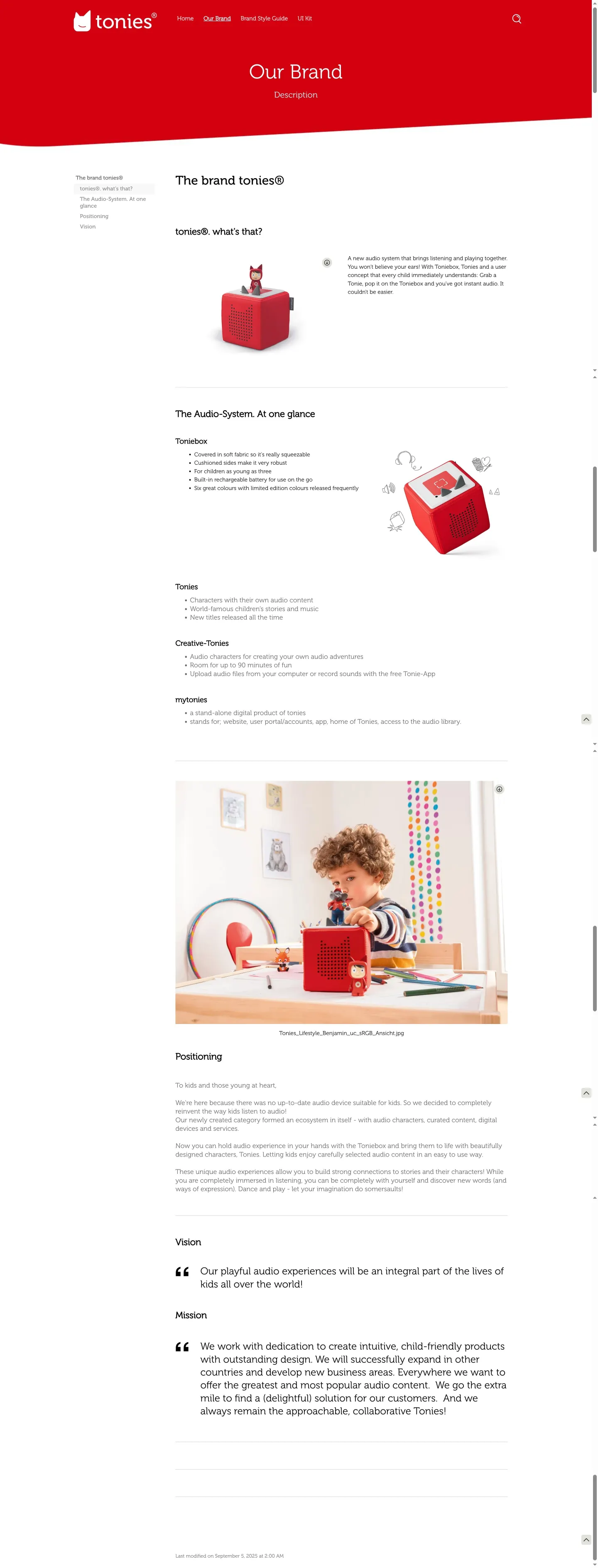
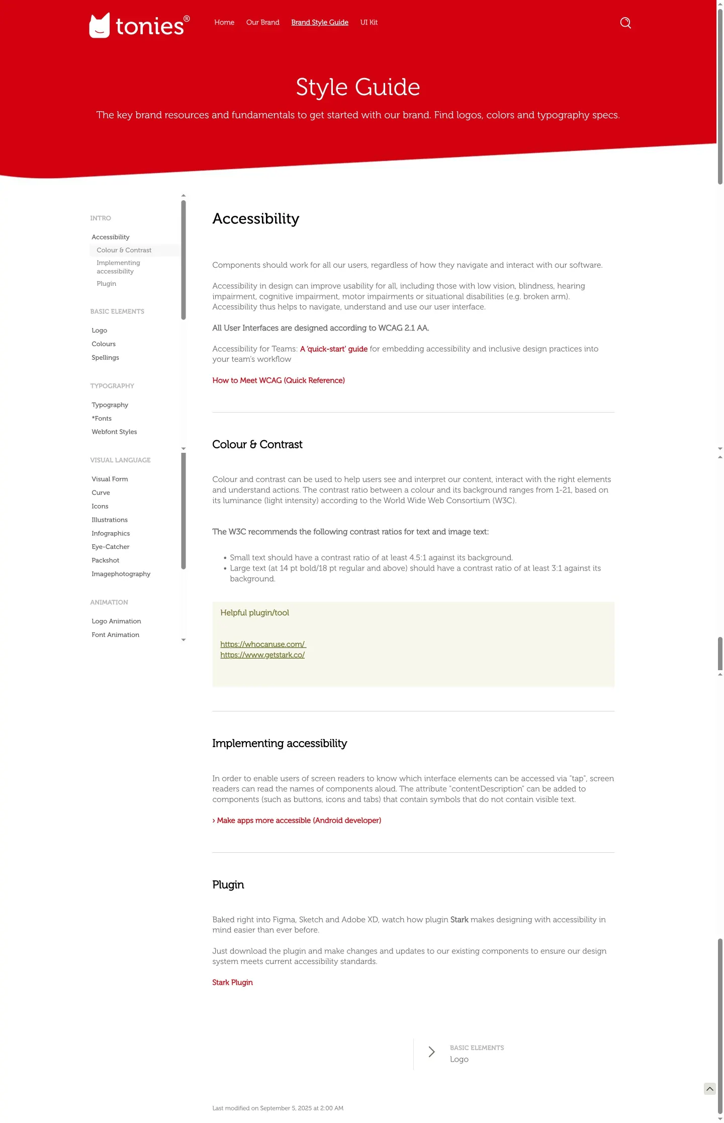
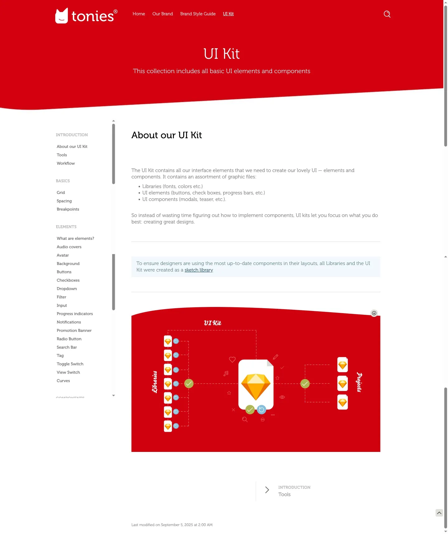
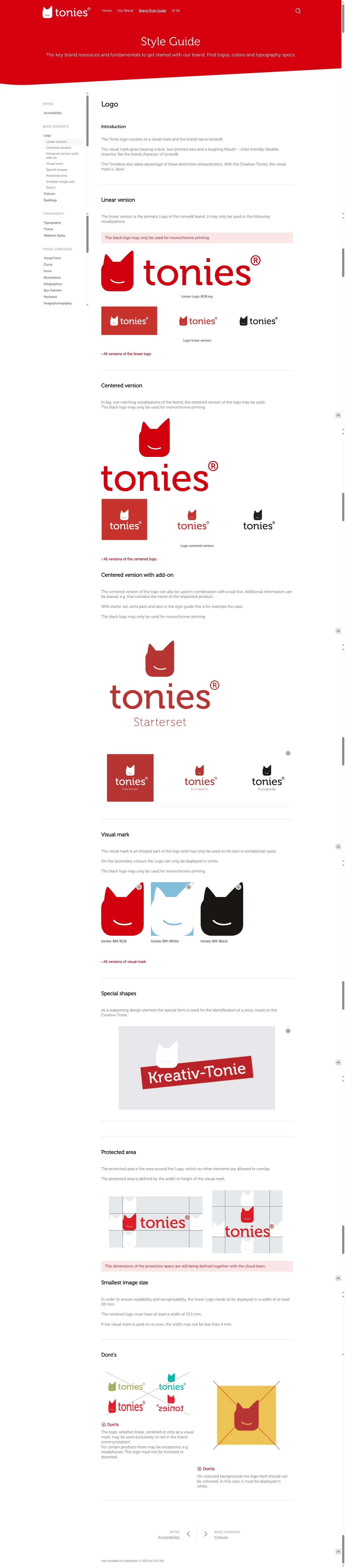
- The guide organizes primary navigation into Home, Our Brand, Brand Style Guide, and UI Kit.1234
- The site is hosted on Frontify.567
- Accessibility is featured within the brand style guide, covering colour contrast, implementation, and plugins.891011
- The brand style guide includes specific sections for motion like Logo Animation, Font Animation, and Doodle Animation.121314
Numbers refer to the screenshots above.
What I could not see
- Could not view the contents of the UI Kit page.
- Could not verify file download workflows or formats from the Media Library.
- Could not inspect the full depth of brand photography or illustration asset libraries.
Ideas to borrow
- Elevate digital accessibility to sit directly alongside core visual standards like logos and colors in the main navigation.
Reviewed on 18 September 2026. Request a correction · I built this