TomTom brand guidelines
TomTom's brand guide outlines core identity elements, co-branding rules, color ratios, and typographic standards for external and partner use.
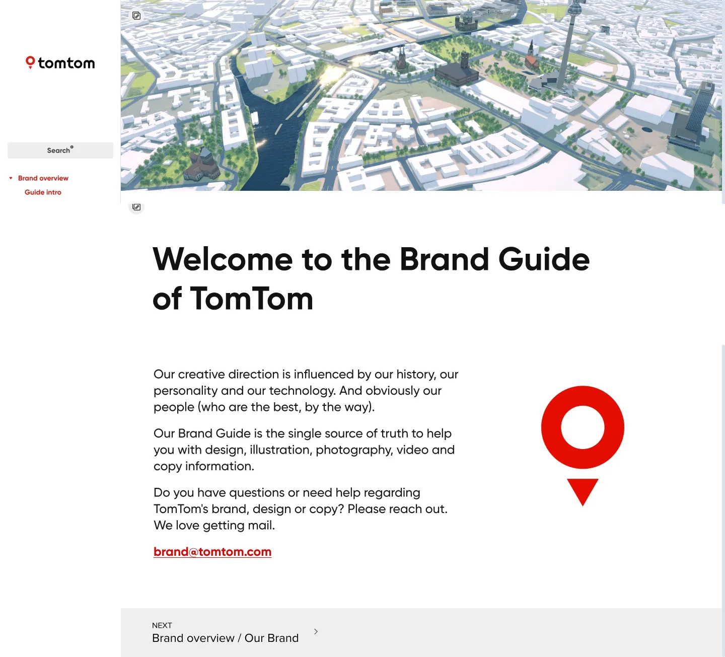
Home page of TomTom's brand guide portal featuring a 3D aerial map header and sidebar navigation.

Logo guidelines page showing primary lockups, clearspace rules, misuse examples, and partner lockup rules.
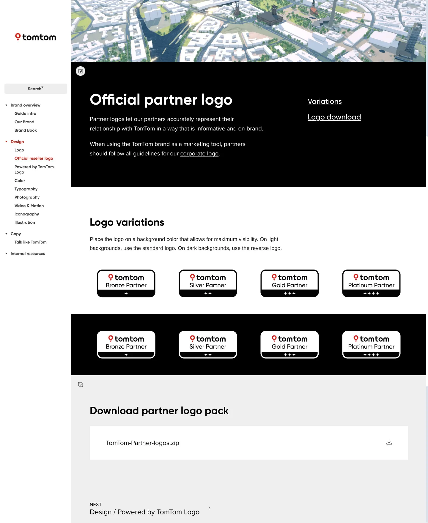
Official reseller logo guidelines detailing light and dark background variations and download links.
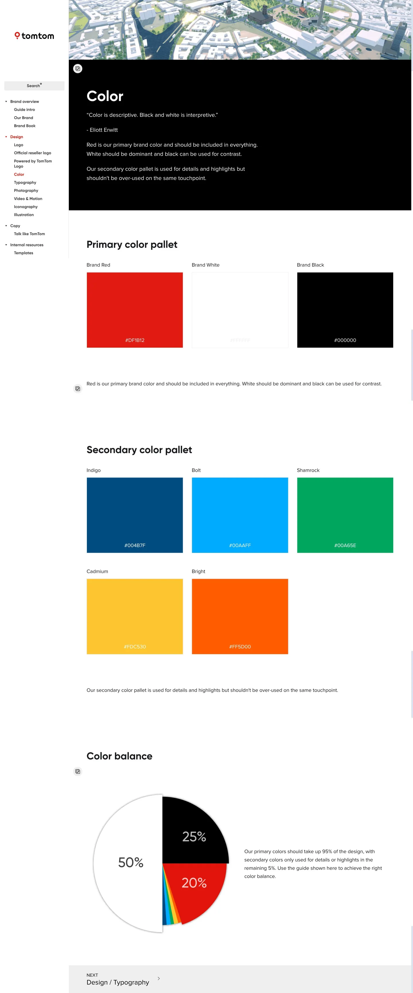
Color guidelines page specifying primary and secondary hex values alongside a color balance ratio pie chart.
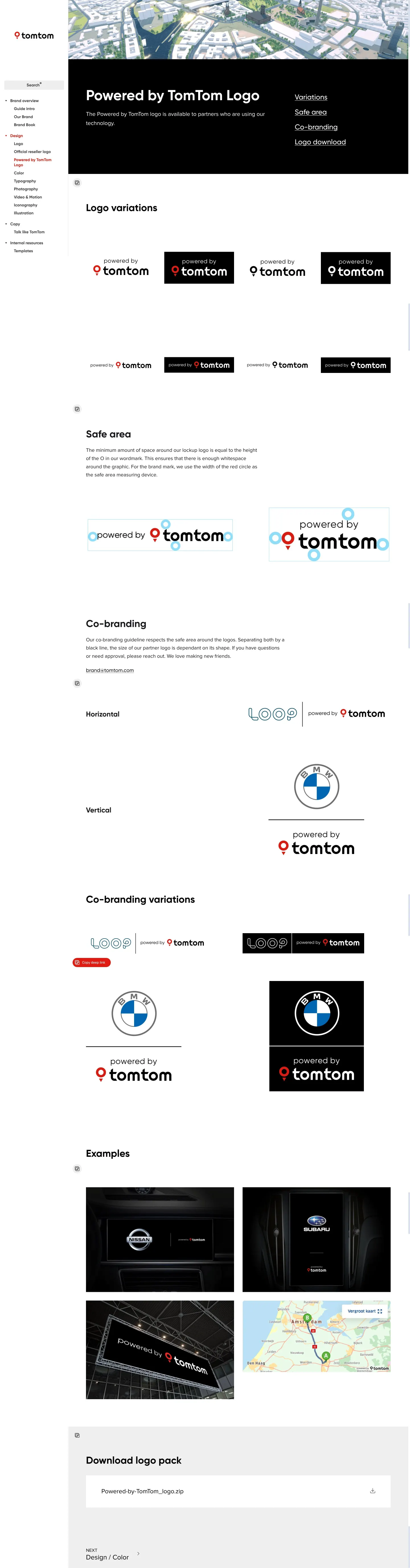
Powered by TomTom logo page displaying lockup rules, real-world digital mockups, and asset download buttons.
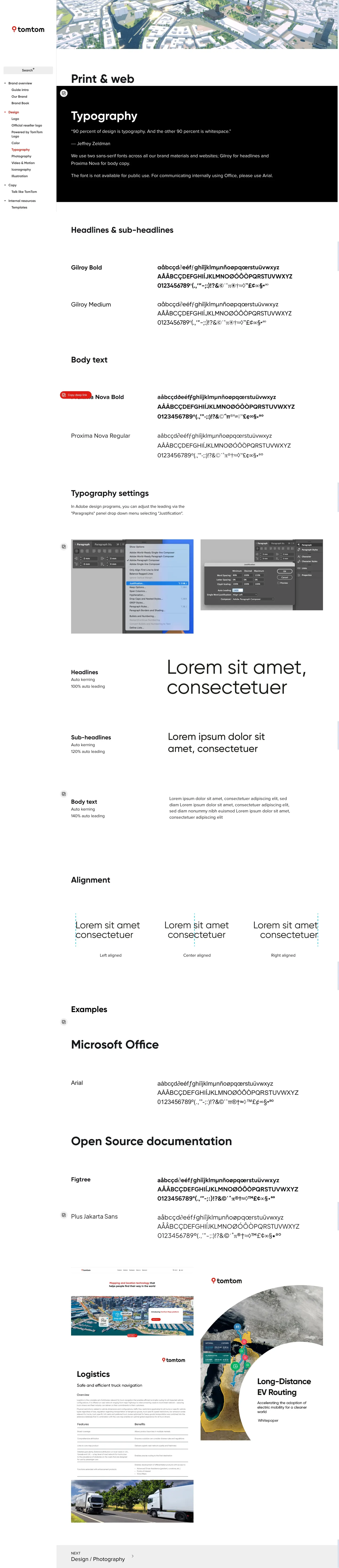
Typography page detailing Gilroy and Proxima Nova specimen sets, kerning instructions, and open-source fallbacks.
Want a brand center like TomTom’s?
Create your brand center with Freedam ↗Freedam's take
I really appreciate how straightforward TomTom keeps its brand system. Built on Corebook, the portal presents clear rules for primary marks alongside specific partner variations like their Powered by TomTom lockup. I like seeing tangible guidance around co-branding relationships with companies like BMW and Uber, complete with clearspace and divider rules. The color page also communicates balance effectively with a simple pie chart showing exact palette proportions, pairing Brand Red, Black, and White with functional secondary accents. It feels very clean and direct for working designers.
At a glance
- Sections
- Brand overview · Design · Copy · Internal resources
- Downloads
- ZIP
- Tone
- Direct, structured, and practical documentation focused on clear application rules.
What I noticed
- The guide organizes primary navigation into Brand overview, Design, Copy, and Internal resources.12
- The color guidelines define a balance breakdown using a pie chart showing 50% white, 25% black, 20% red, and 5% secondary colors.3
- Typography specifications designate Gilroy for headlines, Proxima Nova for body text, Arial as an internal fallback, and Figtree and Plus Jakarta Sans for open-source documentation.456
- Dedicated co-branding and partner pages provide guidelines and download packages for standard logos, reseller marks, and 'Powered by TomTom' lockups.7891011
Numbers refer to the screenshots above.
What I could not see
- Could not inspect the full content under the Copy or Internal resources categories.
- Could not view illustration or photography guidelines mentioned on the home page.
Ideas to borrow
- Illustrating color usage via a proportional percentage chart clarifies dominant and accent palettes better than unranked swatches.3
Quick answers
Where can I download the TomTom logo files?
The logo guidelines page offers a direct download for a 'TomTom_logo.zip' archive within the Download logo pack section.712
Reviewed on 25 September 2026. Request a correction · I built this