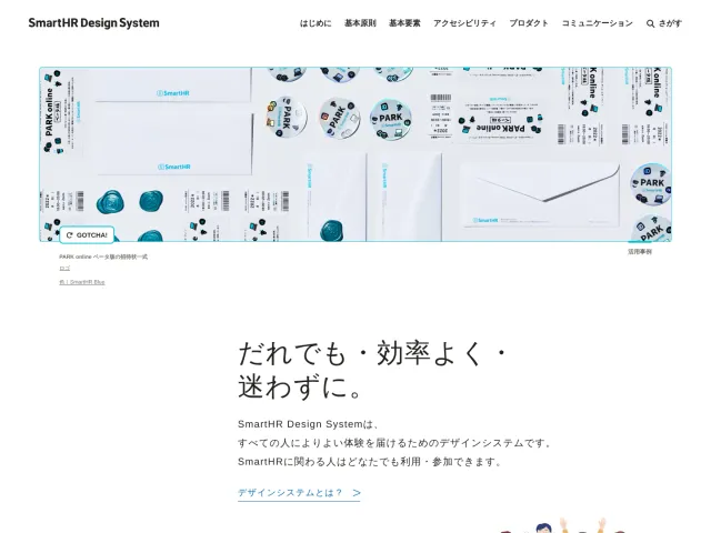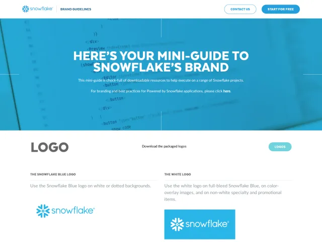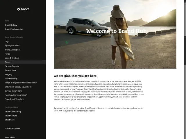
TDC brand guidelines
TDC hosts its design system and brand identity guidelines with dedicated sections for visual elements and language.
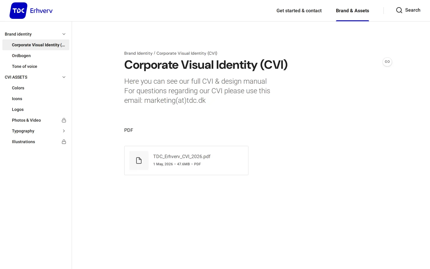
Freedam's take — I like how cleanly TDC lays out its brand documentation using zeroheight. The structure immediately splits into onboarding and identity essentials, making it simple to navigate. In the Brand and Assets section, you find dedicated spaces for corporate visual identity alongside standard foundations like colors, logos, and typography. What stands out to me is the inclusion of Ordbogen, bringing verbal vocabulary directly alongside visual rules like icons and illustration. It feels pragmatic, focused, and organized enough for anyone needing core visual and written standards.
Details
- Type
- Guidelines
- Access
- Public
- Source
- design.tdc.dk
- Industry
- Telecom
- Capabilities
- Guidelines, Asset browsing, Search
- Tags
- tone of voice, color system, iconography, illustration, typography, search, zeroheight
- Added
- Last checked
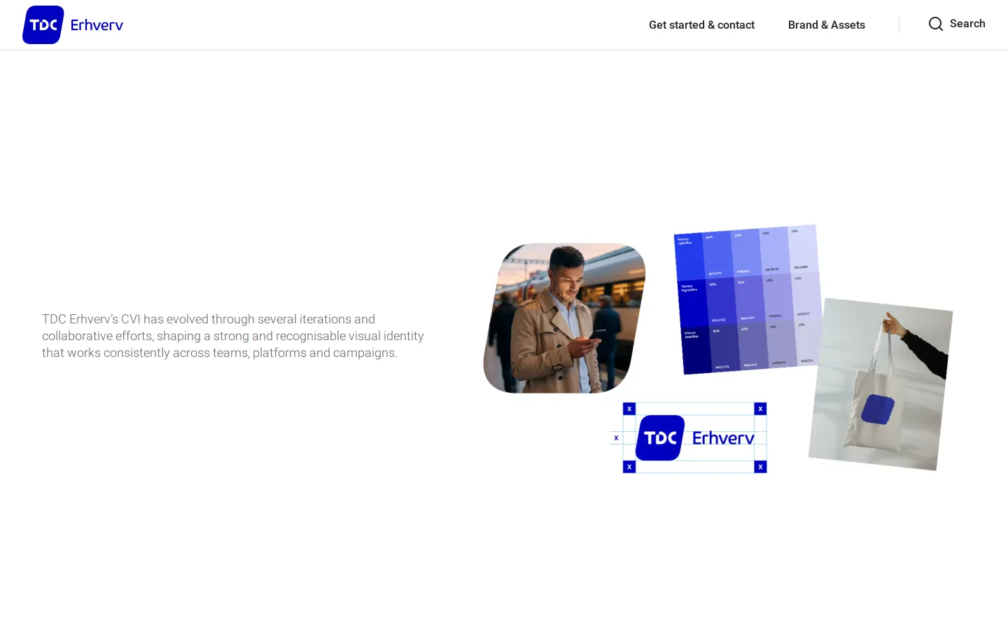
What I noticed
- The documentation platform is built using zeroheight.12
- The Brand & Assets section includes navigation for Ordbogen, Tone of voice, Colors, Icons, Logos, Photos & Video, Typography, and Illustrations.345678910
- A search field is available on the site pages.1112
- The primary navigation cleanly balances getting started support with asset guidelines.
Numbers refer to the screenshots above.
What I could not see
- Could not inspect the full content within individual guideline pages such as Colors or Typography.
- Could not verify if asset files are directly downloadable from these pages.
Ideas to borrow
- Include a dedicated dictionary or glossary alongside tone of voice guidelines to align company vocabulary.
Reviewed on 18 September 2026. Request a correction · I built this