Sound Transit brand guidelines
Sound Transit provides an accessible brand center featuring transit line colors, typography rules, presentation templates, and direct guidelines downloads.
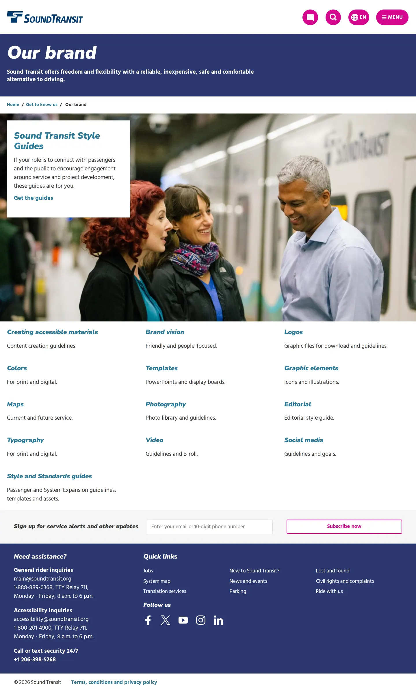
Sound Transit brand hub page providing an overview and links to brand style guides and asset categories.
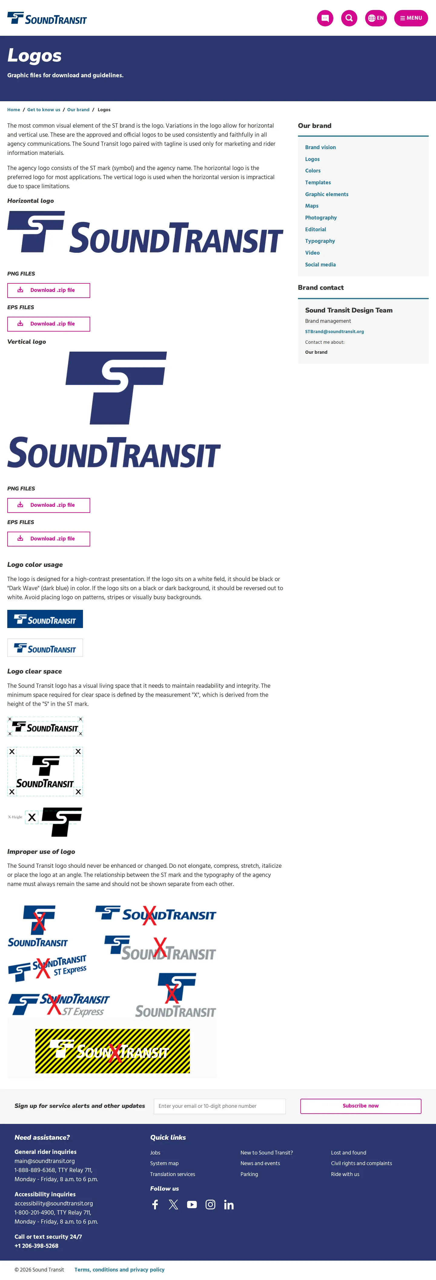
Logos page showing horizontal and vertical lockups, clear space, improper usage examples, and zip downloads.
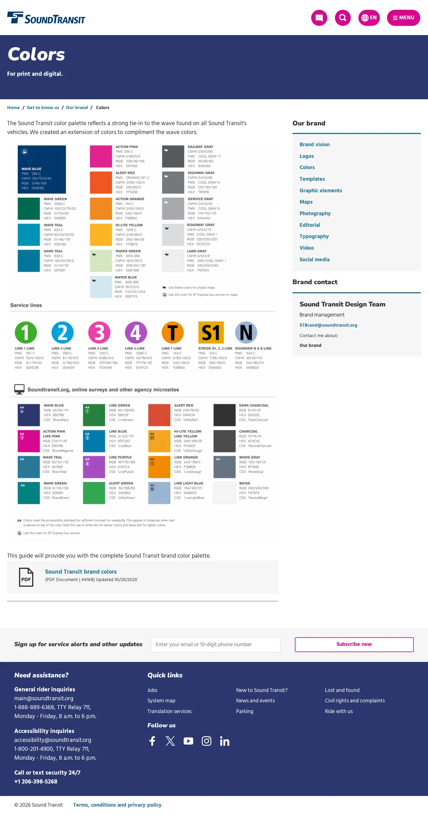
Colors page presenting print and digital palettes, transit service line swatches, and accessibility contrast tags.
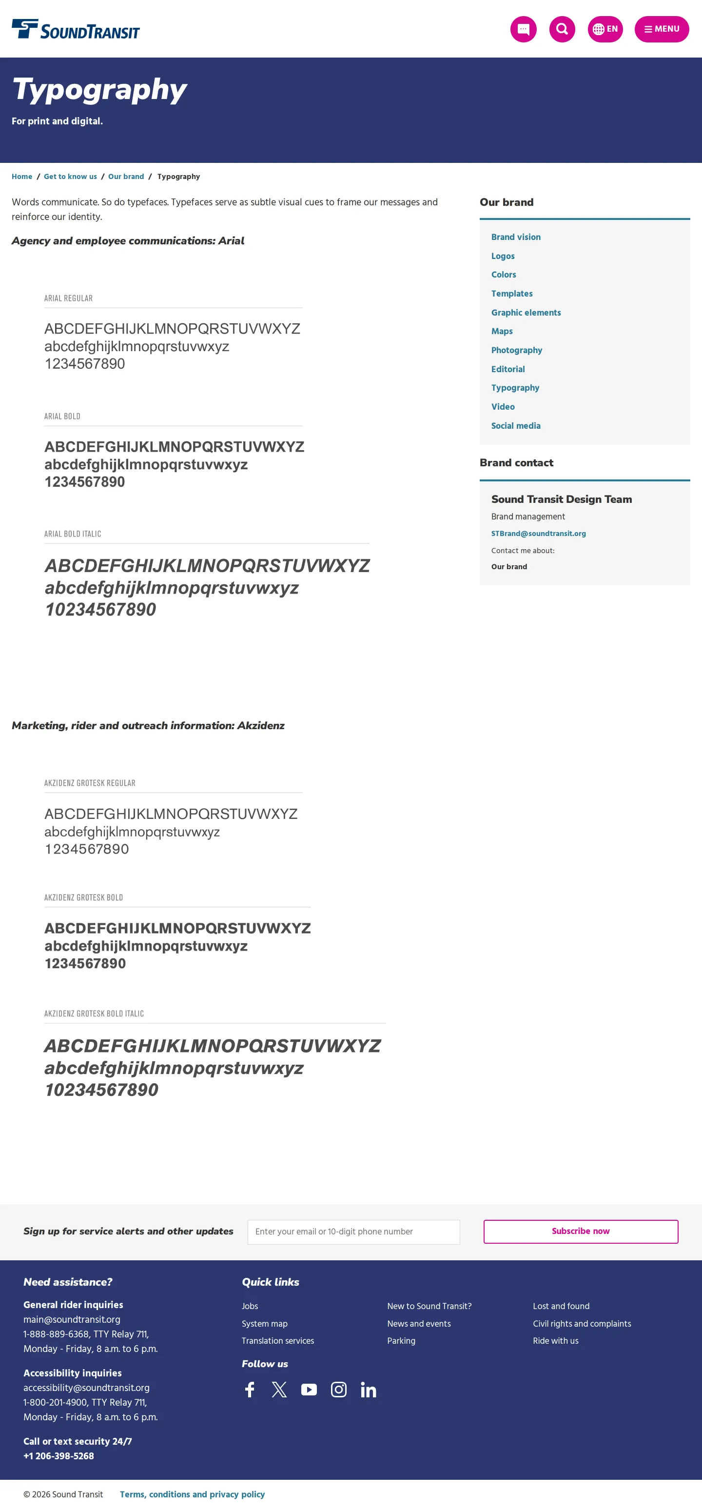
Typography guidelines page detailing Arial for internal agency communications and Akzidenz for riders.
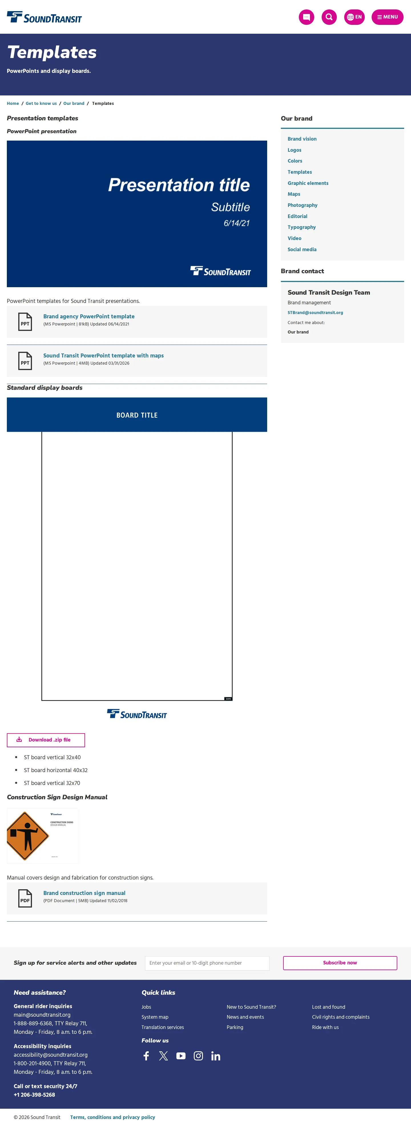
Templates page offering downloadable presentation slide decks, display boards, and a construction sign manual.
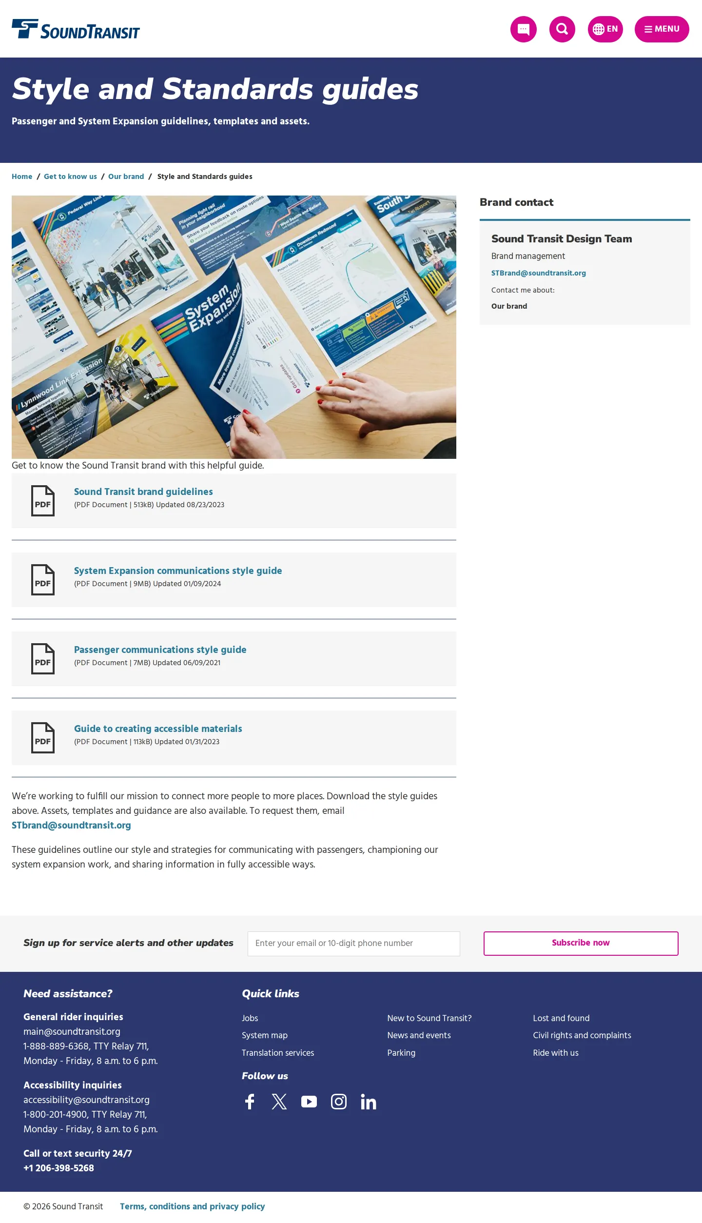
Style and Standards guides page featuring downloadable PDFs for brand, system expansion, and accessible materials.
Want a brand center like Sound Transit’s?
Create your brand center with Freedam ↗Freedam's take
I like how practical Sound Transit keeps their brand hub. Built right into their main public site, it delivers straightforward access to assets across transit lines like Sounder and Link. Their color documentation pairs standard print values with digital CSS class names and accessibility markers. On the typography side, they clearly divide duties, reserving Arial for internal staff communications and Akzidenz for public rider touchpoints. It is refreshingly unpretentious, giving partners, vendors, and staff exactly the downloadable decks, construction manuals, and vector marks they need without unnecessary fluff.
At a glance
- Sections
- Creating accessible materials · Brand vision · Logos · Colors · Templates · Graphic elements · Maps · Photography · Editorial · Typography · Video · Social media · Style and Standards guides
- Downloads
- PNG, EPS, PDF, PPT, ZIP
- Tone
- Functional, civic-minded, and clear, serving both internal agency staff and external production teams.
What I noticed
- Clear space around the logo is defined using the X-height derived from the height of the 'S' symbol.1
- The color system details swatches with PMS, CMYK, RGB, and HEX values, with color swatches marked with AA symbols to indicate accessibility contrast compliance.23
- Typography specifies Arial for agency and employee communications, while Akzidenz is designated for marketing, rider, and outreach materials.45
- A dedicated section outlines specific colors for transit lines including Link 1 Line, Link 2 Line, Link 3 Line, Link 4 Line, Link T Line, Stride, and Sounder.6
Numbers refer to the screenshots above.
What I could not see
- I could not view the individual guidelines pages for photography, editorial, maps, or video.
- Font asset files for Akzidenz were not visibly available for direct download on the typography page.
Ideas to borrow
- Documenting distinct digital palettes alongside CSS class names directly bridges brand guidance with web development needs.7
Quick answers
Where can I download the Sound Transit logo?
Logo files are available on the Logos page in horizontal and vertical configurations packaged as PNG and EPS files inside downloadable .zip archives.8910111213
Reviewed on 26 September 2026. Request a correction · I built this
Similar brand centers
All brand guidelines →