Shutterstock brand guidelines
Shutterstock presents an accessible brand identity system covering logos, stationery-inspired palettes, motion rules, and collage imagery assets.
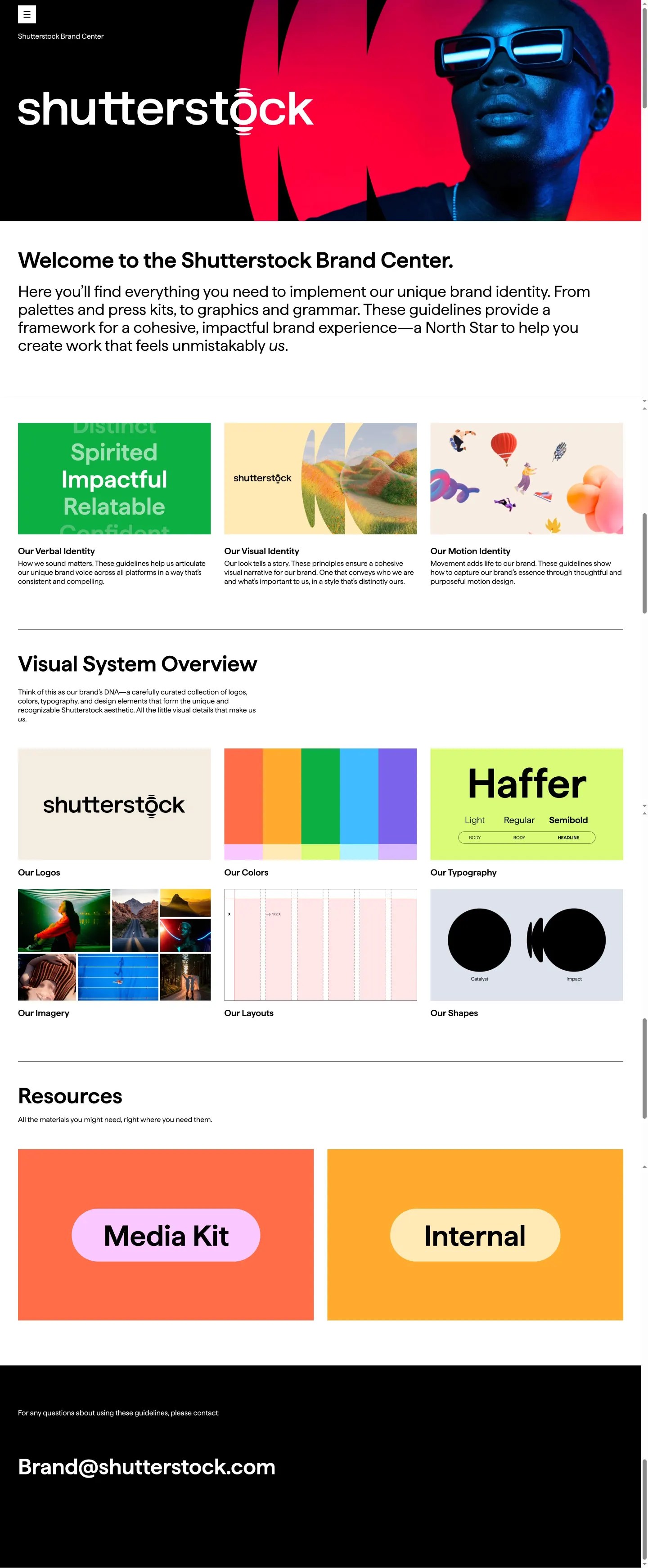
Shutterstock Brand Center homepage showing visual system cards, identity pillars, and links to media kit resources.

Logo guidelines display specifying clearspace rules based on the letter 'h', color treatments, partner lockups, and downloads.
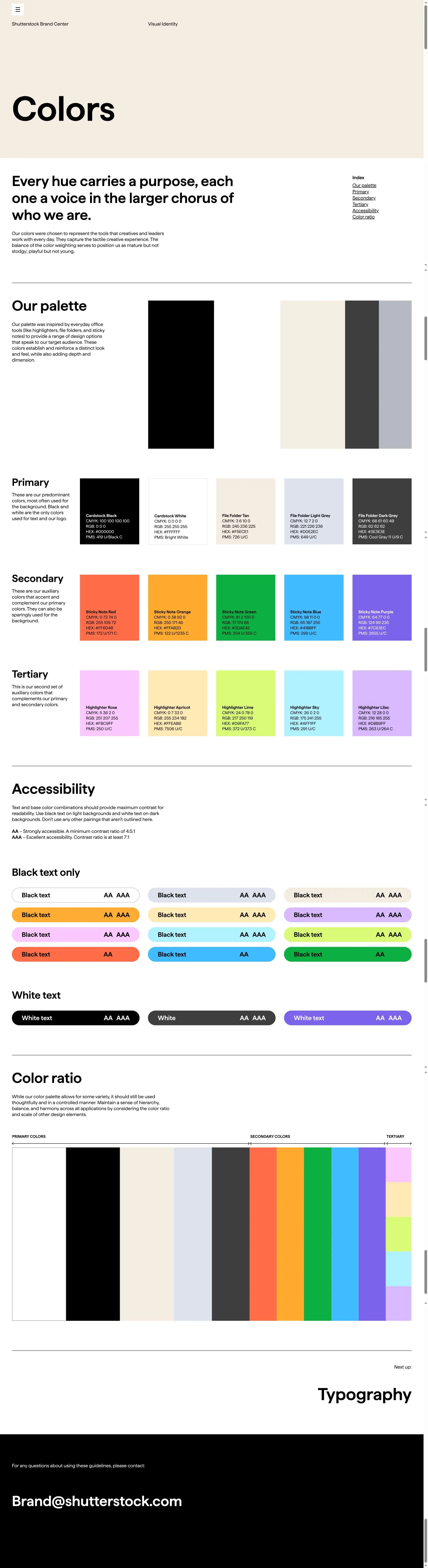
Color palette page featuring office-themed swatch names, print and digital values, and accessibility contrast ratings.
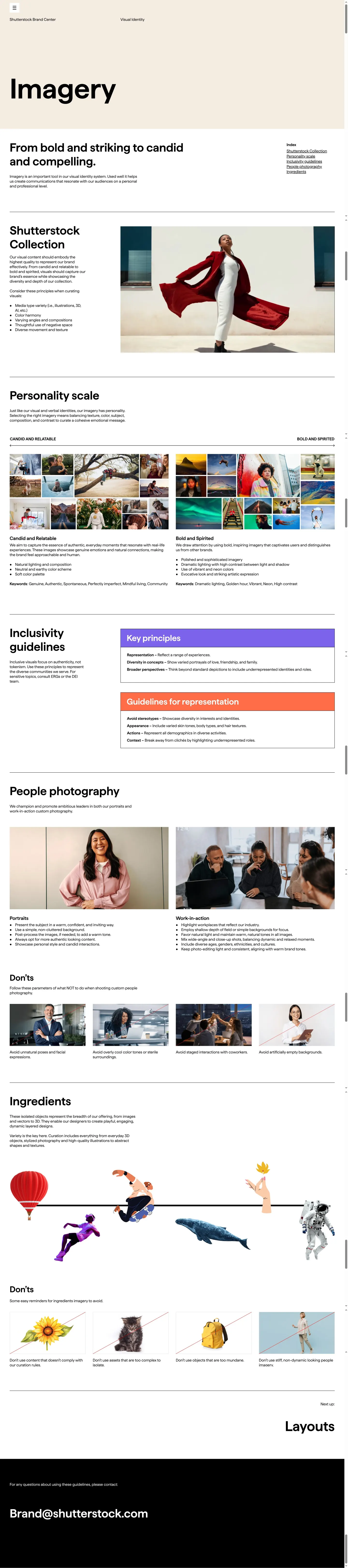
Imagery guidelines detailing personality scales, portrait rules, inclusivity principles, and isolated cut-out ingredients.

Motion pillars section presenting aspect ratio guidelines, logo reveal examples, and end card animation standards.
Want a brand center like Shutterstock’s?
Create your brand center with Freedam ↗Freedam's take
I like how practical Shutterstock makes every page of their brand center. Looking through their logo guidance, the clearspace rule neatly repurposes the letter h right from their mark. The color palette also stands out for its personality, naming shades after physical stationery like Cardstock, File Folder, and Sticky Note while backing them up with clear accessibility contrast ratings. They even detail isolated cutout elements under an ingredients section for design collages. It feels thorough without ever becoming stiff, offering clear boundaries while leaving enough room to build lively marketing work.
At a glance
- Sections
- Our Verbal Identity · Our Visual Identity · Our Motion Identity · Logos · Colors · Imagery · Motion
- Tone
- Practical, clear, and creatively grounded with structured accessibility and usage rules.
What I noticed
- Clearspace for the Shutterstock logo is calculated using the letter 'h' from the logo for vertical spacing and a rotated 'h' for horizontal spacing.1
- Color swatches use names inspired by office stationery like Cardstock, File Folder, Sticky Note, and Highlighter, alongside CMYK, RGB, HEX, and PMS values.2
- The color guidelines include an accessibility section showing approved text pairings rated for AA and AAA compliance.3
- The imagery section details photography styles and an 'Ingredients' area specifying the use of isolated cut-out objects across vectors, photos, and 3D assets.45
- The motion pillars page documents aspect ratios of 16:9, 9:16, 1:1, and 4:5 for end cards alongside animated logo reveals.67
Numbers refer to the screenshots above.
What I could not see
- Specific downloadable file packages could not be inspected directly beyond the presence of download buttons.
- Internal pages behind the 'Internal' resource card were not visible in the captured screens.
- Typography specimen details beyond the overview card mentioning Haffer weights were not captured.
Ideas to borrow
- Grounding clearspace directly in a distinctive letterform from your own wordmark creates an intuitive, memorable rule for creators.
- Teams can include a dedicated 'Ingredients' section to govern cut-out assets and collage treatments alongside standard lifestyle photography.
Quick answers
Where can I download the Shutterstock logo?
A prominent black 'Download' button is provided directly next to the primary wordmark display on the Logos page, alongside dedicated downloads for branded offer lockups.89
What brand font does Shutterstock use?
The visual system overview identifies the font family as Haffer, highlighted in Light, Regular, and Semibold weights.10
Reviewed on 25 September 2026. Request a correction · I built this