ShopBack brand guidelines
The ShopBack Brand Centre shares brand strategy, logo variations, typography packages, and tone of voice guidance for external and internal use.

Freedam's take
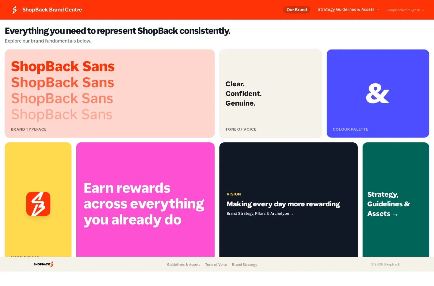
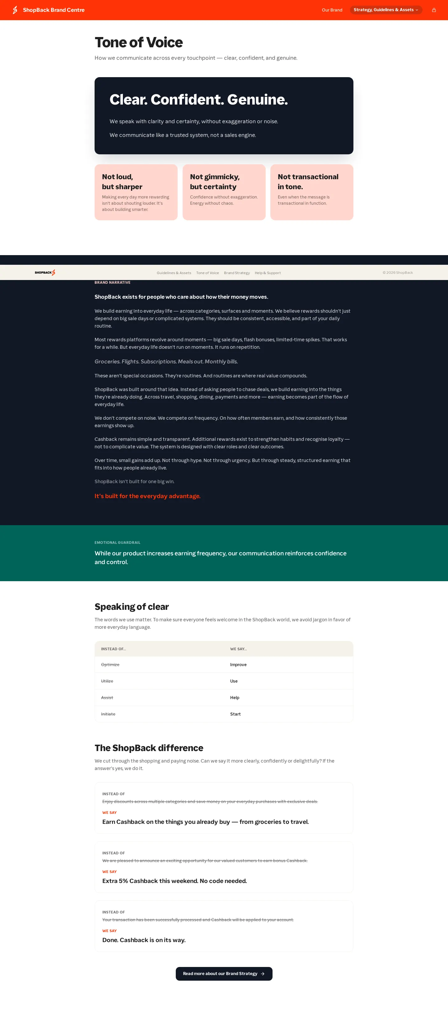
I like how direct the ShopBack Brand Centre is from the start. Rather than hiding resources behind internal walls, the external hub lays out their strategic foundation alongside practical files. The guidelines walk through logo variations like horizontal, stacked, and spark marks, while also addressing placement rules. You can grab their custom ShopBack Sans font directly in web and desktop packages. Moving through the voice guidelines, they frame their tone with clear contrasts, steering away from gimmicky copy toward genuine certainty, which matches the practical ethos laid out in their brand values.
What I noticed
- The hub provides downloadable packages for the ShopBack Sans typeface in both WOFF and TTF formats.12
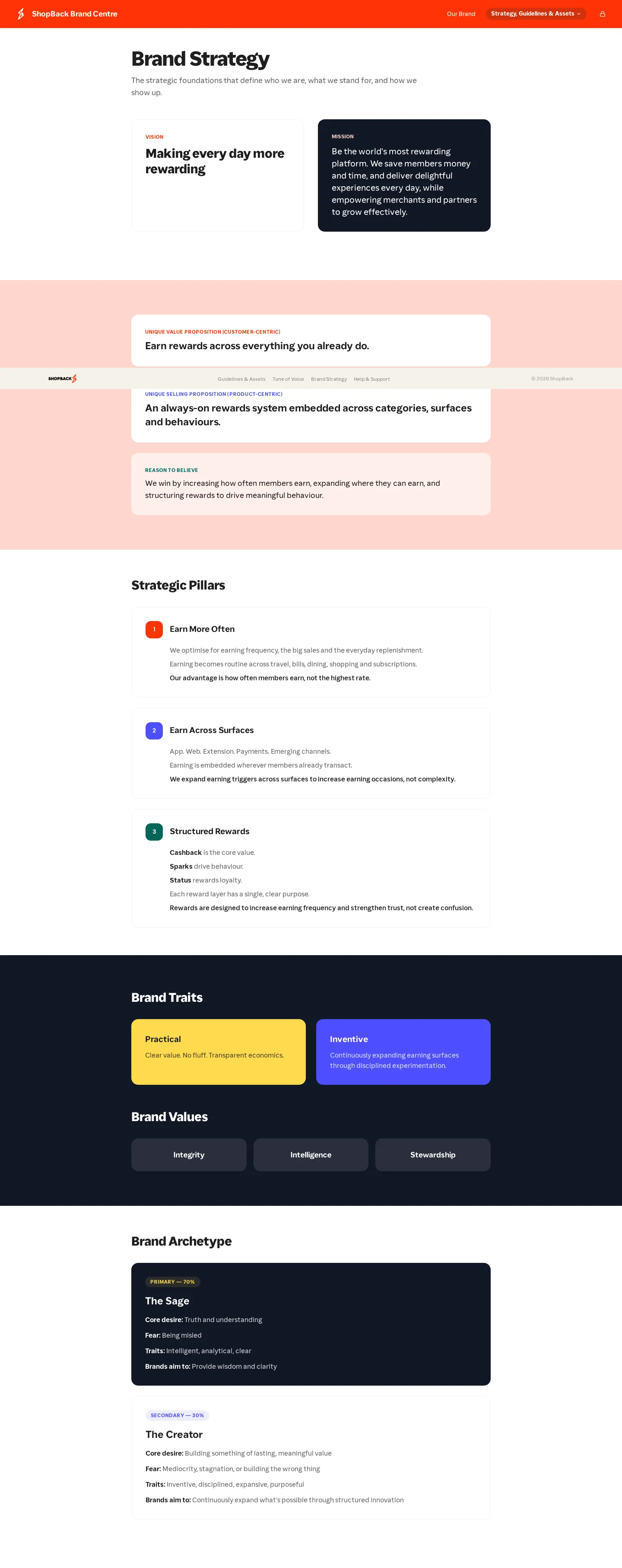
- Brand strategy documents define pillars like Earn More Often alongside archetypes including The Sage and The Creator.34567
- The tone of voice guidance sets writing principles such as 'Not loud, but sharper' and 'Not gimmicky, but certainty'.89
- The navigation offers a dedicated sign-in pathway specifically for internal team members.10
Numbers refer to the screenshots above.
What I could not see
- Could not view the content gated behind the internal ShopBacker sign-in link.
- Could not inspect the full color palette details beyond the core heading due to page truncation.
Ideas to borrow
- Contrast-based principles like 'Not loud, but sharper' help writers understand voice boundaries quicker than abstract adjectives.
Reviewed on 26 September 2026. Request a correction · I built this
Similar brand centers
All brand guidelines →
 Shopify
Technology
Press & asset kit
Shopify
Technology
Press & asset kit
 Amazon
Technology
Press & asset kit
Amazon
Technology
Press & asset kit