Instacart brand guidelines
Instacart provides a structured brand guide detailing logo matrices, color balance percentages, accessible type combinations, and photography principles.
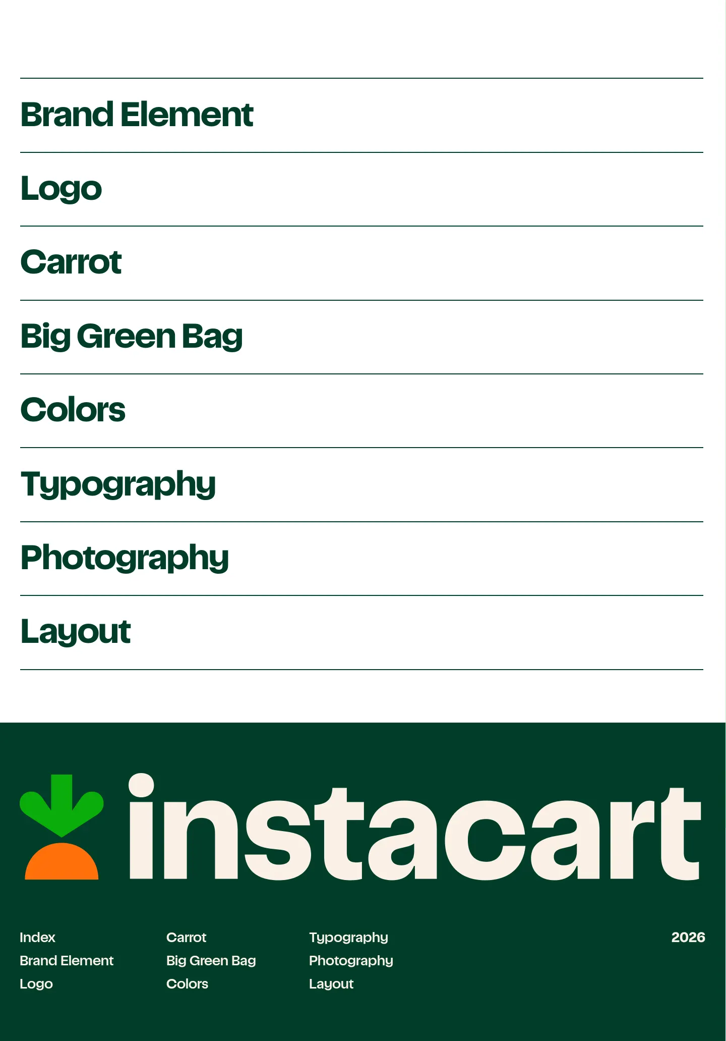
Index page of the Instacart brand guide featuring large horizontal navigation links and a bold green footer.

Instacart's brand guidelines page detailing logo variations, color usage rules, misuse examples, and contextual application matrices.

Brand guidelines page showing Instacart's color system, usage distribution, accessibility criteria, palette applications, and misuse rules.
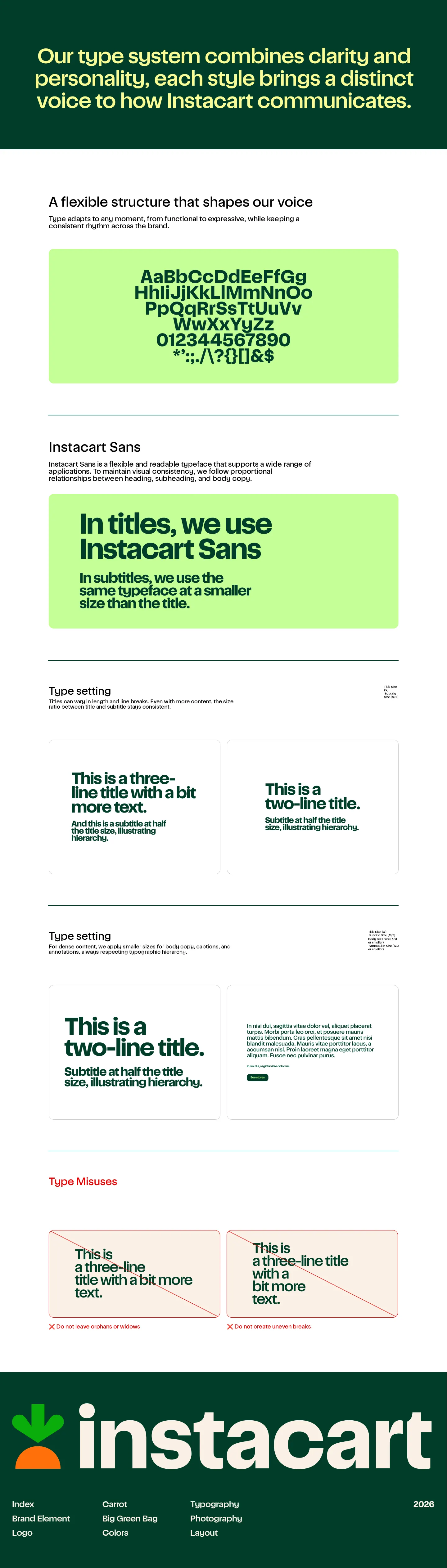
Typography guidelines page detailing the Instacart Sans typeface, typesetting proportions, hierarchy rules, and typographic misuses.
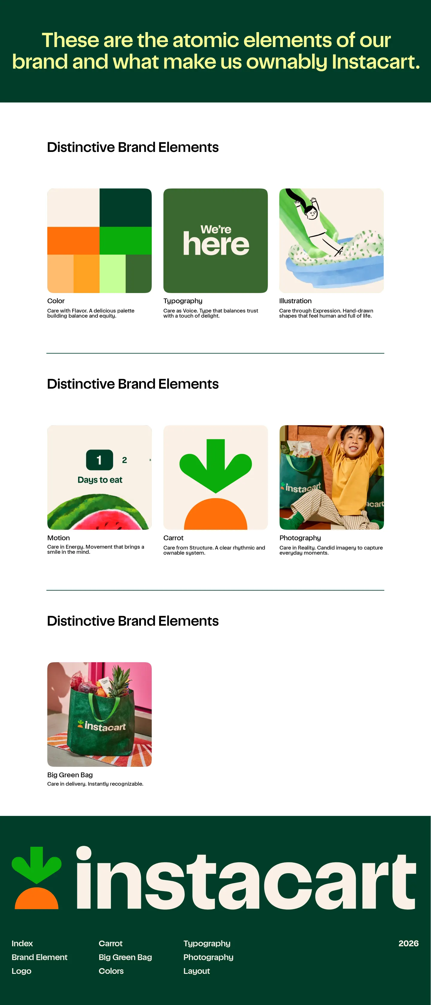
Overview page displaying Instacart's distinctive brand elements through illustrated cards and descriptive subheadings.
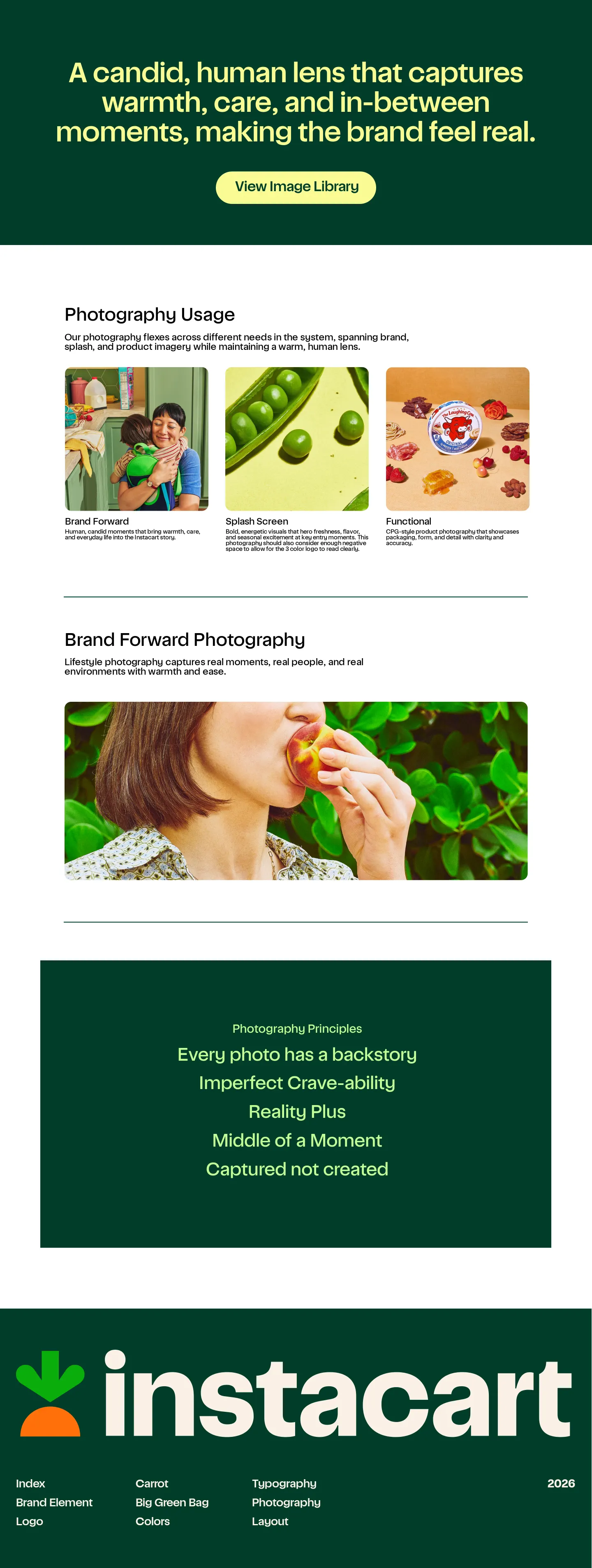
Instacart's photography guidelines page detailing usage styles, examples, and core visual principles.
Want a brand center like Instacart’s?
Create your brand center with Freedam ↗Freedam's take
I love when guidelines treat identity as a clear system, and Instacart does that across every section. Rather than just handing off basic swatches, the color page maps out balance percentages and shows dozens of type pairings tested against accessibility criteria. The logo rules are just as thoughtful, using straightforward matrix tables to show which treatments work across campaigns or partnerships. It feels like an honest manual for production designers, complete with typographic math that ties subtitles directly to headline sizes.
At a glance
- Sections
- Brand Element · Logo · Carrot · Big Green Bag · Colors · Typography · Photography · Layout
- Tone
- Clear, practical, and systematic instructions written directly for designers building real touchpoints.
What I noticed
- The brand guidelines are hosted on Readymag and feature a login link in the header.12
- Color swatches provide HEX, RGB, Pantone, and CMYK codes, supported by a usage distribution bar with percentage breakdowns.34
- The typography guidelines specify proportional sizing formulas, defining subtitles at half the size of titles.5
- Logo usage is broken into contextual matrix tables that explicitly cross out disallowed combinations in red.67
Numbers refer to the screenshots above.
What I could not see
- Could not view the contents behind the login link or the destination of the View Image Library button.
- Could not verify if asset download packages exist behind password protection.
Ideas to borrow
- Displaying color pairings directly in an accessible grid using real sample copy helps teams quickly identify approved contrast combinations.8
Reviewed on 18 October 2026. Request a correction · I built this
Similar brand centers
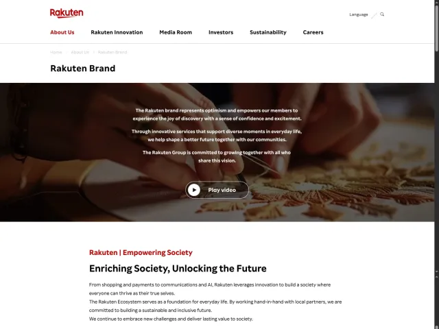
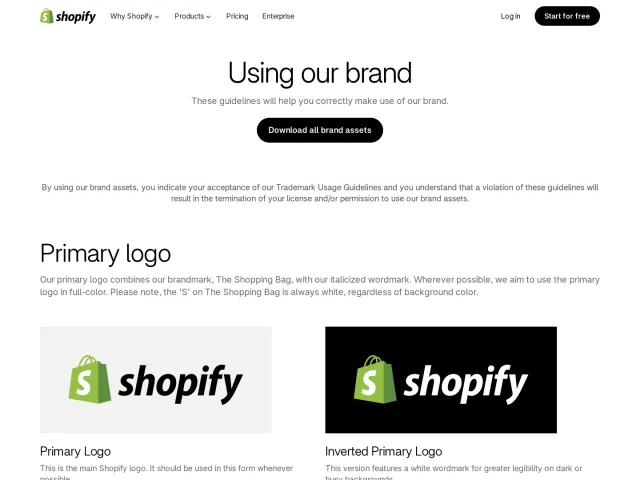
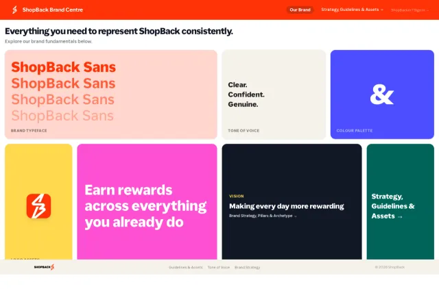
All brand guidelines →Instacart presents multi-page interactive guidelines on Readymag without visible asset download links, whereas Shopify provides a single-page asset kit featuring pill-shaped buttons to download direct zip archives of its logos. Meanwhile, ShopBack offers downloadable typeface packages alongside brand strategy pillars and archetypes.