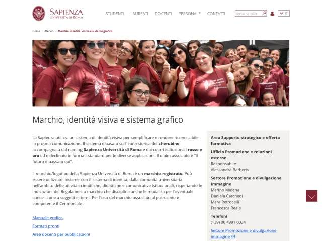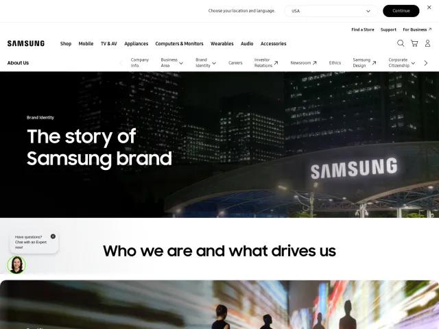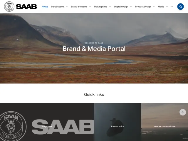
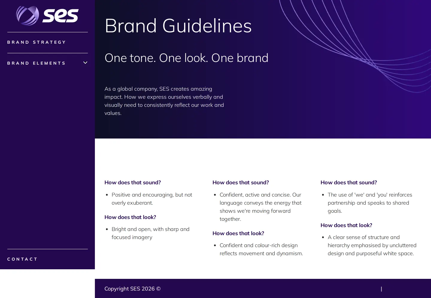
SES brand guidelines
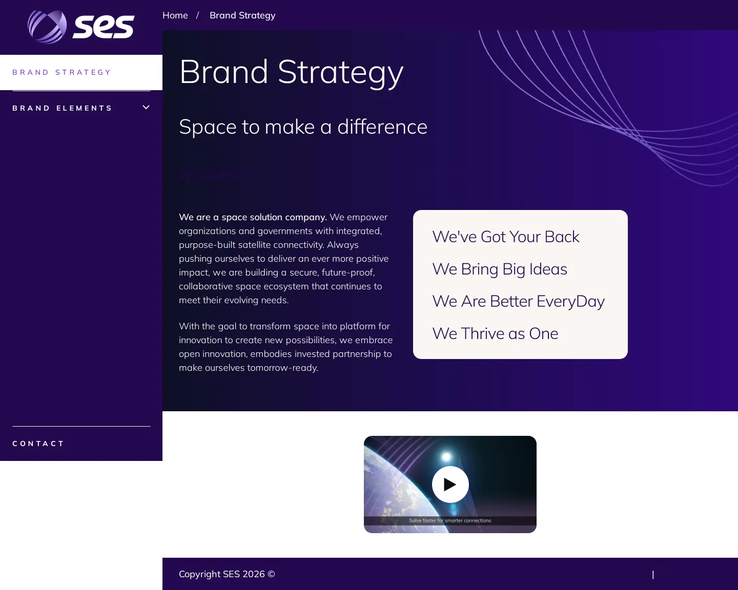
SES provides an online brand guidelines portal detailing brand strategy, logo usage, color systems, and typography rules.
Freedam's take — I like how direct the SES brand guidelines are when laying out the basics. They establish a clear corporate voice right from the start, tying strategic values directly into foundational design elements. The typography section pairs Mulish with Aptos as a practical alternate, alongside explicit rules for color pairing in text like plum and gradient treatments. Their color palette goes beyond simple swatches by specifying sequencing rules for charts and graphs, and sub-brand logos are made available for immediate file download through direct links.
Details
- Type
- Guidelines
- Access
- Public
- Source
- brand.ses.com
- Industry
- Telecom, Aerospace & defence
- Capabilities
- Guidelines, Downloads
- Tags
- color system, typography, data visualization, brand architecture, logo usage, asset downloads
- Added
- Last checked
What I noticed
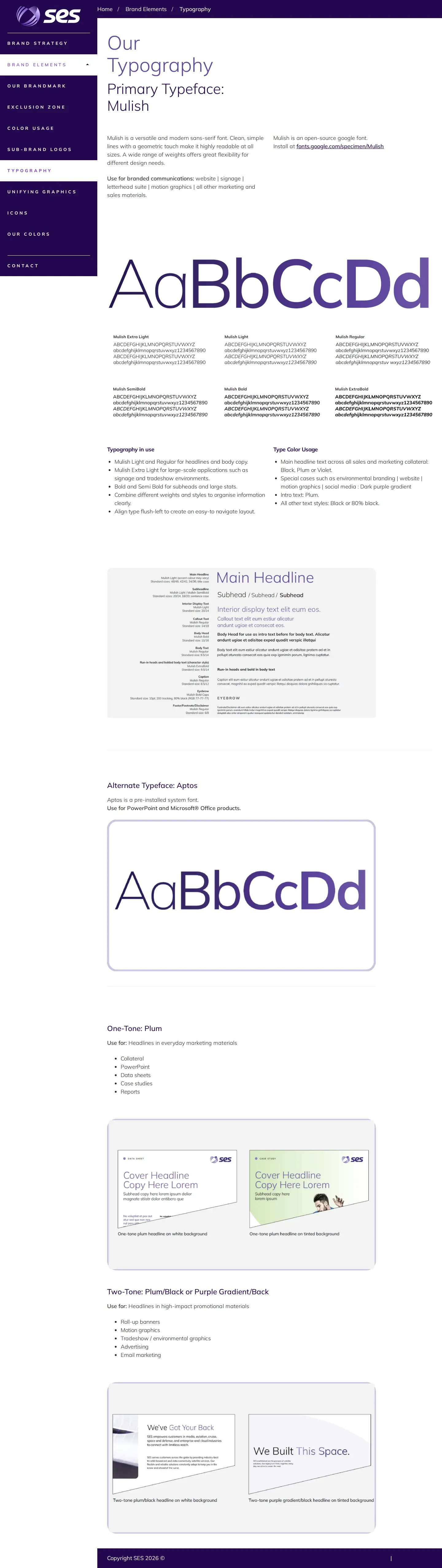
- The typography guidelines specify Mulish as the primary typeface and Aptos as the alternate typeface.12
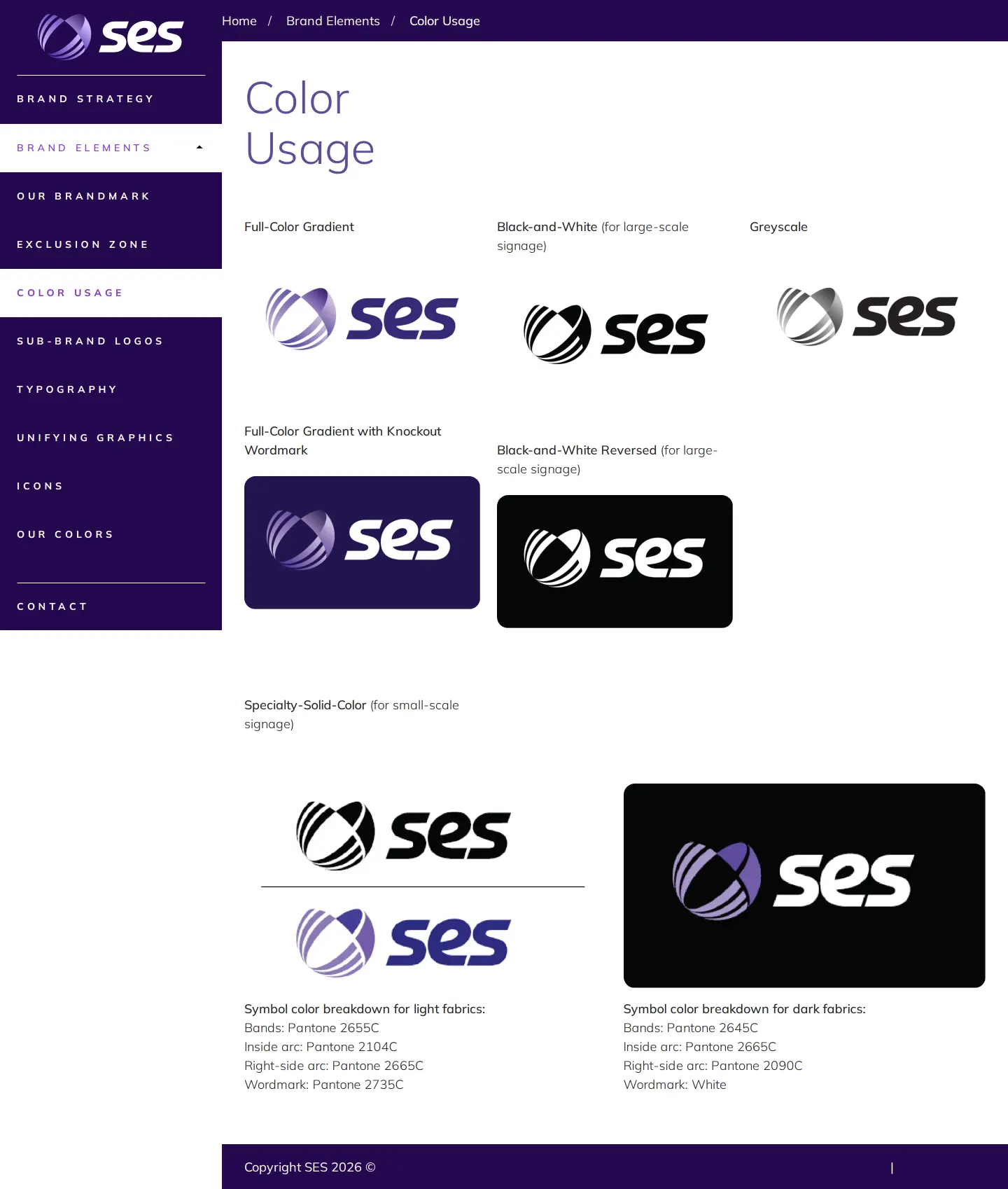
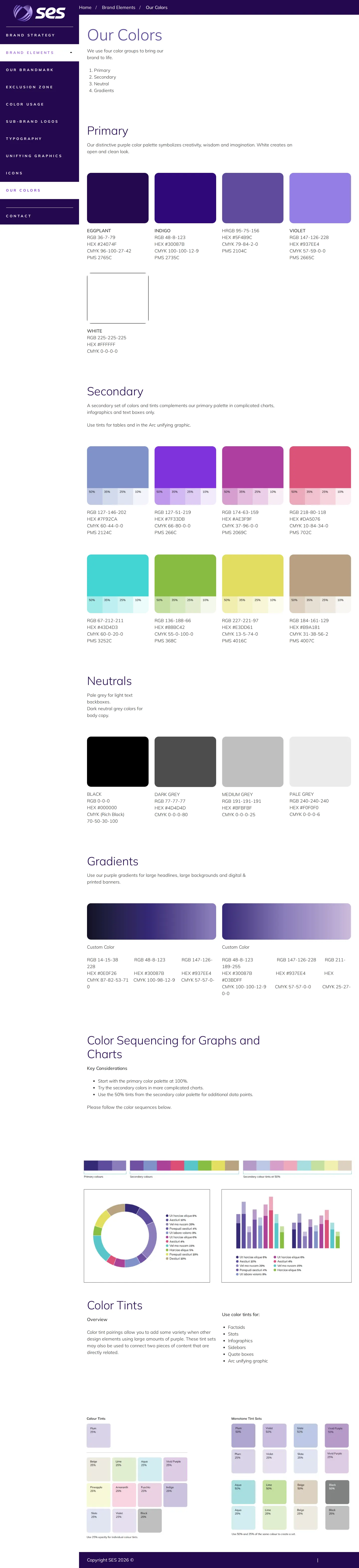
- The color guidelines include specific sections for primary, secondary, neutrals, gradients, and sequencing for graphs and charts.34567
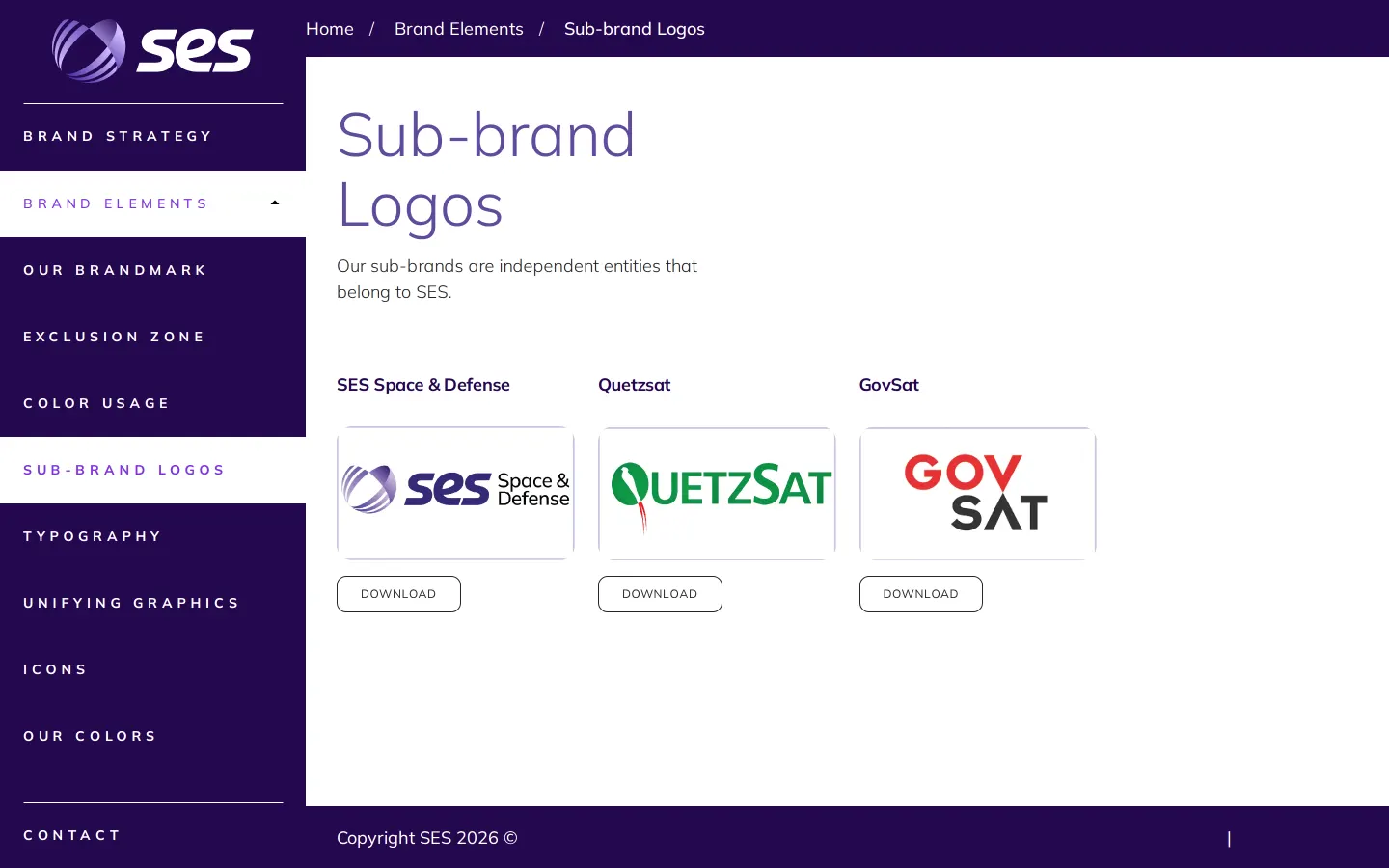
- Sub-brand logo assets such as SES S&D, Quetzsat, and GovSat are provided as direct download links.8910
Numbers refer to the screenshots above.
What I could not see
- No asset browsing library, template downloads, or search functionality were observed in the captured pages.
Ideas to borrow
- Providing a dedicated color sequencing hierarchy specifically for data visualization and charts helps ensure consistency across technical reports.
Reviewed on 18 September 2026. Request a correction · I built this
Similar brand centers
All brand guidelines →