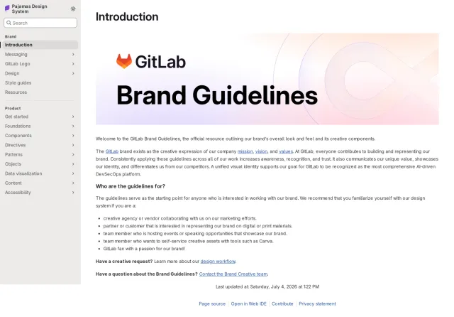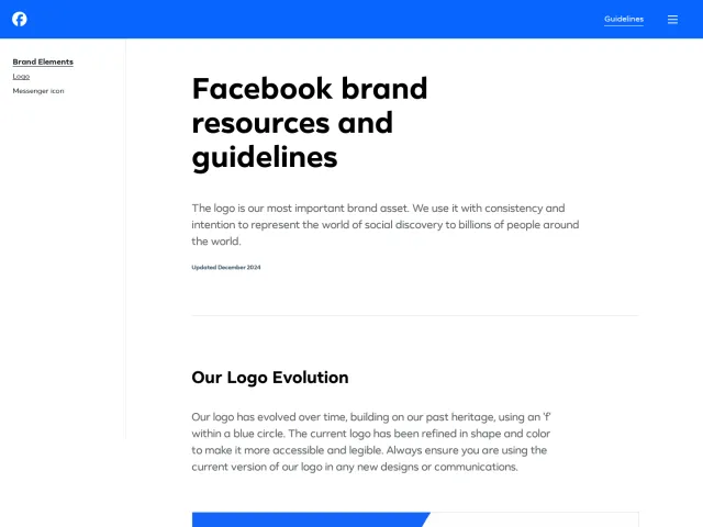
Perplexity brand guidelines
Perplexity presents an online brand guidelines site featuring core identity sections across typography, color, art direction, and logos.
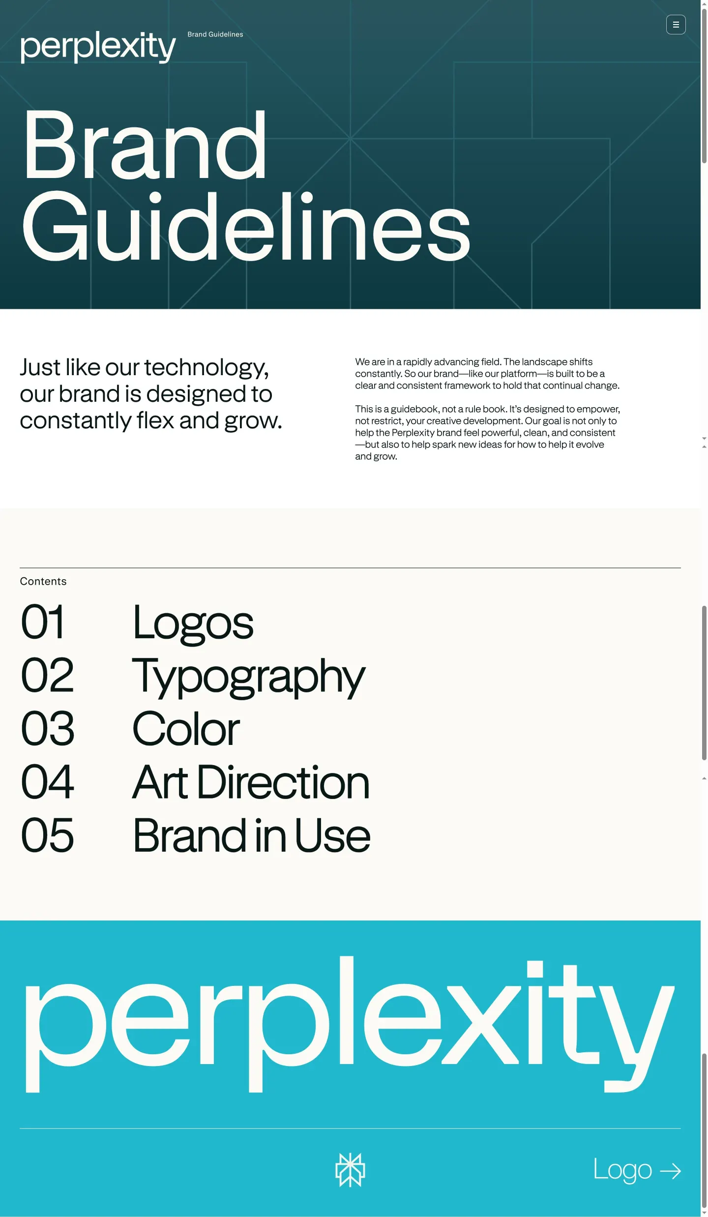
Landing and table of contents view of the Perplexity brand guidelines website.
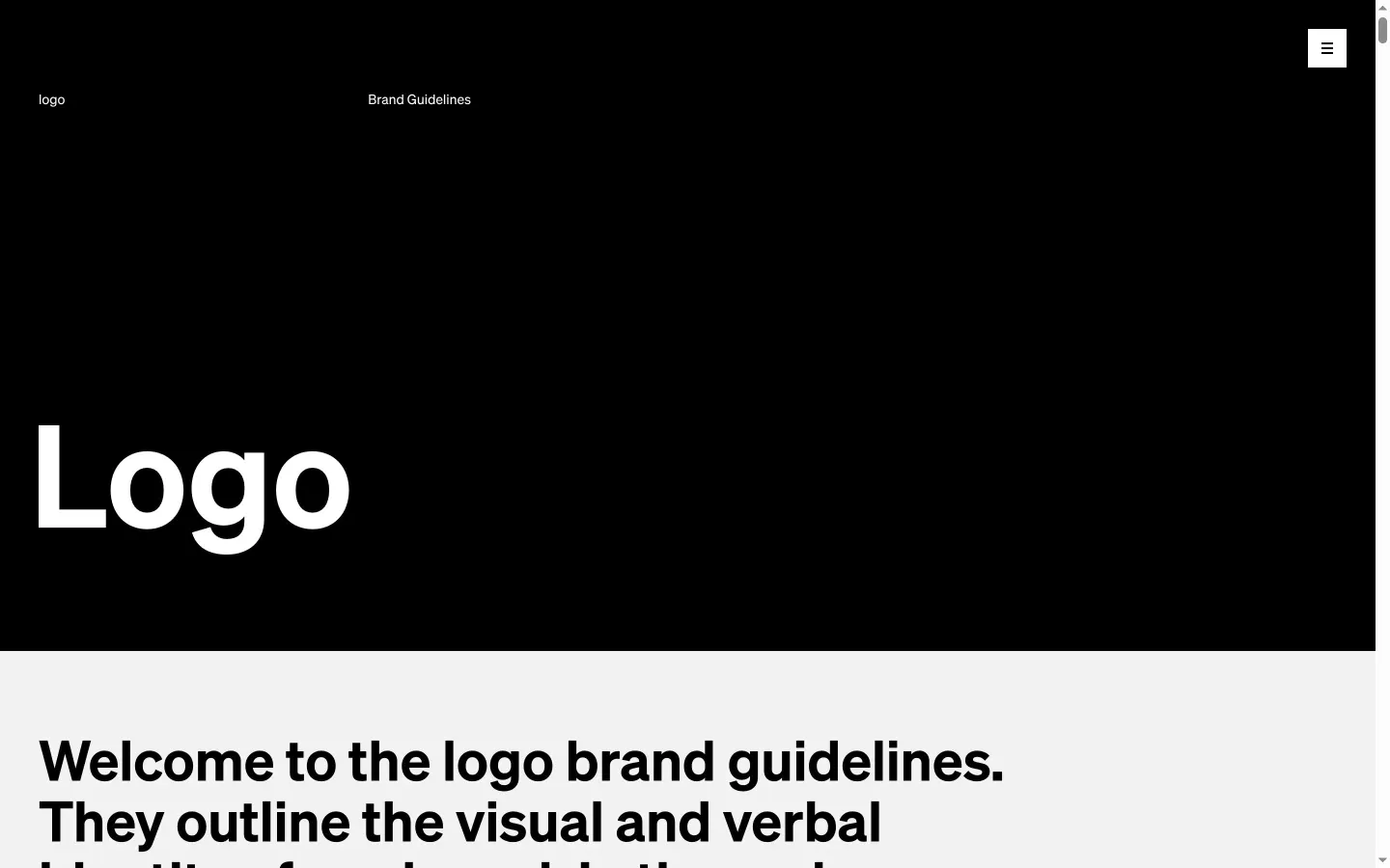
Logo guidelines page showing a large header title section against a black background transitioning to introductory text on a white section below.
Want a brand center like Perplexity’s?
Create your brand center with Freedam ↗Freedam's take
I added Perplexity to the gallery because its portal opens with a straightforward layout. The home page establishes the framework right away with a deep teal hero banner, geometric line patterns, and introductory copy. I like how clearly the numbered table of contents outlines the core sections, from logos and typography to color, art direction, and brand in use. Navigating into the logo area leads to a high-contrast layout, shifting from a solid black field headline down to a clean white section with introductory text. It keeps navigation simple.
At a glance
- Sections
- 01 Logos · 02 Typography · 03 Color · 04 Art Direction · 05 Brand in Use
- Tone
- A structured, minimalist guideline format organized around clear numbered identity topics.
What I noticed
- A deep teal hero banner features the Perplexity wordmark and large 'Brand Guidelines' title over geometric line patterns.1
- A numbered table of contents lists sections: 01 Logos, 02 Typography, 03 Color, 04 Art Direction, and 05 Brand in Use.2
- A teal section below displays the Perplexity wordmark, brand icon, and a link labeled 'Logo →'.3
- The logo page displays a large headline reading 'Logo' against a solid black field before transitioning to introductory text on a white section below.456
- A floating badge in the lower right corner reads 'Made with standards.'7
Numbers refer to the screenshots above.
What I could not see
- Could not view full content or asset downloads for Typography, Color, Art Direction, or Brand in Use.
- Could not inspect the contents of the hamburger navigation menu on the logo page.
Ideas to borrow
- Presenting top-level sections as a numbered table of contents on the main landing screen offers visitors an immediate roadmap of identity documentation.2
Reviewed on 26 September 2026. Request a correction · I built this