OXO brand guidelines
OXO hosts comprehensive brand guidelines directly inside its retail site, detailing logo usage, core color breakdowns, and typography hierarchies.
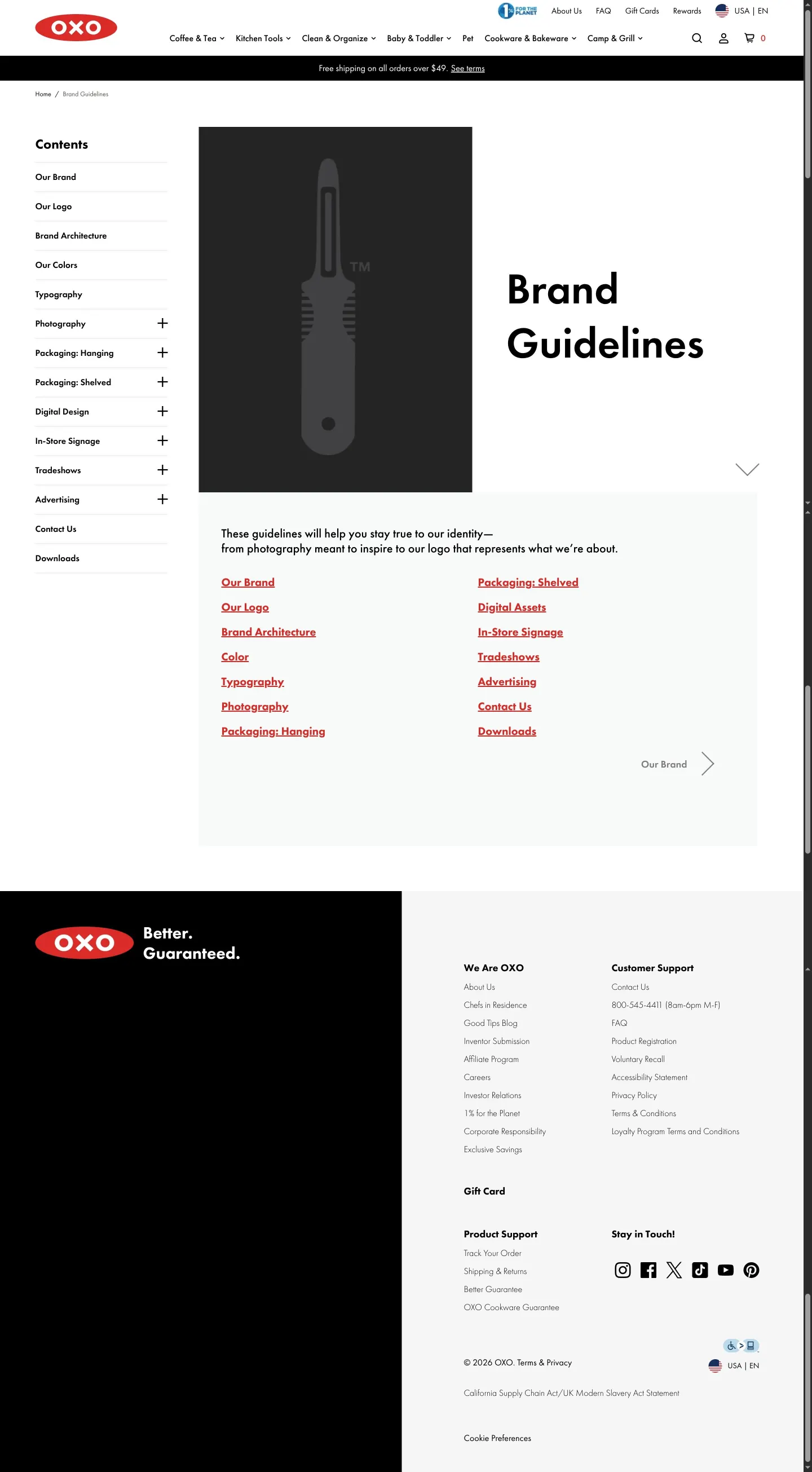
Landing page of the OXO brand guidelines with table of contents and section links.
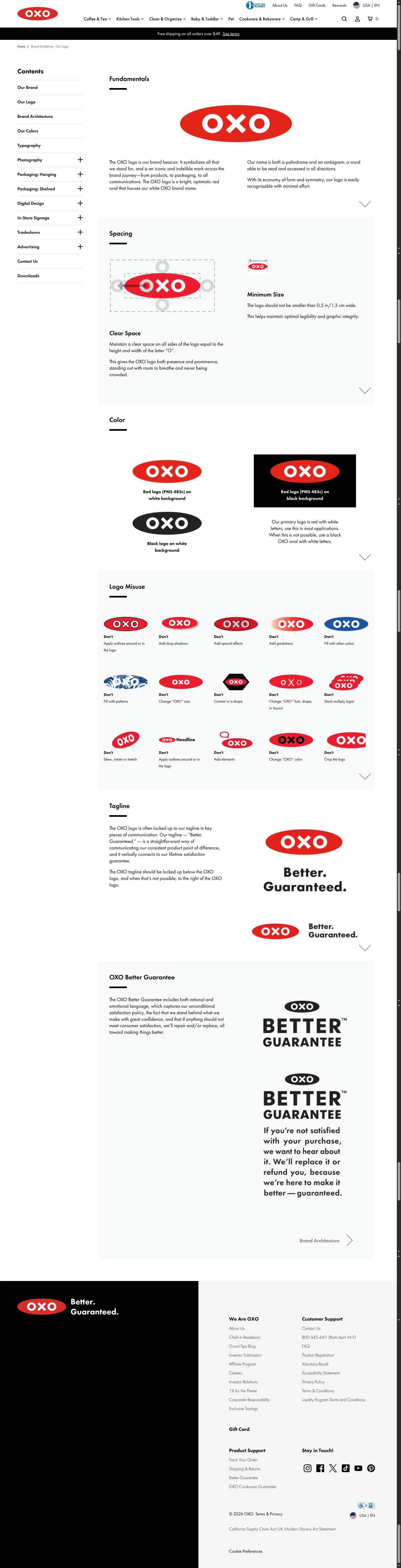
OXO brand guidelines page detailing logo fundamentals, clear space, minimum size, color variants, incorrect usage examples, and lockups.
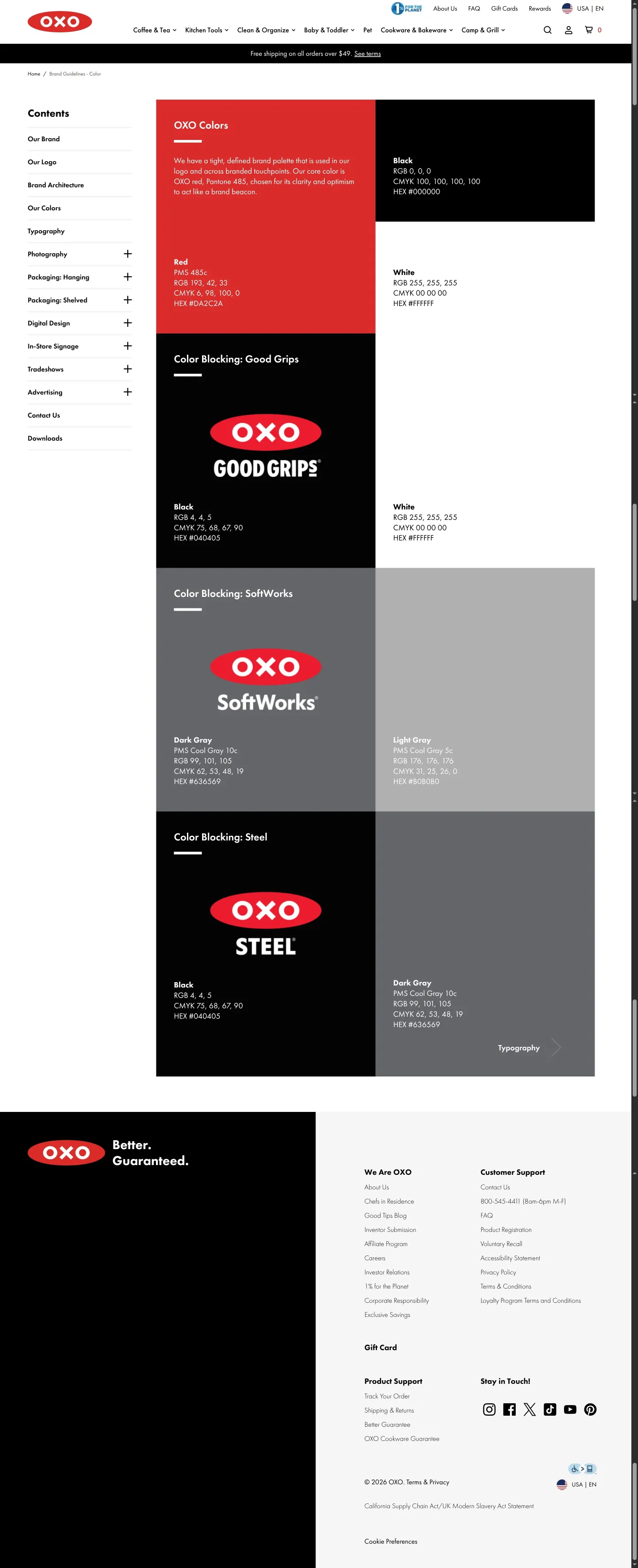
OXO brand guidelines page detailing core brand colors and sub-brand color blocking rules.
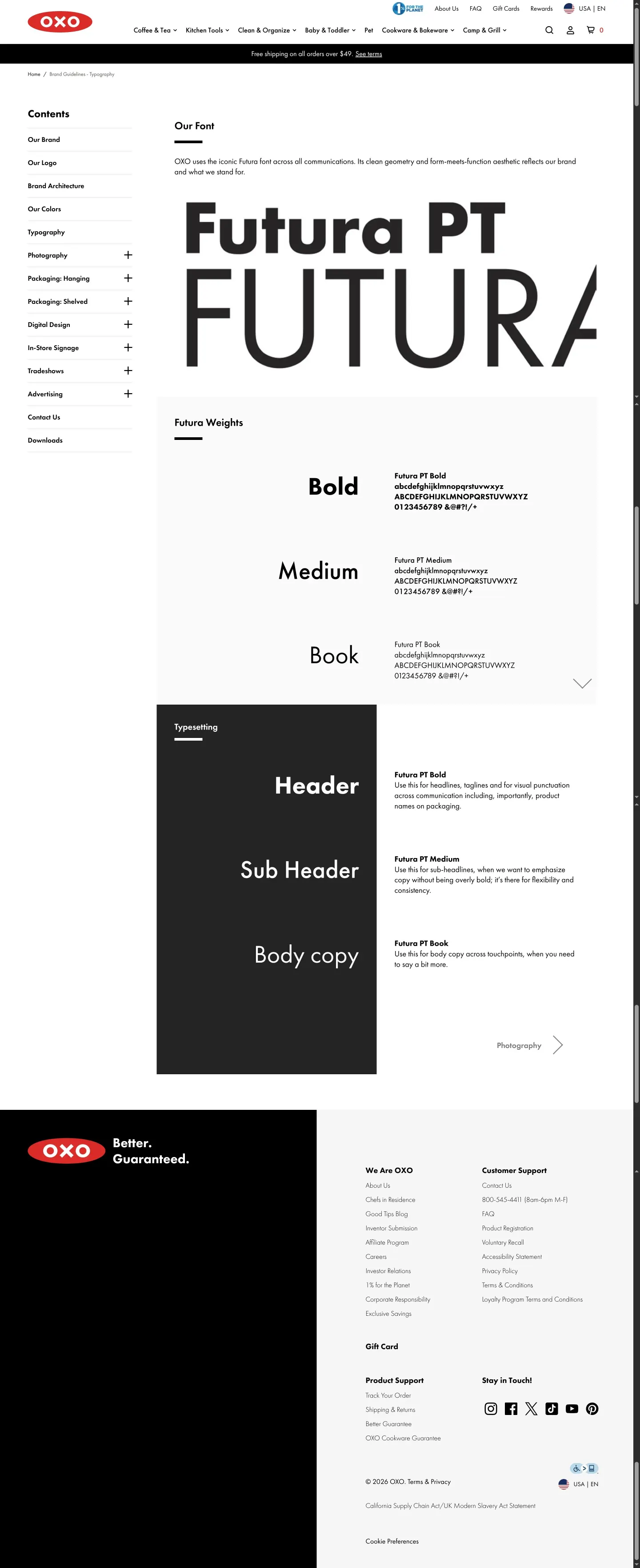
Brand guidelines page for OXO detailing the primary typography and typesetting hierarchy.
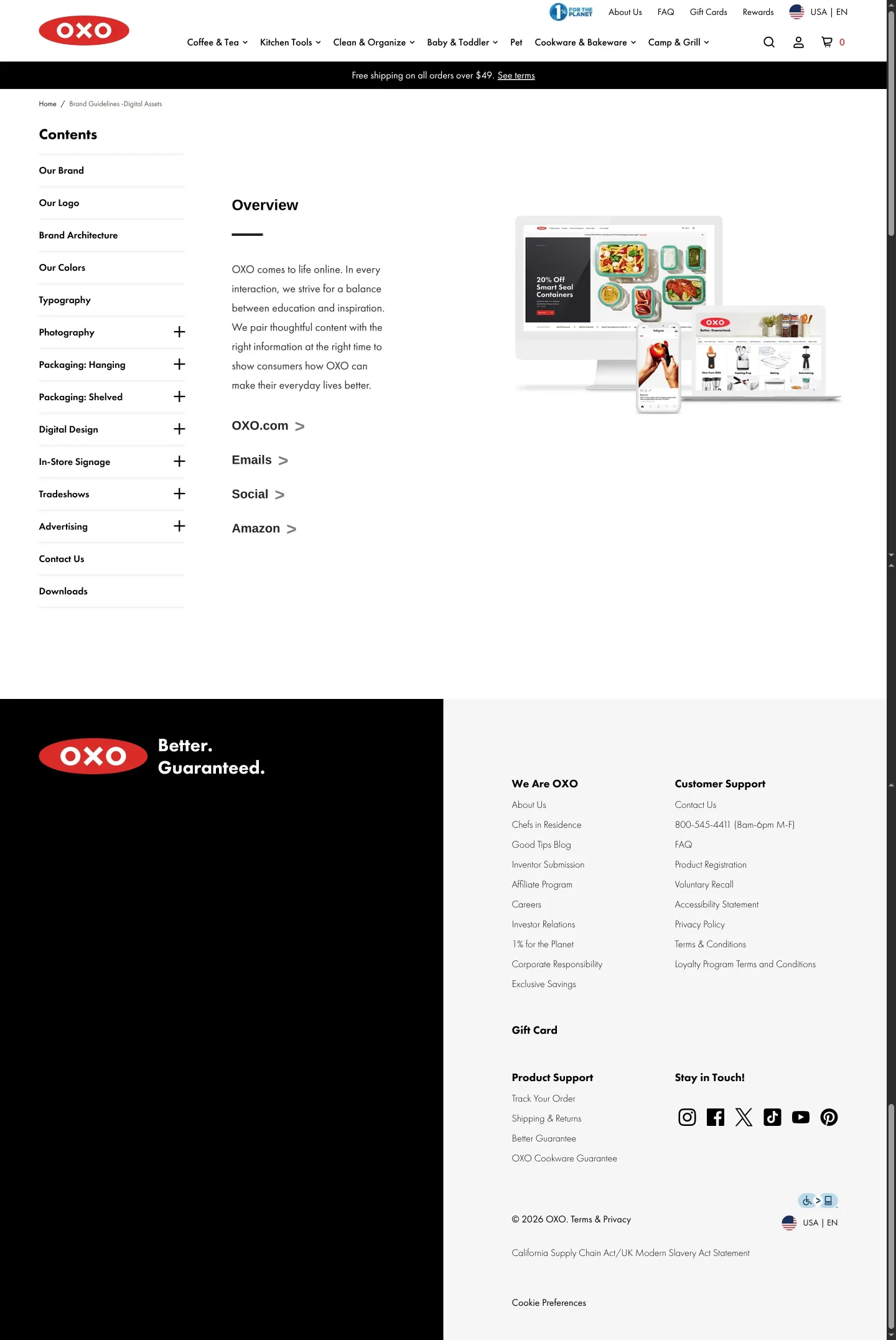
OXO brand guidelines digital assets overview page displaying links to digital design touchpoints alongside device mockups.
Want a brand center like OXO’s?
Create your brand center with Freedam ↗Freedam's take
I like finding public guidelines living directly inside an online shop. OXO houses their entire identity manual within their standard consumer e-commerce site, keeping their store navigation and footer intact. The documentation walks through clear space defined by the letter O, color breakdowns with values across PMS, RGB, CMYK, and HEX, and an extensive misuses section featuring fifteen prohibited logo treatments. They also detail typographic rules using Futura PT across headers, subheaders, and body copy. It is an unpretentious reference that keeps core rules accessible right alongside their everyday retail presence.
At a glance
- Sections
- Our Brand · Our Logo · Brand Architecture · Our Colors · Typography · Photography · Packaging · Digital Design · In-Store Signage · Tradeshows · Advertising · Downloads
- Tone
- Direct, structured, and practical documentation suited for everyday product design and retail execution.
What I noticed
- The brand guidelines pages sit directly within the main OXO consumer e-commerce site framework, retaining the standard header navigation and footer.1
- Spacing guidelines mandate clear space equal to the letter 'O' and define a minimum width of 0.5 in / 1.3 cm for the logo.2
- The logo misuse section outlines fifteen explicit don't examples illustrating prohibited alterations, rotations, effects, and additions.3
- Futura PT serves as the primary typeface, specifying Bold for headers, Medium for subheaders, and Book for body copy.45
- Color specifications define Red, Black, and White with values for PMS, RGB, CMYK, and HEX, alongside sub-brand color blocking for Good Grips, SoftWorks, and Steel.67
Numbers refer to the screenshots above.
What I could not see
- Could not inspect the full content of the Downloads page, as it requires navigating to an external sub-URL.
- Could not view individual file formats available for logo downloads directly from the captured screens.
- Several subsequent page URLs triggered Cloudflare verification screens during capture.
Ideas to borrow
- Publishing brand guidelines as simple pages within an existing content management system or retail site structure avoids the overhead of managing a separate brand portal.1
Quick answers
What is the primary brand font for OXO?
The primary brand font across all communications is Futura PT, using Bold for headers, Medium for subheaders, and Book for body copy.45
What is the minimum size and clear space required for the OXO logo?
The logo requires clear space equal to the letter 'O' and has a minimum width of 0.5 in / 1.3 cm.2
What are the core brand colors for OXO?
The core brand palette consists of Red, Black, and White, defined with PMS, RGB, CMYK, and HEX values.6
Reviewed on 26 September 2026. Request a correction · I built this