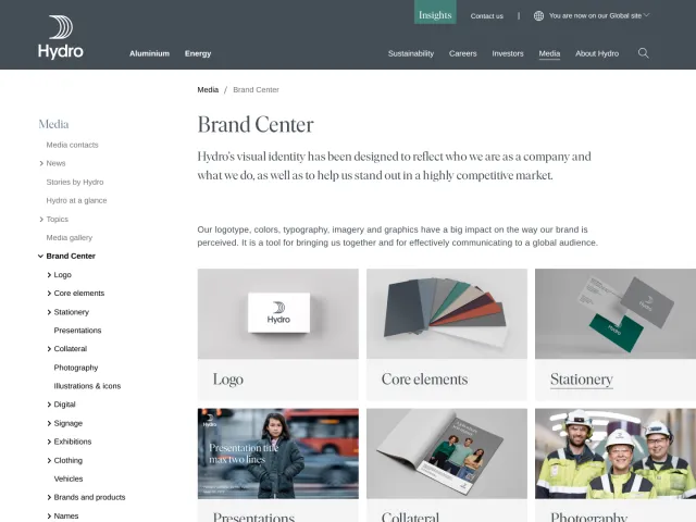
Obsidian brand guidelines
Obsidian provides brand guidelines focused on downloading core identity assets and sharing the story behind its app icon redesign.
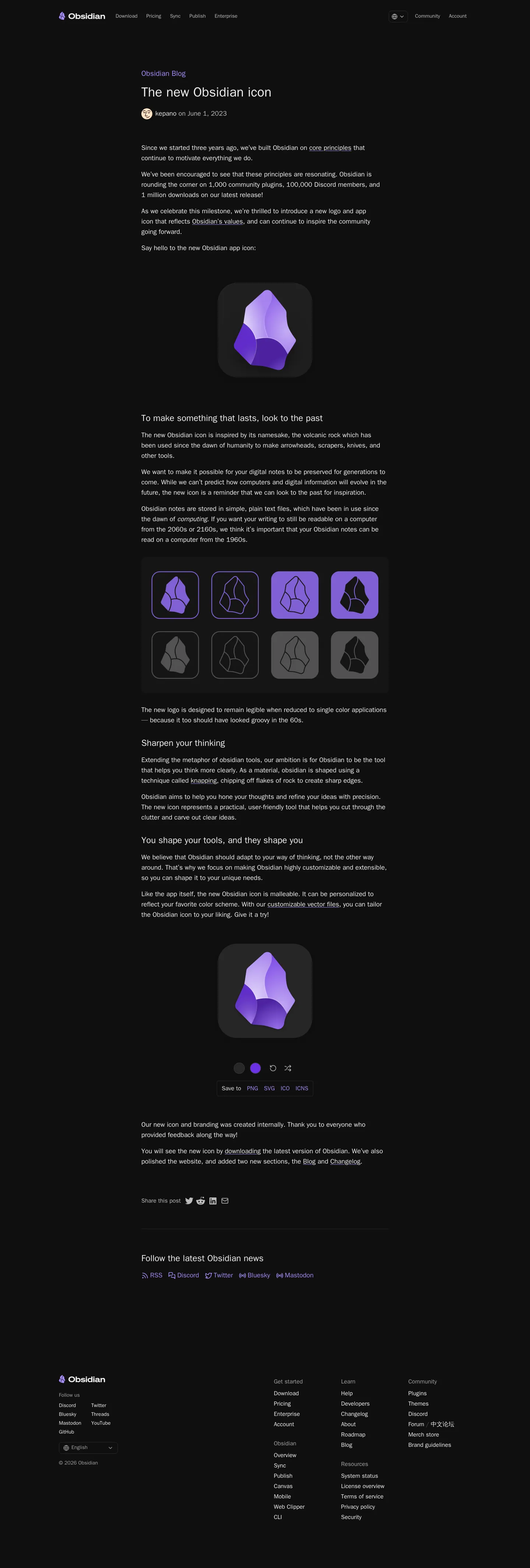
Freedam's take — I like how Obsidian keeps things straightforward for creators and partners looking for official identity elements. Rather than overwhelming you with a massive, rigid design manual, their brand presence centres on delivering essential assets and narrating the evolution of their mark. Reading through the background story of their app icon redesign gives meaningful context into why the shapes and angles were chosen. It feels refreshingly human and aligned with their core product philosophy, offering just enough structure and rationale without getting bogged down in endless corporate rules.
Details
- Type
- Guidelines
- Access
- Public
- Source
- obsidian.md
- Industry
- Technology
- Capabilities
- Downloads
- Tags
- multilingual, brand story, asset downloads, editorial, minimal
- Added
- Last checked
What I noticed
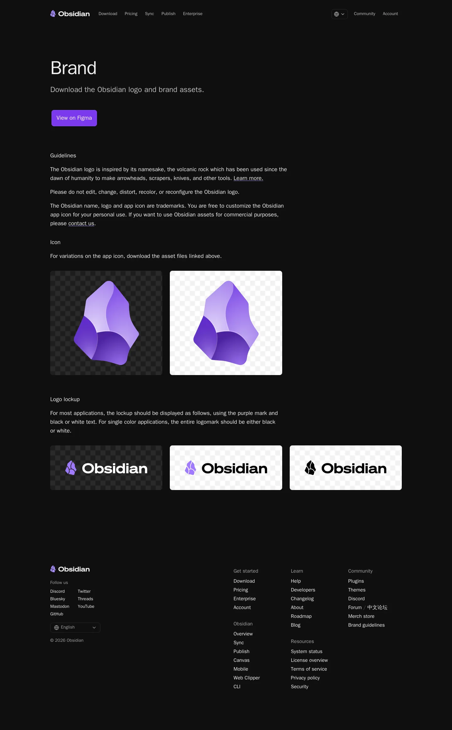
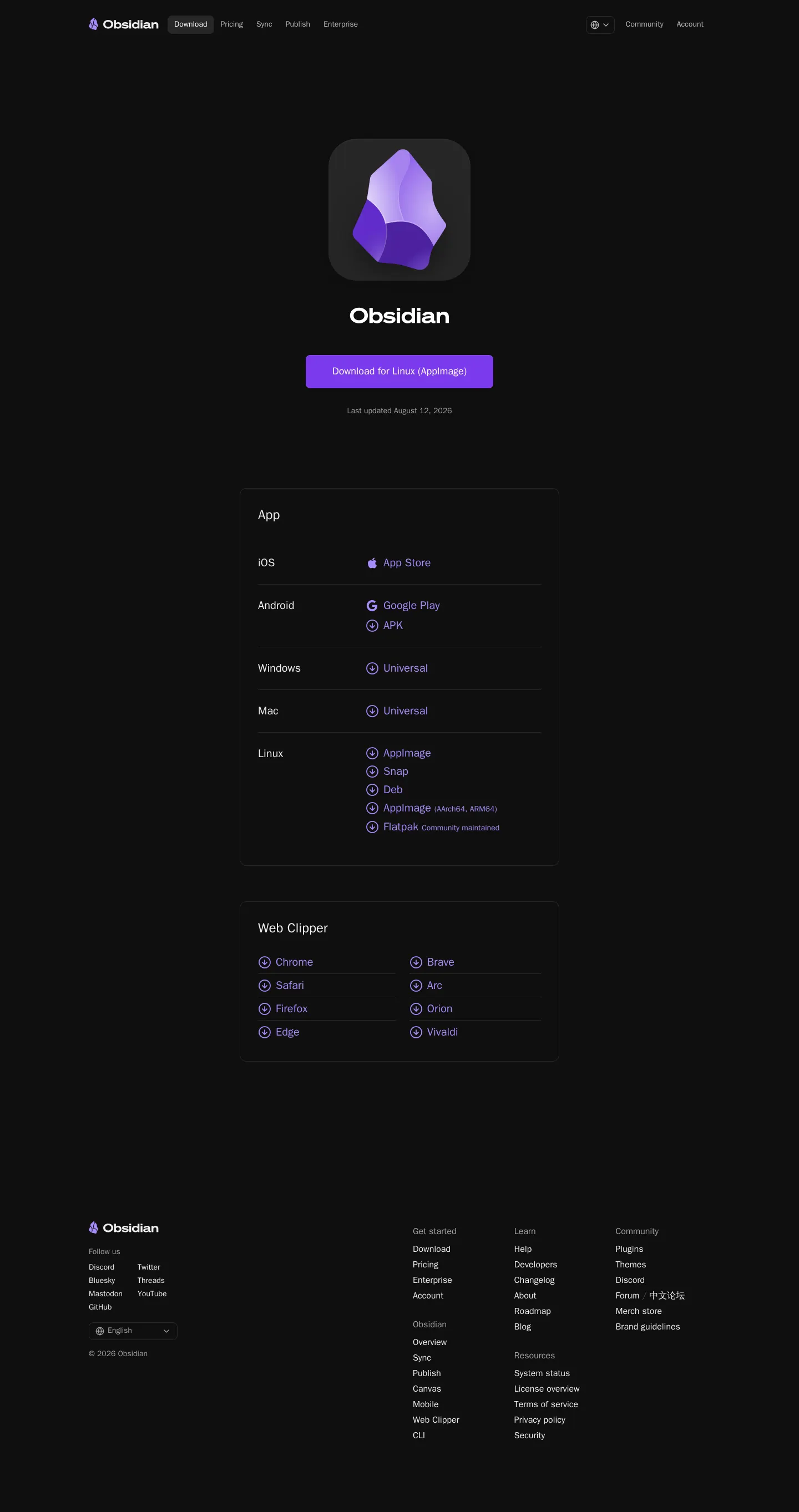
- The brand guidelines page provides direct access to download official assets.12
- A dedicated blog article details the design principles and rationale behind the updated brand icon.345
- The brand section is presented across multiple language locales, including Arabic, Bengali, and German.678
Numbers refer to the screenshots above.
What I could not see
- Could not view specific asset package contents, vector formats, or clearspace guidance from the captured pages.
Ideas to borrow
- Pairing downloadable identity files with an editorial article explaining the symbol's craft helps users understand brand philosophy without heavy rulebooks.
Reviewed on 18 September 2026. Request a correction · I built this