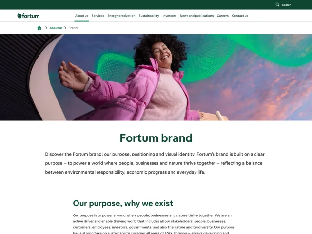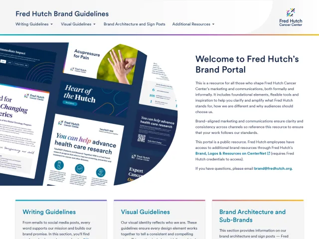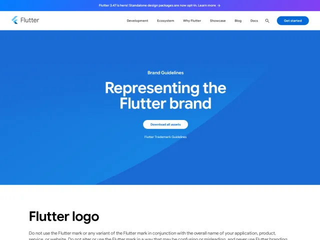
Novo Nordisk brand guidelines
Novo Nordisk provides an organized brand portal detailing foundational identity standards alongside specific asset types and presentation design guidance.
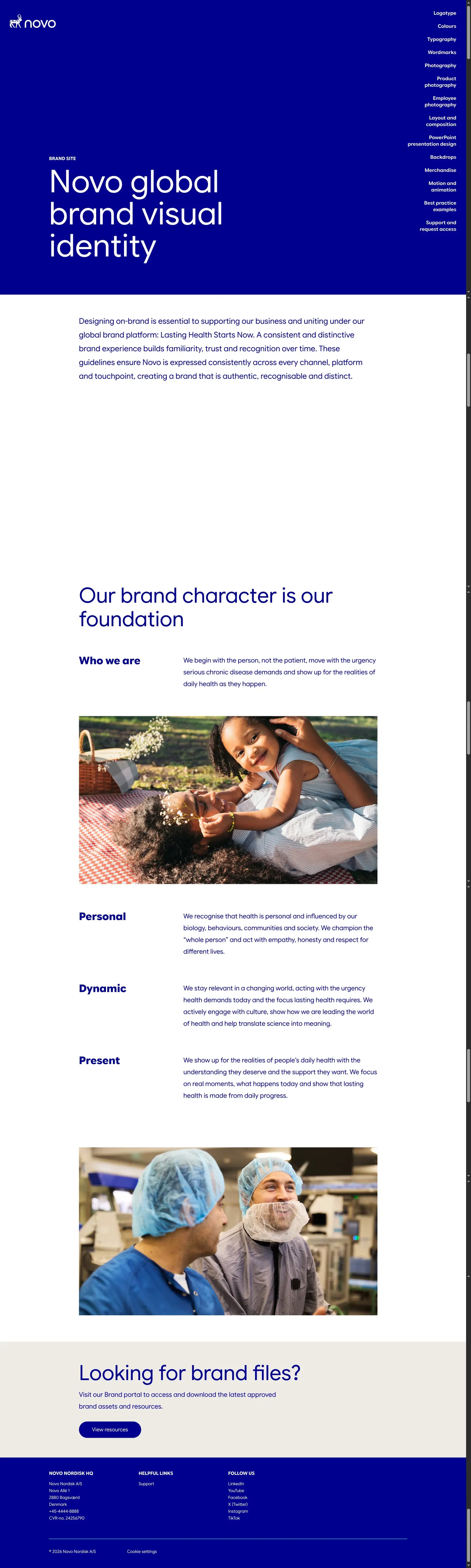
Freedam's take — I like how direct the Novo Nordisk visual identity portal is right from the landing page. It immediately establishes foundational brand values like Personal, Dynamic, and Present alongside a search bar. The navigation shows a clear breakdown of practical application areas, ranging from logotypes and typography to merchandise, backdrops, and PowerPoint presentation design. It also signs off with a clear prompt pointing visitors toward brand asset downloads, keeping the core structure orderly and accessible.
Details
- Type
- Guidelines
- Access
- Public
- Industry
- Health
- Capabilities
- Guidelines, Asset browsing, Search
- Tags
- presentation templates, merchandise, logo usage, typography, photography, search
- Added
- Last checked
What I noticed
- The portal organizes its design guidelines into clear navigation categories including Logotype, Colours, Typography, Wordmarks, and Photography.12345
- The site provides specific sections dedicated to practical executions such as PowerPoint presentation design, Backdrops, and Merchandise.678
- The homepage features brand pillars titled Personal, Dynamic, and Present under the section 'Our brand character is our foundation'.9101112
- A dedicated search function is present on the page.13
Numbers refer to the screenshots above.
What I could not see
- Could not inspect the full contents of individual navigation subpages or verify download permissions for brand files.
Ideas to borrow
- Offering dedicated sections for presentation slide design and event backdrops alongside core identity rules helps teams apply branding accurately in everyday operational contexts.
Reviewed on 18 September 2026. Request a correction · I built this
Similar brand centers
All brand guidelines →