athenahealth brand guidelines
athenahealth provides a focused brand guideline portal covering core identity elements, typography rules, color palettes, and motion principles.
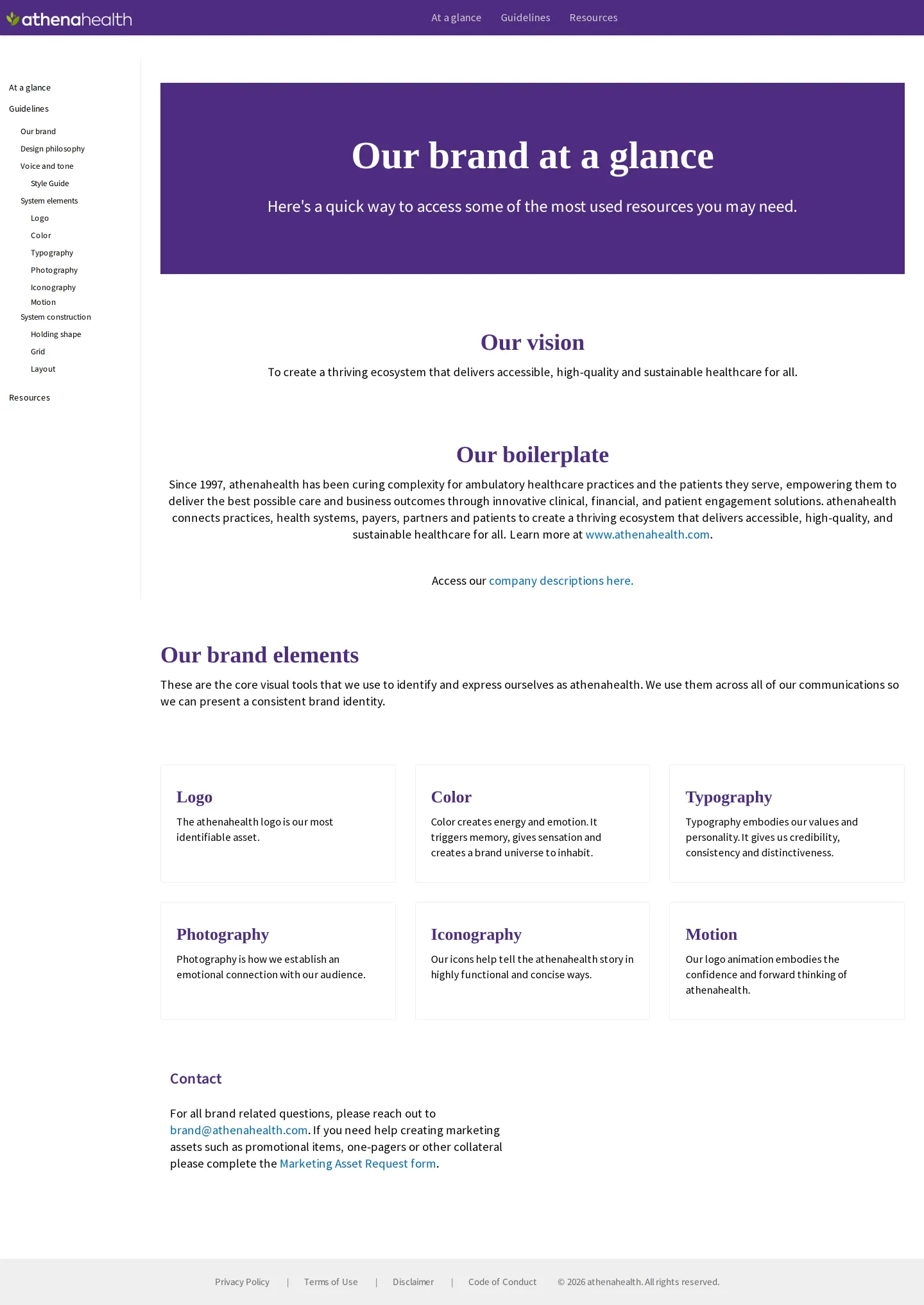
Freedam's take — I like how cleanly organized the athenahealth brand center is right from the start. They set up the primary navigation around just three straightforward pillars: an overview at a glance, thorough guidelines, and shared resources. Delving into the guidelines, they dedicate dedicated space not just to traditional design staples like color palettes, logo lockups, and typography rules, but also to a dedicated motion section. Documenting motion patterns like solo leaf and logo animations gives creative teams clear guidance on bringing identity assets to life across digital touchpoints.
Details
- Type
- Guidelines
- Access
- Public
- Source
- brand.athenahealth.com
- Industry
- Technology, Health
- Capabilities
- Guidelines, Asset browsing, Search, Downloads
- Tags
- motion design, typography, color system, logo usage
- Added
- Last checked



What I noticed
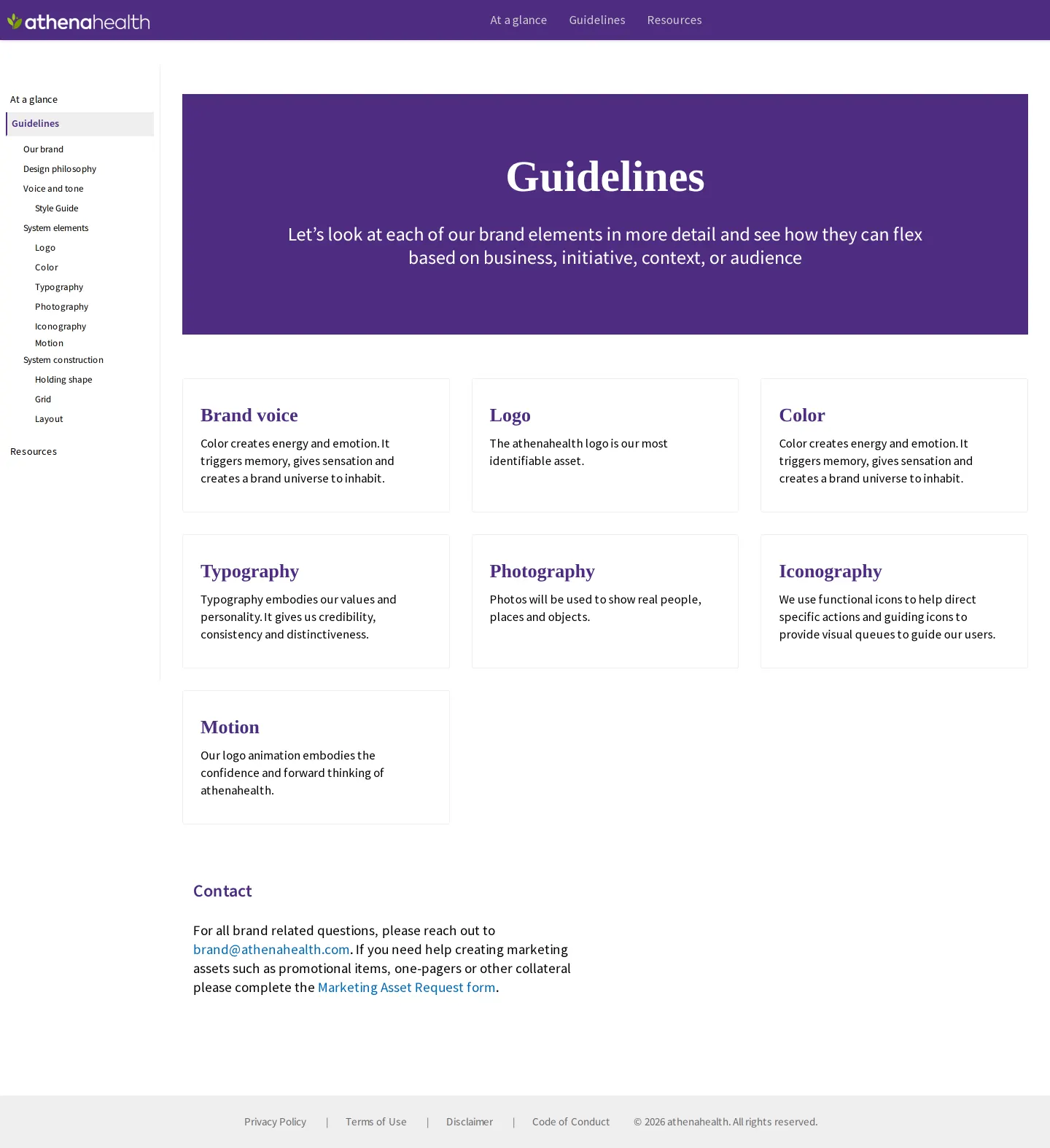
- The site organizes top-level navigation into At a glance, Guidelines, and Resources.123
- A dedicated motion section covers horizontal logo animations, stacked animations, and a solo leaf animation.456
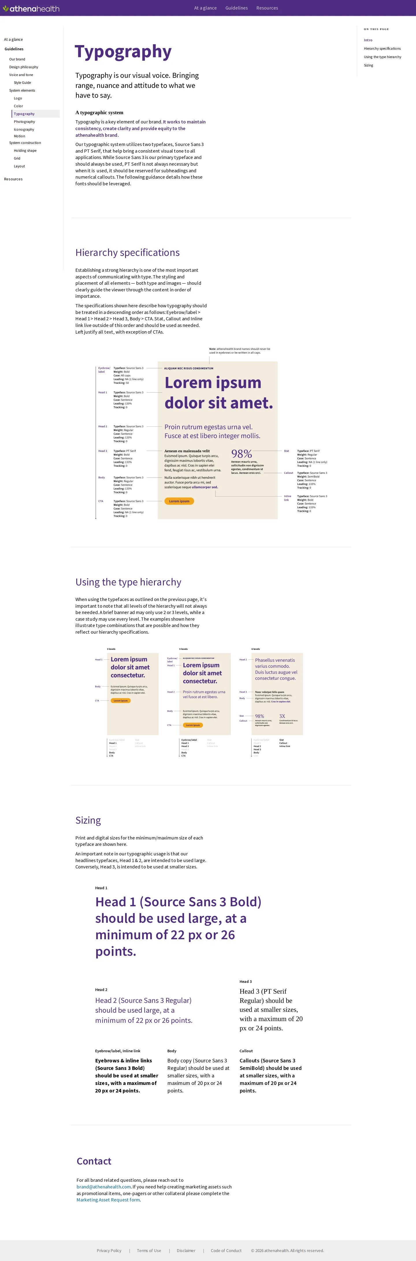
- The typography guidelines specify Source Sans 3 Bold for primary headings with a minimum size of 22 px or 26 points.7
- The color section defines a hero purple alongside primary and secondary palettes, tints, gradients, and combinations.8910111213
Numbers refer to the screenshots above.
What I could not see
- Could not view the contents of the Resources section or downloadable asset repositories beyond the Code of Conduct document.
Ideas to borrow
Reviewed on 18 September 2026. Request a correction · I built this