Nordic Co-operation brand guidelines
The Nordic Co-operation design manual provides comprehensive identity guidelines, logo downloads, colour formulas, and document templates across its regional bodies.
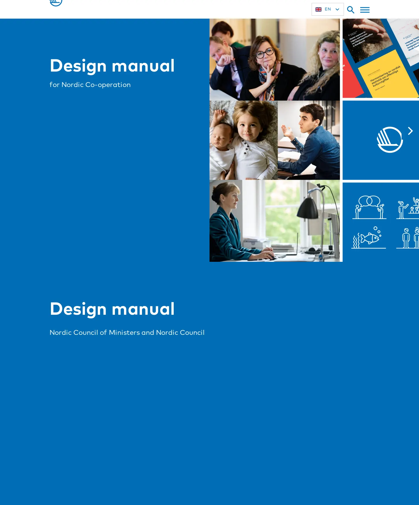
Design manual homepage for Nordic Co-operation featuring an asset preview grid and section navigation.
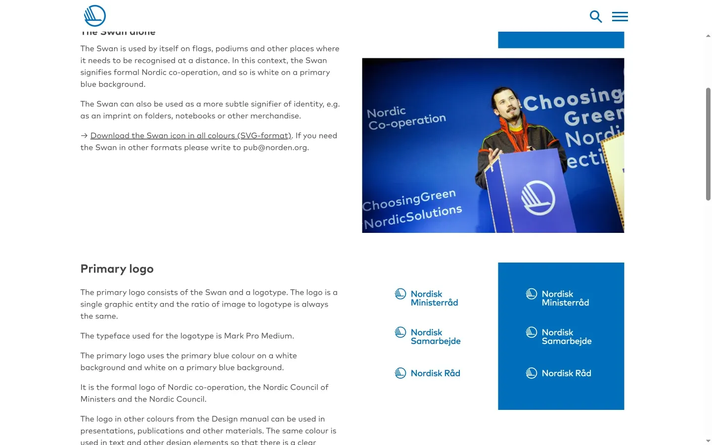
Swan logo rules, real-world podium applications, and asset download links.
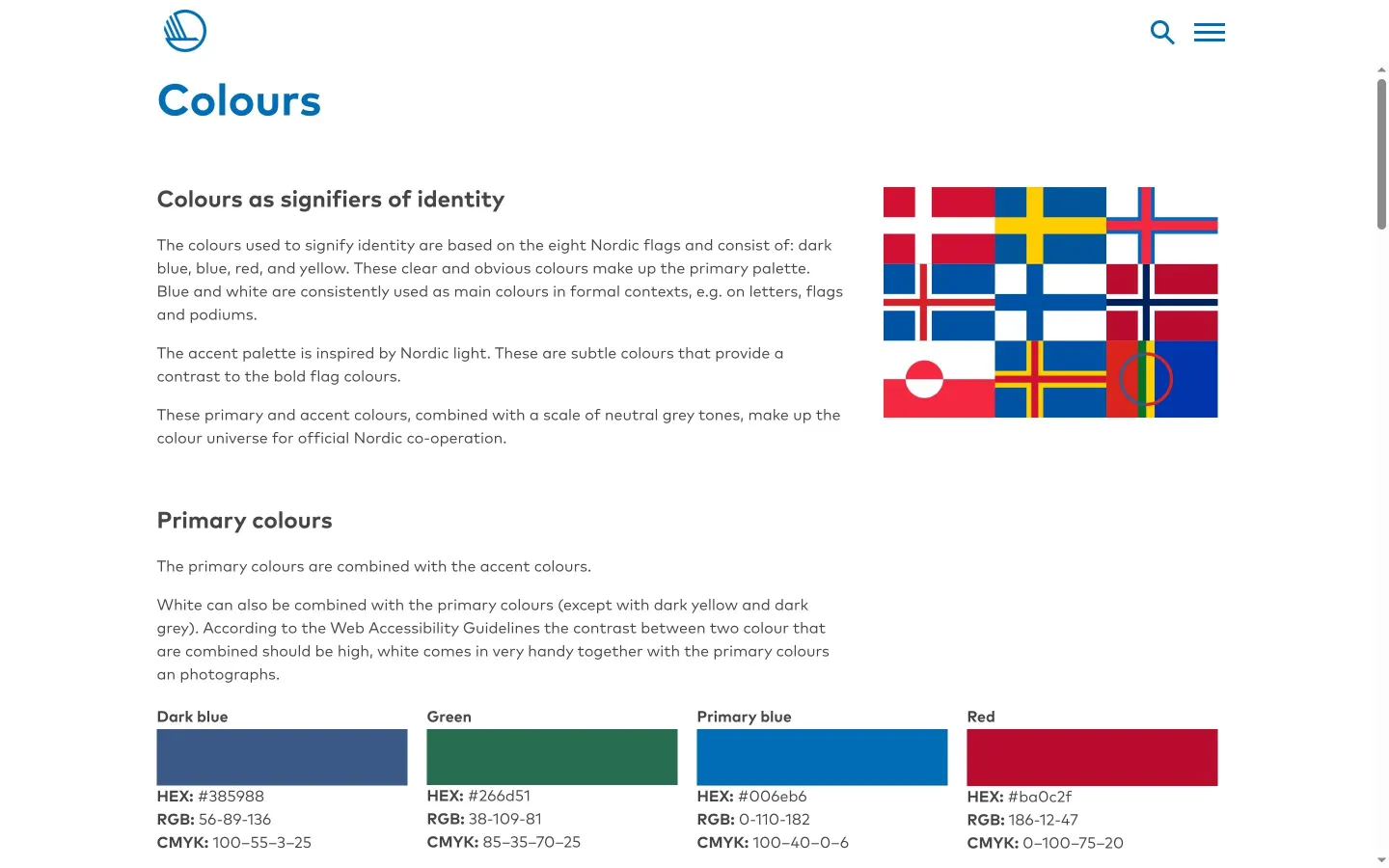
Identity colour swatches derived from eight Nordic flags with print and digital values.
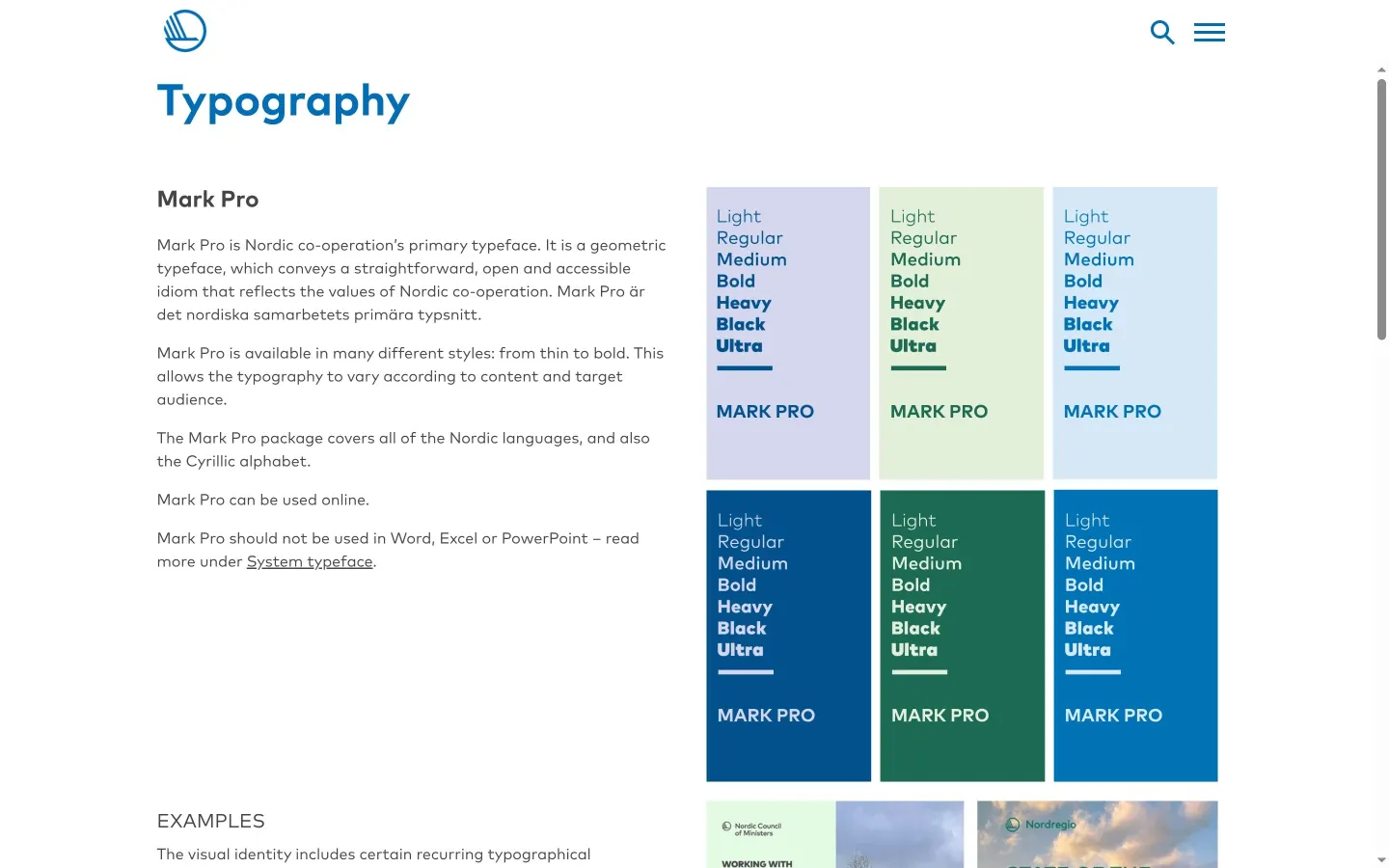
Mark Pro primary geometric typeface specifications, language support, and usage rules.
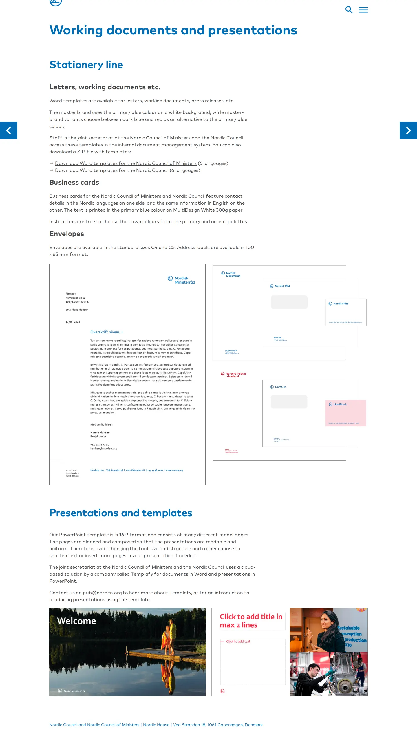
Stationery specifications, paper weights, and downloadable Word templates across six languages.
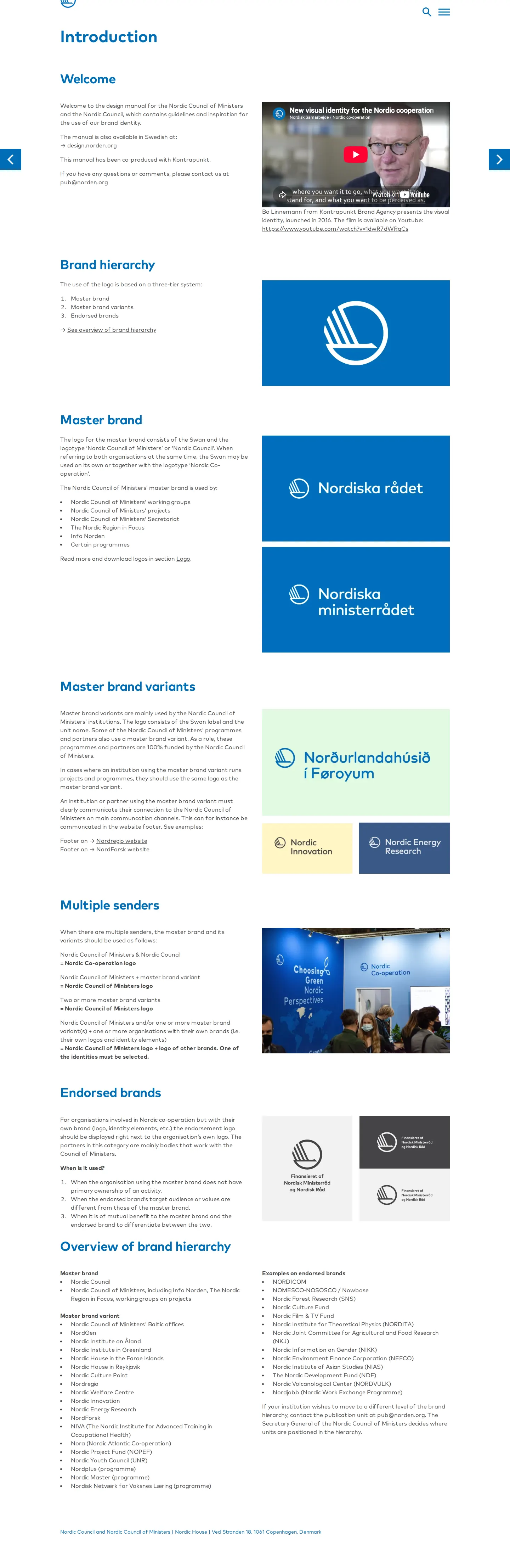
Brand hierarchy overview presenting the three-tier architecture and introductory video.
Want a brand center like Nordic Co-operation’s?
Create your brand center with Freedam ↗Freedam's take
I really appreciate how clearly Nordic Co-operation explains where their visual language comes from. The colour palette directly references the flags of eight Nordic nations, giving the system immediate geographic meaning. I also like how the manual handles the Swan symbol, offering SVG assets directly alongside practical context for podiums and flags. The typography guidance around Mark Pro is honest about where to draw the line, specifically warning teams not to use it inside office software. It feels like an open, usable public sector standard.
At a glance
- Sections
- About this manual · Brand hierarchy · Basic elements · Publications · Digital media · Working documents and presentations · Graphics
- Downloads
- SVG, ZIP
- Tone
- Clear, direct, and civic-minded with an emphasis on practical cross-border implementation.
What I noticed
- The colour system derives its palette directly from eight Nordic flags arranged in an illustrative grid.12
- The primary typeface Mark Pro includes seven weights but is explicitly barred from use in Word, Excel, and PowerPoint in favour of system typefaces.34
- The Swan symbol is distributed as a standalone SVG download package in all colours alongside full lockups for the Nordic Council and Nordic Council of Ministers.5678
- The brand architecture divides the organization into three tiers: Master brand, Master brand variants, and Endorsed brands.910
Numbers refer to the screenshots above.
What I could not see
- Could not view full details of digital publication or web accessibility pages.
- Could not inspect the Swedish language edition hosted on design.norden.org.
Ideas to borrow
Quick answers
What primary typeface is specified in the design manual?
The primary geometric typeface is Mark Pro, specified in weights from Light through Ultra, though it is not permitted for use in Word, Excel, or PowerPoint.1134
Reviewed on 25 September 2026. Request a correction · I built this
Similar brand centers
All brand guidelines →