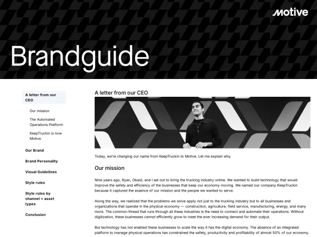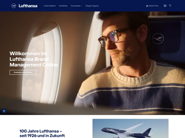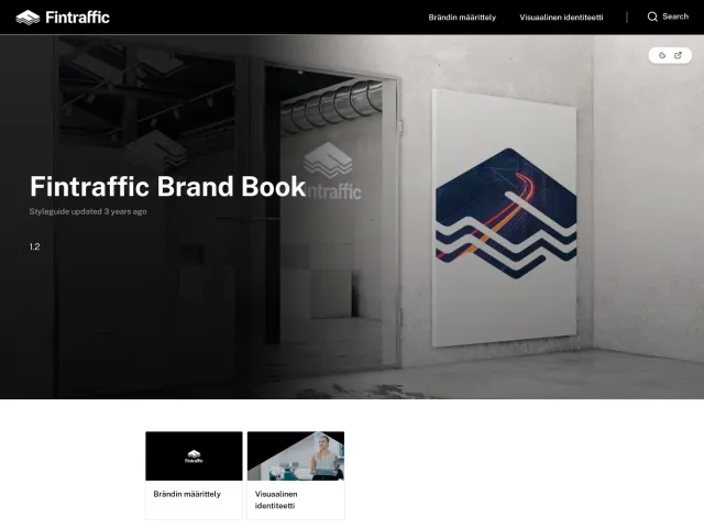
Matkahuolto brand guidelines
Matkahuolto's bilingual brand book outlines core strategy, visual guidelines, and partner logo standards with channel-specific tone of voice meters.
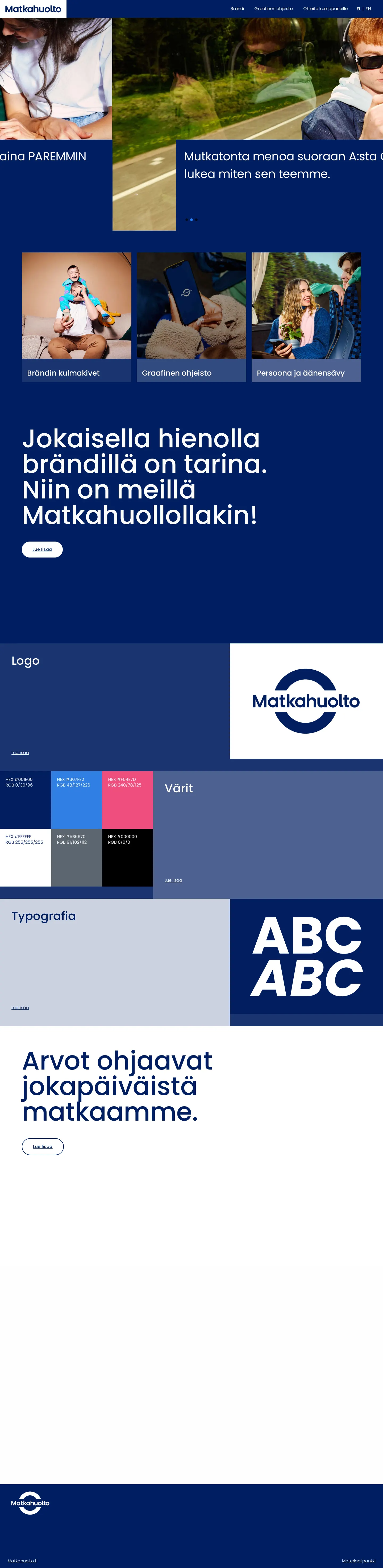
Finnish homepage presenting introductory links to brand pillars, graphic guidelines, logo emblem, typography, and color swatches.
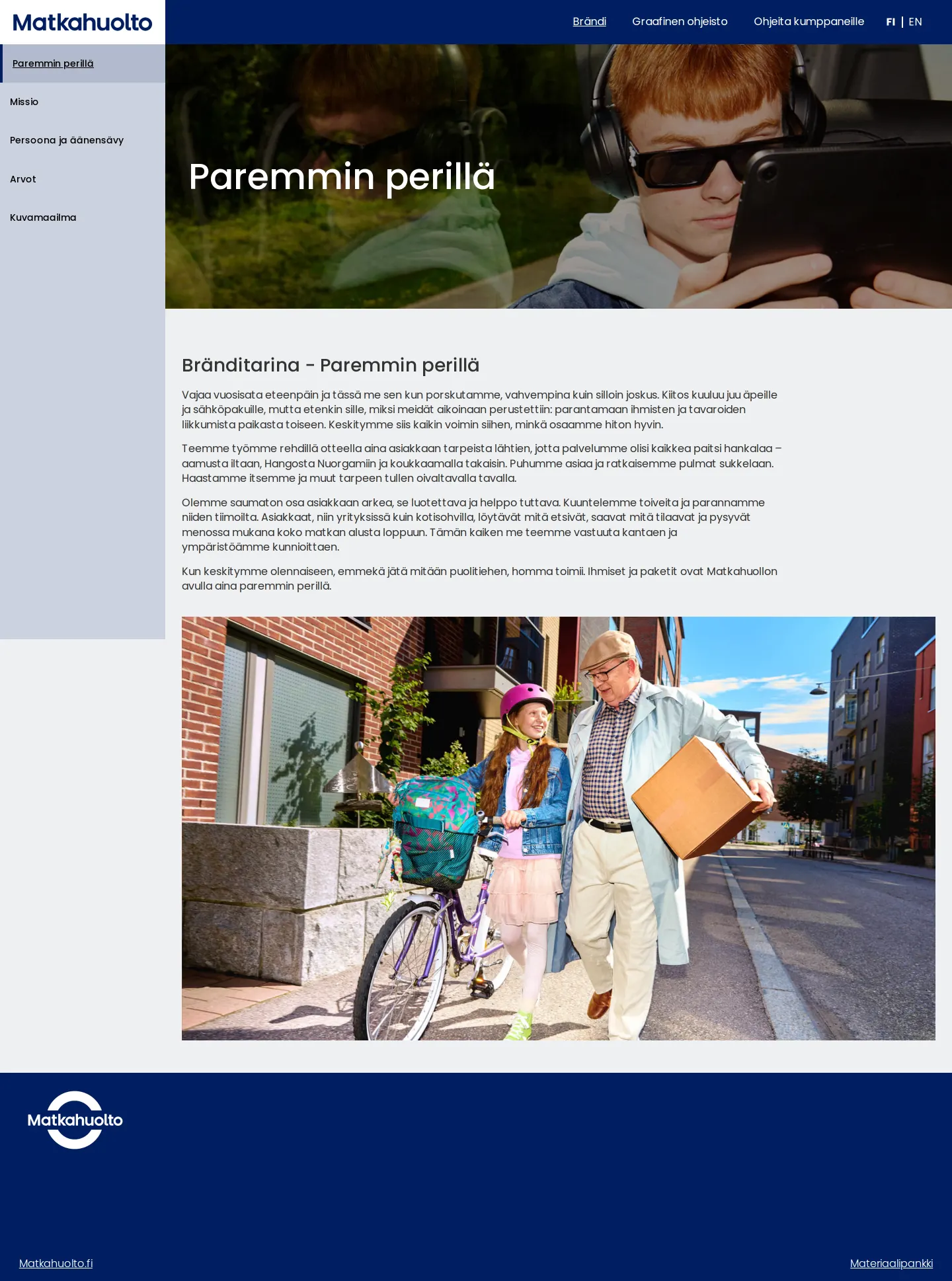
Brand story page featuring narrative text and lifestyle photography under the concept Paremmin perillä.

Graphic guidelines page detailing Kaari-tunnus and Tekstilogo usage, color variants, clear space, and slogan pairings.
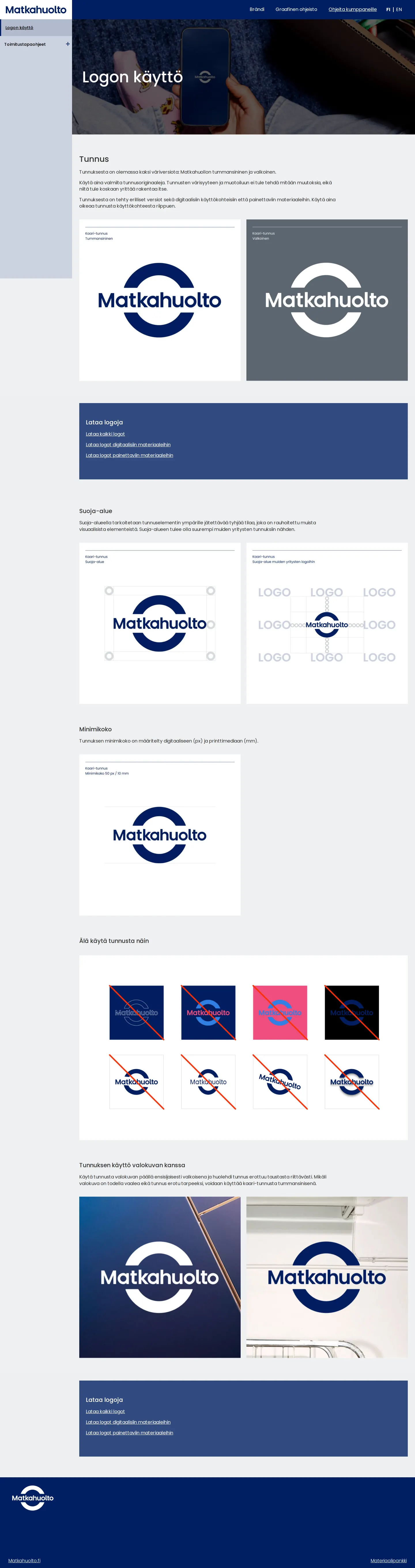
Dedicated partner guide detailing logo clearance, minimum size rules, incorrect applications, and image overlays.
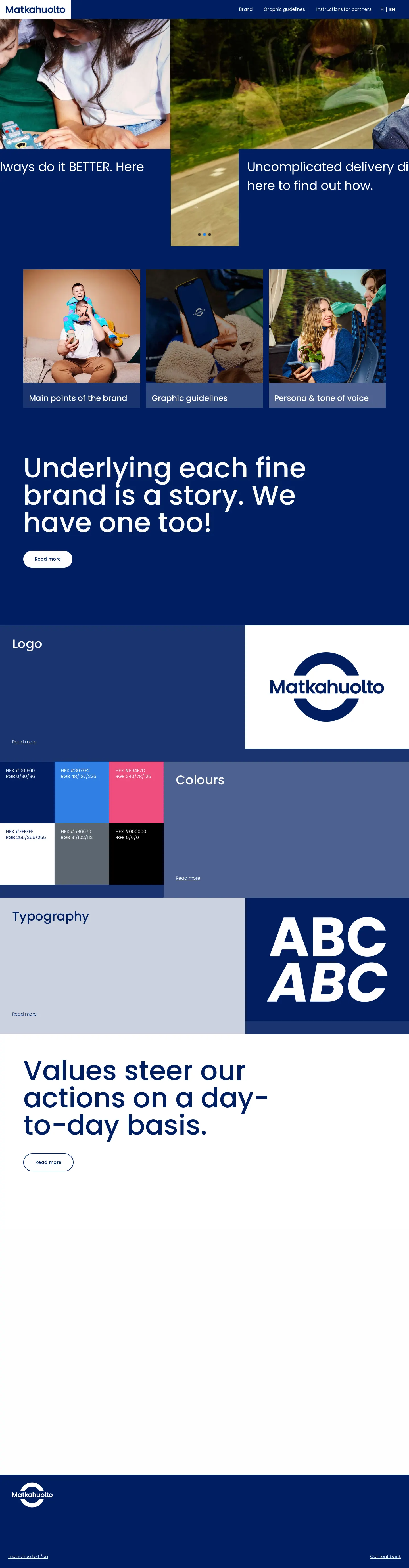
English front page introducing core brand principles, logo mark, color values, and typography previews.
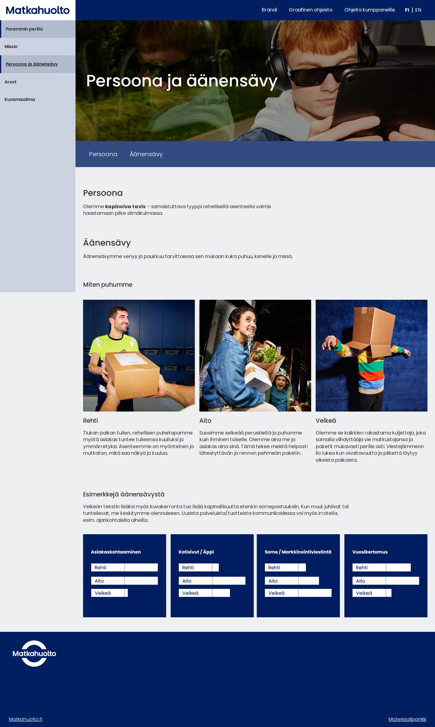
Persona and tone of voice page defining the kapinoiva tavis identity and showing channel-based voice meters.
Want a brand center like Matkahuolto’s?
Create your brand center with Freedam ↗Freedam's take
I like how clear and pragmatic Matkahuolto's online brand book feels right from the start. Built on WordPress, it splits its guidance cleanly between core brand strategy and everyday visual execution. One detail that really stands out to me is on the tone of voice page, where they take three voice pillars and chart them across channel-specific bar meters, showing how to balance them from customer service to annual reports. Giving partners their own dedicated portal section for logo clearances and misuses is another smart touch.
At a glance
- Sections
- Brändi · Graafinen ohjeisto · Ohjeita kumppaneille
- Tone
- Direct, structured, and practical guidelines designed for internal teams and external partners alike.
What I noticed
- The website is built on WordPress 7.1 and offers complete navigation structures in both Finnish and English.123456
- The tone of voice guidelines illustrate the balance of three attributes—Rehti, Aito, and Veikeä—using horizontal bar meters across four specific communication channels.78
- A dedicated partner instructions page defines logo minimum sizes at 50 px / 10 mm and demonstrates clear space and photo placements.9101112
- The logo guidelines present both the circular Kaari-tunnus and the secondary Tekstilogo alongside an eight-example incorrect usage grid.13141516
Numbers refer to the screenshots above.
What I could not see
- Could not inspect the external Materiaalipankki asset repository to confirm file formats or direct downloads.
- Could not view full typography download packages or specific font licensing details beyond the specimen displays.
Ideas to borrow
- Calibrating tone of voice attributes with horizontal meter bars across specific channels helps creators understand how to dial personality up or down depending on the medium.8
Quick answers
What is the minimum size for the Matkahuolto logo?
The partner guidelines specify a minimum logo size of 50 px for digital applications and 10 mm for print.11
Reviewed on 26 September 2026. Request a correction · I built this
Similar brand centers
All brand guidelines →