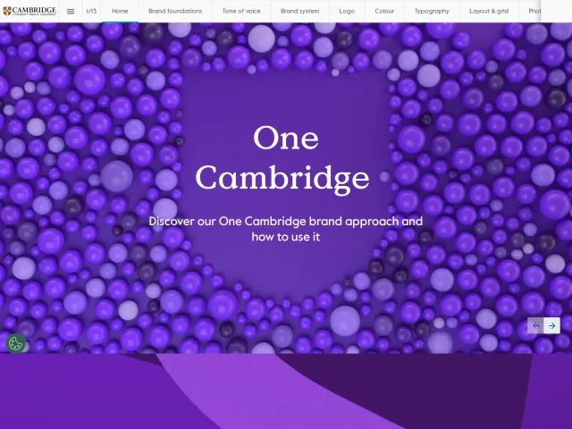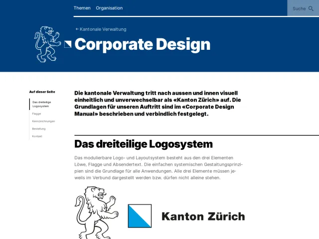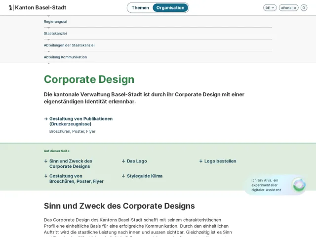
Massachusetts Institute of Technology brand guidelines
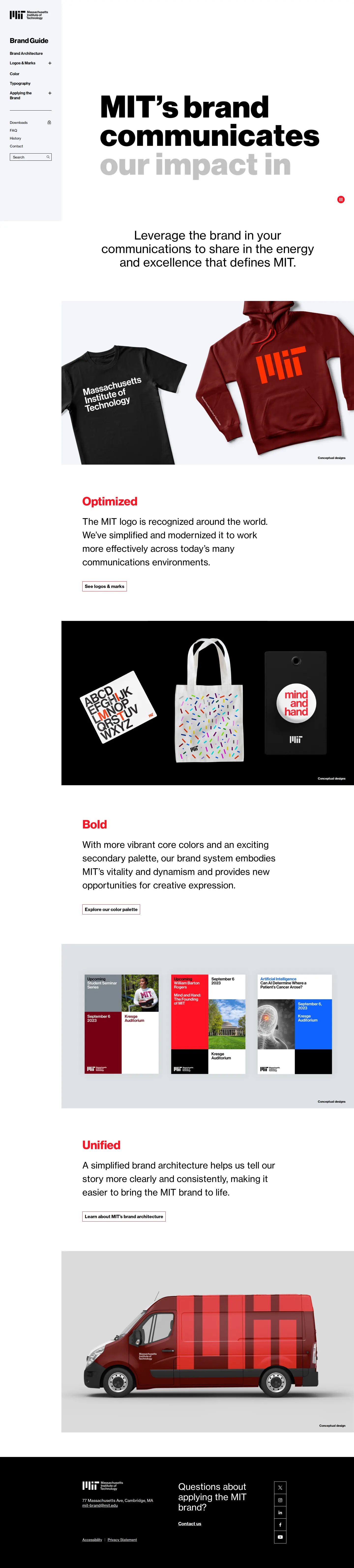
The MIT Brand Guide offers clear documentation on brand architecture, identity marks, color systems, typography, and downloadable assets for the university community.
Freedam's take — I really appreciate how clean and straightforward the MIT brand guide feels. It gets right to work detailing core elements like Neue Haas Grotesk, the primary mark, and color palettes without extra noise. The brand architecture section is particularly practical, breaking down parent, sub-brand, and endorsed relationships across multiple line configurations. Pairing this with explicit guidance on typography access through Adobe and Google Fonts makes implementation practical for campus teams. It is a thoughtful, structured design portal that respects the complexity of a massive institution while remaining approachable.
Details
- Type
- Guidelines
- Access
- Public
- Source
- brand.mit.edu
- Industry
- Education
- Capabilities
- Guidelines, Search, Downloads, Templates
- Tags
- brand architecture, typography, logo usage, color system, accessibility
- Added
- Last checked

What I noticed
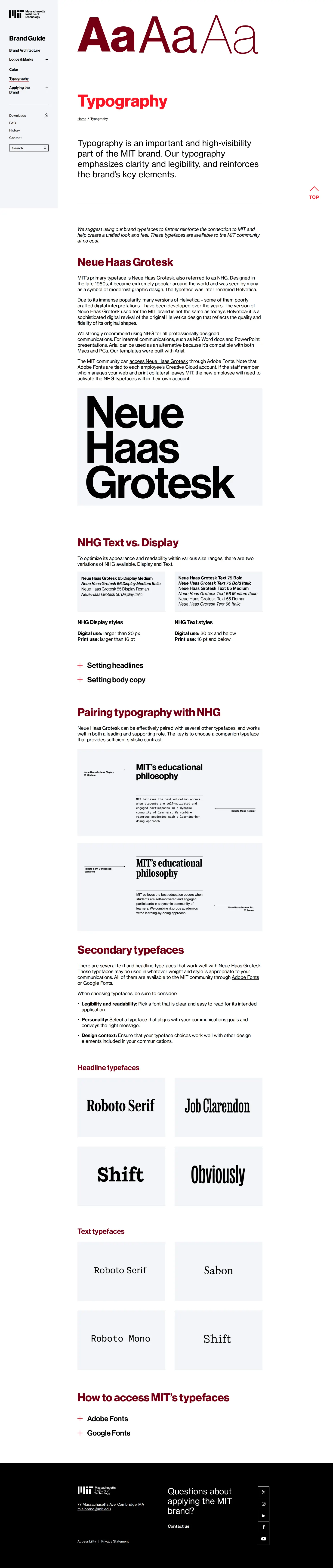
- The typography documentation specifies Neue Haas Grotesk with guidance for Text versus Display styles, alongside secondary font pairings.1234
- Brand architecture is organized into parent brand, sub-branding, and endorsed branding with distinct multi-line typographic lockups.567891011
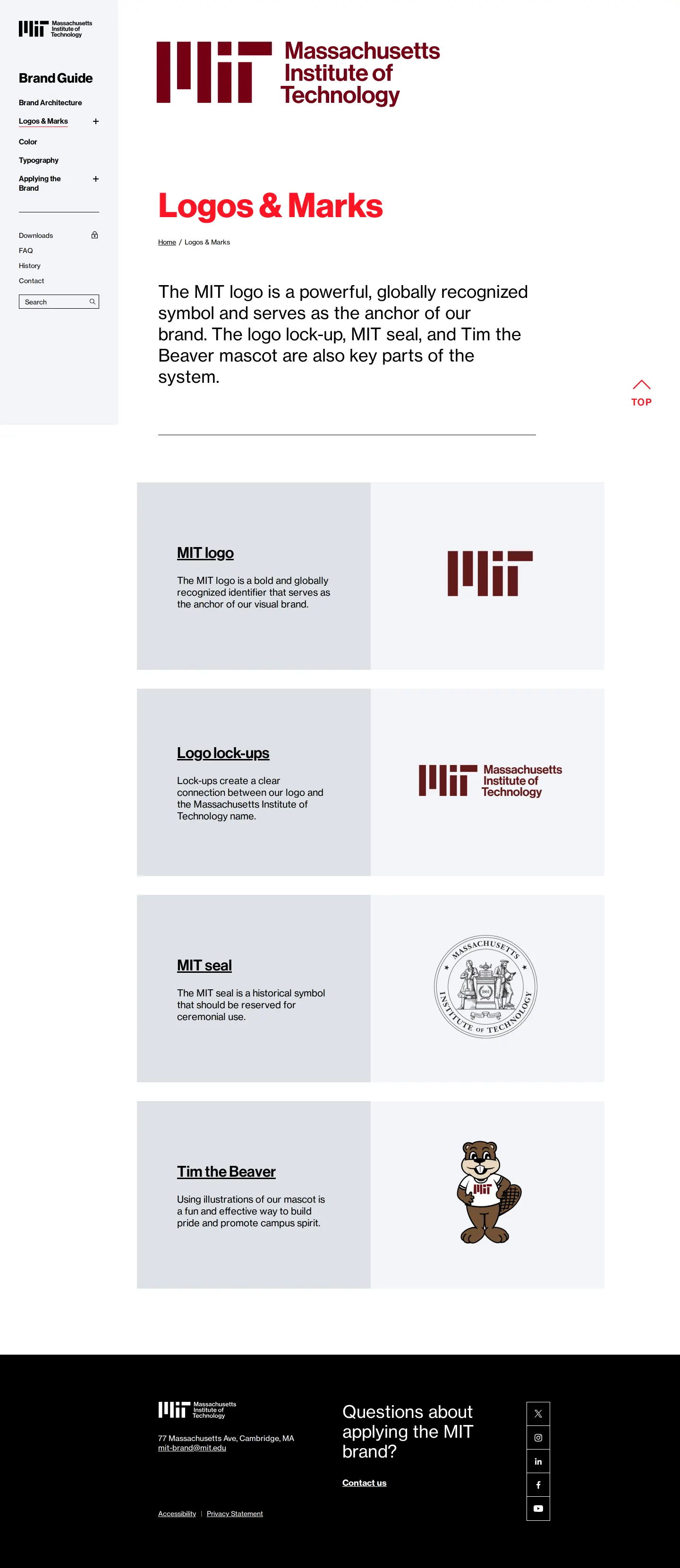
- The identity system includes guidelines for Tim the Beaver and the official MIT seal alongside the main logo.121314
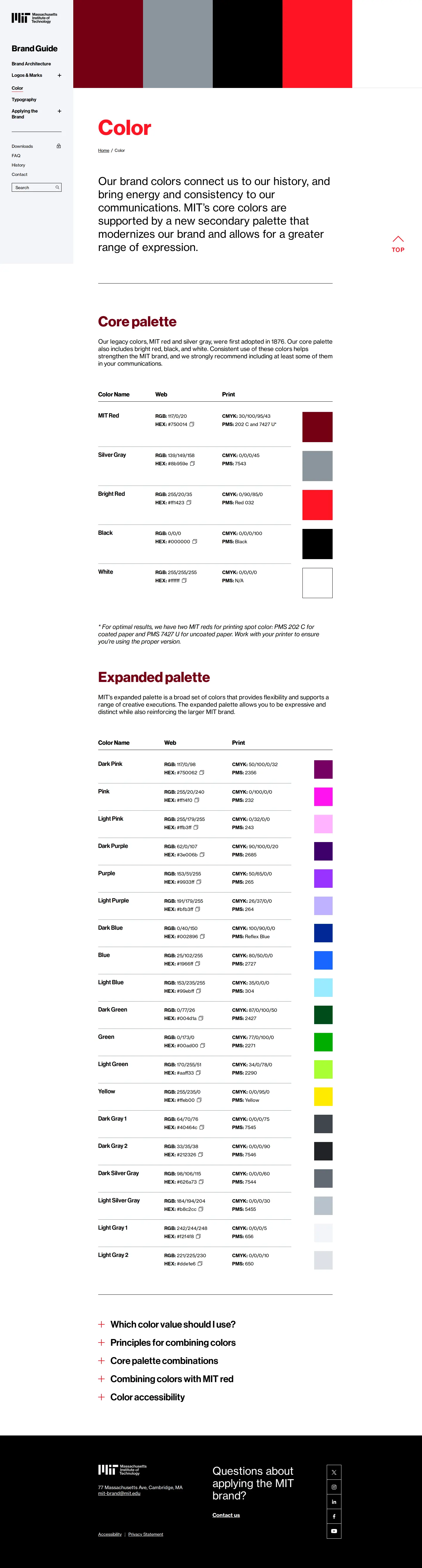
- The color guide addresses accessibility and provides rules for combining palette colors with MIT red.1516
Numbers refer to the screenshots above.
What I could not see
- Could not view the contents of the downloads hub or asset files directly.
- Could not inspect the full text and interactive examples on the Applying the Brand and FAQ pages.
Ideas to borrow
Reviewed on 18 September 2026. Request a correction · I built this
Similar brand centers
All brand guidelines →