International Motors brand guidelines
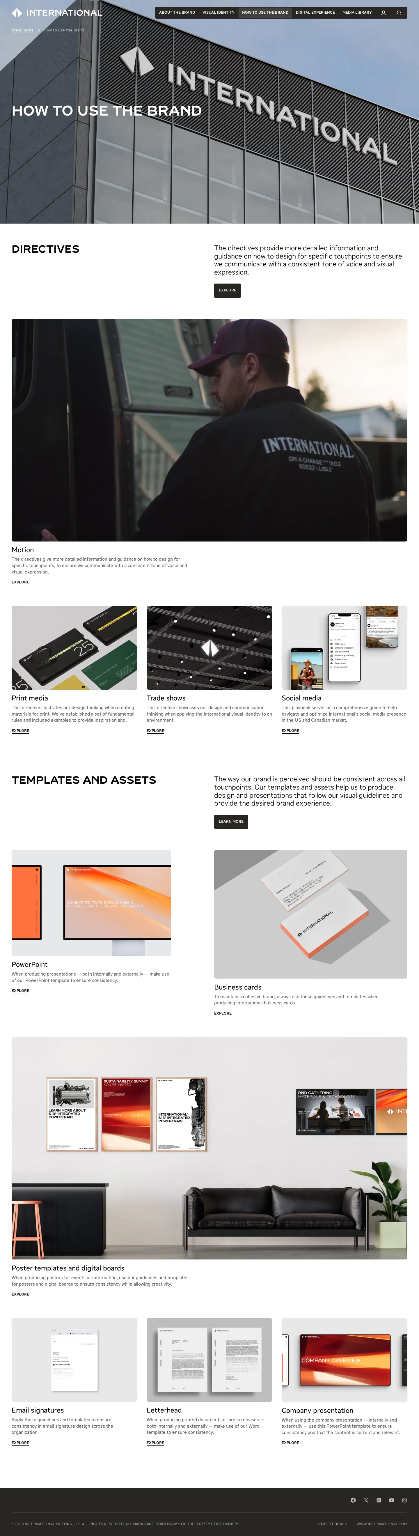
International Motors brand portal offers comprehensive brand strategy and visual identity guidelines, including detailed typography and application rules.
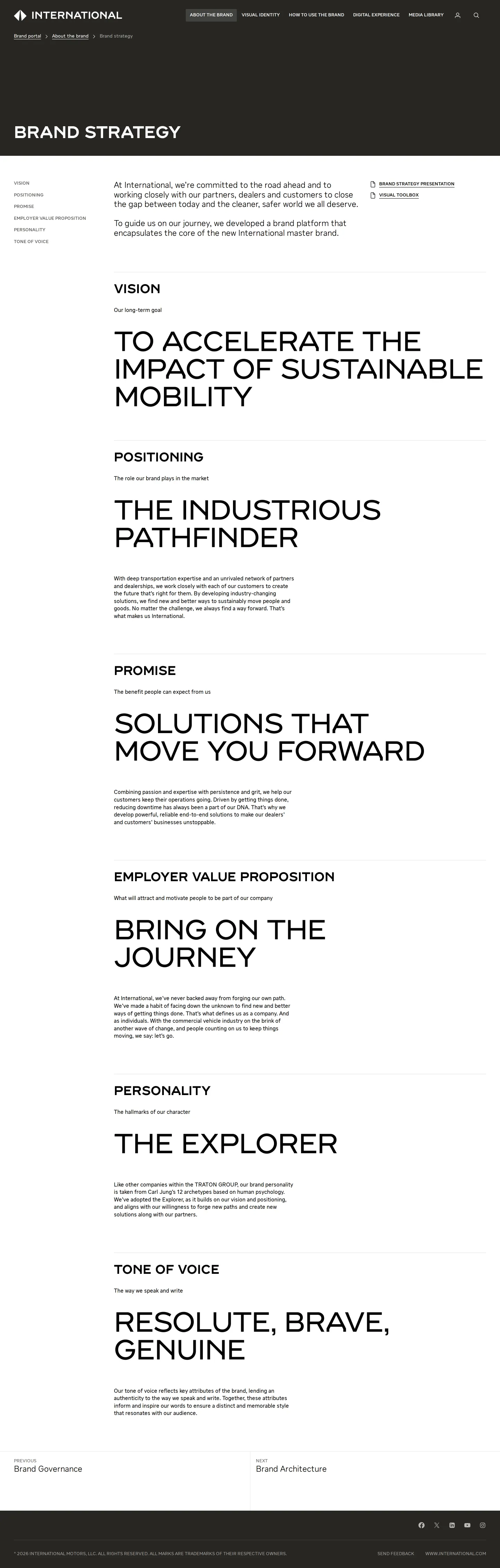
Freedam's take — I spent some time looking through the International Motors brand portal, and I really appreciate how thoroughly the core visual elements are broken down. The typography section goes into practical craft details, from line spacing and weight pairings to specific rules for fallback fonts and asterisks. They also clearly map out their strategic foundations, covering everything from employer value proposition to tone of voice. While the dedicated media library is kept behind a sign-in screen, the public pages provide a thoughtful look into their design DNA and overarching identity system.
Details
- Type
- Guidelines
- Access
- Public
- Source
- brand.international.com
- Industry
- Automotive, Industrial
- Capabilities
- Guidelines, Asset browsing, Search, Templates
- Tags
- typography, brand story, tone of voice, gated access, media library
- Added
- Last checked


What I noticed
- The typography documentation details specific typefaces named INTL Headline and INTL Text along with fallback system fonts.123
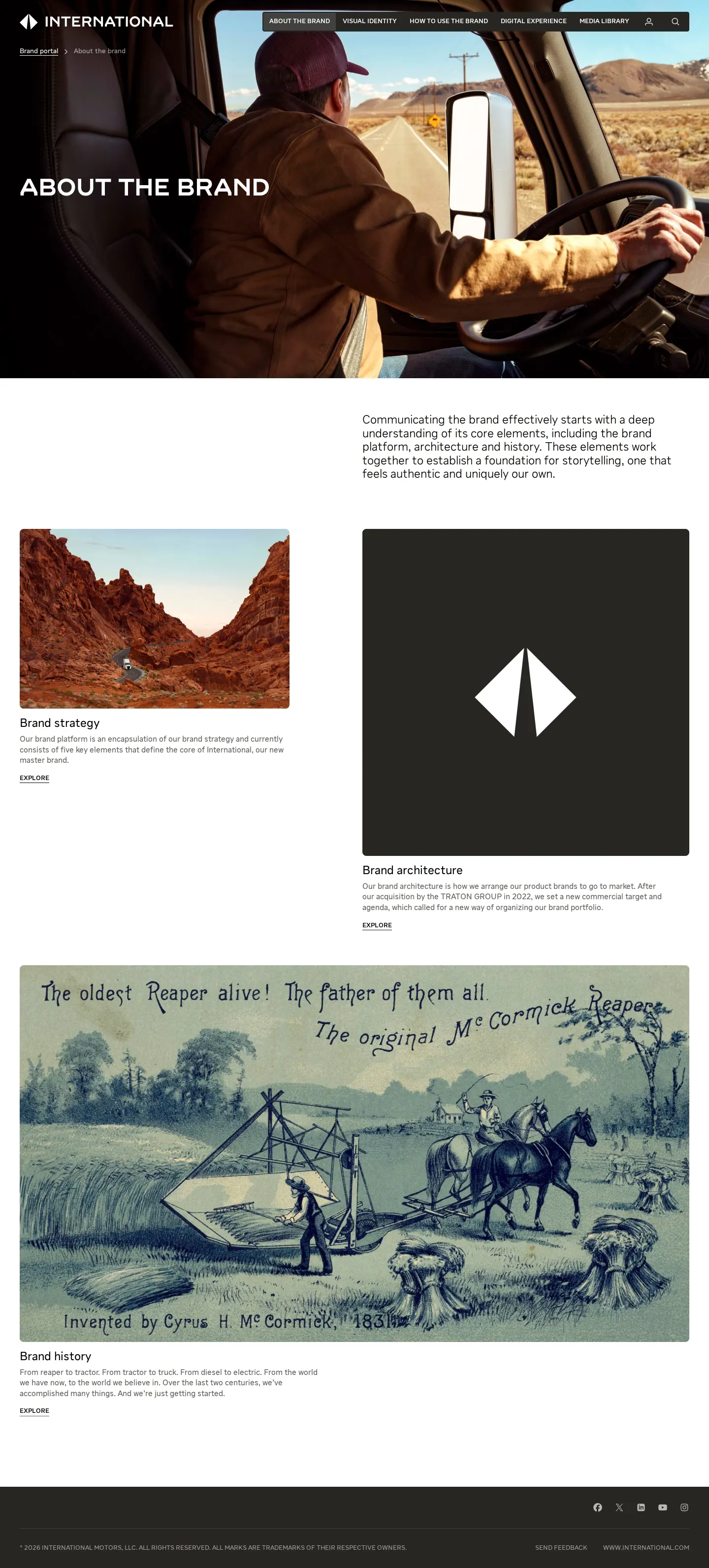
- The brand strategy section outlines vision, positioning, promise, employer value proposition, personality, and tone of voice.45678910
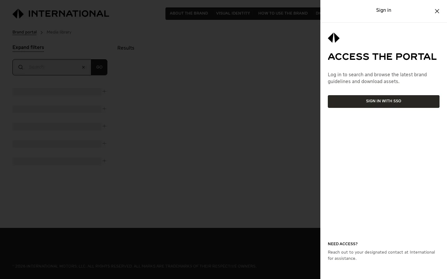
- Access to the media library section requires signing in.1112
- The typography guidance pays unusual attention to typographic micro-rules like asterisk usage and top alignment.1314
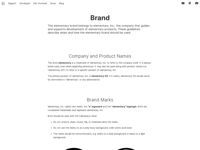
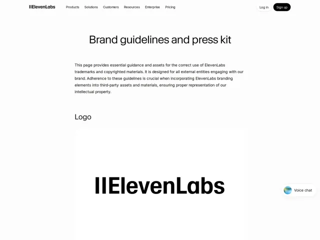
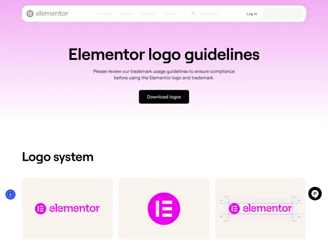
Numbers refer to the screenshots above.
What I could not see
- Could not view the contents of the media library due to an authentication sign-in screen.
- Could not view the downloadable template files or asset links directly from the capture.
Ideas to borrow
Reviewed on 18 September 2026. Request a correction · I built this
Similar brand centers
All brand guidelines →