IE University brand guidelines
IE University presents a zeroheight-hosted design system featuring brand foundations, individual school brand kits, presentation templates, and Figma resources.
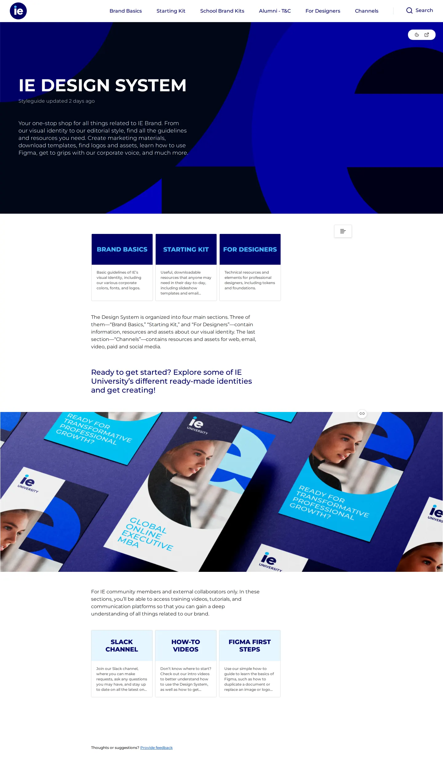
IE Design System homepage featuring top navigation, core section cards, collateral imagery, and onboarding resources.
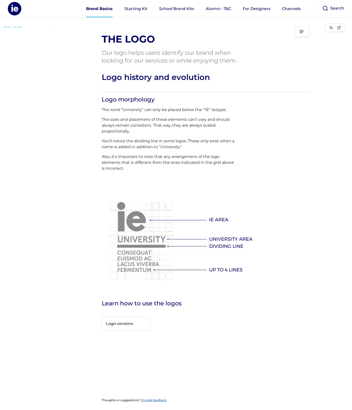
Logo documentation page outlining logo morphology rules, placement of University lettering, and sidebar navigation.
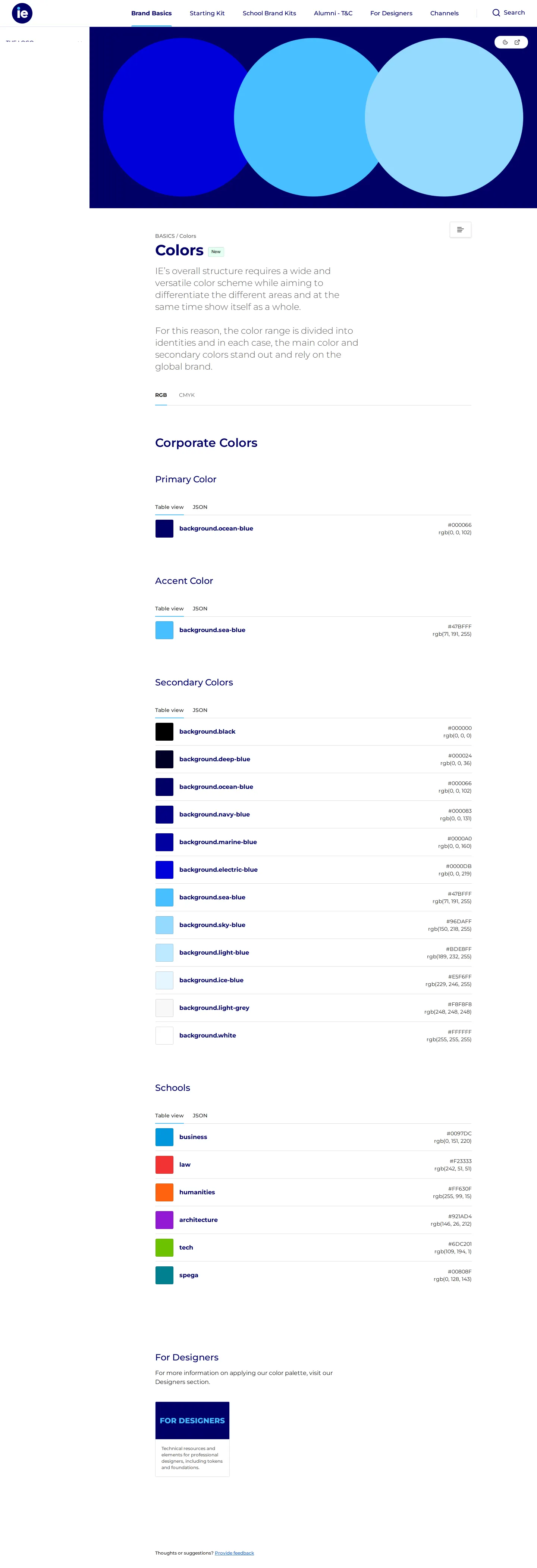
Brand colors page displaying corporate and school color palettes with RGB, CMYK, and JSON viewing options.
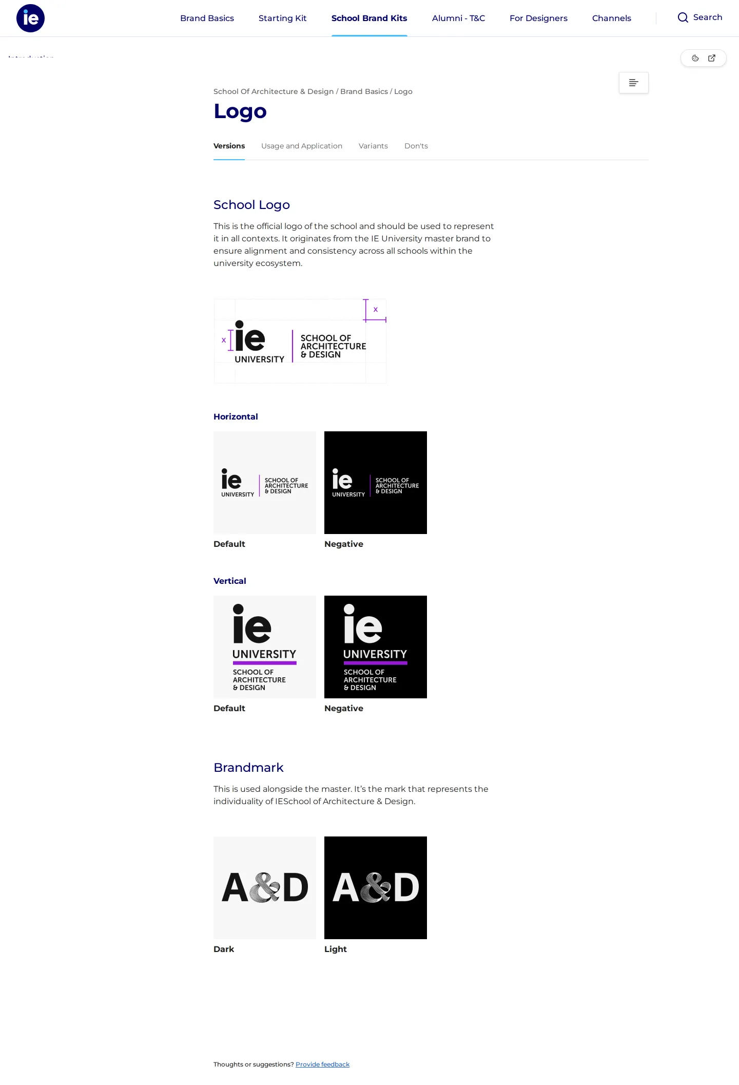
School of Architecture & Design guidelines detailing lockup clear space units, color variants, and the A&D brandmark.
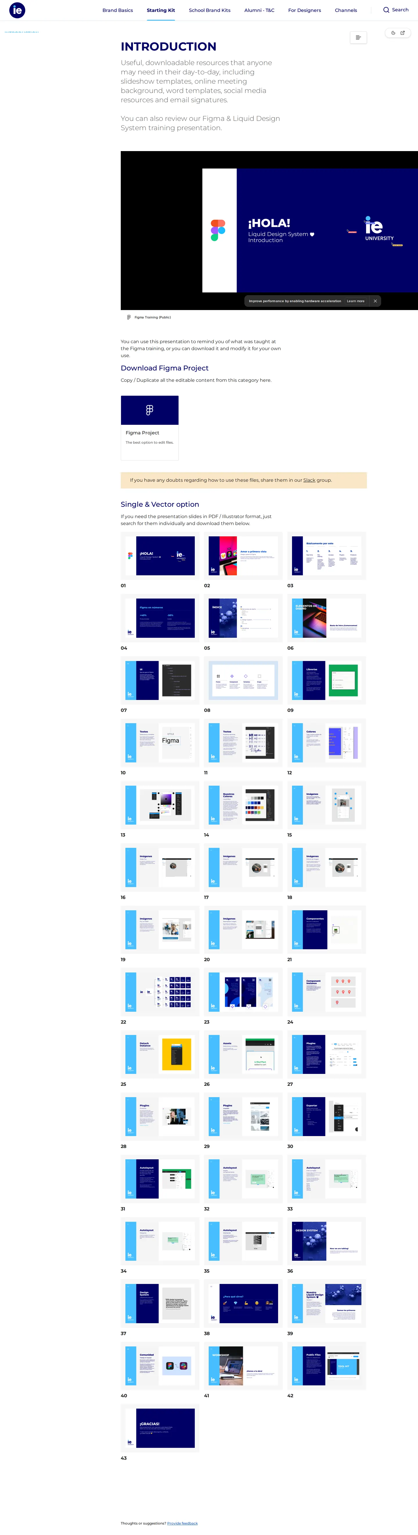
Starting kit introduction page featuring an embedded Figma training presentation, template lists, and slide assets.
Want a brand center like IE University’s?
Create your brand center with Freedam ↗Freedam's take
I like how pragmatic IE University is with this design portal. Built on zeroheight, it serves a complex academic institution without feeling overwhelming. I noticed they separate general brand foundations from tailored school brand kits, giving entities like the School of Architecture & Design their own logo variants and clear space rules. The starting kit is especially thoughtful, providing presentation slides, diploma files, and Figma onboarding decks alongside everyday assets. The color palette page even lets you switch between RGB and CMYK or export as JSON, making the system genuinely useful for both designers and staff.
At a glance
- Sections
- Brand Basics · Starting Kit · School Brand Kits · Alumni - T&C · For Designers · Channels
- Downloads
- Figma, PDF, Illustrator
- Tone
- Structured, educational, and modular brand portal built for university departments and designers.
What I noticed
- The portal separates brand documentation into Brand Basics, Starting Kit, School Brand Kits, Alumni - T&C, and For Designers.12345
- The color guidelines page includes toggles between RGB and CMYK models, as well as a JSON view alongside the table view.6
- School Brand Kits provide distinct sub-brand guidance, such as clear space diagrams and brandmarks for the School of Architecture & Design.789
- The starting kit section embeds a training viewer labeled 'Liquid Design System Introduction' and lists downloadable templates for slides, diplomas, and meetings.1011
Numbers refer to the screenshots above.
What I could not see
- Full typography specimen downloads and licensed font files were not visible in the captured screens.
- Access restrictions or external permissions on the Figma files and Slack channels could not be determined.
Ideas to borrow
- Offering multiple view modes for color swatches, including table views and direct JSON data exports, helps bridge design rules with engineering workflows.6
Quick answers
Reviewed on 18 October 2026. Request a correction · I built this
Similar brand centers
All brand guidelines →