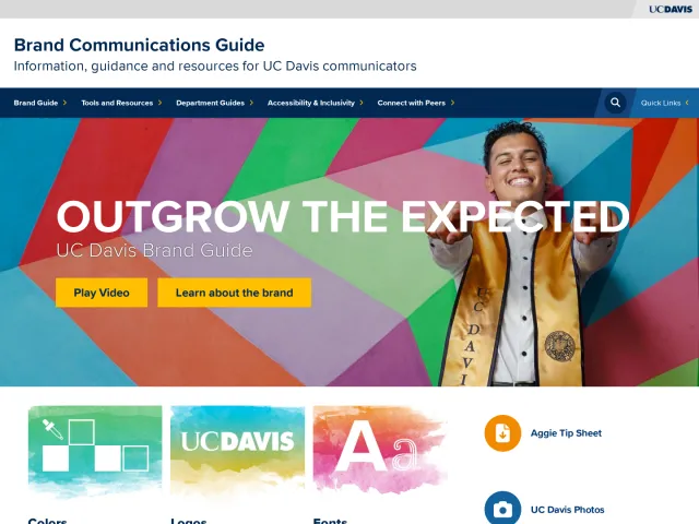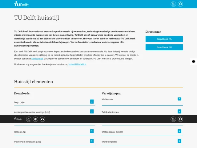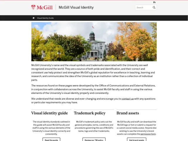
Hogeschool Utrecht brand guidelines
Hogeschool Utrecht hosts an online brand identity portal with modular topic cards and sidebar navigation covering core design rules, writing guidelines, and downloads.
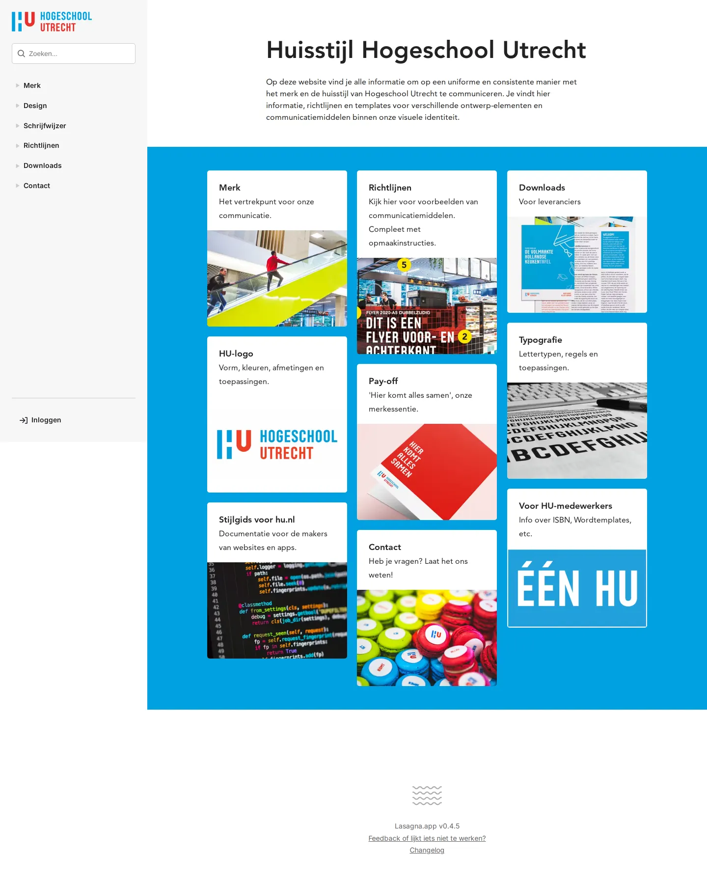
Homepage of the Hogeschool Utrecht brand portal with sidebar navigation and card links for logos, typography, and guidelines.
Want a brand center like Hogeschool Utrecht’s?
Create your brand center with Freedam ↗Freedam's take
I like how Hogeschool Utrecht sets up a friendly, accessible entry point for their visual identity. The portal opens on a clean cyan backdrop with modular white cards guiding you into core areas like the HU-logo, typography, payoff, and writing guidelines. The left sidebar stays persistently anchored with quick search and clear high-level navigation, while separate cards branch out to employee resources and external supplier downloads. It feels thoughtful and straightforward, organizing complex university assets into bite-sized tiles that anyone on staff or working with the school can easily navigate.
At a glance
- Sections
- Merk · Design · Schrijfwijzer · Richtlijnen · Downloads · Contact
- Tone
- Organized, functional, and clear Dutch institutional design guidance.
What I noticed
- The left sidebar includes a search input and navigation links for Merk, Design, Schrijfwijzer, Richtlijnen, Downloads, Contact, and Inloggen.1
- The homepage displays a grid of white cards over a cyan background linking to topics such as HU-logo, Pay-off, and Typografie.23
- The portal provides a specific download link targeted at external suppliers.4
Numbers refer to the screenshots above.
What I could not see
- Internal pages behind the topic cards and login-protected areas could not be inspected.
Ideas to borrow
Quick answers
Where can external suppliers find downloads for Hogeschool Utrecht?
A dedicated download link titled 'Voor leveranciers' is provided directly on the site.4
Reviewed on 25 September 2026. Request a correction · I built this
Similar brand centers
All brand guidelines →