GOV.UK brand guidelines
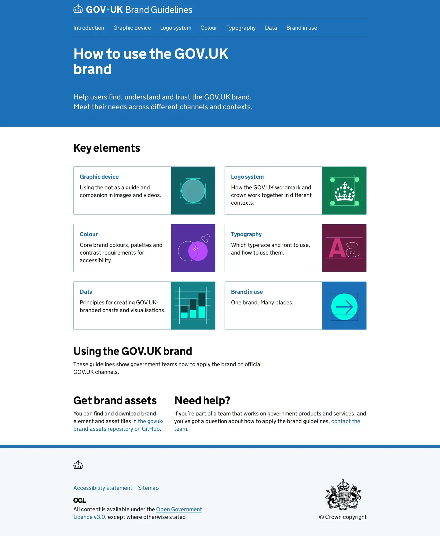
GOV.UK Brand Guidelines provides structured documentation for applying the UK government digital identity across web, app, social, and print channels.
Freedam's take — I really appreciate how clean and straightforward the GOV.UK Brand Guidelines site feels. It builds neatly on their broader design system language, breaking elements down into logical sections like graphic devices, logo systems, and typography with GDS Transport. Rather than overwhelming people with abstract theory, they focus directly on execution across web, app, social, and print. The colour palette section even organizes swatches specifically for data applications like charts and maps, which is great for complex public services.
Details
- Type
- Guidelines
- Access
- Public
- Industry
- Public sector
- Capabilities
- Guidelines, Asset browsing
- Tags
- color system, data visualization, logo usage, typography, print & stationery, social media
- Added
- Last checked
What I noticed
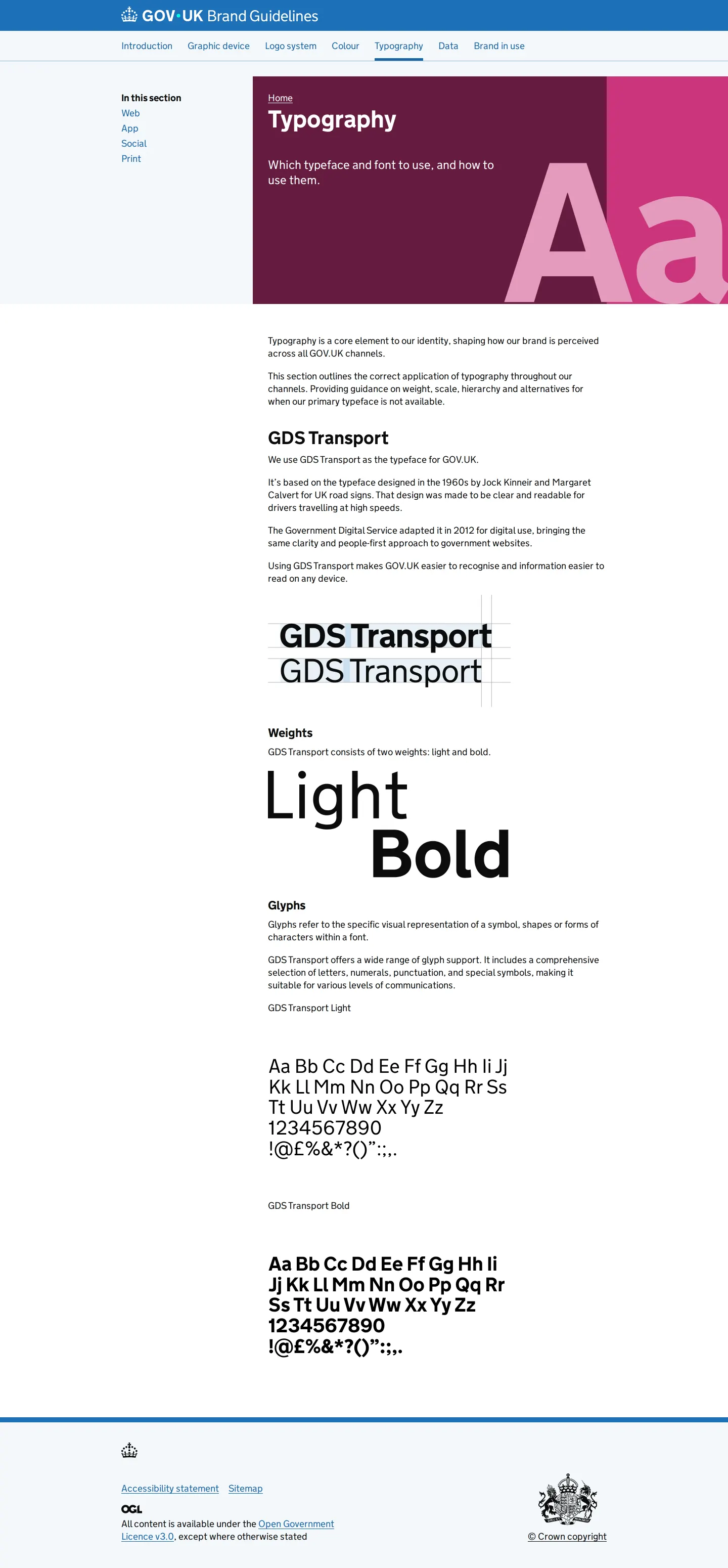
- The typography documentation focuses on the GDS Transport typeface, detailing weights and glyphs.123
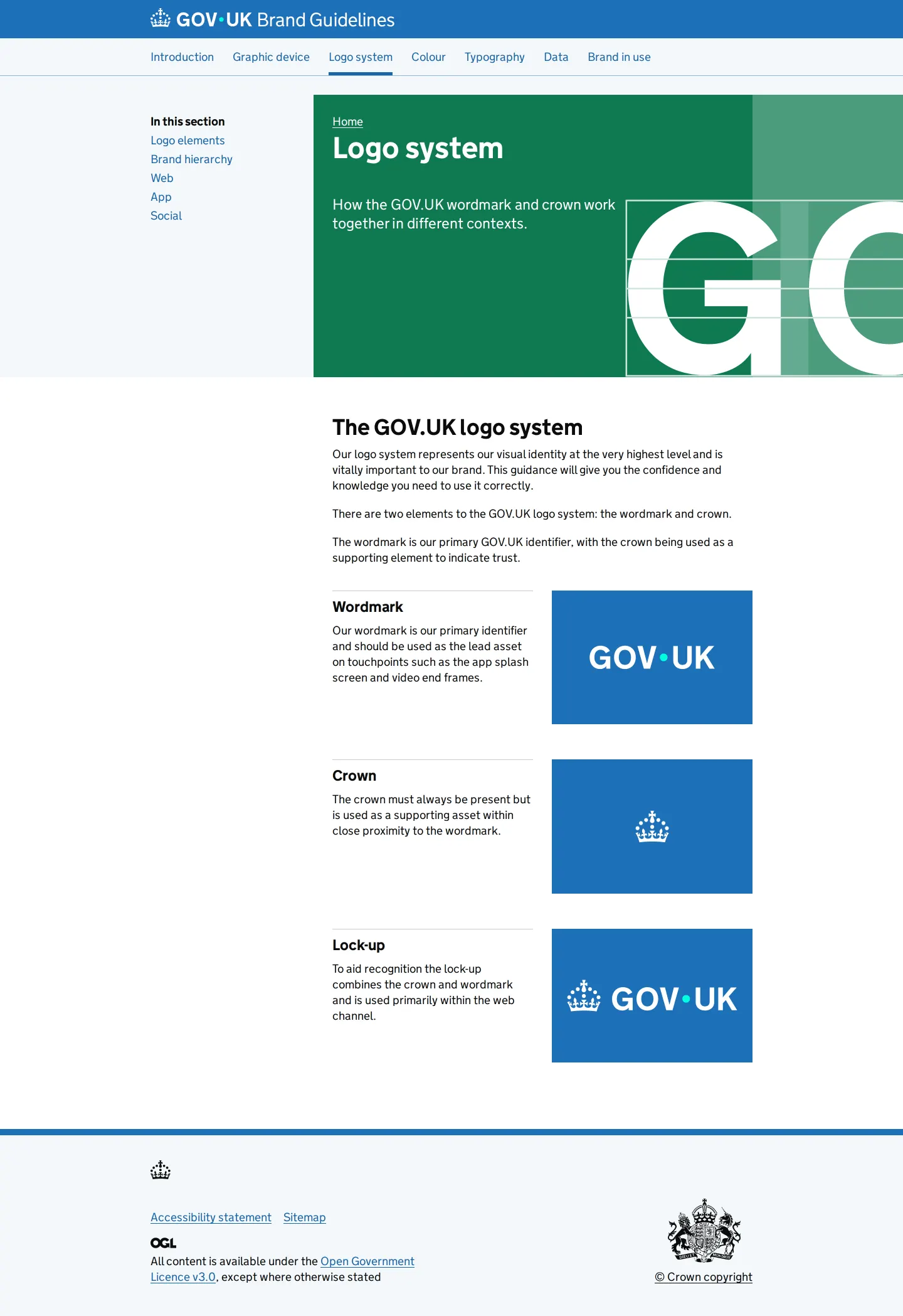
- The logo system documentation details the wordmark, crown, and lock-up components.4567
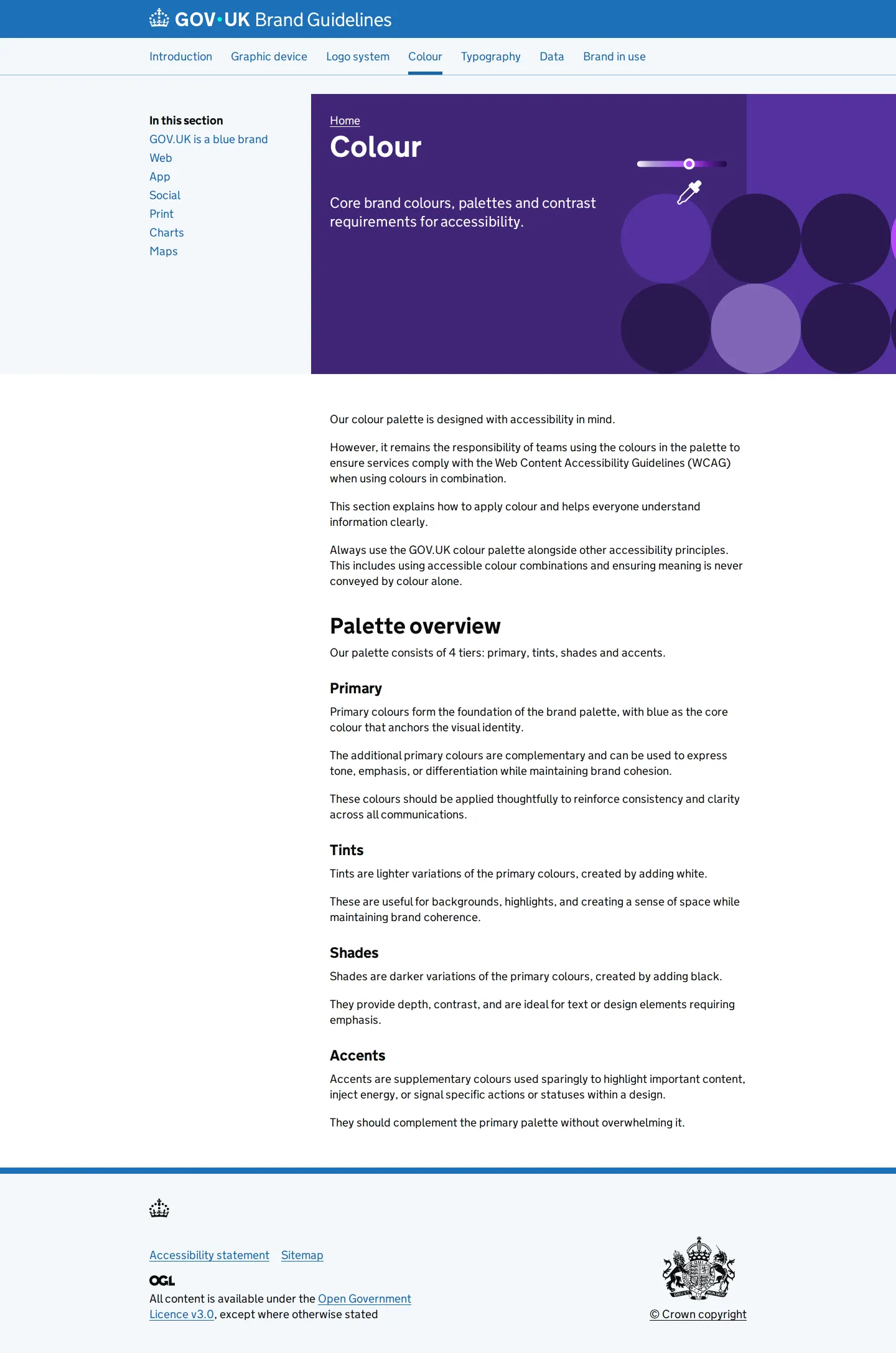
- The colour section includes specific navigation entries for charts and maps.89
- The documentation structure seems intentionally designed to mirror practical channel handoffs across digital and print teams.
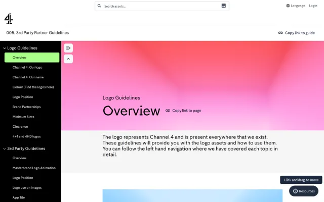
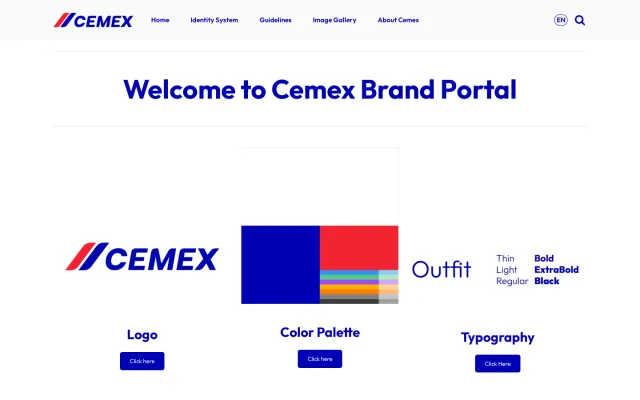
Numbers refer to the screenshots above.
What I could not see
- Could not view individual asset download files or file format details.
- Could not confirm search functionality across the guideline pages.
Ideas to borrow
Reviewed on 18 September 2026. Request a correction · I built this
Similar brand centers
All brand guidelines →