Fred Hutch Cancer Center brand guidelines
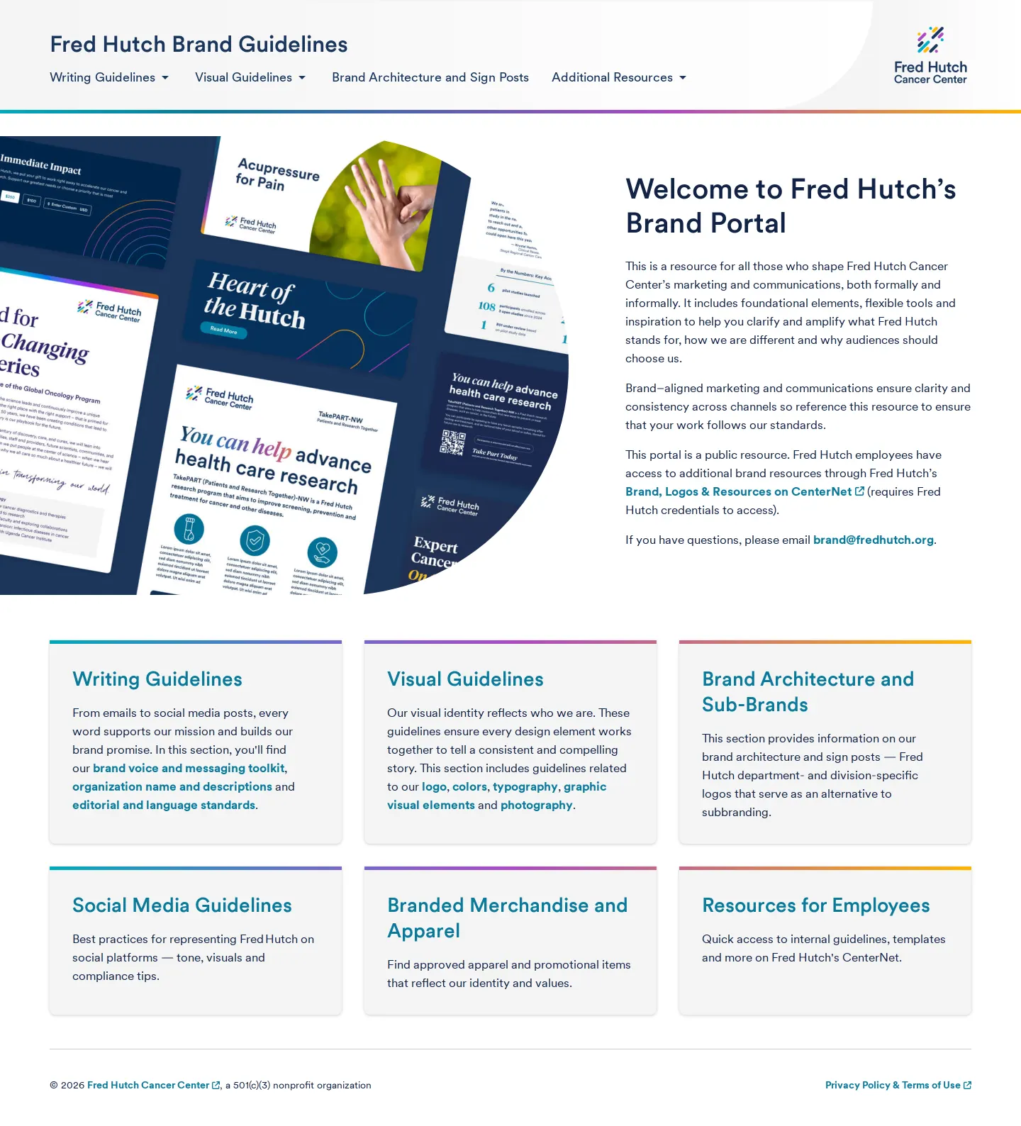
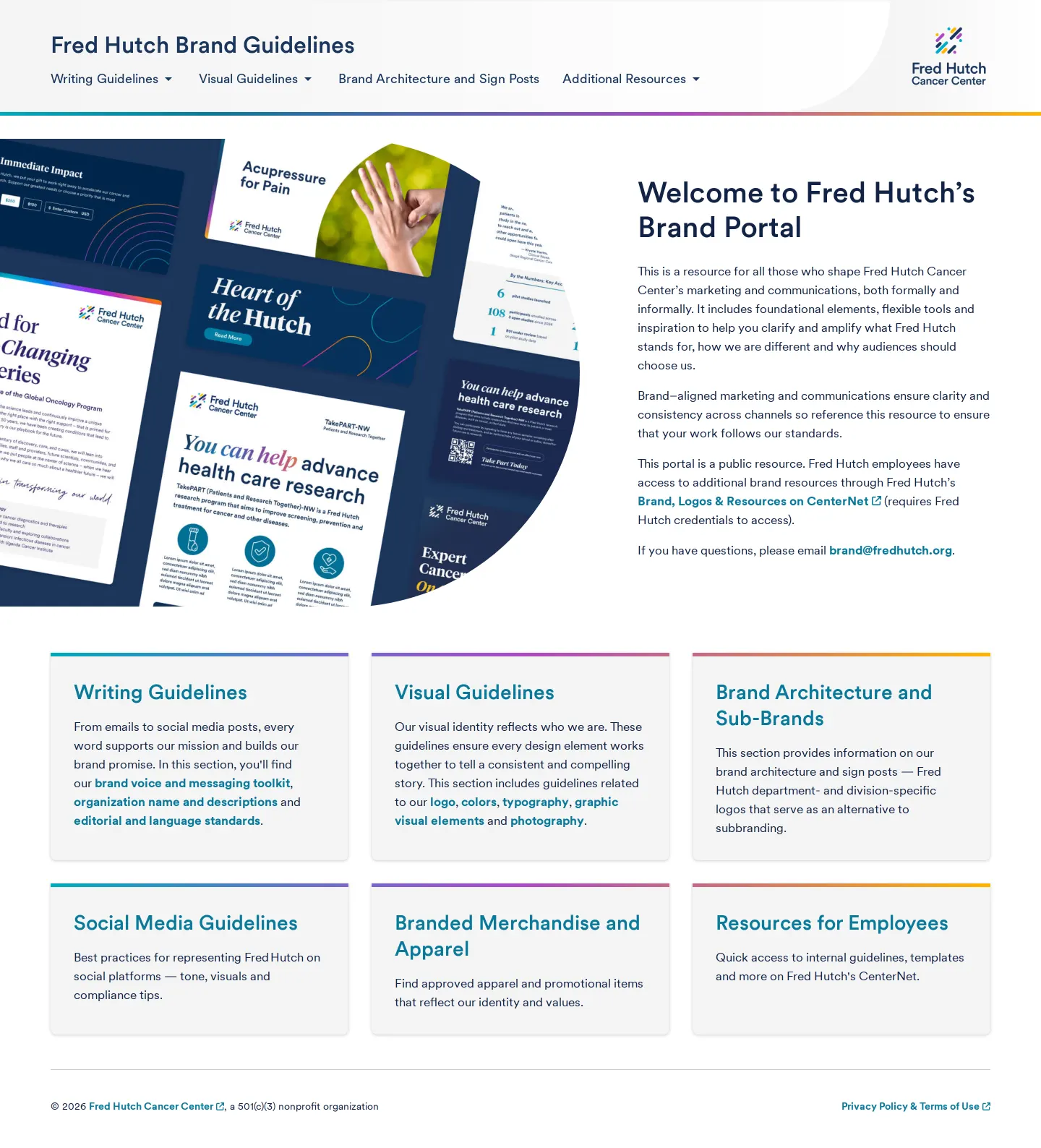
Fred Hutch Cancer Center's brand guidelines provide accessible visual rules, downloadable logo assets, and detailed editorial standards.
Freedam's take — I really appreciate how practical the Fred Hutch brand guidelines are, especially when it comes to clarity and everyday usage. Rather than just showing off their color system and typography, they dedicate entire sections to digital accessibility and even call out inaccessible color combinations directly. Their logo documentation is equally pragmatic, providing immediate zip downloads partitioned neatly by color space for print and screen, along with direct guidance on out-of-date assets. It feels grounded in helping staff and partners build clear, readable communications without any ambiguity.
Details
- Type
- Guidelines
- Access
- Public
- Source
- brand.fredhutch.org
- Industry
- Health, Science & research
- Capabilities
- Guidelines, Downloads
- Tags
- accessibility, color system, editorial guidelines, logo usage, asset downloads, tone of voice
- Added
- Last checked



What I noticed
- The site provides dedicated packages for primary and stacked logos in both digital RGB and print CMYK formats.1234
- The color guidelines include specific sections addressing digital accessibility and inaccessible color combinations.567
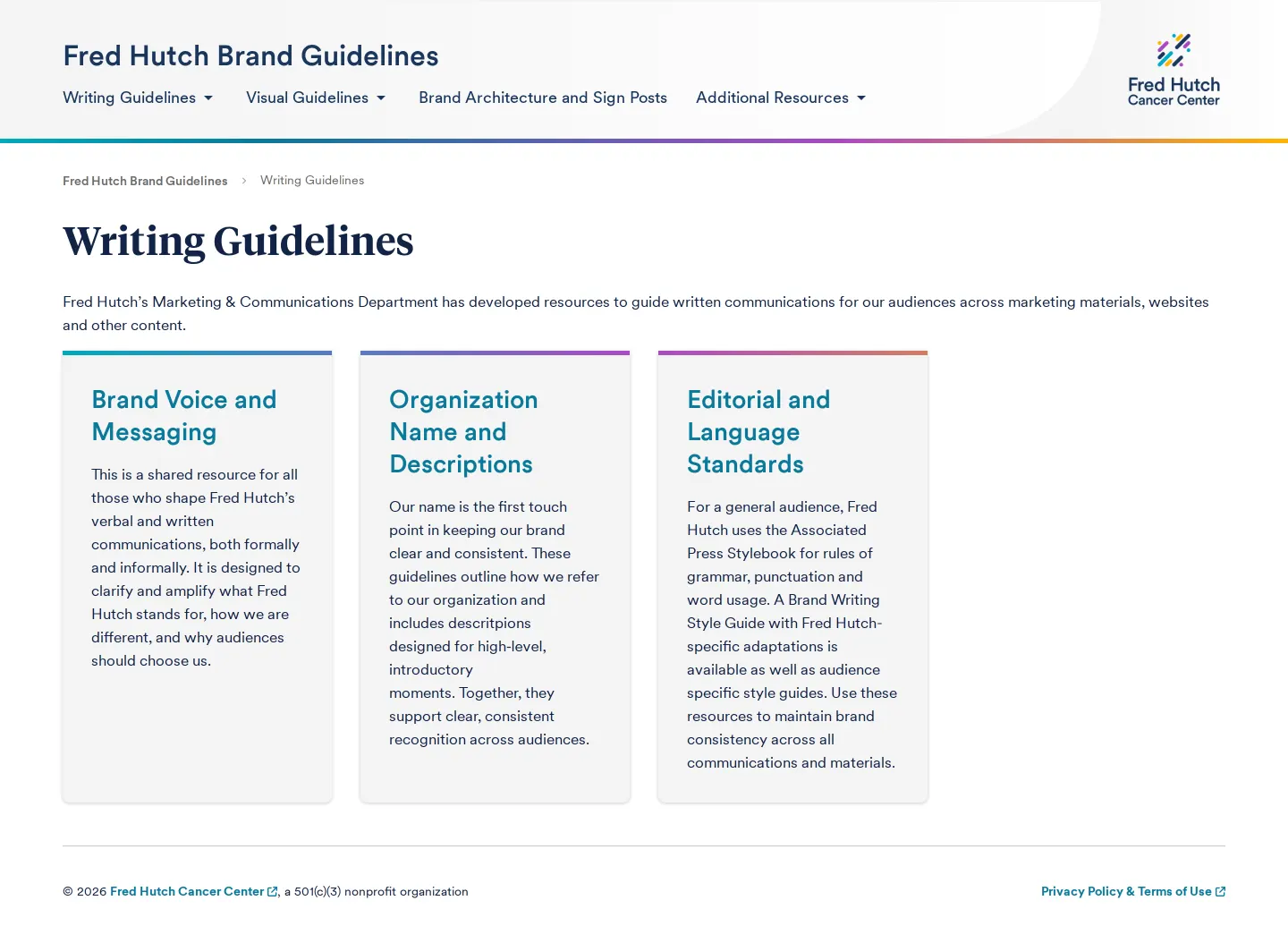
- The writing section covers brand voice, organization naming rules, and editorial standards.891011
- Explicitly documenting out-of-date marks helps prevent retired visual assets from lingering in active communications.12
Numbers refer to the screenshots above.
What I could not see
- Internal employee toolkits and asset libraries referenced in navigation require authentication or were not captured in this crawl.
Ideas to borrow
- Highlighting inaccessible color pairings alongside approved palettes gives teams a clear reference for what combinations to avoid.6
Reviewed on 18 September 2026. Request a correction · I built this
Similar brand centers
All brand guidelines →