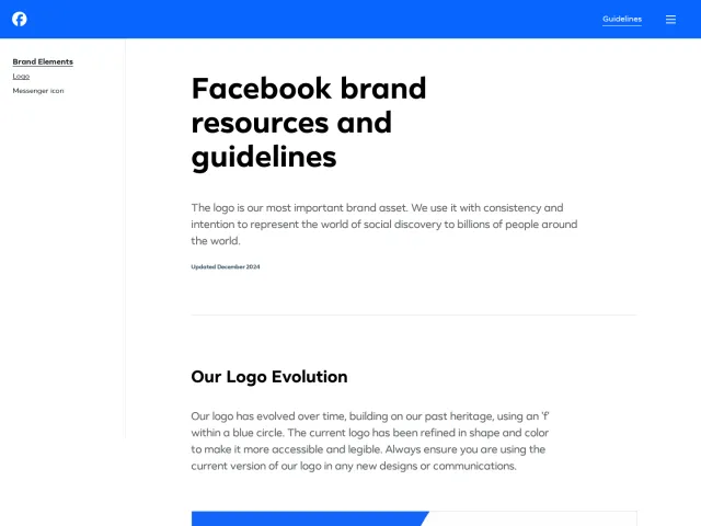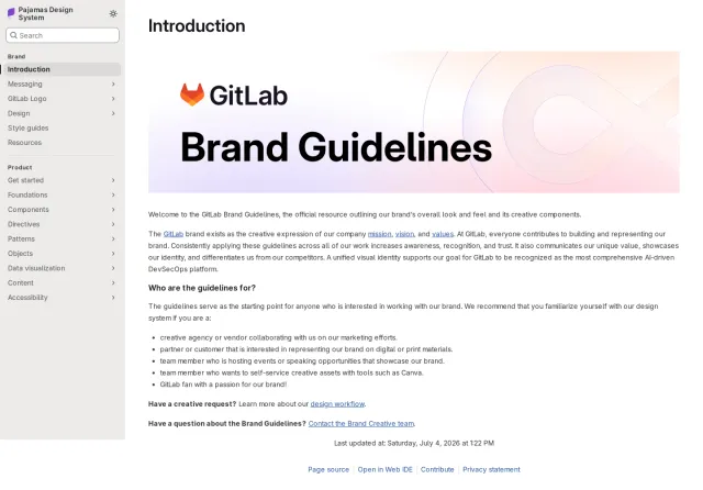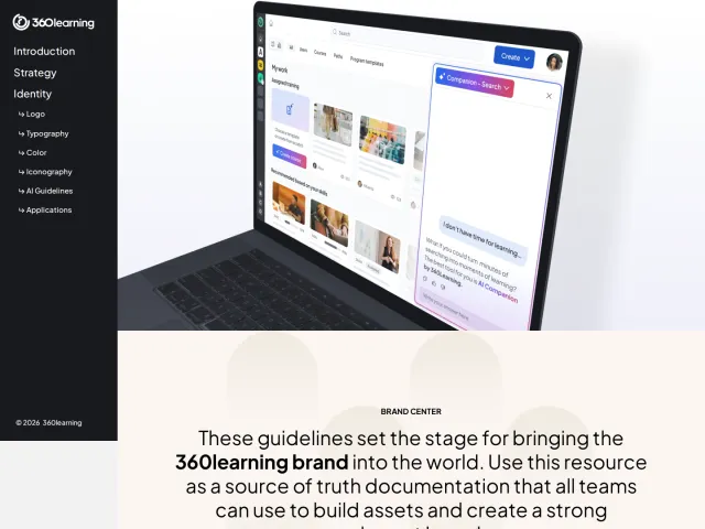
Duolingo brand guidelines
Duolingo's design page redirects to a dedicated blog hub showcasing editorial case studies, product craft reflections, and character design stories.
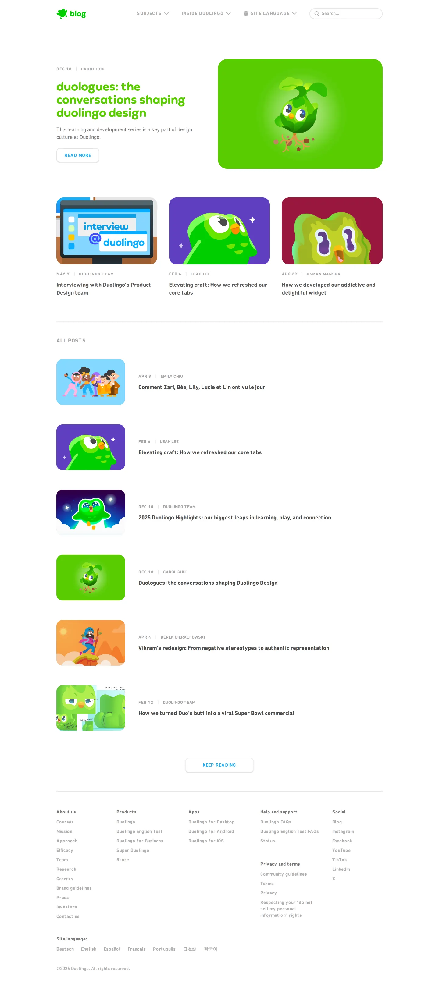
Design category archive page on the Duolingo blog featuring editorial case studies, illustrated thumbnails, and character art.
Want a brand center like Duolingo’s?
Create your brand center with Freedam ↗Freedam's take
When I navigated to Duolingo's design address, it landed on a curated category archive on their official blog rather than a traditional brand asset portal. The page centers on narrative case studies, interviews, and deep dives into product craft, from character design evolution to UI tab refreshes. Everything is framed through editorial stories accompanied by expressive illustrations of their mascot. While you will not find downloadable vector files or standard identity rules here, I appreciate how openly they document the thinking and teamwork behind their visual language.
At a glance
- Sections
- Subjects · Inside Duolingo · Site Language · ALL POSTS
- Tone
- Editorial, narrative, and candidly focused on product craft and storytelling.
What I noticed
- The page functions as a design category blog archive powered by Ghost.12
- The top navigation bar includes a Duolingo blog logo, Subjects dropdown, Inside Duolingo dropdown, Site Language dropdown, and search input.34
- The hero feature highlights an article titled 'duologues: the conversations shaping duolingo design' next to an illustration of the Duo mascot.56
- Articles cover design hiring, UI component updates, widget mechanics, and character representation.78910
Numbers refer to the screenshots above.
What I could not see
- No brand identity guidelines, downloadable logos, typography rules, or design tokens were visible on this captured page.
Ideas to borrow
Reviewed on 25 September 2026. Request a correction · I built this