Dartmouth College brand guidelines
Dartmouth College presents its visual identity standards covering wordmarks, brand marks, typography, and color palettes, complete with asset download links.
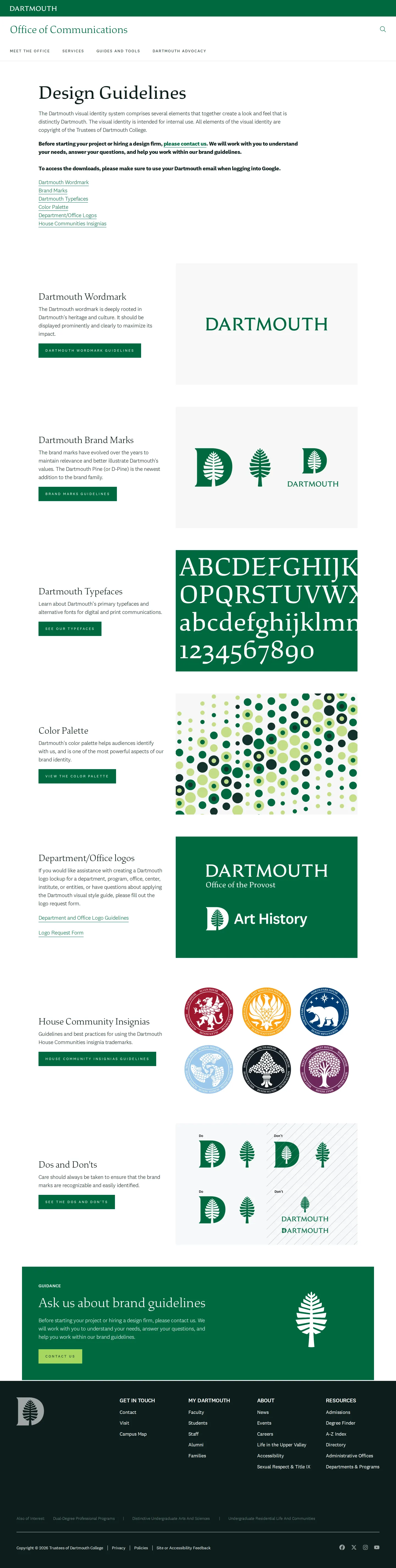
Dartmouth Office of Communications visual identity guidelines landing page with links to core brand elements.
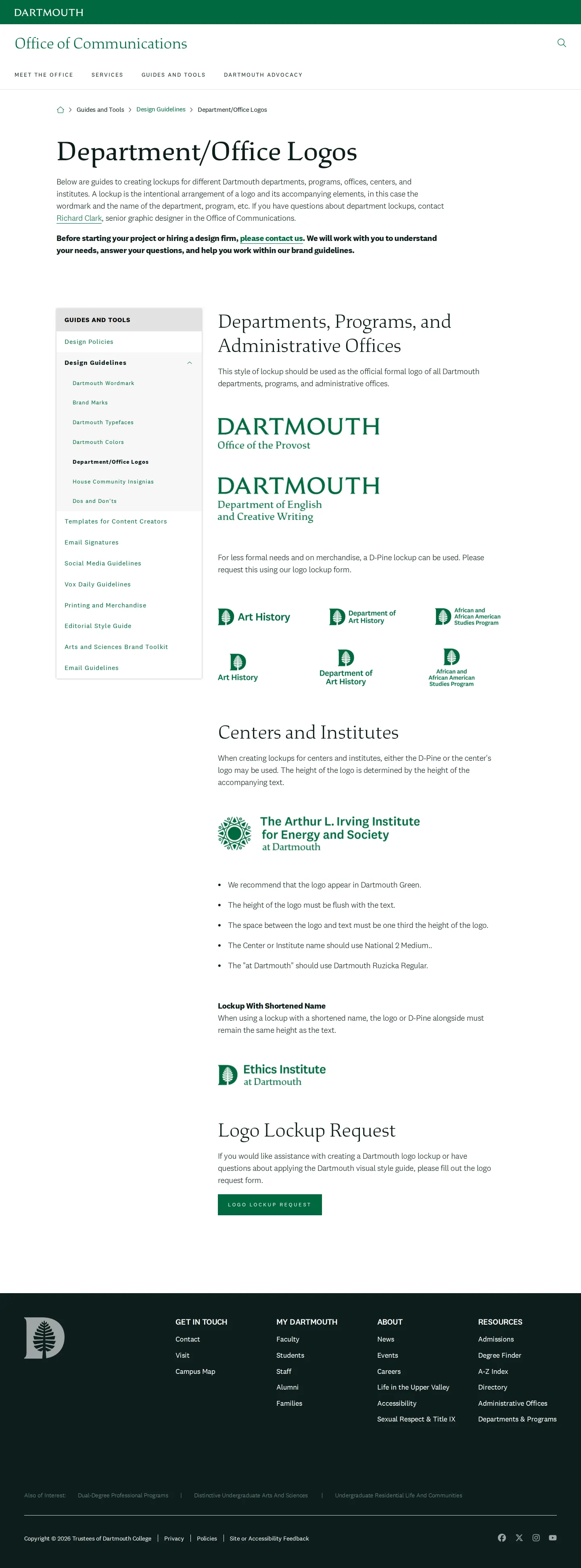
Dartmouth Office of Communications brand guidelines page detailing department, office, center, and institute logo lockups.

Dartmouth Colors guideline page presenting primary, secondary, tertiary, and paint color specifications with swatches and color values.
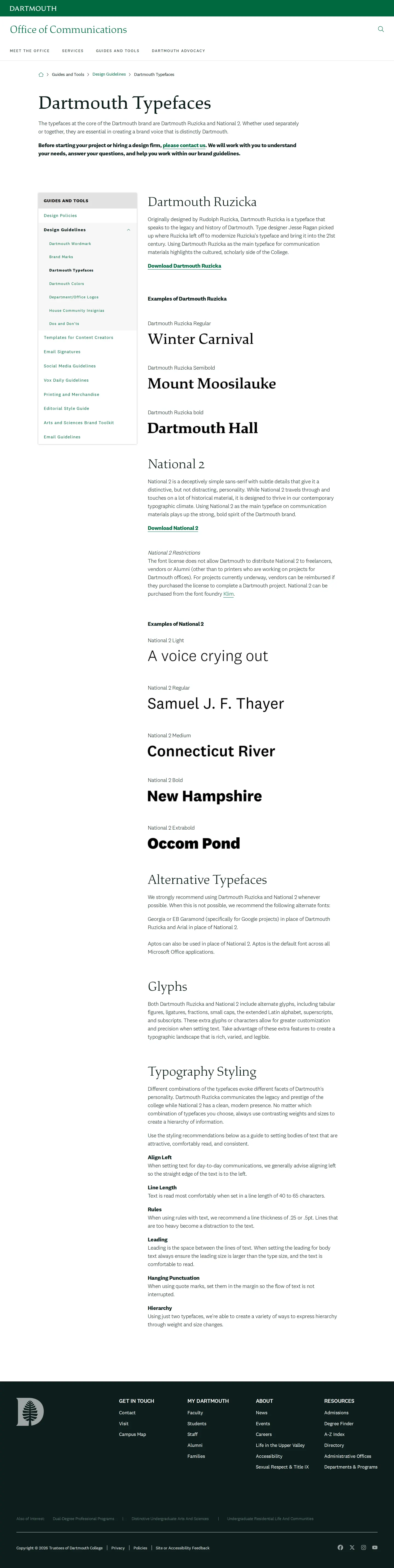
Dartmouth brand guidelines page detailing primary typefaces, alternative fonts, glyphs, and typography styling rules.

Dartmouth Office of Communications brand marks guidelines page detailing the usage, spacing, and variations of The Dartmouth Pine, The Lone Pine, and co-branded symbols.
Want a brand center like Dartmouth College’s?
Create your brand center with Freedam ↗Freedam's take
I like how grounded the Dartmouth College guidelines feel, offering clear rules across their identity system. The team breaks down everything from the formal wordmark to the D-Pine emblem and Pride flags with clear spacing rules. I appreciate seeing everyday physical touches like Benjamin Moore paint codes alongside digital HEX values. They also provide direct links out to Google Drive files for fonts and lockups, making implementation very practical for campus creators.
At a glance
- Sections
- Dartmouth Wordmark · Dartmouth Brand Marks · Dartmouth Typefaces · Color Palette · Department/Office logos · House Community Insignias · Dos and Don'ts
- Tone
- Clear, practical, and structured for academic departments and campus communicators.
What I noticed
- The color guidelines specify Benjamin Moore paint recommendations for Dartmouth Green, Forest Green, and Spring Green alongside digital values.1
- Typeface specifications detail Dartmouth Ruzicka and National 2 as primary brand typefaces with Google Drive download links.234
- The brand marks section details clear space and minimum sizes for the D-Pine mark, requiring at least 0.25 inches in print or 30 pixels wide on digital screens.56
Numbers refer to the screenshots above.
What I could not see
- Template files and actual asset file extensions inside the external Google Drive folders could not be viewed directly.
- Guidelines for photography, tone of voice, or editorial copy style were not visible in the captured screens.
Ideas to borrow
- Publish specific commercial interior paint codes alongside digital and print color values to ensure physical campus spaces match the brand palette.1
Quick answers
Where can the Dartmouth wordmark be downloaded?
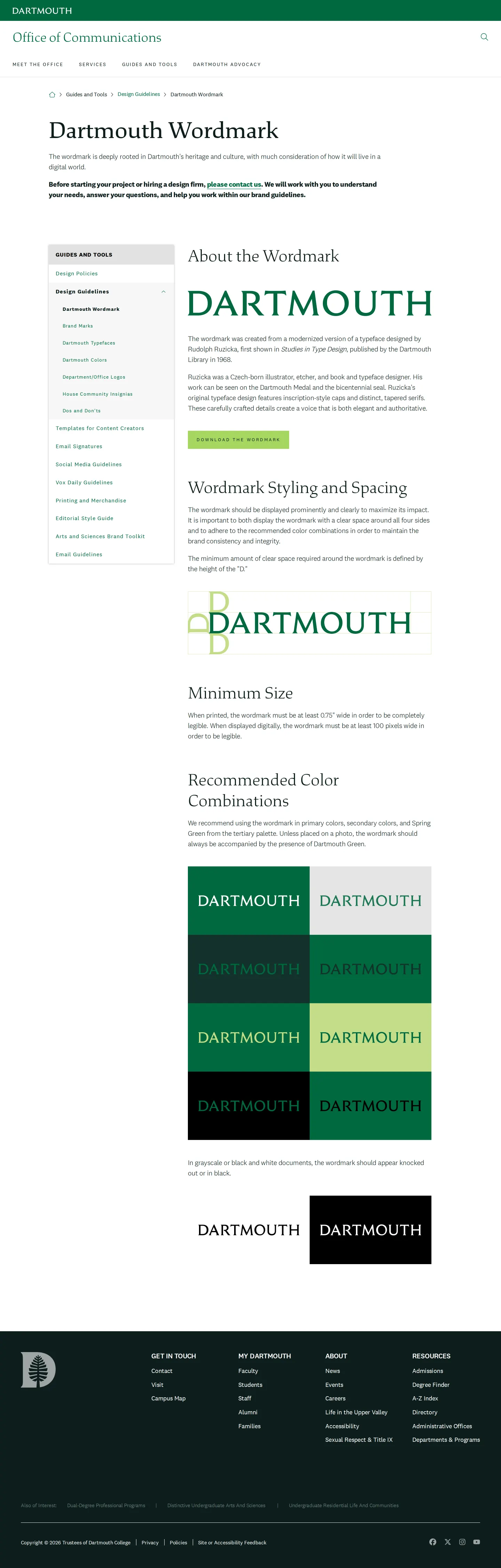
A download link for the wordmark is provided on the Dartmouth Wordmark page, linking directly to a shared Google Drive file.7
What primary typefaces are used by Dartmouth?
Dartmouth specifies Dartmouth Ruzicka and National 2 as its primary brand typefaces.4
What are the approved fallback fonts for Dartmouth typography?
Alternative fonts include Georgia or EB Garamond in place of Dartmouth Ruzicka, and Arial or Aptos in place of National 2.8
Reviewed on 25 September 2026. Request a correction · I built this
Similar brand centers
All brand guidelines →