
Curri brand guidelines
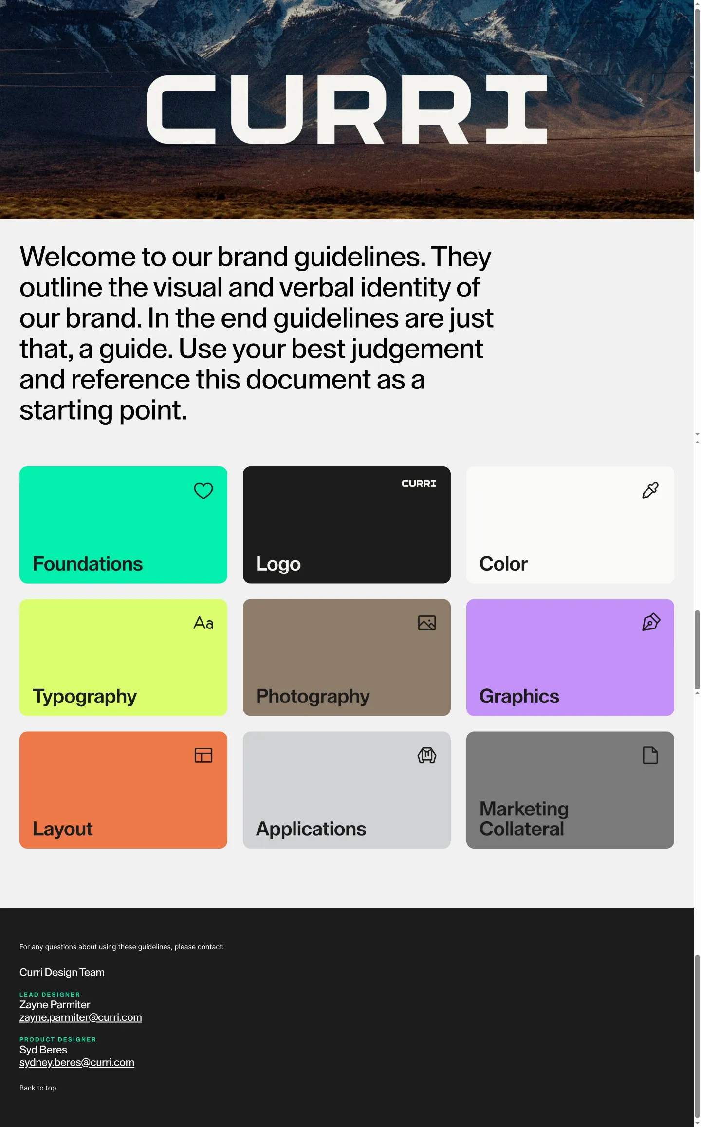
Curri Brand Guidelines serves as the official hub for exploring the brand's logos, color palette, graphic assets, and typography.
Freedam's take — I came across Curri's brand portal and took a look at their landing setup. Their stated purpose is clear from the metadata, describing a central space to explore essential brand elements like logos, colors, graphics, and fonts. While the full internal structure and assets were not accessible in this initial capture, I appreciate how directly they outline what a brand guideline site should deliver. Clear framing around foundational visual identity elements always helps set expectations for teams and external partners looking to build consistent creative work.
Details
- Type
- Guidelines
- Access
- Public
- Source
- brand.curri.com
- Industry
- Transport & logistics
- Capabilities
- None recorded
- Tags
- logo usage, color system, typography
- Added
- Last checked
What I noticed
- The site title is Curri Brand Guidelines.1
- The page description highlights resources including logos, colors, graphics, and fonts to create on-brand materials.2
- A desktop viewport capture of the landing page was recorded.3
Numbers refer to the screenshots above.
What I could not see
- The full navigation menu, specific guidelines, search, and asset download capabilities were not observable in the provided capture.
Ideas to borrow
- Summarize key identity components directly in the site meta description to orient visitors before they navigate deeper.
Reviewed on 18 September 2026. Request a correction · I built this

