ComfyUI brand guidelines
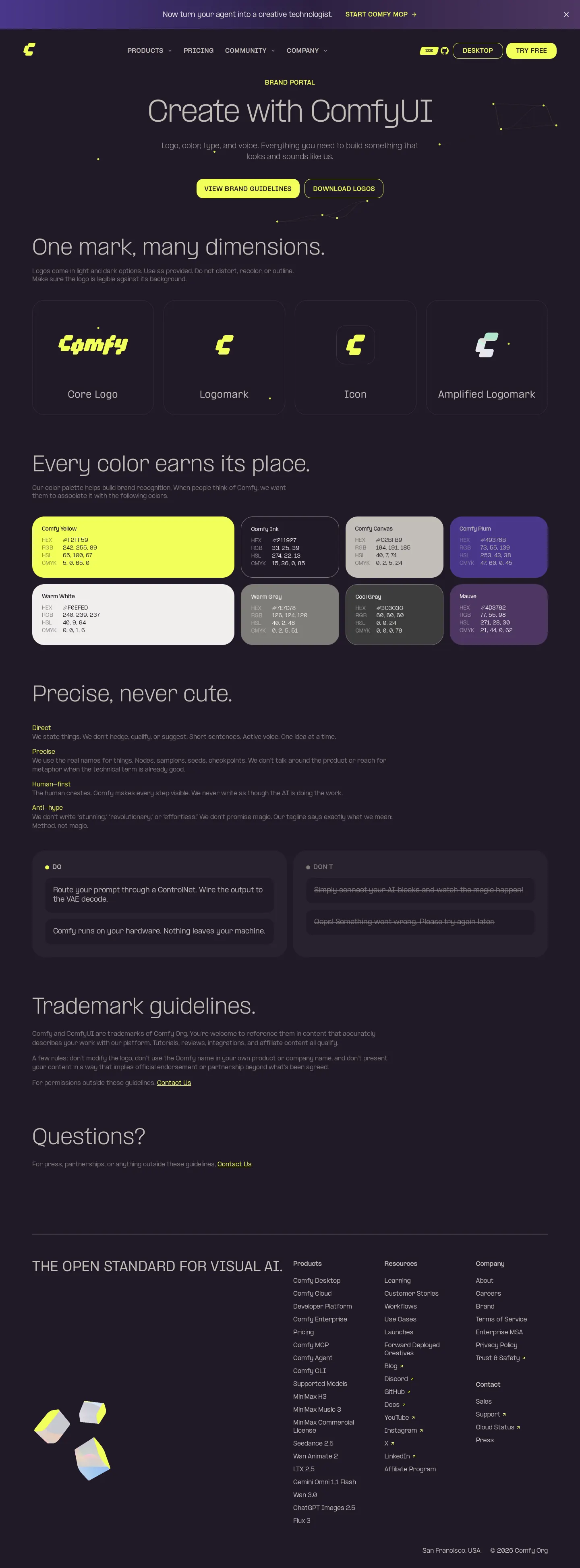
ComfyUI provides a streamlined brand portal covering mark dimensions, color, typography guidelines, and downloadable logo assets.
Freedam's take — I like how direct ComfyUI is with their identity standards. The brand page outlines the core visual elements with clear section headings for logo usage, color hierarchy, and typography tone, declaring that color earns its place and typography stays precise. They make asset distribution straightforward through a direct download link for the brand bundle. It feels honest and technical, giving designers and developers just enough context on trademark rules and logo dimensions to build alongside the platform without drowning them in unnecessary rules.
Details
- Type
- Guidelines
- Access
- Public
- Source
- comfy.org
- Industry
- Technology
- Capabilities
- Guidelines, Asset browsing, Downloads, Partner resources
- Tags
- logo usage, color system, typography, legal & trademark, asset downloads, minimal
- Added
- Last checked
What I noticed
- The brand page organizes visual standards into sections for mark dimensions, color choices, typography, and trademark guidelines.1234
- A direct download link is provided for a brand assets archive containing logos.5
- The portal emphasizes a precise and functional design tone across its identity rules.3
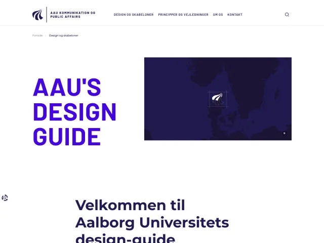
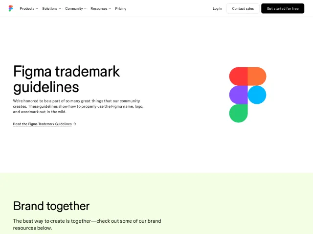
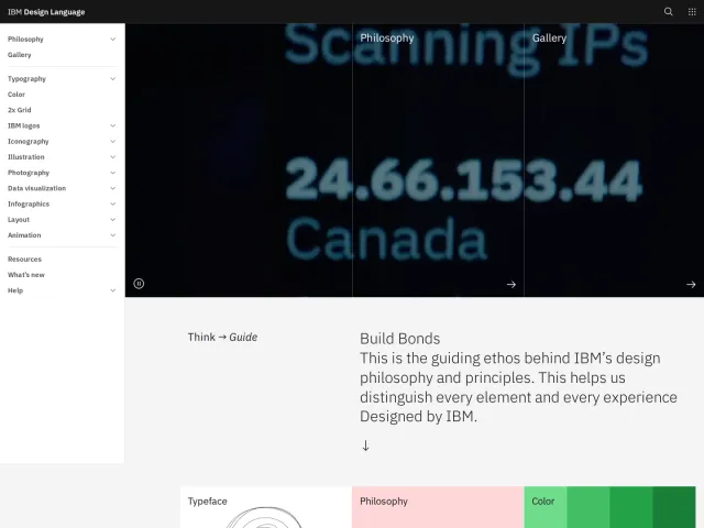
Numbers refer to the screenshots above.
What I could not see
- Specific hex color codes and font family definitions were not visible in the text extract.
- Internal search functionality was not observed on the brand page.
Ideas to borrow
Reviewed on 18 September 2026. Request a correction · I built this