
City of Oslo brand guidelines
Designmanual for the City of Oslo detailing logo usage, the custom Oslo Sans typeface, color palettes, and accessibility guidelines.
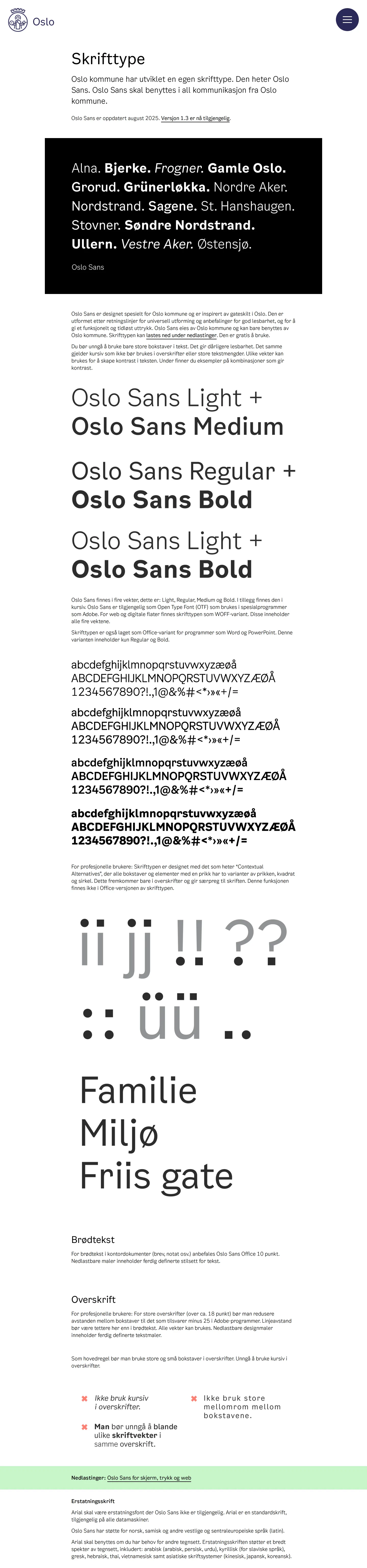
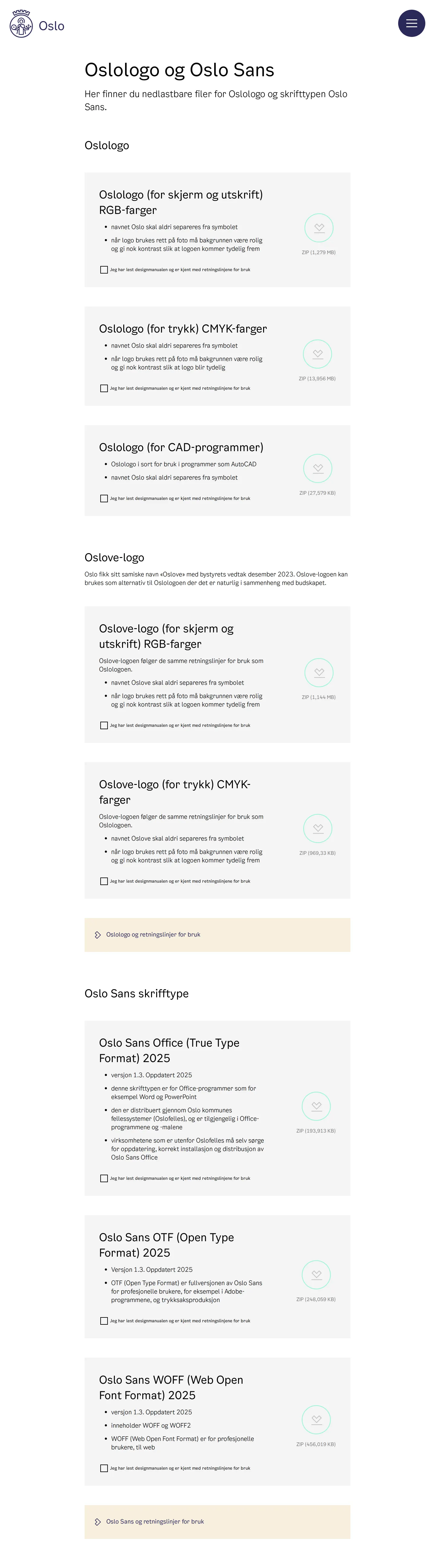
Freedam's take — I really appreciate how clearly Oslo organizes its identity requirements for such a wide civic system. The manual covers everything from basic logo treatments to typography and universal design. I noticed dedicated sections detailing the primary mark alongside the community Oslove logo across specific color spaces like RGB, CMYK, and even CAD formats. They also provide targeted font packages for Oslo Sans, distinguishing between web, desktop, and standard office formats. It feels deliberate and practical, giving municipal teams and external partners exactly what they need to stay consistent without unnecessary complexity.
Details
- Type
- Guidelines
- Access
- Public
- Industry
- Public sector
- Capabilities
- Guidelines
- Tags
- typography, logo usage, color system, accessibility, font downloads, signage & wayfinding
- Added
- Last checked


What I noticed
- The manual features dedicated guidance for both the primary Oslologo and an Oslove logo variant.12
- Oslo Sans typography files are categorized into Office TrueType, OTF, and WOFF web font formats.345
- The home page outlines universal design alongside core identity elements like grid composition, colors, and signage.6789
- Logo specifications cover use across photographic backgrounds, color backgrounds, and clear space rules.101112
Numbers refer to the screenshots above.
What I could not see
- Direct download links or buttons could not be verified from the captured headings alone.
- Internal page contents beneath the navigation toggles were not fully inspectable beyond the visible headings.
Ideas to borrow
- Organizing font deliverables by use case, such as everyday office software versus specialized design formats, makes brand adoption easier across non-design municipal departments.
Reviewed on 18 September 2026. Request a correction · I built this

