
City of Delft brand guidelines
The City of Delft brand guidelines outline the municipality's visual identity principles, mission, logo usage rules across print and digital media, and project style parameters.
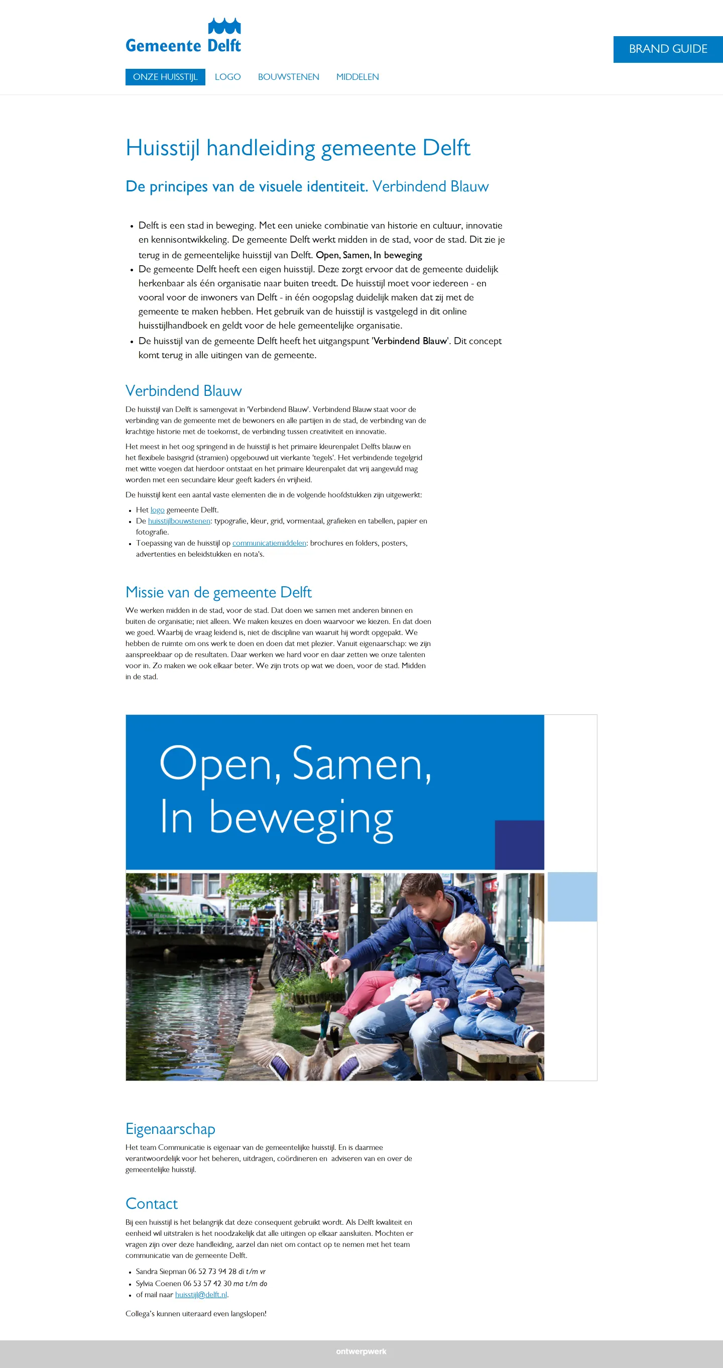
Freedam's take — I added the City of Delft brand guide to the collection because I appreciate straightforward municipal design systems. The site focuses right away on core identity elements, anchoring the story in a concept they call Verbindend Blauw alongside clear mission and contact details. On the logo documentation page, everything is structured logically, breaking down exact sizing rules for both print and digital layouts. They also outline rules for developing project-specific styles and clarify what is permitted. It feels accessible and practical, offering direct asset zip downloads right where you expect them.
Details
- Type
- Guidelines
- Access
- Public
- Industry
- Public sector
- Capabilities
- Guidelines, Downloads
- Tags
- logo usage, brand story, brand architecture, asset downloads
- Added
- Last checked

What I noticed
- The guide introduces identity principles centered on 'Verbindend Blauw' along with the municipality's mission and contact information.1234
- The logo section details sizing standards separated into print and digital specifications, as well as color variants and positioning.56789
- A downloadable zip file containing the complete logo set is provided on the logo documentation page.10
- The documentation provides clear guidance and constraints for developing unique sub-project styles.11121314
Numbers refer to the screenshots above.
What I could not see
- Only the homepage and the logo page were captured.
- Search functionality, asset browsing tools, and design templates were not observed in the captured pages.
Ideas to borrow
- Dividing logo dimensions explicitly between print and digital applications provides teams with unambiguous sizing guidance.
Reviewed on 18 September 2026. Request a correction · I built this

