
City of Amsterdam brand guidelines
Stijlweb provides public brand guidelines for the City of Amsterdam, covering typography, logo variations, and core identity rules.
Freedam's take — I really appreciate how straightforward the City of Amsterdam makes its visual identity system through Stijlweb. When you explore the site, the clear organization stands out immediately. They break down essential standards into focused sections like logo rules and typography, addressing real municipal needs like signage, print, and digital applications. The typography section even details Amsterdam Sans alongside practical implementations for tools like MS Office. It feels remarkably direct and public-facing, serving as a dependable guide for anyone communicating on behalf of the city.
Details
- Type
- Guidelines
- Access
- Public
- Source
- amsterdam.nl
- Industry
- Public sector
- Capabilities
- Guidelines
- Tags
- typography, logo usage, brand architecture, signage & wayfinding
- Added
- Last checked
What I noticed
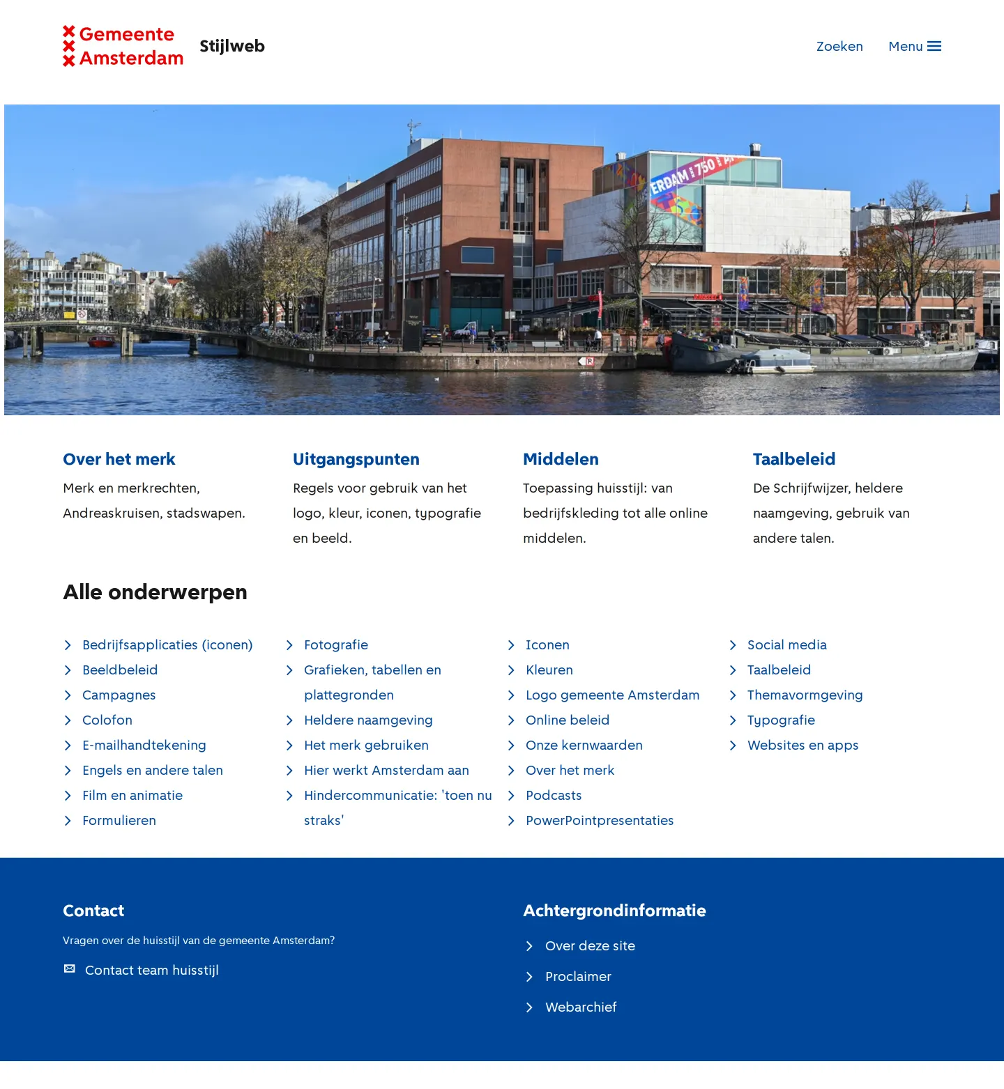
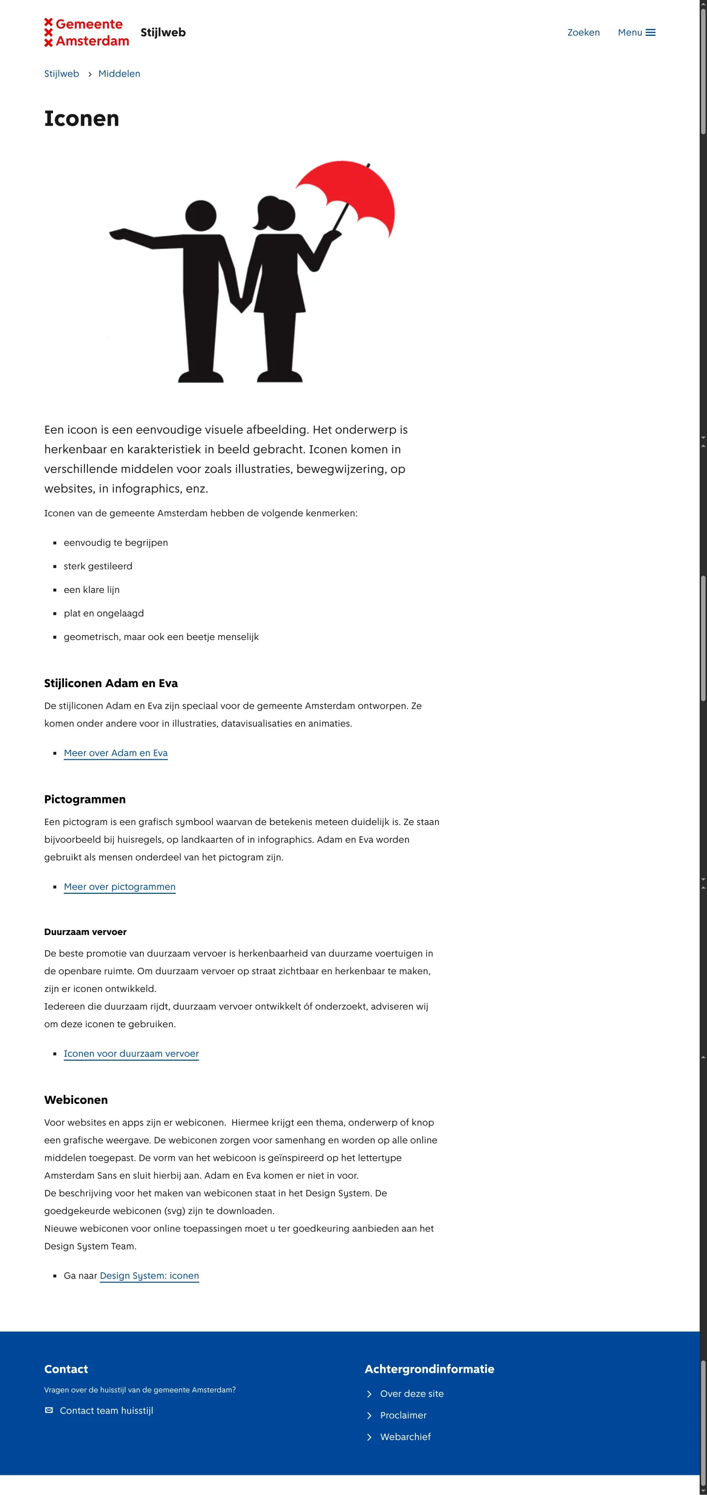
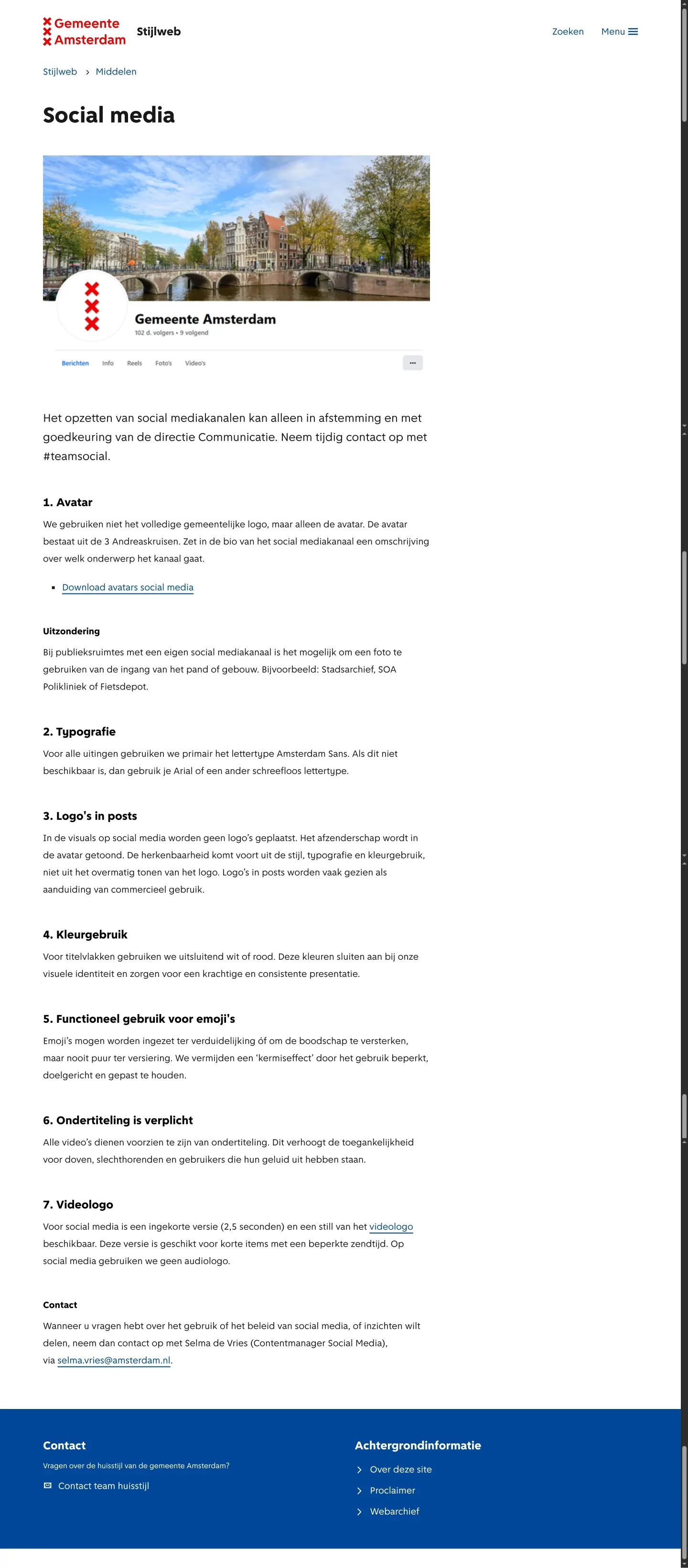
- The website describes Stijlweb as the living style guide for the visual identity of Amsterdam.1
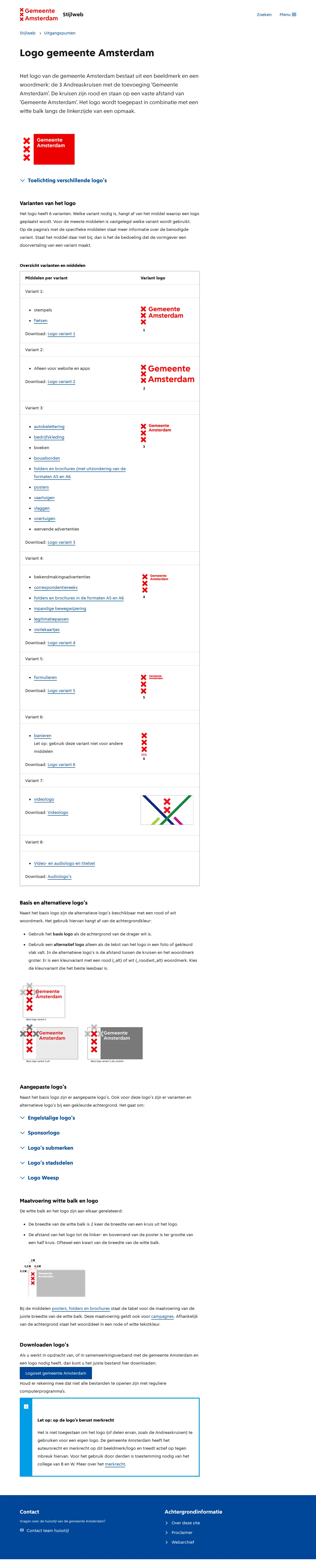
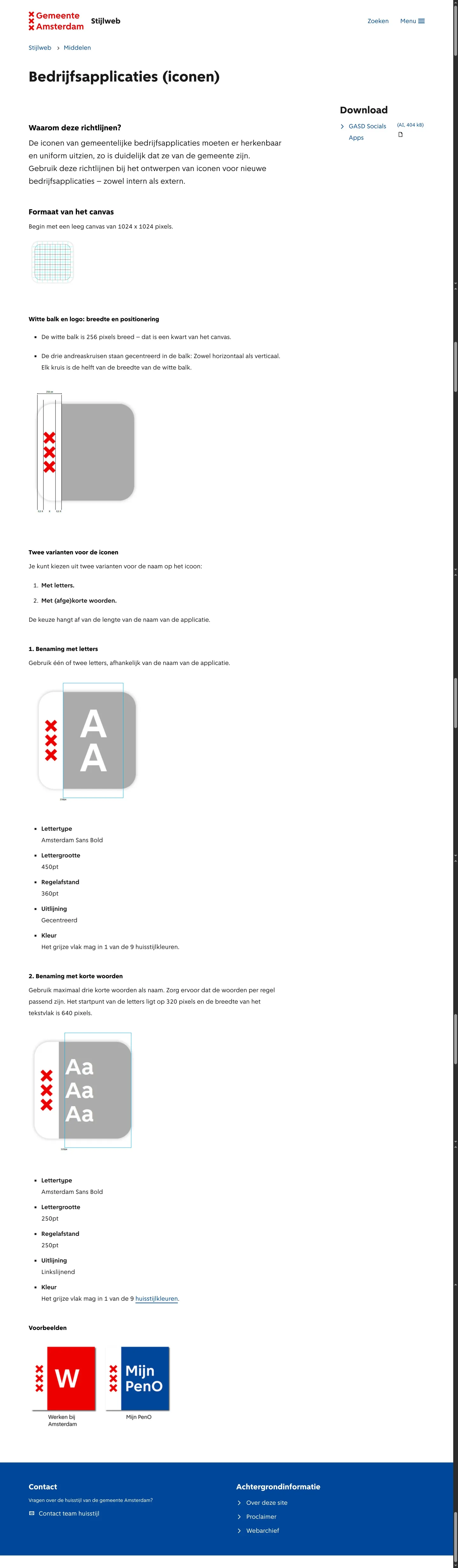
- The logo documentation details multiple variants including sub-brand logos, city district versions, and English logos.234
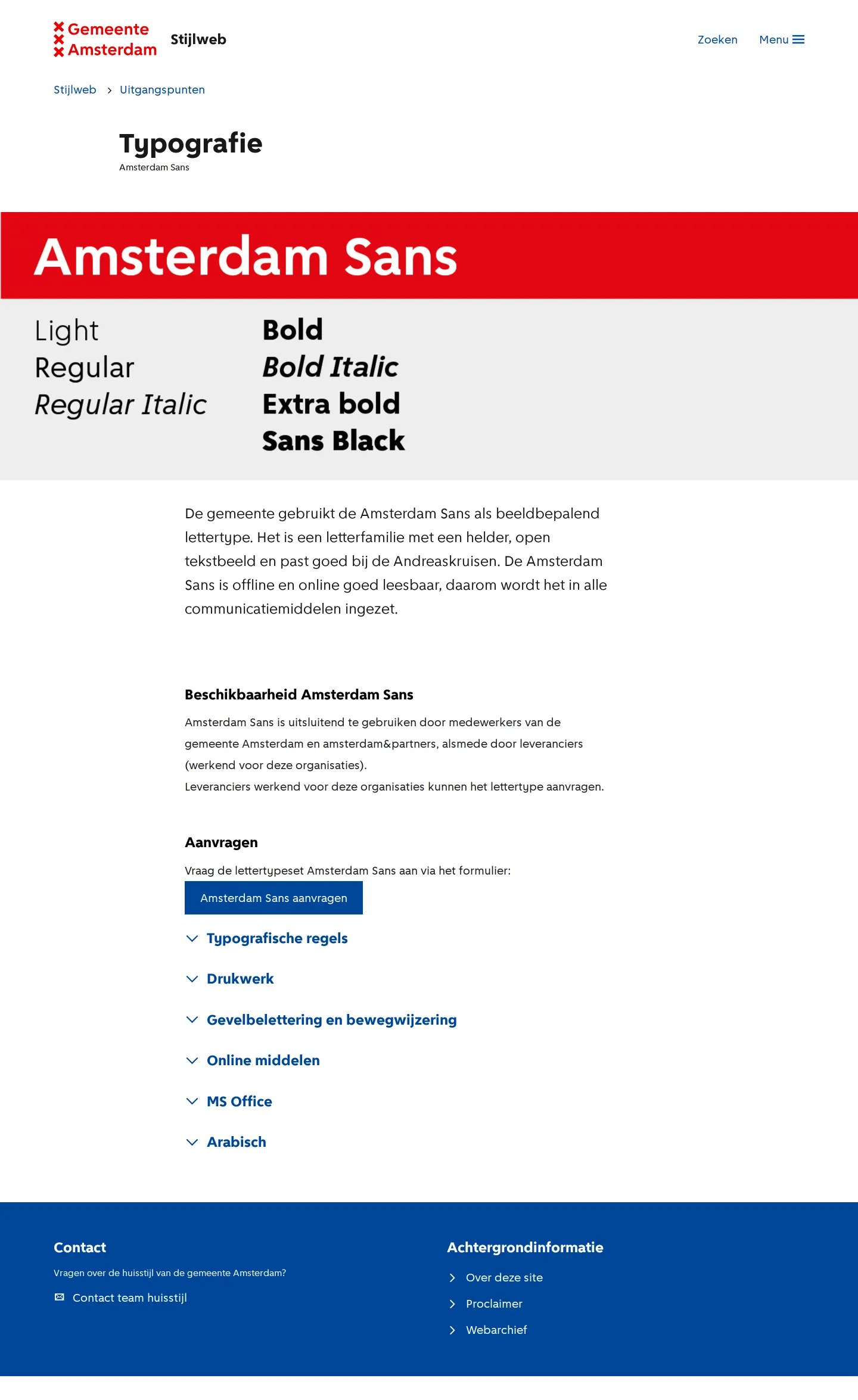
- The typography section outlines specific contexts for Amsterdam Sans, including print, signage, online media, and MS Office.56789
- The site structure prioritizes clear categorisation to make civic communication assets easy to understand.
Numbers refer to the screenshots above.
What I could not see
- Could not view direct asset download files or interactive asset browsing components.
Ideas to borrow
Reviewed on 18 September 2026. Request a correction · I built this

