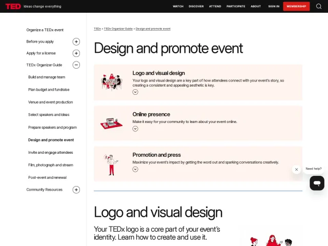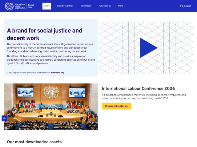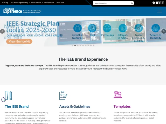
charity: water brand guidelines
The charity: water brand guidelines provide visual standards, editorial guidance, and direct asset downloads across a photography-rich documentation site.

The charity: water logo page introduces the mark centered around the iconic yellow jerry can, with a direct asset download link.

The color section opens with an expressive portrait hero image and outlines values of clarity, energy, and optimism.

The typography page highlights clarity and purpose alongside a direct download link for the organization's typefaces.
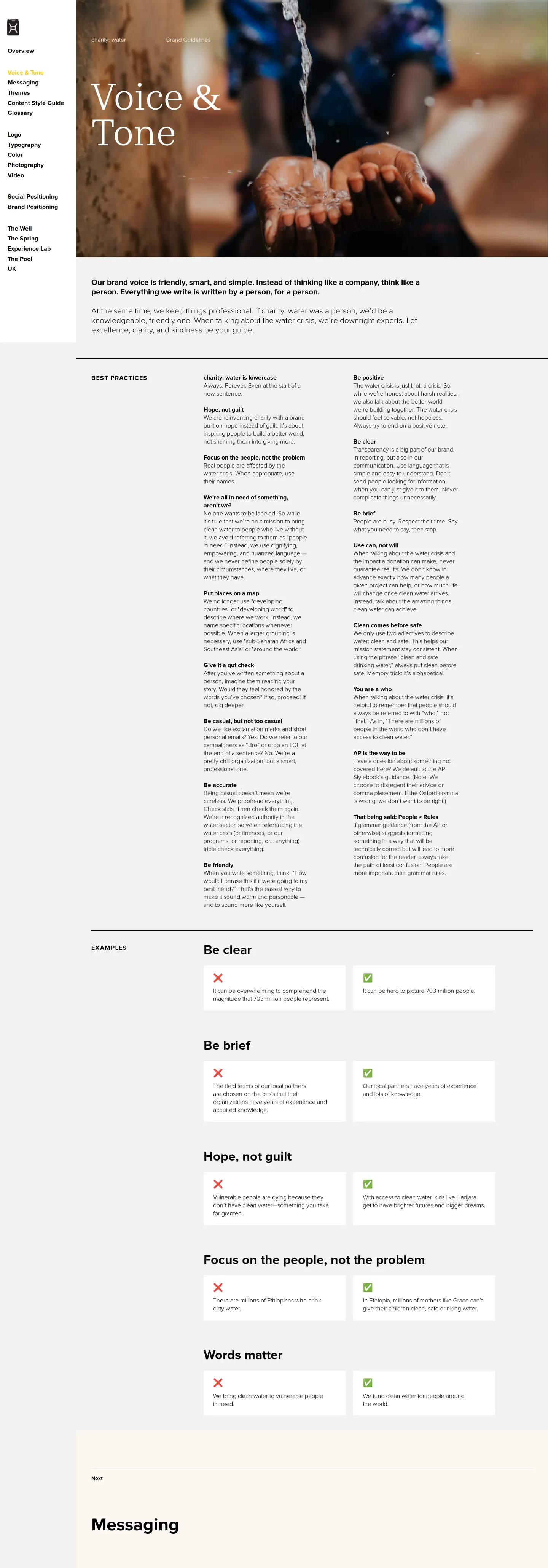
The voice and tone chapter pairs community photography with core editorial principles of being friendly, smart, and simple.

The photography section establishes documentary imagery as integral to the brand with a full-width header photograph.
Want a brand center like charity: water’s?
Create your brand center with Freedam ↗Freedam's take
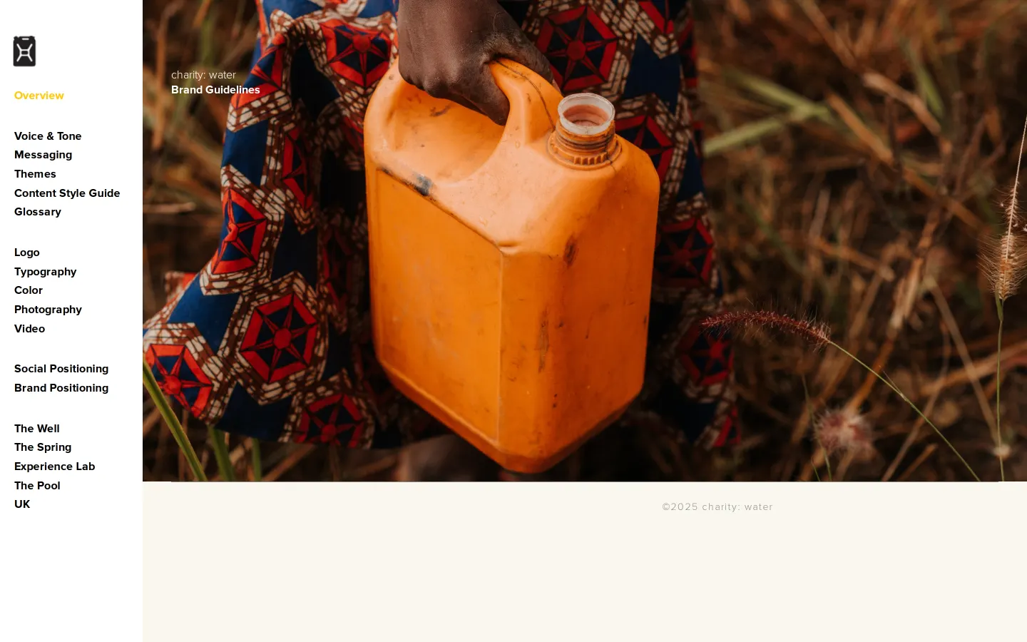
I really appreciate how grounded and human the charity: water guidelines feel right from the start. Each section opens with an expressive, full-bleed photograph that reinforces their storytelling before you even read a guideline. They pair this human imagery with clean serif headings and practical tools, including zip downloads for both typefaces and logo packages directly in the relevant chapters. The left navigation keeps everything organized across voice, messaging, and visual elements without overcomplicating things. It feels warm, straightforward, and clearly built for collaborators who need assets quickly.
At a glance
- Sections
- Overview · Voice & Tone · Messaging · Themes · Content Style Guide · Glossary · Logo · Typography · Color · Photography · Video
- Downloads
- ZIP
- Tone
- Warm, mission-led, and human, pairing direct field photography with straightforward editorial and visual standards.
What I noticed
- The site provides direct ZIP package downloads for brand typefaces and logo sets.12
- Every main page features a full-width photographic hero image overlaid with a large serif section title.3456789
- The left navigation sidebar uses yellow highlighting to indicate the active section.101112
- The voice and tone section outlines the brand's writing style as friendly, smart, and simple.13
Numbers refer to the screenshots above.
What I could not see
- Specific hex codes, color values, and typographic spec scales were not fully captured in the screen evidence.
- Logo clearance rules, sizing minimums, and misuse examples were not displayed in the captured viewports.
- Internal pages for Messaging, Themes, Content Style Guide, and Glossary were not opened.
Ideas to borrow
Quick answers
Where can I download the charity: water logos?
A ZIP archive of the charity: water logo files can be downloaded directly from the top of the Logo page.1
Can I download charity: water brand fonts?
Yes, a download link for brand typefaces is provided directly on the Typography page as a ZIP file.2
Reviewed on 25 September 2026. Request a correction · I built this
Similar brand centers
All brand guidelines →