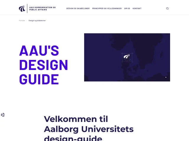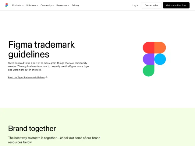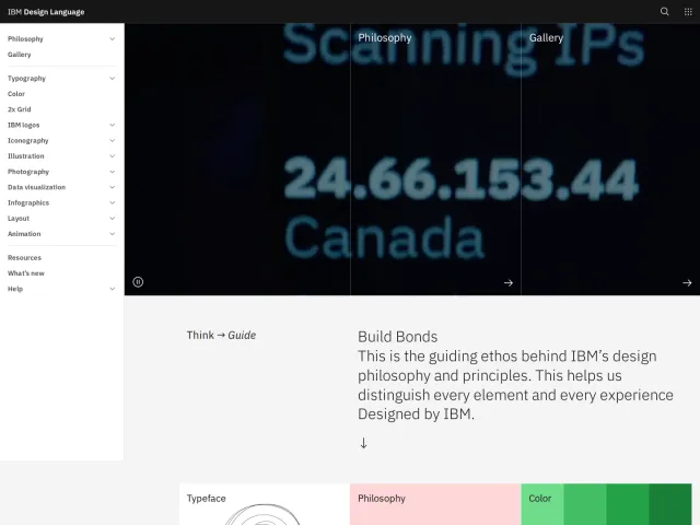
Cash App brand guidelines
Cash App Brand Guidelines provides foundational identity standards covering logos, color, and typography alongside direct asset downloads.
Freedam's take — I love when a brand guide gets right to the core of its identity without excessive decoration. Looking through the Cash App design site, I noticed dedicated sections for essential foundations like logo, color, and typography. The presence of quick asset downloads, including specific partner lockups for Visa right on the logo page, makes it clear that practical utility is prioritized. It gives designers and partners immediate access to the exact vector assets they need while reinforcing a philosophy rooted in balancing order with freedom.
Details
- Type
- Guidelines
- Access
- Public
- Source
- design.cash.app
- Industry
- Finance
- Capabilities
- Downloads
- Tags
- logo usage, color system, typography, partner branding, vector assets, asset downloads
- Added
- Last checked
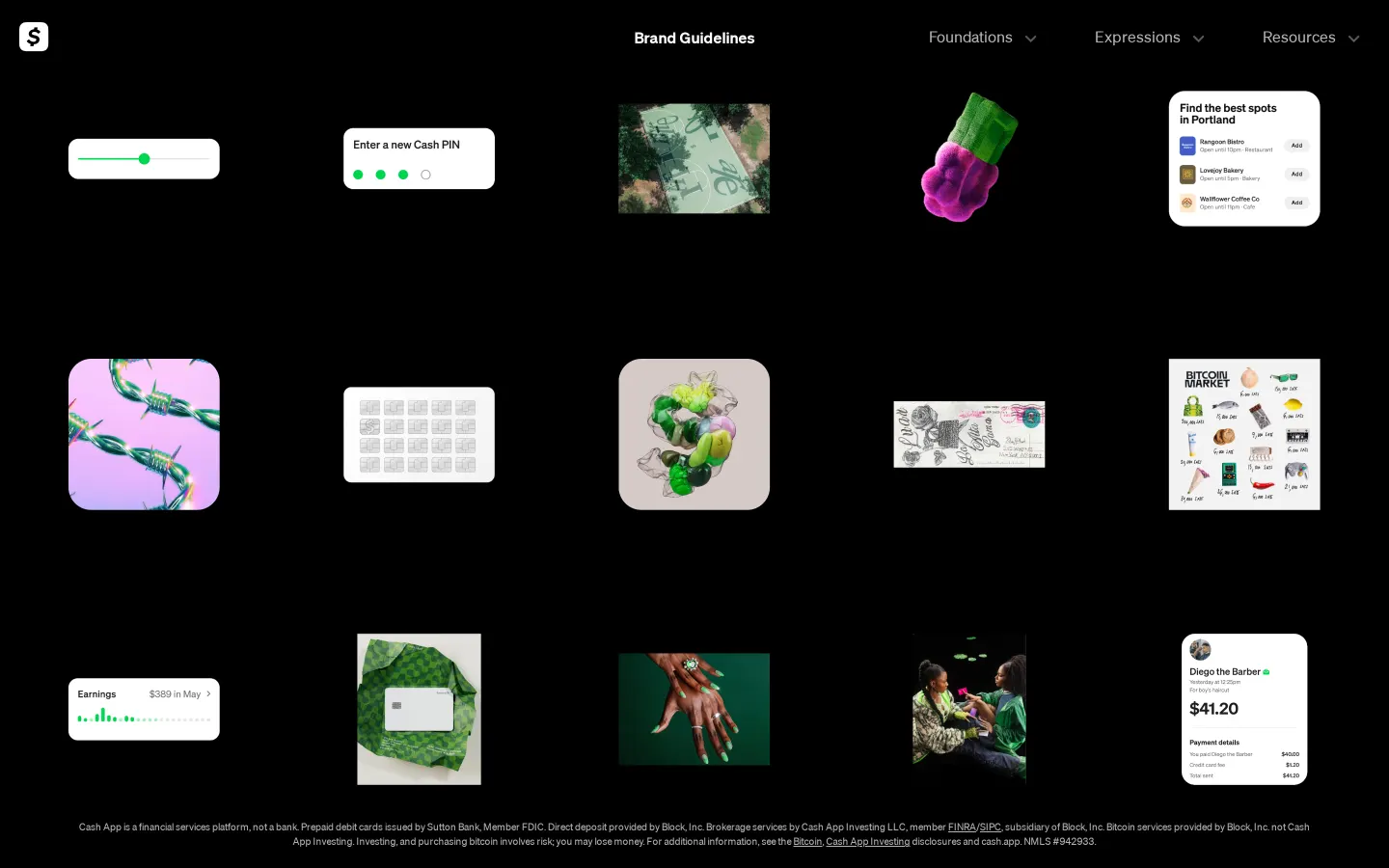
What I noticed
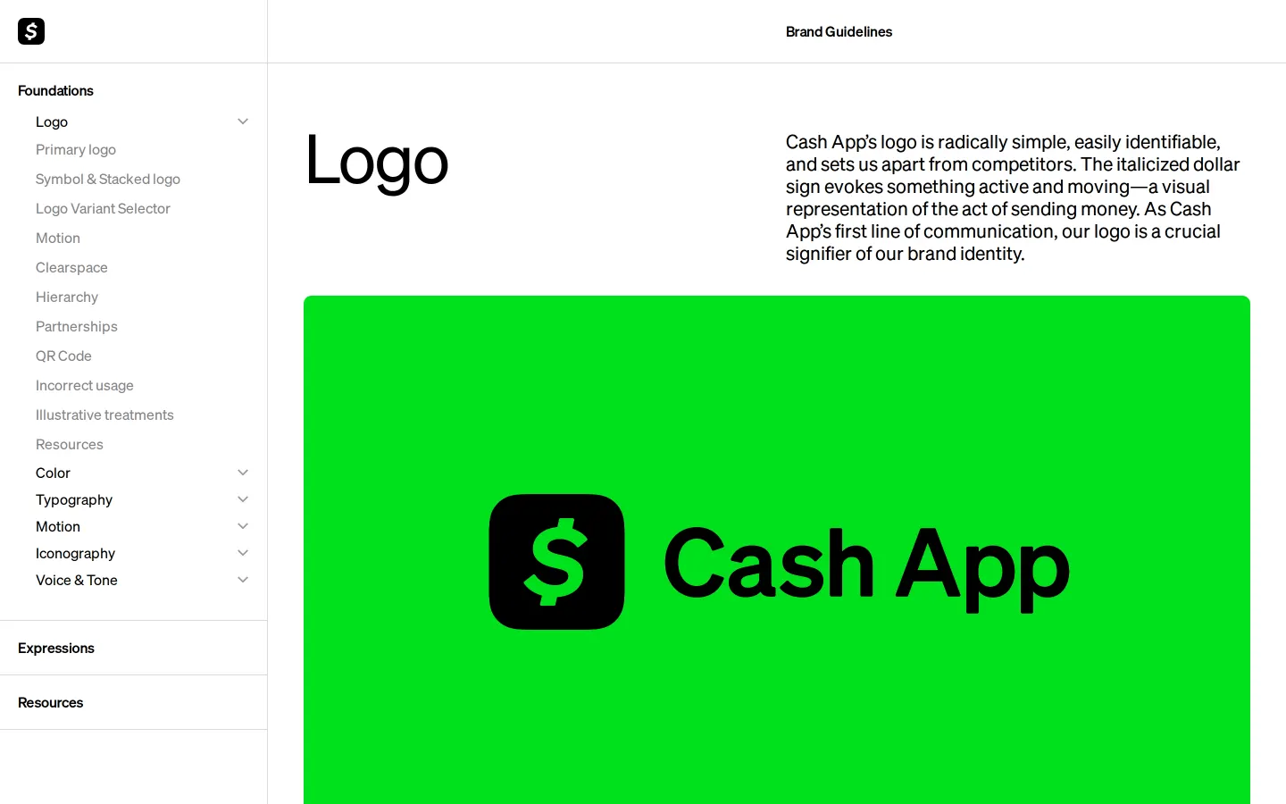
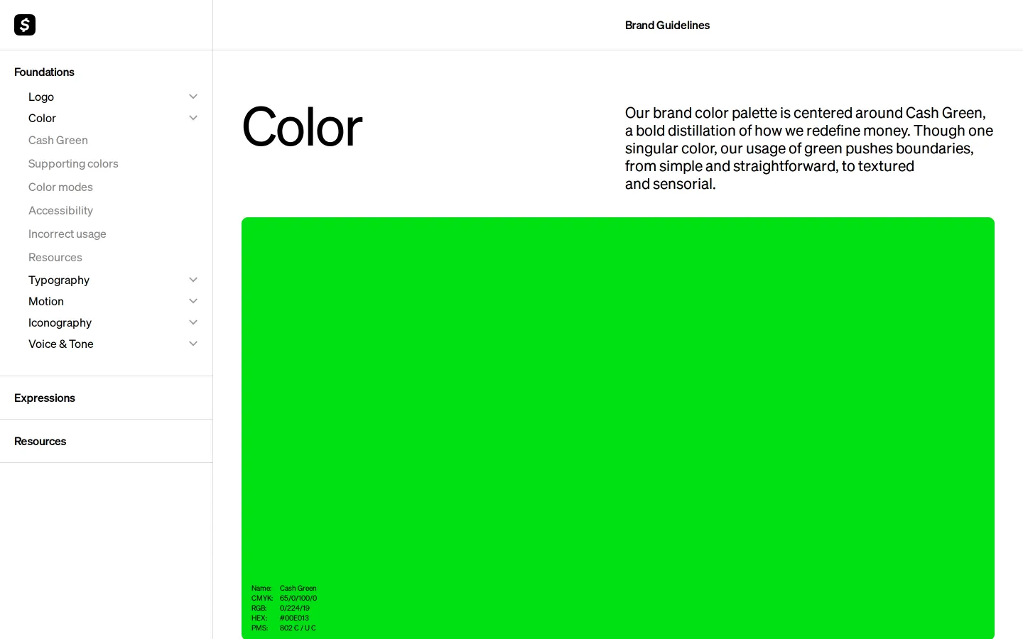
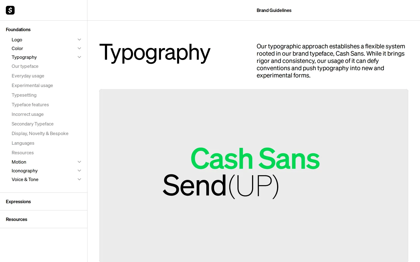
- The site includes dedicated sections for logo, color, and typography.123
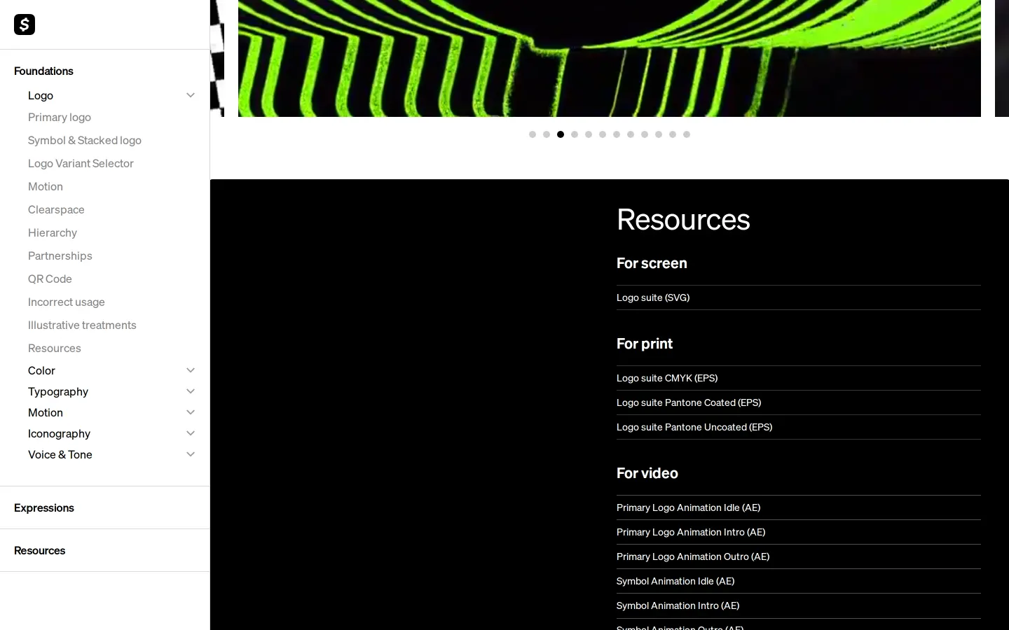
- Direct SVG downloads are available for Visa partner lockups in black and white variations.45
- The pages share a consistent description defining Cash App as thriving on the tension between structuring order and explosive freedom.6789
Numbers refer to the screenshots above.
What I could not see
- Could not view full written narrative rules, color palette specs, or typography styling details beyond page titles and download links.
Ideas to borrow
- Providing co-branded partner lockups directly on the main logo page helps external teams implement partnerships accurately without extra back-and-forth.
Reviewed on 18 September 2026. Request a correction · I built this