
bunq brand guidelines
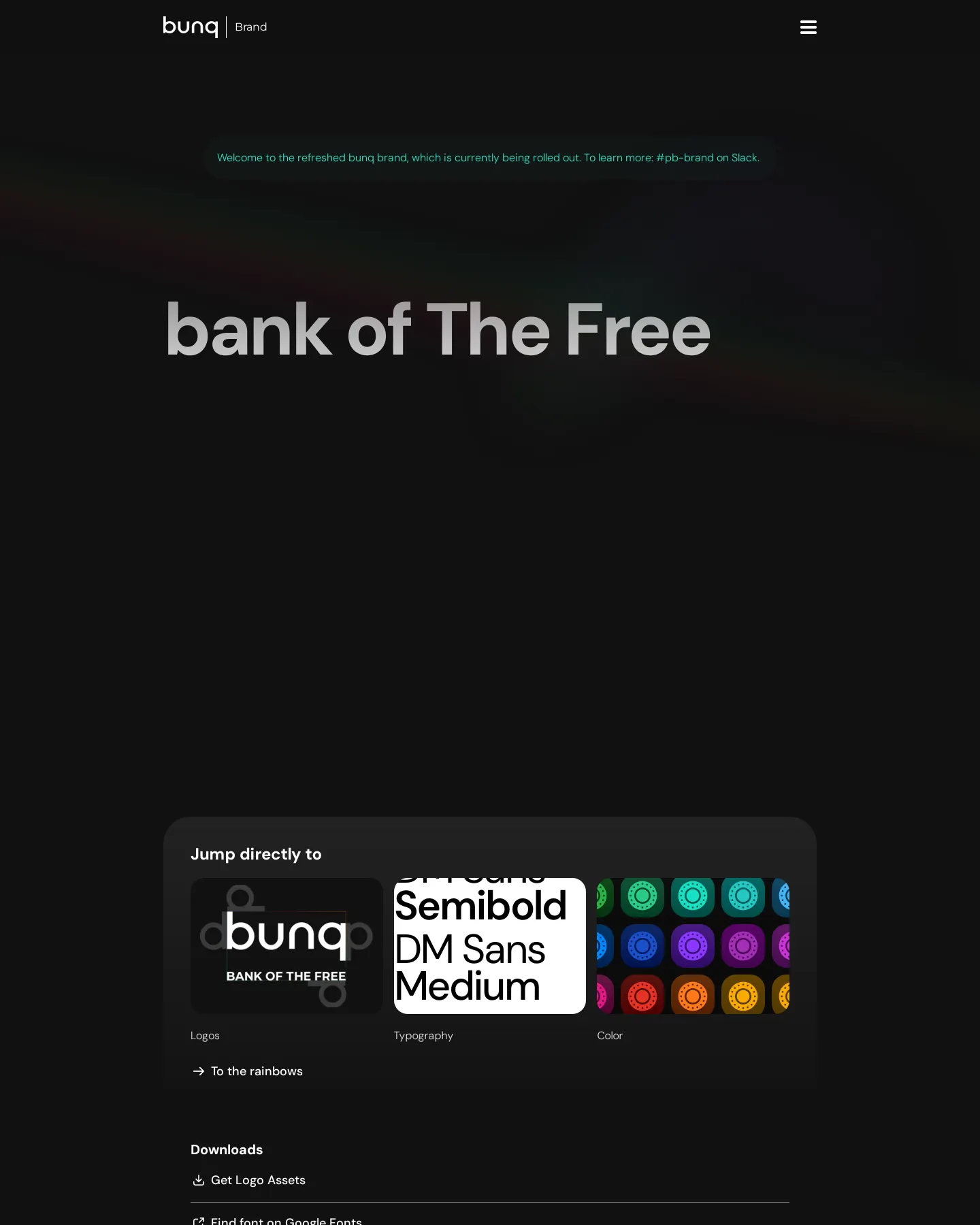
The bunq brand portal outlines core identity rules, including their signature twelve-color rainbow, DM Sans typography, and downloadable logo assets.
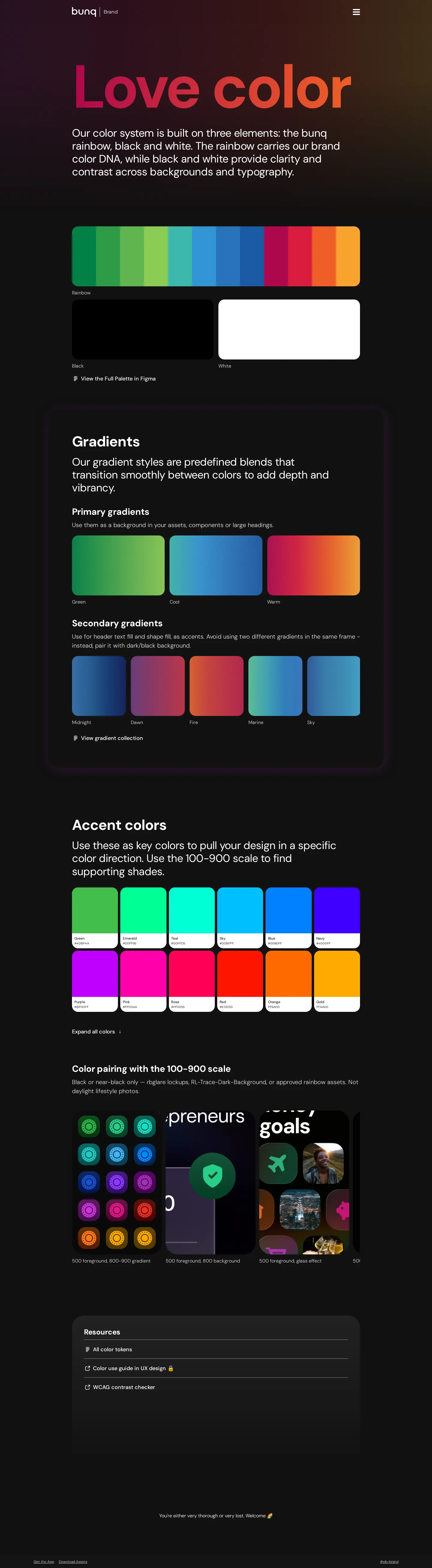
Freedam's take — I like how bunq treats their signature rainbow not just as an accent, but as the core visual anchor of the whole system. The guidelines outline its twelve specific colors and show how to scale the effect, from full props to subtle light traces across photography. Alongside clear rules on keeping the wordmark strictly lowercase, they lean heavily on DM Sans across weights to keep financial information approachable. Built on Framer, the site feels energetic and easy to browse, giving creators direct access to logo archives and crisp typographic guidance.
Details
- Type
- Guidelines
- Access
- Public
- Source
- brand.bunq.com
- Industry
- Finance
- Capabilities
- Guidelines, Asset browsing, Downloads
- Tags
- color system, typography, logo usage, asset downloads, vector assets, framer
- Added
- Last checked

What I noticed
- The identity system centers on a 12-color rainbow arranged in a fixed left-to-right order as its primary visual cue.12
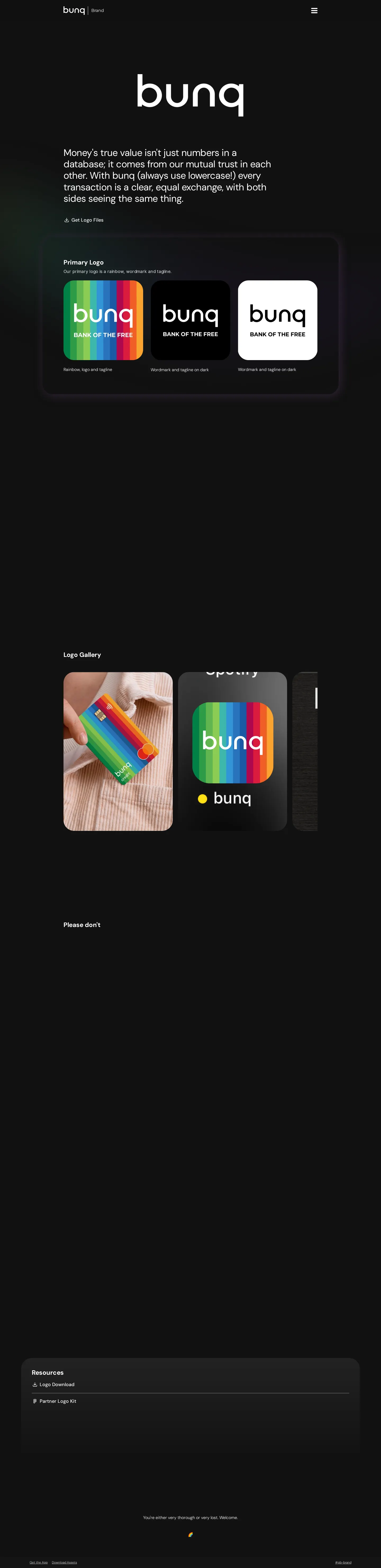
- The brand name bunq is explicitly specified to always be written in lowercase.3
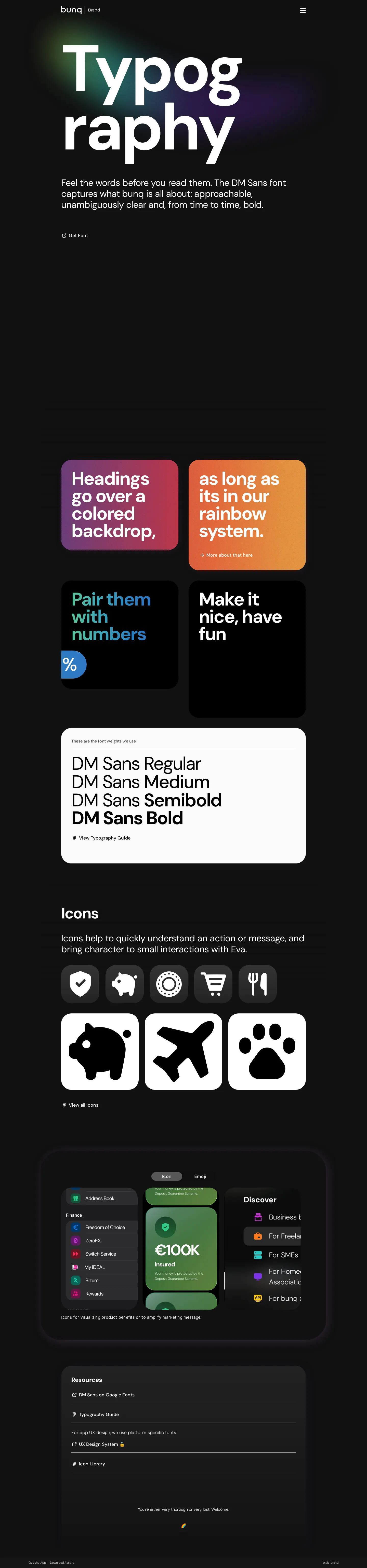
- Typography guidelines rely on DM Sans across Regular, Medium, Semibold, and Bold weights.4567
- The site provides direct ZIP downloads for logo files in PNG and SVG formats.89
Numbers refer to the screenshots above.
What I could not see
- No internal site search was observed.
- Marketing campaign archives, templates, and partner portals were not visible in the captured pages.
Ideas to borrow
Reviewed on 18 September 2026. Request a correction · I built this

