Bukalapak brand guidelines
Bukalapak's brand portal outlines company values, brand story, and visual identity standards covering architecture, typography, color, and supergraphics.
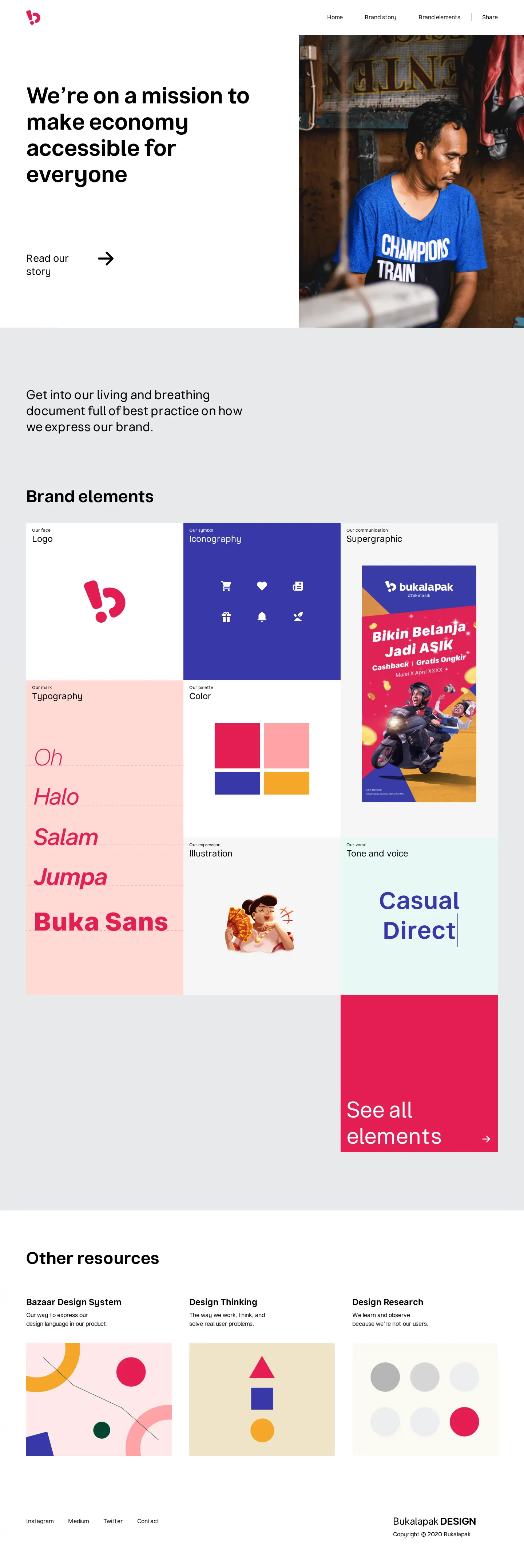
Freedam's take — I really appreciate how direct Bukalapak keeps their brand documentation. Instead of sprawling across dozens of pages, they organize everything into a clean narrative centered on their brand story and core design elements. Browsing through the elements section, I love seeing dedicated breakdowns for brand architecture, supergraphics, and icon construction alongside the usual logo and color rules. It feels thoughtful, structured, and easy for any designer to digest quickly without getting lost in overly complex navigation menus.
Details
- Type
- Guidelines
- Access
- Public
- Source
- brand.bukalapak.design
- Industry
- Retail
- Capabilities
- Guidelines
- Tags
- brand story, brand architecture, iconography, color system, typography, logo usage
- Added
- Last checked

What I noticed
- The site organizes its primary content into Home, Brand story, and Brand elements pages.123
- The Brand story section highlights company values, a mission around making the economy accessible, and identity updates such as a new logo.456
- The Brand elements page documents logo construction, brand architecture tiers, color palettes, typography, supergraphics, and iconography.789101112
- The structure favors a streamlined reading experience rather than a sprawling asset library.
Numbers refer to the screenshots above.
What I could not see
- No asset download links or file repositories were visible in the captured pages.
- Search functionality was not observed in the navigation or page headers.
Ideas to borrow
Reviewed on 18 September 2026. Request a correction · I built this