
BTG Pactual brand guidelines
BTG Pactual's brand center outlines corporate positioning and thorough visual guidelines spanning typography, architecture, cards, and audio identity.
Freedam's take — I like how direct the BTG Pactual brand center is. The site splits its focus neatly between corporate identity and an extensive visual guide. Stepping into the visual guide, you find clear sections covering everything from logo exclusion zones and typography to specific applications like physical architecture, cards, and sound branding. It also offers quick access to download asset packs directly. The layout feels practical, serving up foundational brand rules alongside tactile details without burying what designers need to build cohesive collateral.
Details
- Type
- Guidelines
- Access
- Public
- Industry
- Finance
- Capabilities
- Guidelines, Asset browsing, Downloads
- Tags
- audio branding, logo usage, color system, typography, asset downloads
- Added
- Last checked
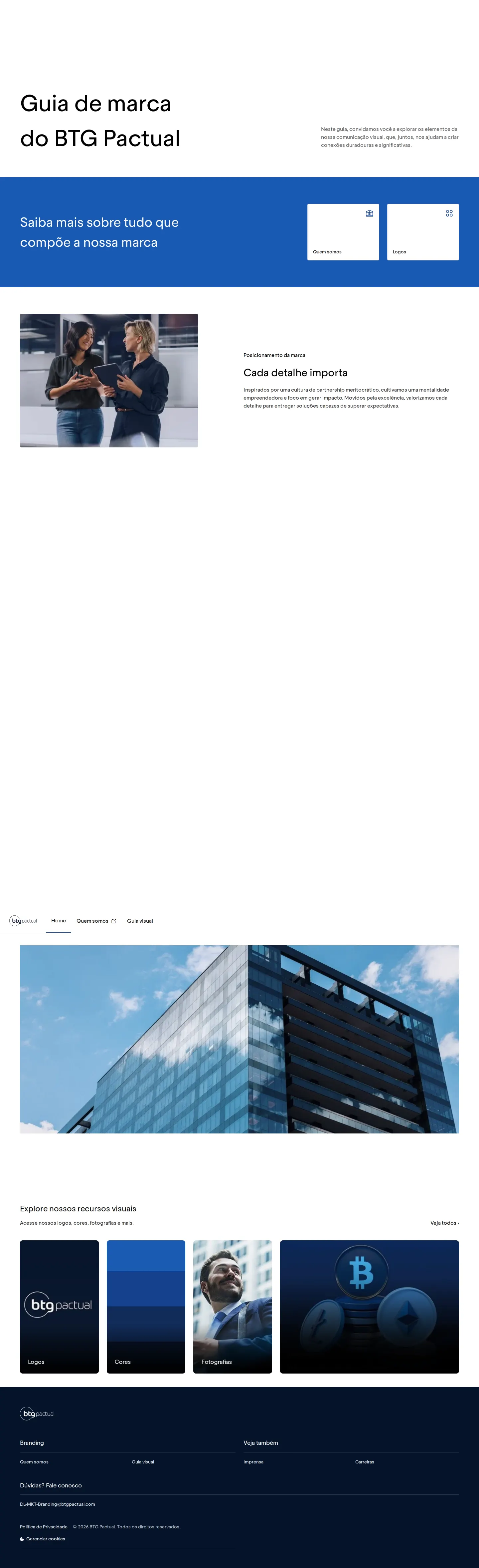

What I noticed
- The visual guide covers standard identity elements such as logo usage, color palettes, and typography.123
- Specific guideline sections are dedicated to color in architecture, card design, and a sound logo.456
- The portal provides a direct download package for brand logos as a zip file.7
- The structure prioritizes both conceptual positioning and practical application rules.
Numbers refer to the screenshots above.
What I could not see
- Could not inspect the full content of the downloadable styleguide package.
- Could not confirm search functionality across guideline documentation.
Ideas to borrow
- Include dedicated identity sections for physical spaces and audio branding alongside standard digital and print rules.
Reviewed on 18 September 2026. Request a correction · I built this

