
ATP Tour brand guidelines
The ATP Brand Identity Guidelines offer core logo rules, centering standards, and direct Dropbox asset download links.
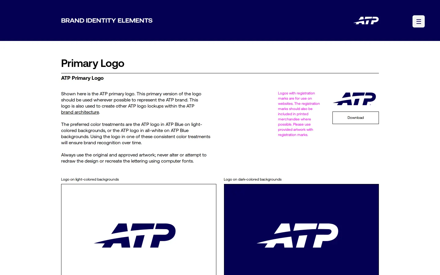
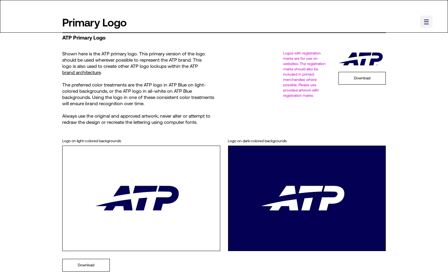
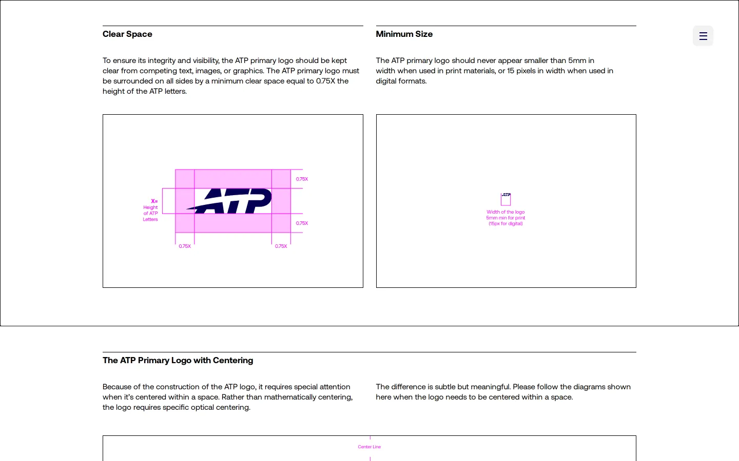
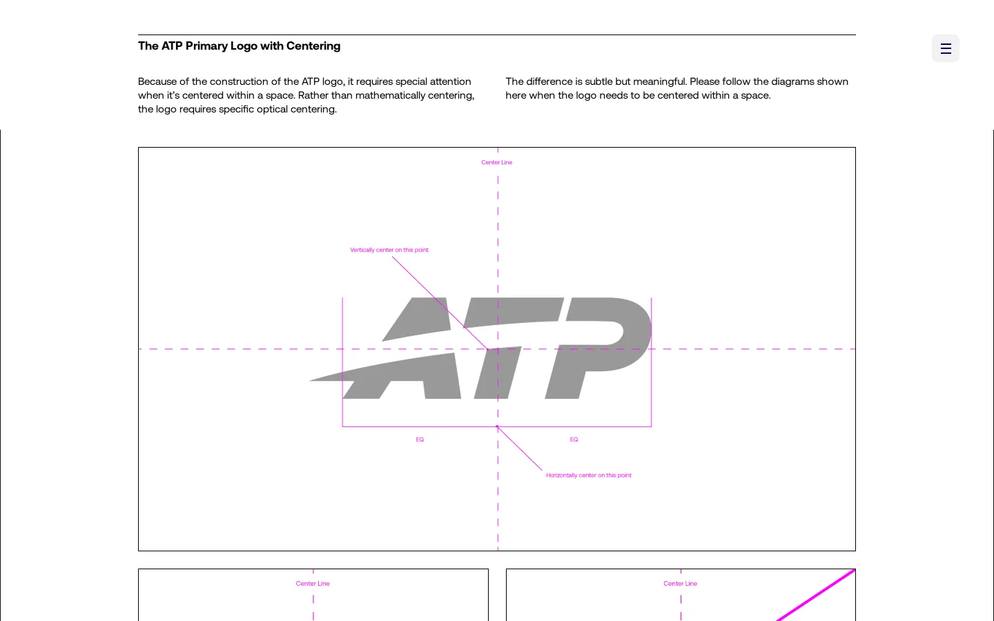
Freedam's take — I spent some time looking through the ATP Tour brand identity portal, and its focus is sharply on practical marks. The captured sections drill down into the primary logo, covering essentials like clear space, minimum size, centering rules, and how to place the mark against colored backgrounds. It is a straightforward, functional presentation. Rather than hosting heavy asset libraries directly within the interface, the site routes external downloads straight to organized Dropbox folders. It keeps things direct and easy to access for external partners and tournament organizers needing quick files.
Details
- Type
- Guidelines
- Access
- Public
- Source
- brand.atptour.com
- Industry
- Sports
- Capabilities
- Downloads
- Tags
- logo usage, asset downloads, minimal
- Added
- Last checked

What I noticed
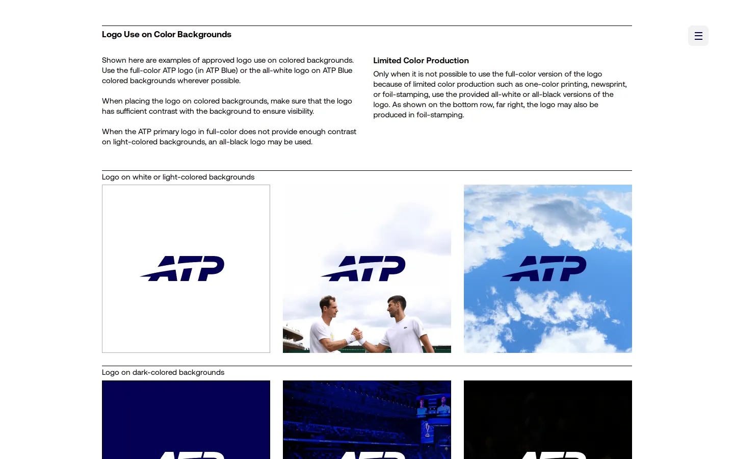
- The site provides dedicated pages covering the ATP primary logo, clear space and minimum size, centering rules, and logo usage on color backgrounds.1234
- Asset downloads across the primary logo pages are routed via external Dropbox links.5678910
- The portal uses query parameters on the primary logo path to paginate or segment subtopics.11234
Numbers refer to the screenshots above.
What I could not see
- Could not inspect the full typography, color palette, or broader brand guidelines beyond the primary logo pages.
- Could not view the contents of the linked external Dropbox folders.
Ideas to borrow
- Offloading asset packages to external cloud storage folders like Dropbox can simplify asset distribution without maintaining a complex internal digital asset management system.
Reviewed on 18 September 2026. Request a correction · I built this

