
Atlassian brand guidelines
Atlassian Design is an extensive design system documentation site covering foundational tokens, UI components, typography, iconography, and emerging AI patterns.
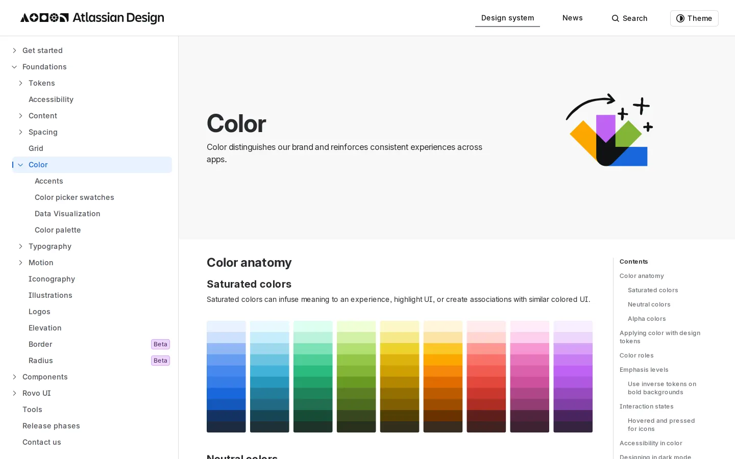
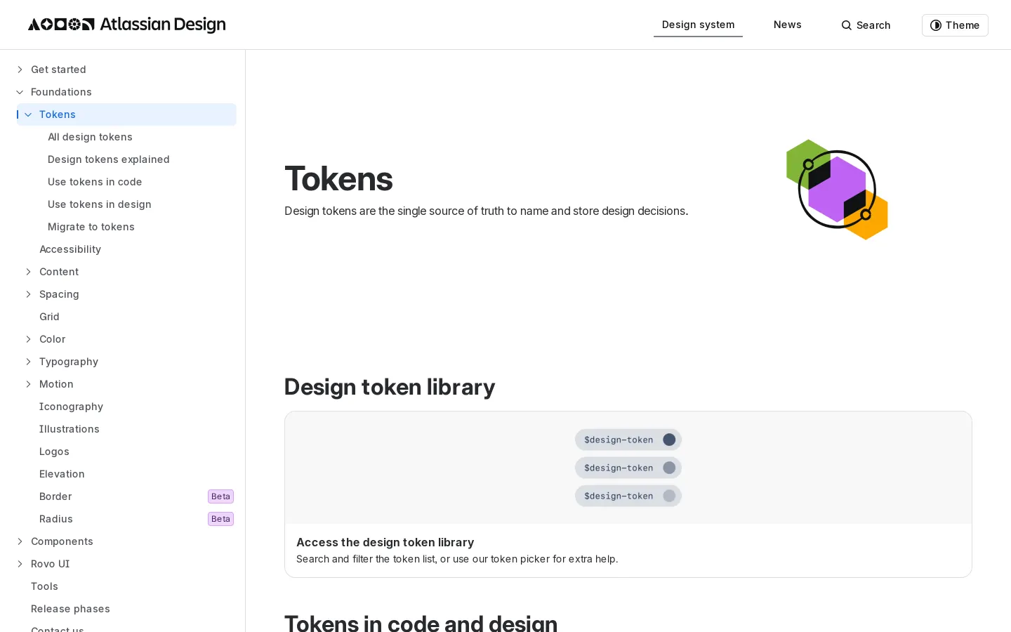
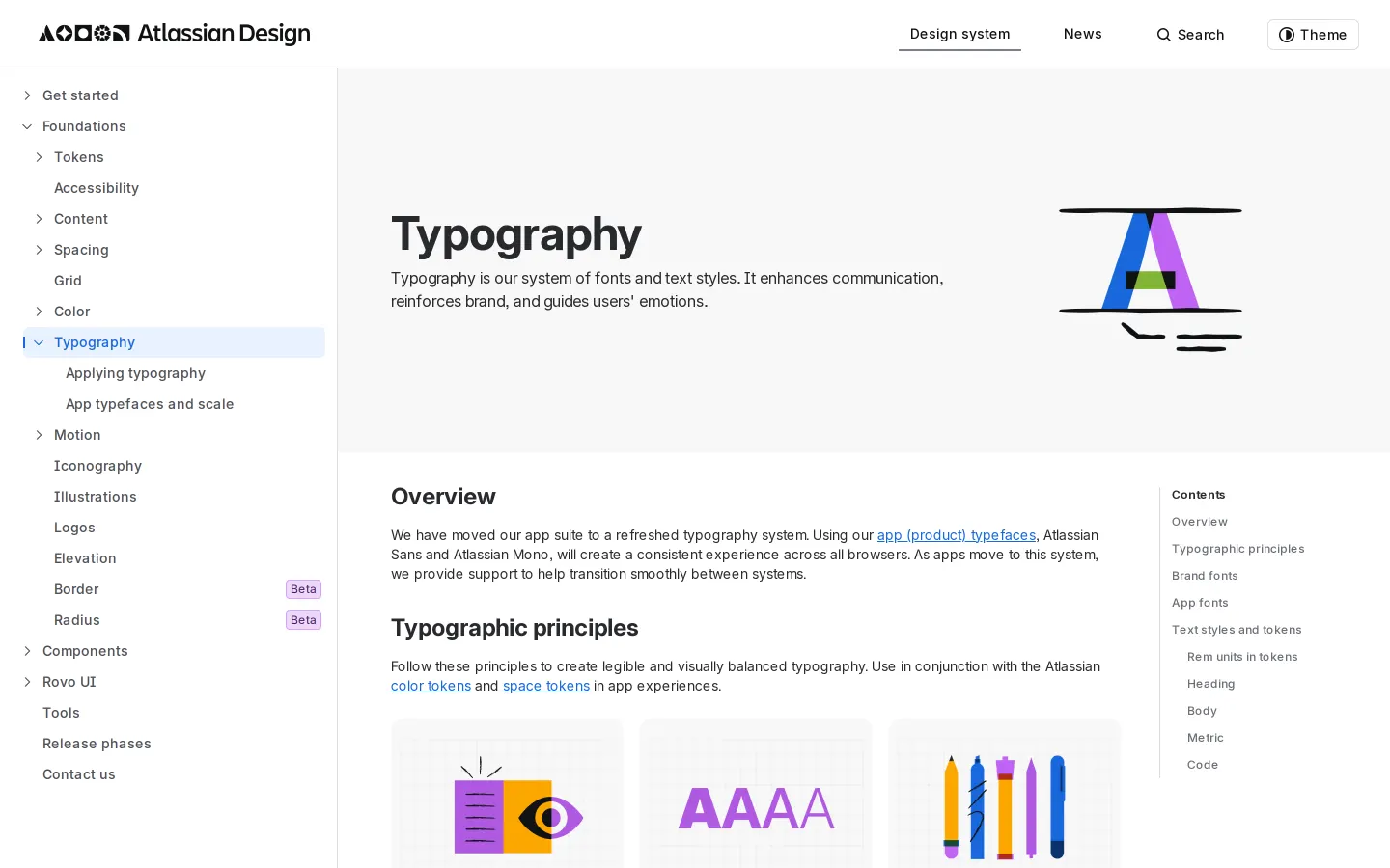
Freedam's take — I really appreciate how Atlassian treats their design system documentation as an open product guide. Exploring their foundational sections, I noticed how they balance high-level principles with granular details. Color is explained right down to alpha values and dark mode roles, while typography breaks down rem units and dedicated app fonts. They also give dedicated space to emerging topics like AI patterns and design tokens. It feels comprehensive without becoming dense, giving both designers and engineers the clear rules they need to build cohesive interfaces across complex software ecosystems.
Details
- Type
- Guidelines
- Access
- Public
- Source
- atlassian.design
- Industry
- Technology
- Capabilities
- Guidelines, Asset browsing
- Tags
- design tokens, ui components, color system, typography, iconography, product design, comprehensive
- Added
- Last checked

What I noticed
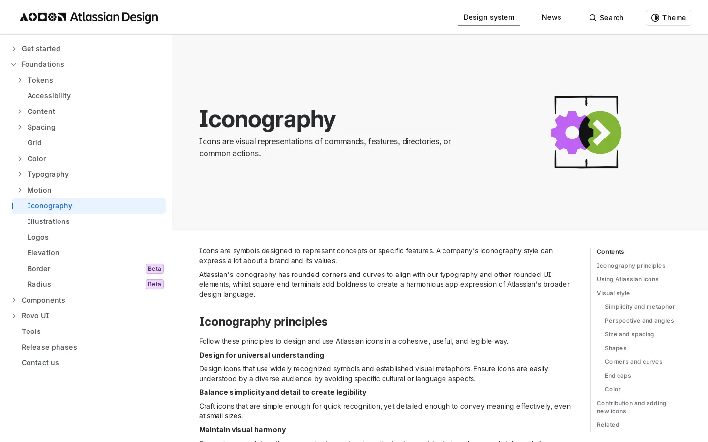
- The documentation includes dedicated sections for Design tokens, Color, Typography, and Iconography within its Foundations area.12345
- The home page highlights 'Design for AI' alongside foundational components like AI Patterns.67
- The site is built using Gatsby 5.16.0.89101112
- The iconography guide details specific construction rules down to corners, curves, and end caps.1314
Numbers refer to the screenshots above.
What I could not see
- Could not inspect interactive code sandboxes or copyable token snippets directly from the captured viewport
- Did not observe search functionality or direct asset download links
Ideas to borrow
Reviewed on 18 September 2026. Request a correction · I built this

