
AtkinsRéalis brand guidelines
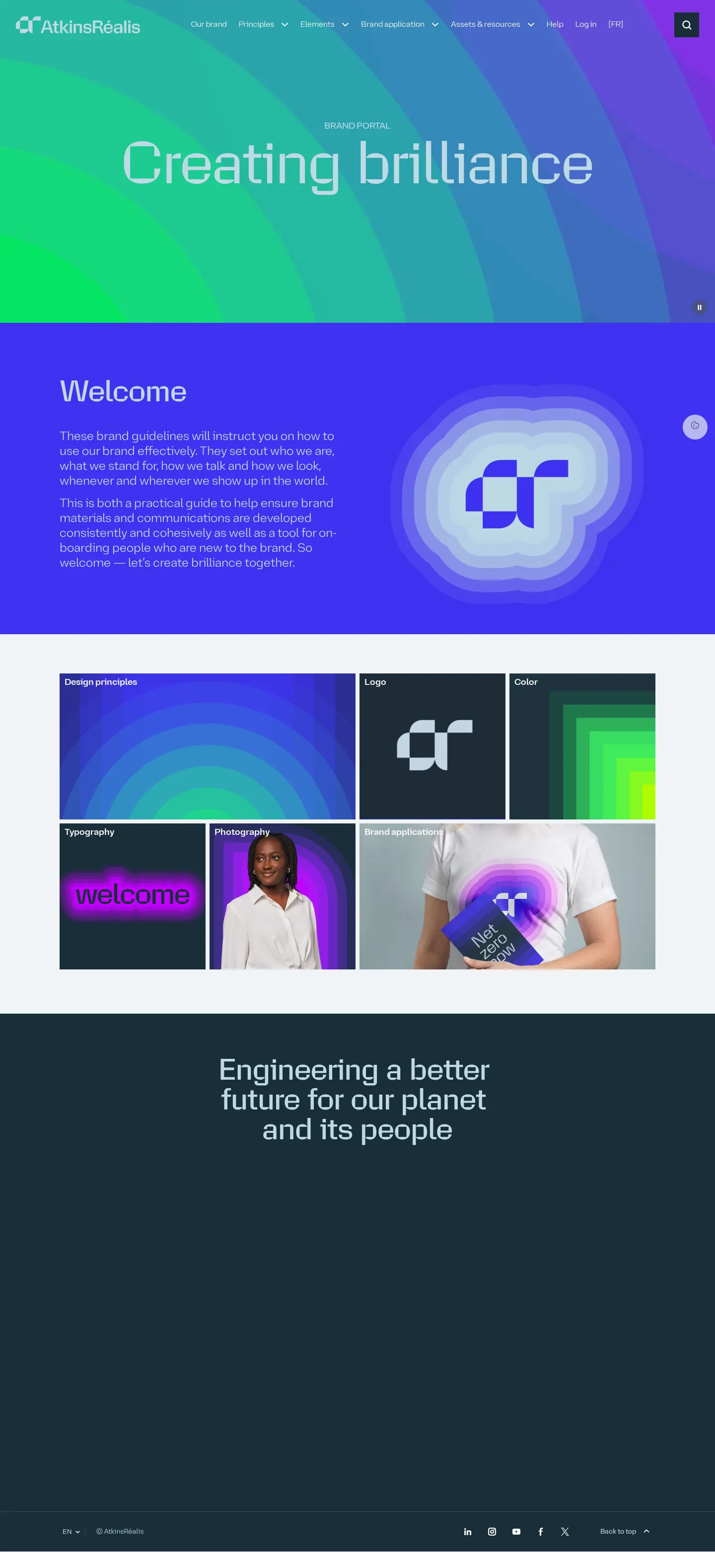
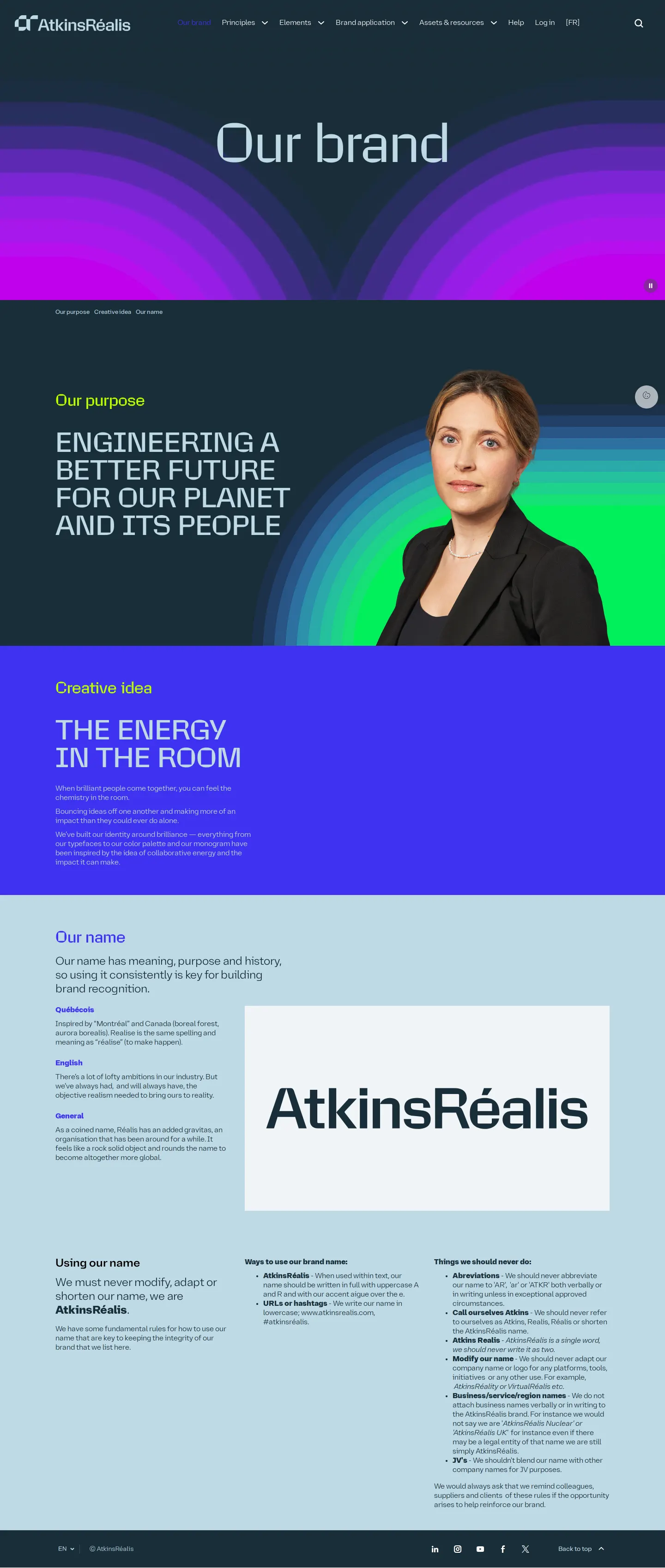
AtkinsRéalis provides an organized brand portal detailing purpose, logo lockups, typographic hierarchies, and color reproduction rules.
Freedam's take — I love when large enterprise brand portals present complex identity systems with absolute clarity. The AtkinsRéalis site lays out everything from their core purpose to detailed logo lockups, typography hierarchies, and color reproduction rules. The typography page caught my eye right away with its explicit headline rules, contrasting uppercase for short titles with sentence case for longer copy. Each section balances high-level vision with practical application guides and direct file downloads, giving teams a clean reference for digital and print formats.
Details
- Type
- Guidelines
- Access
- Public
- Source
- brand.atkinsrealis.com
- Industry
- Real estate & construction, Professional services
- Capabilities
- Guidelines, Asset browsing, Search
- Tags
- typography, logo usage, color system, brand story, asset downloads, papirfly
- Added
- Last checked



What I noticed
- The portal organizes documentation into main sections including Our brand, Principles, Elements, Brand application, and Assets & resources.12345
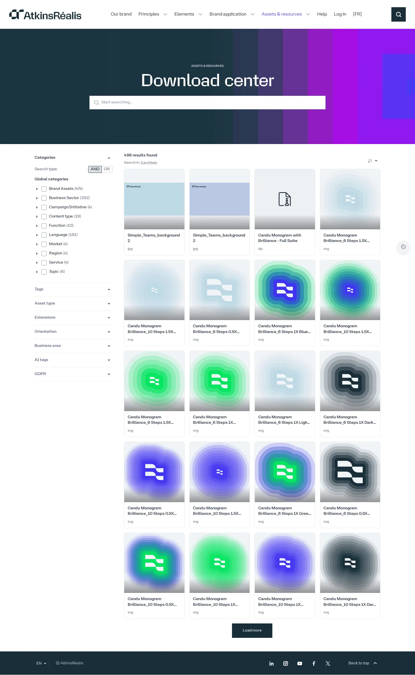
- The site provides dedicated download sections for primary and secondary logo lockups across screen and print media.6789
- Typography guidance specifies uppercase usage for short headlines and sentence case for headlines with ten or more words.1011
- The portal is built on the Papirfly platform.1213
Numbers refer to the screenshots above.
What I could not see
- Content behind the login screen and within the Assets & resources section was not accessible in the capture.
- Brand application details and specific color palette hex values were not visible in the captured text.
Ideas to borrow
Reviewed on 18 September 2026. Request a correction · I built this

